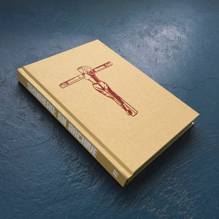
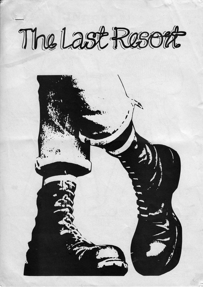
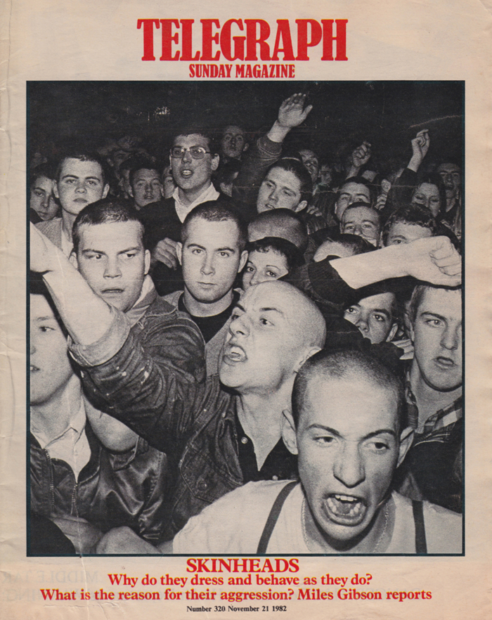
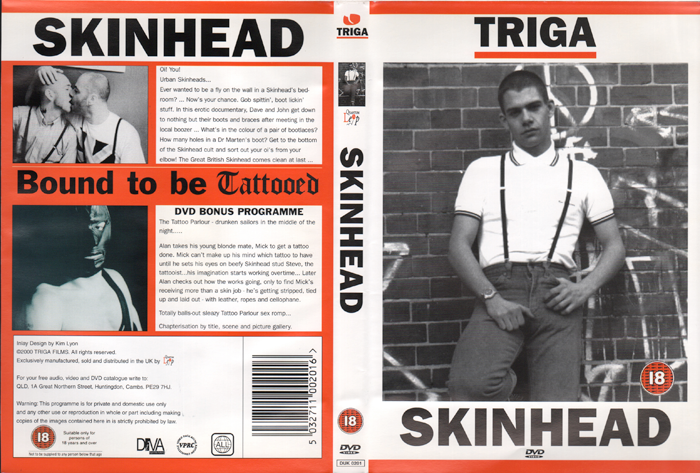
“Skinhead: An Archive” is a powerful publication that explores the unique visual identity of a widely misunderstood and controversial subculture. The publication is a collection of visual material and texts curated by Toby Mott, an artist, designer and historian. The book has been meticulously designed by Art Director Jamie Reid and published by Ditto Press.
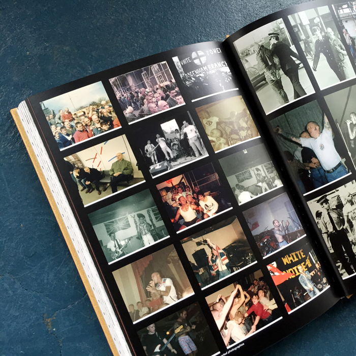
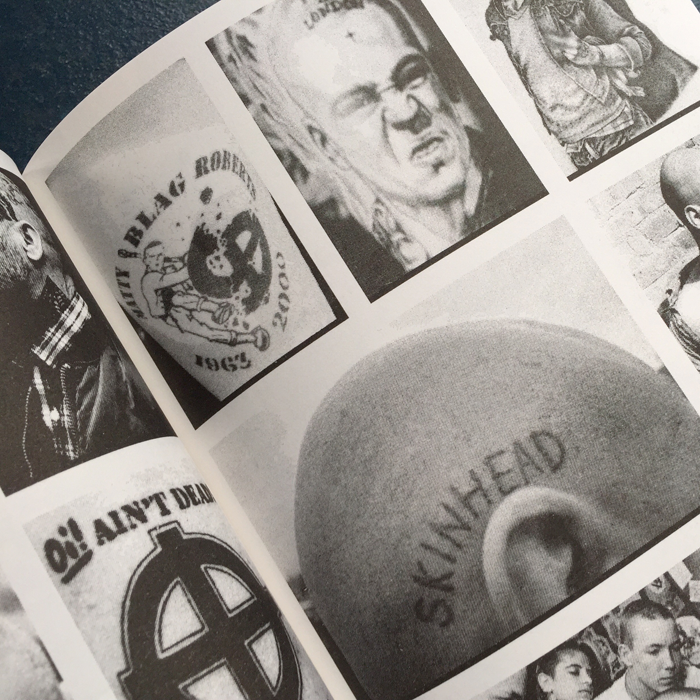
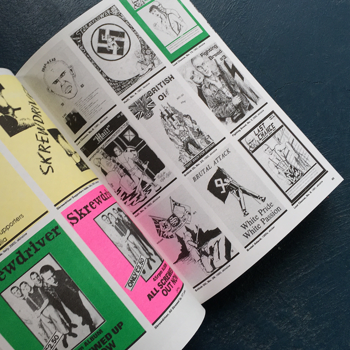
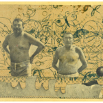
Arguably representing Britain’s grittiest faction, Skinhead culture is branded with a unique aesthetic that is perhaps conveyed most strongly via the platforms of fashion and music. The book brings together visual relics such as zines, posters, photographs and films in order to get back to the real routes of this multi-faceted and radical movement. This publication is an intriguing artifact and definitely one to add to your collection.
We caught up with the super talented Jamie Reid to get a better insight into how this remarkable project came to fruition.
How did the project come about and who initiated it?
Myself, Ditto Press and Toby have a good working relationship, having worked together on a number of books previously, though none as major as this. When Toby first mentioned that he had been collecting the material, we all met to look through it, and immediately saw something we were all onboard with.
How long did the project take from start to finish?
We started talk of the book around 2 years ago; it’s such a big and significant project it was important for us that it didn’t feel rushed.
How did the content drive the aesthetic of the book across layout, stock and fonts?
It was important that the design of the book felt suited to the subject without being pastiche or too familiar to a certain element or subsection of skinhead culture you might see in the book. The image pages are relatively simple grid layouts, where each image is captioned directly underneath; as we are presenting Toby’s archive of material, it was important that all the imagery could be referenced.
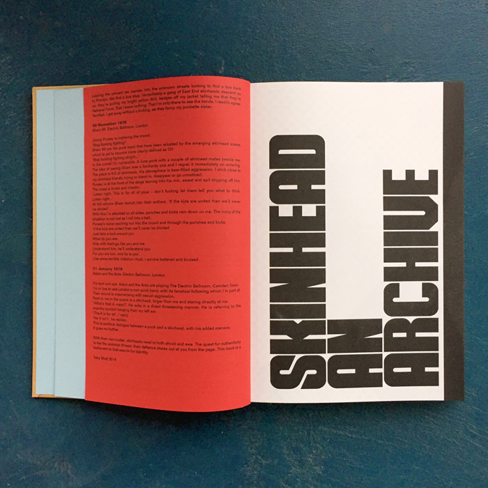
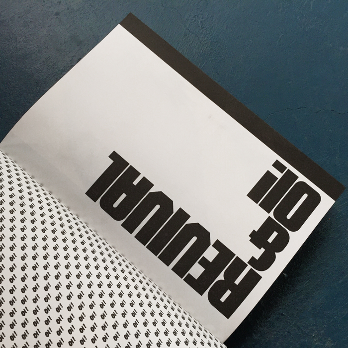
The headline font has been totally redrawn from a Penthouse Magazine article headline, which in a way became the starting point for the overall design. I was attracted to the sharpness, blockiness and aggression. Only the word ‘SKINHEAD’ appeared, and from that I redrew the full uppercase alphabet, glyphs and accents. The font will be available for licence at the end of the month through Ditto’s web store.
The ‘luxury’ of the case binding and finishing is an intentional decision to contract the rough immediacy of the original imagery inside, where the inner pages being risograph printed are perhaps more indicative of the originals.
What relevance do you think the book has to current trends?
I wanted the book to be an authentic artefact and to present Toby’s archive. Lots of the design decisions were intended to give a rough allusion to the aesthetic of the subject without being an imitation. Therefore I would probably say it doesn’t have any relevance in trend.
The book is available to buy from Ditto’s site here.
You might like...
 Katy Binks
- Linocut Boy
- ONLY NY INC. | Summer Collection 2014
- Fukt Magazine
- Block & Branch by Alice Pugini
- Sagmeister & Walsh | Aïzone
- Kitty Frilling
- Paul Wolterink
- 50 years of Illustration
- Diego Mena: Ministry of Sound Print
- Graduate Print Awards 2015 :: Beatrice Bless of New North Press’s Advice for Grads
- Line Solina Studio
- OWT Creative
- LRG :: Holiday 13
- Upright Press
- Hannah Höch :: Whitechapel Gallery


- Stanley Anderson - April 19, 2015
- Ellie Andrews - April 13, 2015
- Pete Sharp - April 12, 2015