A compelling consideration of detail and composition is infused within the work of Jordan Smith, instilling the perfect amount of negative space to compliment his captivating aesthetic. A confident exploration of both illustration and graphic design details an immense intelligence, evoking a deeper reaction when immersing oneself within both the beauty and the underlying message confidently injected.

Hi Jordan, tell us a bit about yourself.
I’m Jordan Smith; I study at University of the Arts London where I explore the links between Illustration and Graphic Design within my work
Where or who do you draw your inspirations from? What influences your work?
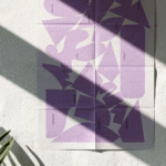
For me, I tend to draw inspiration from all over the place. I’m quite interested in composition and negative space as a source of inspiration. I am often interested in the way things fall into shape, how things align and play with negative space around them. German Bauhaus design from early in the 20th century could arguably be one of my main sources of inspiration in this sense.
Your talent ranges vastly from quirky illustrations to mesmerising realism, how would you ultimately describe your desired style as an illustrator?
Obviously being a student I’m still experimenting as much as I possibly can so it’s hard to completely pin point my current style as illustrator at the moment. In terms of where my style is heading, I’d like to think I’m currently making work that stimulates a sense of viewer satisfaction through wit and personality communicated through ordered and easy-on-the-eye visuals.
What have you been working on lately?
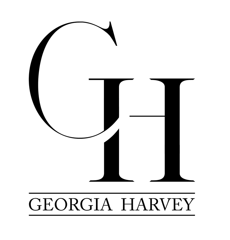
Recently I have been working much more within Graphic Design. I created a logo for Fashion Designer Georgia Harvey where I experimented with typeface and positioning of lettering in order to create an illusive visual. I also have entered the Penguin Design Award 2016 where I have re-designed the book cover for Caitlin Moran’s ‘How to be a Woman’.
Tell us more about the book cover and the design decisions behind your final outcome.
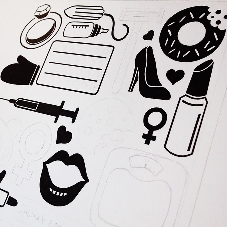
After reading the ‘How To Be A Woman’ by Caitlin Moran and researching into the feminist interests of Moran, I was particularly interested in the high levels of witty feminist rants Moran explores throughout the book. The book is written in a very smart tone yet at times is often very funny.
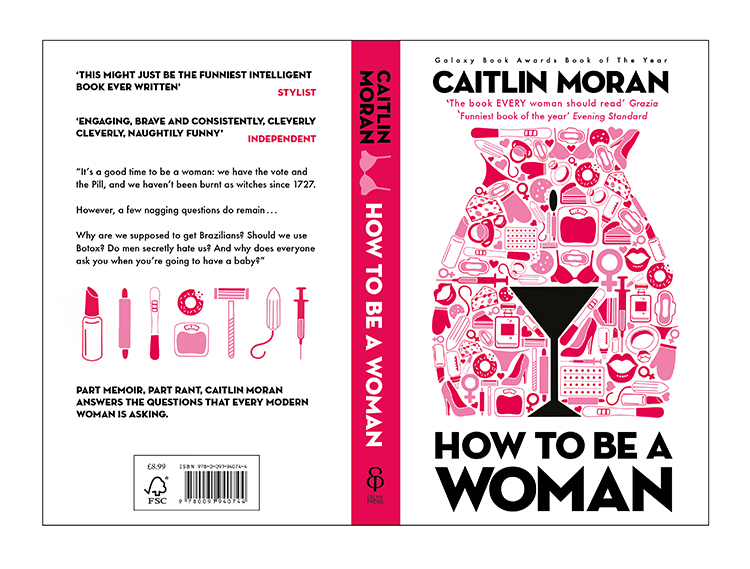
I strived to juxtapose stereotypes of women contrasting how they wish to be perceived within a modern day society by breaking existing expectations of women, like the book depicts. Gathering examples referenced in the book and chapter themes, I hand drew black and white bold object illustrations which best represented these stereotypes. Originally, I intended to display these in a random order over the cover. However, when placing the martini glass illustration I was inspired by how the glass almost looked similar to the shape of a woman’s vagina and gap between the legs. One of the themes Moran explores is that of genital shaving; should women be given the choice not to shave? Hereby I then developed the arrangement so that the glass could be stretched and formed to shape the genital area. Placing the other illustrations around the glass much smaller and editing them pink in Adobe Illustrator not only made them represent skin and feminist typical colours but it also made them greatly contrast the black mark not glass where the colours greatly represented pubic hair. More than just a visual contrast, this arrangement also contrasted the two themes, stereotypes of women and how women perhaps want to be able to behave. This caused extreme wit, which I felt majorly, conveyed the book’s themes.
What would you say is your greatest accomplishment so far?
In terms of personal satisfaction, I would say I’m most pleased with my Penguin Design Award entry; it combines many areas of design I’m interested in so for me it has been quite significant in terms of personal development. Regarding accomplishment, back in 2012 I came first place for The Renaissance of the Portrait’s ‘Jubilee contest where applicants were asked to illustrate her majesty herself. My illustration was presented to her majesty and I was invited to a presentation at the House of Lords. I was very young at the time and personally feel this is where my creative direction properly stemmed from!

Where do you see yourself going next?
Having developed so much during the Penguin Design Award work, I see myself taking the commercial graphic design road from here. I’m quite interested in publishing design right now and wish to explore this some more. Like any creative discipline though, where you plan to go next very often can be extremely different to where you end up.
You might like...
 C100
C100- Top 2021 Calendars
- Patricia Voulgaris
- Fanciful Pages
- Bruno Oppido: Who Shot Who?
- Cluster Illustration Residency
- Frinton Press
- La Perruque: Type Magazine
- Filippos Fragkogiannis & Georgia Harizani | AkzoNobel Colour of the Year 2021, Brave Ground
- Alphabetical
- Swiss Coasters
- Feral Kid
- Jennie Webber
- Vicious Midget
- Hoxton Hall :: Creative Agency
- Moveable Type


- Kristina Suvorova - March 27, 2017
- Andrés Gallardo Albajar - March 21, 2017
- Marietta Varga - March 14, 2017