A Practice for Everyday Life is a graphic design studio based in London. Their work focuses on art direction, identities, publications, exhibitions, type design, signage, packaging, and digital. They have recently created a new visual identity for celebrated British shoe and bookmaker, John Lobb, which is owned by Hermès. The new package consists of a new logo, typography and colour scheme, along with design of stationery, packaging, printed and digital invitations; and a new website to top it off.
“We explored the company’s extensive archive in order to establish a distinct, thoughtful and contemporary graphic language for John Lobb, which remains faithful but not reverential to its long history. John Lobb is a shoe and bootmaker whose heritage reaches back to 1851, when the eponymous Mr Lobb, a farmer’s son, made his way on foot from his home in rural Cornwall to London to seek his fortune. He was apprenticed to the greatest bootmaker in the city and became a master of his craft, eventually establishing shops in London and Paris. John Lobb, now owned by Hermès, includes a Bespoke atelier, Ready-to-wear range, and By Request service. They have remained true to their heritage of traditional hand craftsmanship, premium quality and a precise and personal service.”
A Practice for Everyday Life were commissioned following the appointment of Paula Gerbase as the new Artistic Director of the brand in 2014. The brief was to create an identity for the brand which echoed and emphasised the approach of the shoemakers themselves: precise, refined, sensitive to materials and to function, and respectful of heritage.
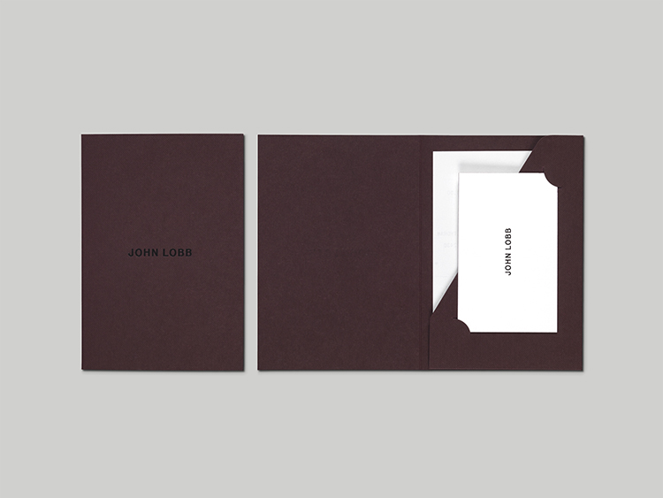
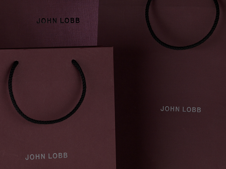
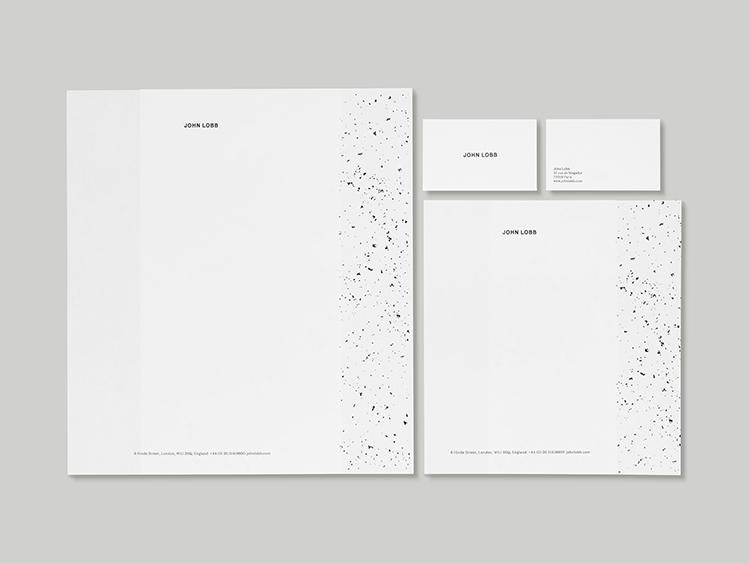
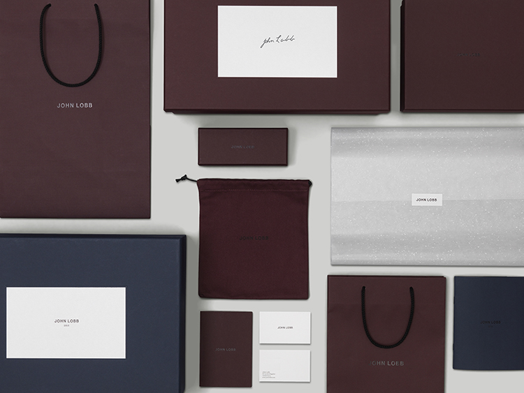
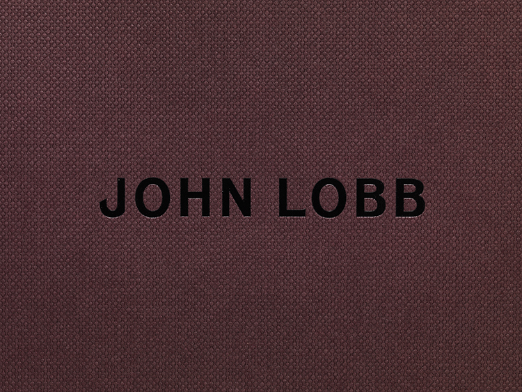
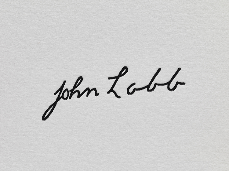
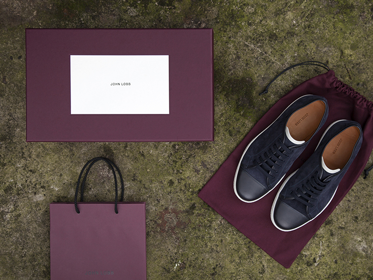
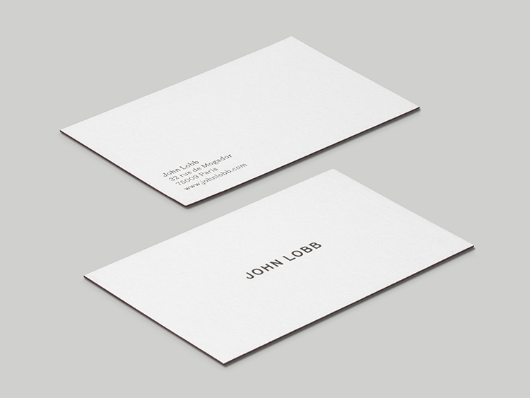
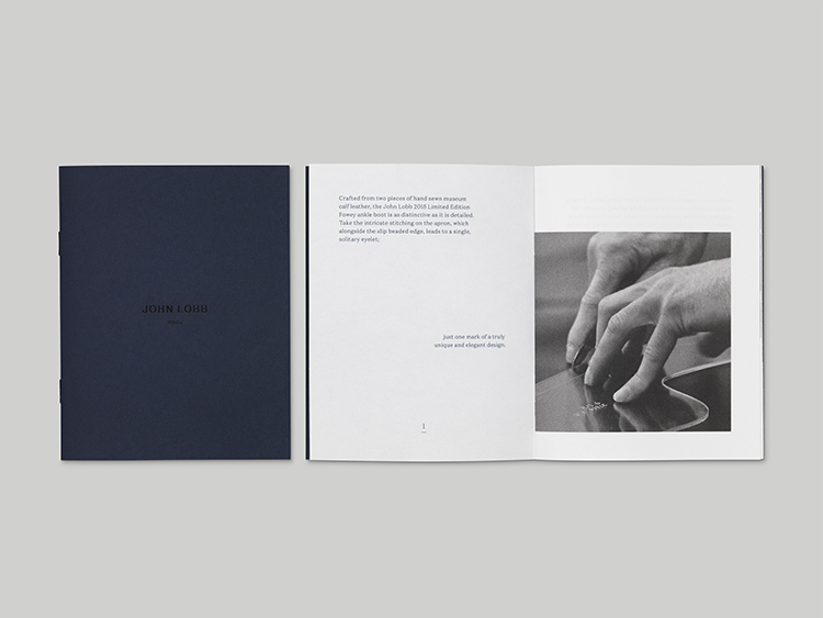
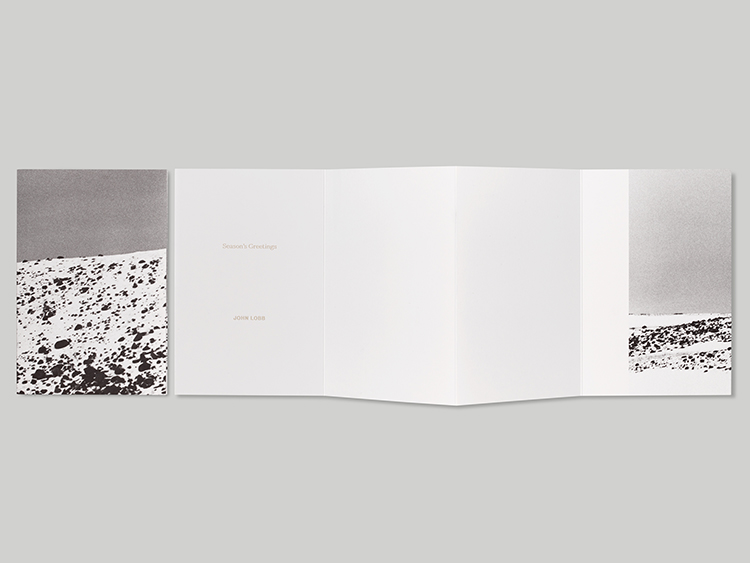
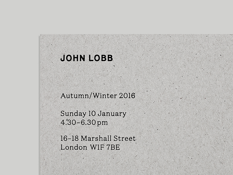
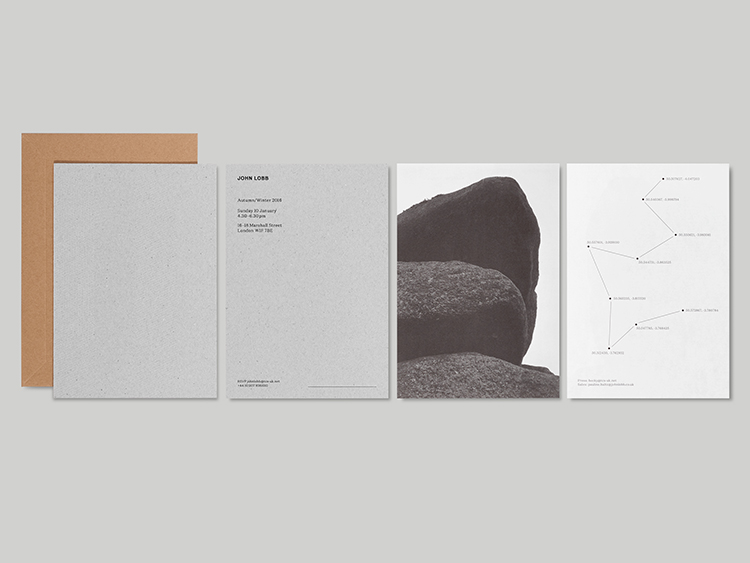
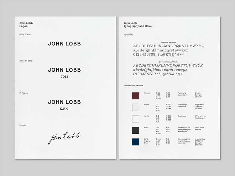
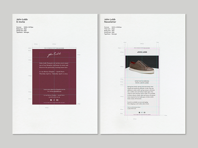
The new identity establishes a distinct and thoughtful graphic language for John Lobb, which evolved out of research into early packaging and investigation into the history and story of the company. The new logo is evolved from an early version we discovered in the company archive, on the label of a shoebox from 1937. Its letterforms were refined and updated to create a logotype that remains faithful to the history of John Lobb, whilst feeling contemporary, in much the same way as Gerbase’s new designs for the shoes themselves. Throughout the identity, these logos are paired with a latin typeface, Domaine (Klim Type Foundry) which is itself derived from archival letterforms from the same time period in which John Lobb first came about.
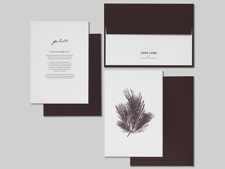

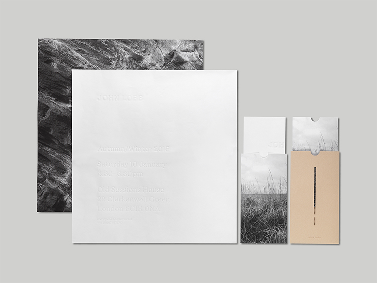
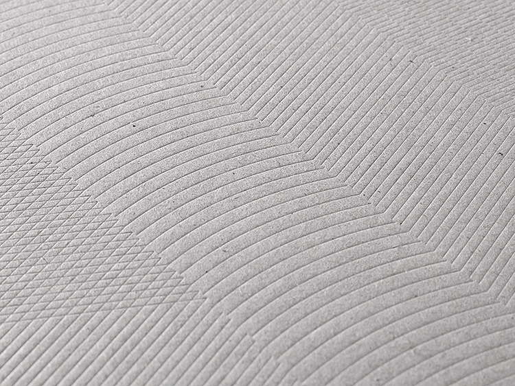
APFEL also developed a new colour and materials palette. The key Russet colour was again inspired by packaging materials and shoeboxes found in the company archive, and is paired with warm white and greyscale imagery. An extensive range of packaging was developed using this palette, with uncoated papers and boards, textured embossings and abstract patterns inspired by the landscape of Cornwall. Printed items such as stationery and invitations also emphasise the quality and tactility of the chosen materials.
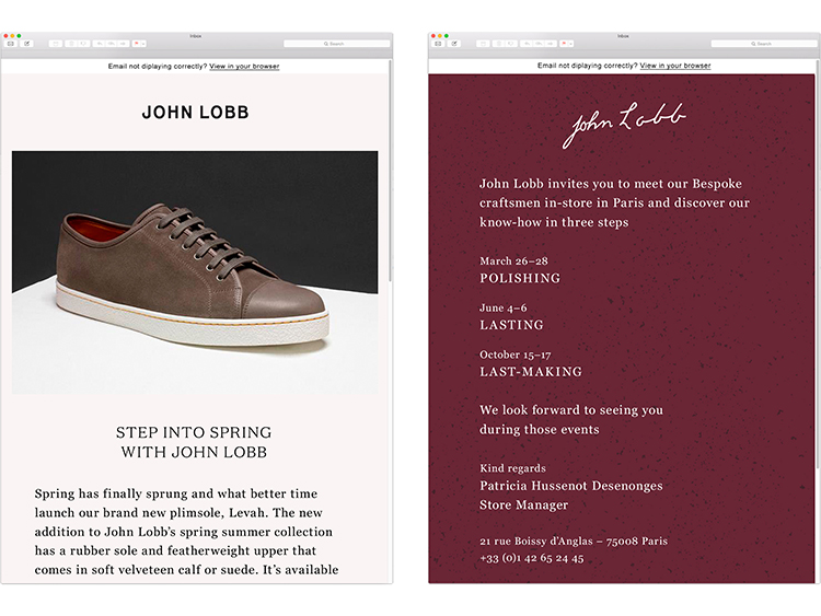
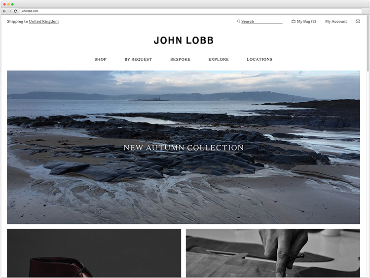
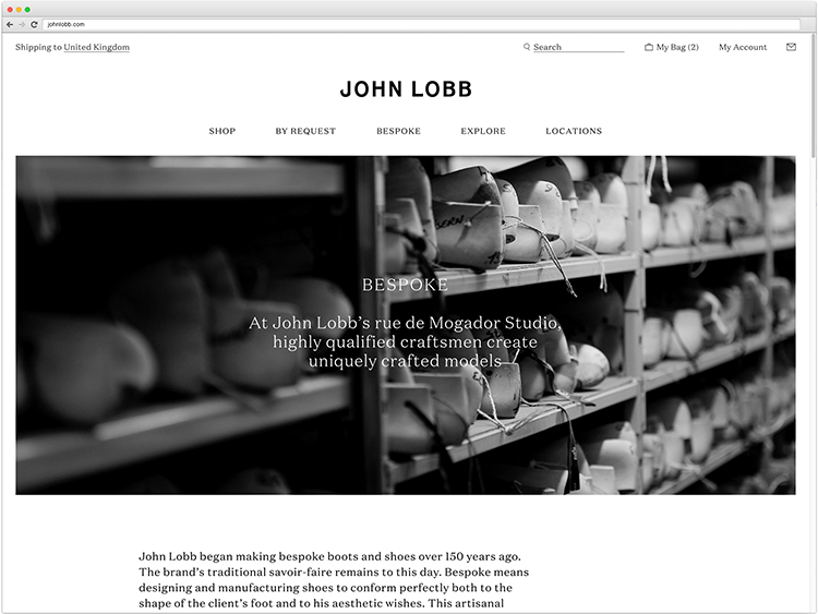
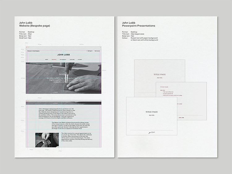
The new website design for John Lobb, which is currently in development, incorporates the new identity, typography and colour scheme, and was created with the aim of improving the experience of visiting and using the site. The graphic treatment of the site incorporates a more narrative-led editorial structure and imagery, and will be built to a responsive grid structure, allowing flexibility across a range of platforms.
www.apracticeforeverydaylife.com
You might like...


marcroy@peopleofprint.com