It’s hard not to be into Ben Eli’s work, with its unashamedly poppy, internet culture aesthetics, bright colours and bold type; and it’s hard not to like the person behind it once you hear them gushing about both Dolly Parton and Madonna’s Ray of Light album. “It’s probably a tie between Ray of Light and Confessions on a Dance Floor for me,” says Eli, on Madonna’s finest work. “Not only is the music amazing, but the world building around the albums, the visuals and photoshoots are just so good. Ray of Light was a complete 180, a re-invention for her, and that’s what I love about pop artists. The theatrics, fantasy and storytelling…”
Eli graduated from the graphic design course at Teesside University in 2017, and since then has worked for big names in design and fashion, including a two-year stint at Depop. Eli landed the latter role right after graduation: “When I first started as a Junior Graphic Designer I was also the only graphic designer, creating work for the UK, US and Italian markets so it was definitely a ‘thrown into the deep end and learn to swim’,” they say. “I joined right as the new rebrand launched which meant I was able to play and experiment and really find out what worked, what didn’t, and what I genuinely liked.”
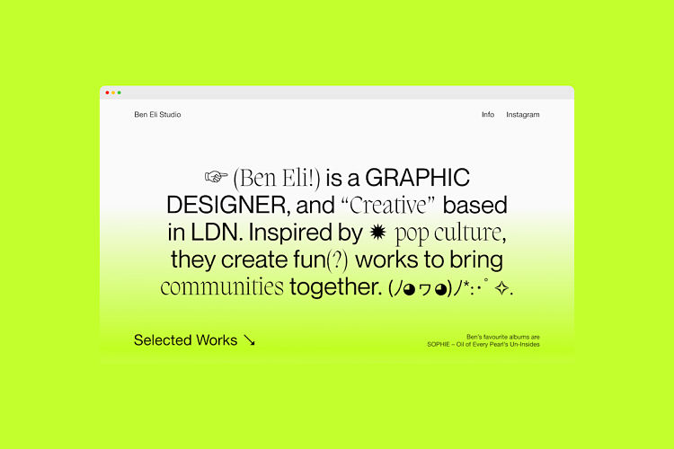
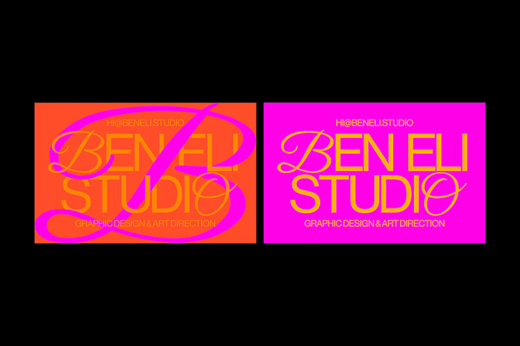
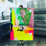
Now based in London working as a graphic designer and creative, Eli has just finished their stint at the Wix Playground Academy, where they were selected as one of 30 participants out of more than 300 candidates for an intensive month-long web design program. Working as Ben Eli Studio, their flair with typography plays out across projects such as their self-initiated pop posters series, a joyful collection of work that showcases both their characteristic playfulness and well-honed craft. The studio website is equally joyful—all mixed-up fonts, neon gradients and a totally brilliant custom cursor. We had a chat about that cursor, the concept of “personal branding”, how amazing Dolly Parton is and more.
 What do you wish you’d been taught, or hadn’t been taught at uni?
I wish I had leaned into my personal brand and positioning a lot more. I don’t just mean “what will my logo be?”—but on a much deeper level. I went to Uni way outside of the London bubble and it was quite a shock once I got here how truly white and middle-class the industry is. The past few years have been a bumpy road to finding comfortability with how I want to position myself and feeling unapologetic about that. At the Wix Playground Academy we learned a lot about presenting ourselves and our work in the best possible way, along with how to reframe and maximise the potential of our projects. This was really beneficial for me as I was able to create a site that really balanced the fine line of showing off my personality while also allowing my work to shine and speak for itself.
 I love the CareBear cursor on your site. Why that icon?
I grew up customising websites and MySpace profiles where a custom cursor was always the pinnacle of adding your personality to your profile. I wanted to channel that energy and nostalgia into my site by going back and looking through the same cursor sites I used as a teen (in this case, TotallyFreeCursors) and making that relevant to 2021. I chose a CareBear because it feels camp and a little bit silly but I think there’s actually a lot of power in that. I want to be unapologetic about using symbolism that might feel too femme, too young, too “unprofessional”. I love kitsch touches and I think a custom cursor is always going to be something I add to my sites. My previous site had a Furby, for example! Things like this also spark conversation—it often comes up in job interviews or when people contact me about how much they love the cursor. So I also see it as a way of doing something small to brighten someone’s day and inspire that feeling of nostalgia.
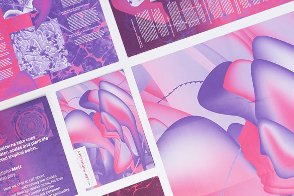
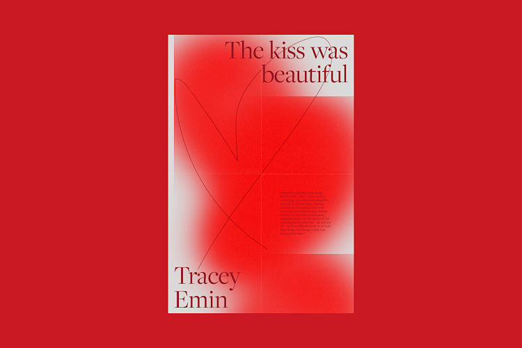
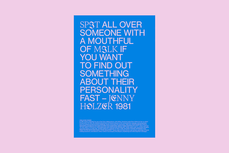
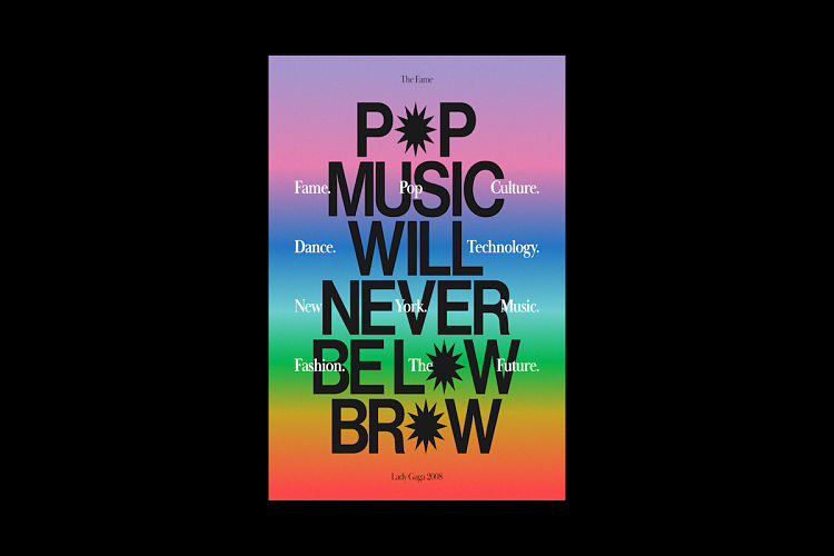 Tell me more about your pop posters…
Pop Posters is a totally self-initiated project. I see them as fan art and love letters to whatever media I’m consuming through music, art, film, news etc. I went through a period of feeling less-enthused by some projects in my day job, and it was really important for me to keep that spark and love of what I do. I also use it as an avenue for experimentation, trying and failing, which is super important to me.
By making time to learn and try out new things, I am developing new skills that I can bring to my job or freelance clients making me a more well-rounded designer. I think I’m still exploring and finding my own style but I definitely feel the pressure to stick to one style, which feels quite boring to me. I want the ability to switch lanes. Right now, the most important thing to me is trying, learning and getting inspired. At the moment I love mixing different typefaces, stretching type, and breaking all the type rules I worked so hard to learn whilst studying. When I look through my current work, it feels quite loud and brash which I think comes from being inspired by that excessiveness of pop culture. This is a complete 180 from a few years ago when I was all about minimalism and a 5% grey. I would attribute that to learning more about and coming into my queer identity—my work has shifted alongside that. For my personal work, I definitely want it to feel queer and unapologetic about taking up space.
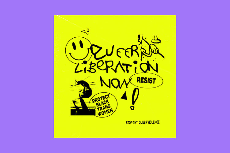
 You say “I’m interested in creating work that inspires and uplifts communities”, can you tell me more about that approach?
Something that stuck with me and inspired me through working at Depop, was empowering and inspiring communities through access, creative, art and fashion. Working on projects where we were able to put young people who wouldn’t normally have the opportunity on flyposters and billboards across major cities, giving them and their business a platform was really great. Right now I’m interested in creating work that uses fashion, music and creativity as a vehicle to create communities, bring people together and create a platform for people, particularly in the Black, POC, and LGBTQ+ communities. Design is such a powerful tool to do that and there are endless possibilities to what you can create, whether it’s a digital campaign, a printed zine, or a motion film. I think creating work that brings people with a shared experience together or makes people stop and think is a really amazing opportunity.
 What elements of pop culture do you draw from, and how does that play out?
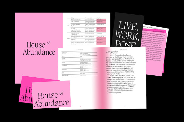
I take a lot of my inspiration from pop culture and LGBTQ+ culture and history. I’m a huge pop music fan, and I’m always fascinated by the world building by the likes of Gaga and Madonna. There’s a lot of story and concept in what they create around their music, from videos to fashion to tours–and it’s all about creating an experience for their community and fans. There’s an essence and energy in there that I try to bring into my practice.
There’s a lot of fantasy and theatrics in pop music which I love. I also love diving into history and archives and looking at old album artworks and flyers for events and raves. ‘No Sleep: NYC Nightlife Flyers 1988-1998’ by DJ Stretch Armstrong is a book I reach for often which is a catalogue of nightlife flyers that have tons of type, colour and composition inspiration. LGBTQ+ culture and history is super important to me and I’m always trying to learn more and channel that into my work where possible. I love documentaries like Paris Is Burning, shows like Pose and magazines like Candy Magazine by Luis Venegas which which celebrate the Transgender, gender nonconforming, non-binary and drag communities—I highly recommend this one!
 Similarly, can you talk to us about your interest in language in graphic design?
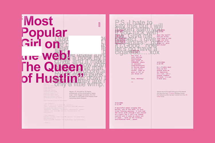
I think this interest comes from feeling like a child (and a product) of the internet. Since I can remember, I’ve been online and navigated through so many different worlds of online social interaction, from MSN, Bebo, MySpace, Habbo Hotel etc. I’ve kind of watched how others and myself go through that journey of presenting yourself through a string of words on a screen. One constant across those, and to this day, are symbols, emoticons and emojis—which I love. They feel like a universal way of communicating! For my final major project at uni, I actually designed a publication about the rise and fall of MySpace and language featured heavily throughout. It was almost a study on profanity, slang, trolling. I used the Internet Archive Wayback Machine to go and dig through some of the most notorious MySpace profiles and it almost feels otherworldly how differently we used to present ourselves on the internet.
Dolly Parton is one of the best people ever—discuss.
Is there anyone sweeter than Dolly? Her contribution to pop culture through her music and style is immense. There are so many references you can pull from, but on top of that her philanthropy is just so inspiring. I’m all about the idea of access and what she does with her Imagination Library should be a lesson to us all on giving back! Not to mention, last year I came across her album Great Balls of Fire which I’d never heard before and fell in love instantly! I truly think the album cover might be one of my favourites of all time! The combination of the neon typography and this photo of her in the middle looking ethereal, I’m totally obsessed and it’s super underrated.
 Any advice for grads/new designers?
Don’t forget the importance of personal work! I know it’s hard to balance finding or working a job and still making time to do personal projects – but I’ve found the importance in making time for both. I can honestly say most interesting conversations I’ve had with employers, job offers, networking etc always start with something I’ve done in my personal practice. I think that’s because they’re a true reflection of you, what you’re inspired by, and what you’re passionate about; which means you can have more interesting and engaging conversations around them. At the same time, don’t be too precious about them. It’s easy to get caught up in wanting everything to be perfect before you put it online but you can get stuck in a cycle of never sharing anything and if you don’t share and have pride in your work, who’s going to see it? You never know who could come across your website or social platform, so I definitely encourage everyone to just be proud of their work, whether it’s a 20 minute experiment or 3 month long project.
You might like...
 POP Member Showcase | Flora & Fauna Prints
- POP :: Book One :: Final Submissions
- Lennard Kok
- Murmure
- Seripop
- Logan Hicks
- Kokoro & Moi :: Selected Print Works
- Théâtre des Bouffes du Nord | Violaine & Jérémy
- Hell’O Monsters
- People of Print :: Studio Mail
- The Print Wagon by Aidan Saunders
- Double Vision | The Lauriston
- Adeline Meilliez
- Posterzine Issue 69 | Anna Lomax
- Joseph Vass
- Among Equals


- Autobahn - November 26, 2021
- Alphabetical - November 12, 2021
- SOFA Universe - November 8, 2021