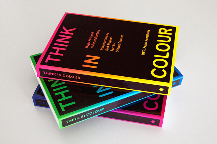
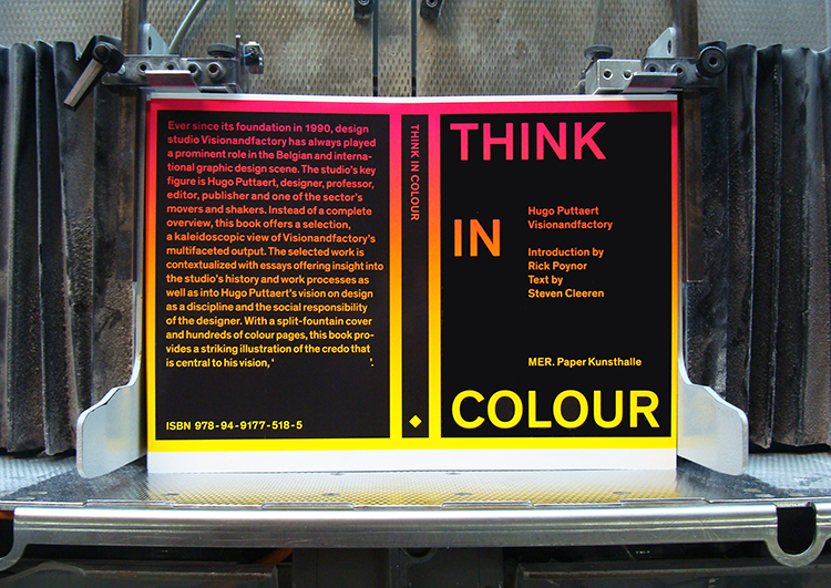
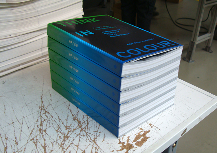
We have been receiving so many amazing things in the post lately, and this is another fine example of something which blows us away. We are always so happy to get our hands on something which is so beautifully designed, considered and produced, not to mention the cover that changes colour with heat. We had the chance to interview the graphic designer behind Think In Colour – 380 pages of delicious visual content that takes you on a journey through a world of colour. Hugo Puttaert really shows his skills and expertise as a professor, editor and creative director. We love this book and it has taken prime placement on our bookshelf.
It has been over two decades since you set up Visionandfactory, why do you think ‘now’ seems like the perfect time to publish ‘Think In Colour’?
I think there is no such thing as the “perfect time.” Yes, since a few years, I doubted doing this book. The final click appeared while meeting the young Swiss book designer Dimitri Jeannottat. Let’s say there was an immediate synergy. Since I never wanted to make this book on my own, I commissioned the project to a young and very talented designer. Neither did I want to publish the book for an occasion such as for the twenty-fifth anniversary of my studio, for instance. That seemed to obvious. I always decide things quite intuitively and so I did with releasing ‘Think in Colour’.
It is very interesting to see the work ordered by colour, can you tell us briefly how you came up with this idea?
‘Think in Colour’ as a title was nearly immediately decided after its start. On the one hand, we didn’t want a structure as a literal translation of the title. On the other hand ‘Think in Colour’ might have proved to be the invisible motto of my studio all the time. We always worked very openminded, trying to find design solutions which were or weren’t appropriate for the project or to our own way of thinking. We were never interested in ‘style’ and ‘easy moneymaking’ as such. So, after extensive structural research, Dimitri and I decided that ordering the book by colour would be the best thing to do. Very difficult though, since projects that had nothing to do with each other, were placed side by side even there was a time difference of about 20 years or even more. Rick Poynor pointed it out very sharply: “…a novel and intriguing structural coherence…revealing continuities and discontinuities across Visionandfactory’s body of work over more than two decades.” I think he’s right. It has everything to do with my studio approach and that’s why the colour scheme structure works really well.
In terms of readership, who is this book aimed at, designers, non-designers, or both?
Of course, this book is showing graphic design, so you could conclude that this book is aimed at designers. But, for me it is both, designers and non-designers, even broader public. I wanted it to be a sort of ‘time capsule’ of a certain period. ?It is connceted with everything: client expectations, economic successful and less successful periods, failures, graphic design history and even ‘politics’. The title could easily be read as a ‘political statement’. I mean it. Or stated differently: ‘Embrace complexity’! Graphic design is not an easy thing, it is powerful in its complexity. But the designer has to be committed. So therefore this book is not a showcase, you could see it as a metaphor for the way I think, live, organize, teach and design. ‘The Full Monty’, design-wise spoken. And then forward again. To mention Tibor Kalman: “As soon as you learn, move on.”
Can you pick one or two of your favourite pieces of work from the book and tell us about them? Maybe the highlights?
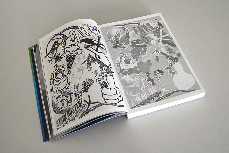
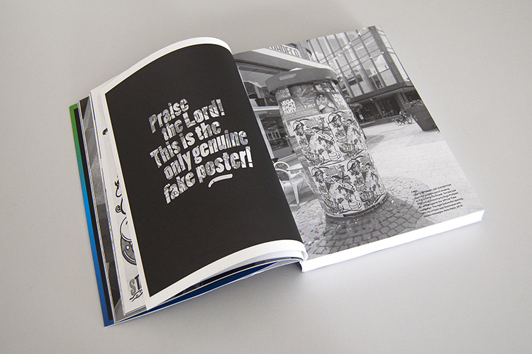
That’s very hard. I like the early work which I did in the nineties for Ad!dict magazine, although I was more searching for my own graphical language at the time. I left this behind me. The work that I find most interesting is the more conceptual work. The ‘Fake’ poster project, for instance, a collaboration with my friend and artist Jo De Smedt. He made a splendid graphite pencil drawing, I did the terrible bad Photoshop colouring. We were commissioned to design the poster and catalogue for ‘Fake’, an exhibition about contemporary art. But at the end the curator refused our project (he was under pressure from his political authority). Well, I thought, let’s use ‘propaganda’ as a strong tool. We decided to print the poster at our own expense and we flyposted it all over the town the day before the opening. Since during the day, the poster was uploaded with sunlight, at nightfall the following text appeared: ‘Praise the Lord, this is the only genuine Fake poster!’ (the text was silkscreened with phospor ink). We wanted to offend the organizers, but they were very enthusiastic and asked us if they might use our poster as the ‘official’ art gift, a sort of take away surprise for the audience. Nobody was talking about the official poster anymore and newspapers, blogs and art magazines picked up our stunt and it became the most talked-about project of the exhibition. Goal achieved! It is all about communication, isn’t it!
When you look back through your work from the early days, anything you’d want to edit or change?
Of course, I would do things different now, but I do respect the work like it was, so no changes have to be made. Not even in the early posters from 1982-1983, which I silkscreened myself. Even when the type wasn’t really good. It was Letraset transfer type, remember! However, when aging, I felt much more connected again with the period when I started. I studied Fine Arts/printmaking and in the early eighties I already pioneered in combining digital techniques with silkscreen, etching and multimedia. I always smelled the ink, the paint & the paper, sitting behind my first computer. In my studio (somewhere in the middle of the eighties), I combined a silkscreen facility, a repro camera and darkroom, an etching- and small letterpress with an early DTP configuration, first Agfa scanner and Apple laserprinter included. All that on about 25 square meters. What a lovely time!
Please tell us briefly about the collaboration with Rick Poynor and Steven Cleeren. What was the biggest challenge in creating this book?
The biggest challenge was to convince the quality of my work for myself. I always had lots of doubt about that. Talking to Steven Cleeren and Rick Poynor forced me to point out things much more clearly. As if I understood it better for myself by reviewing the work and trying to find the right words to express the process, the way of thinking, the approach. Of course, I am used talking about graphic design, since I teach since a long time, but it is different when you are the subject. I felt so much respect and I was really overwhelmed by the thoughtful sharpness of their texts. So keen, honest and very clarifying the complexity of the studio’s work. I didn’t want to change one character. The text was published like it was written and so should it be.
And lastly, what is your most favourite colour?
Short answer: none! Or to put it differently: all of them.
This seems slimy, but it true. I always had a good feeling for colouring. This goes very fluently since I always follow my intuition. I think it works.
Interview conducted by Anna Chayasatit, see more of her posts here.
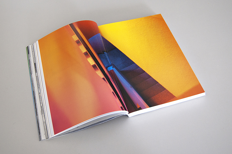
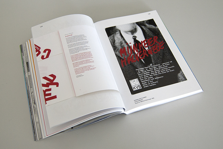
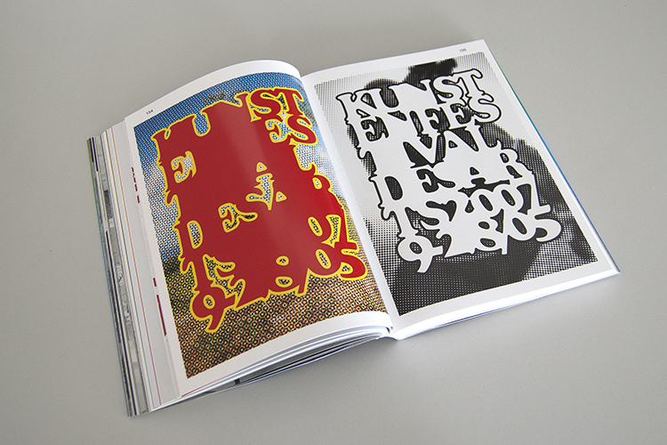
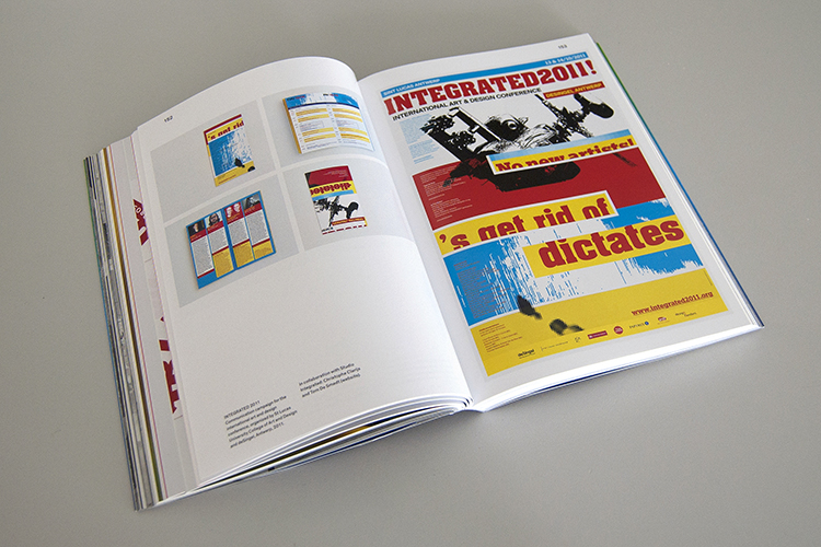
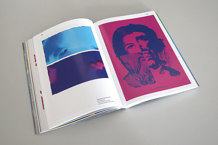
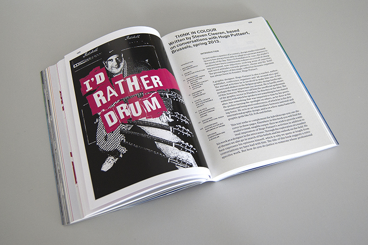
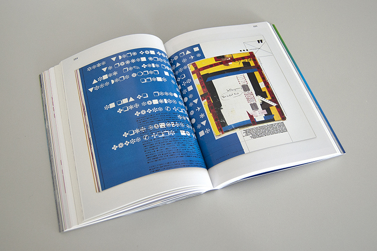
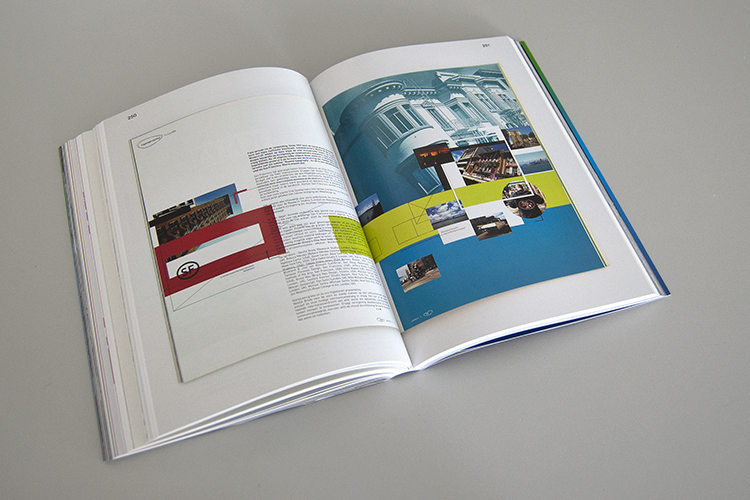
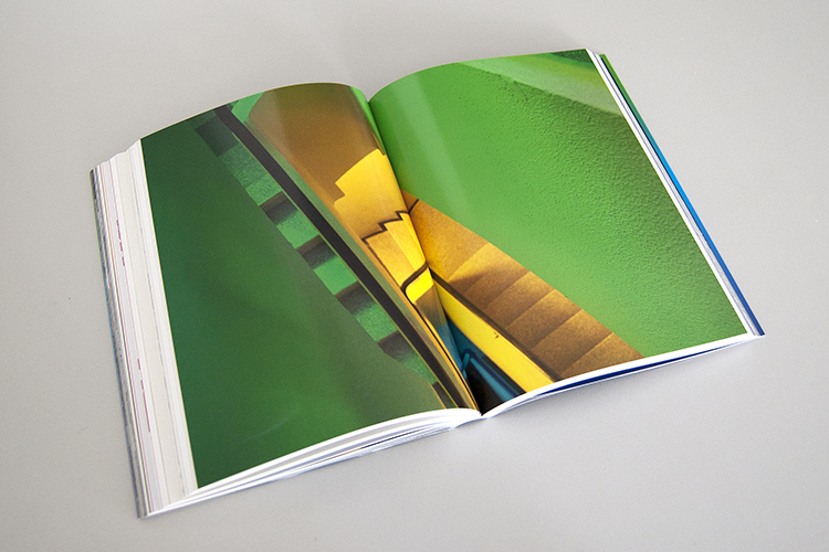
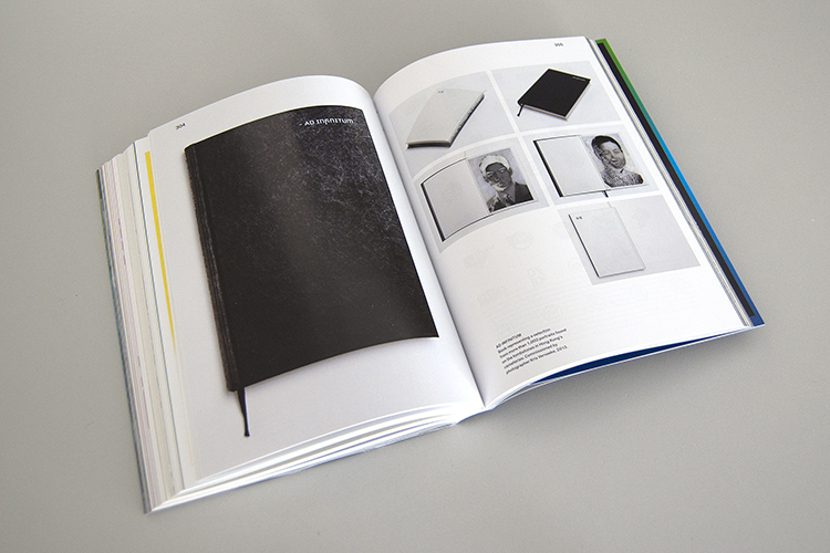
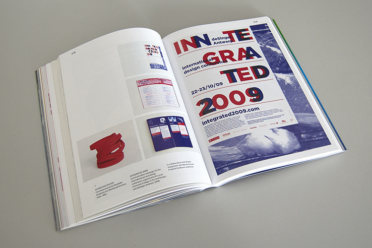
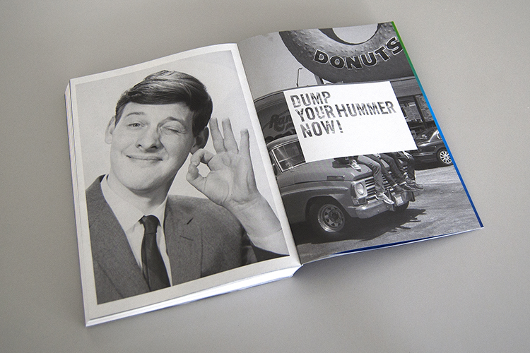
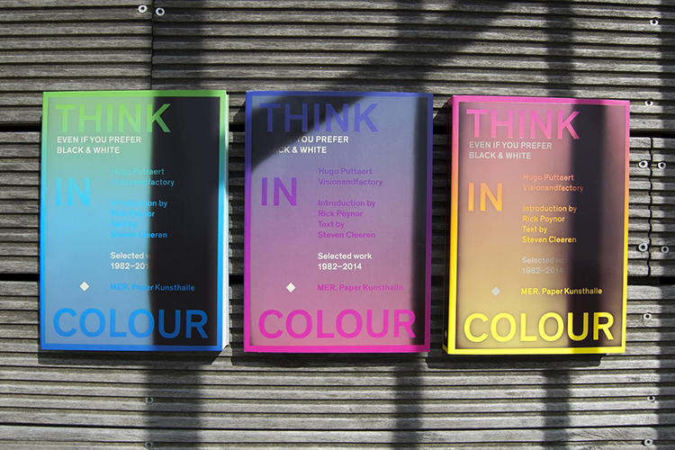
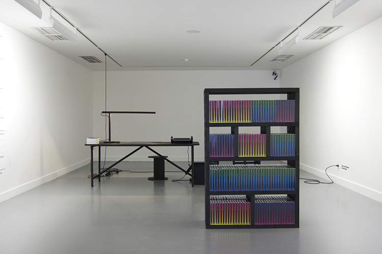
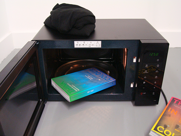
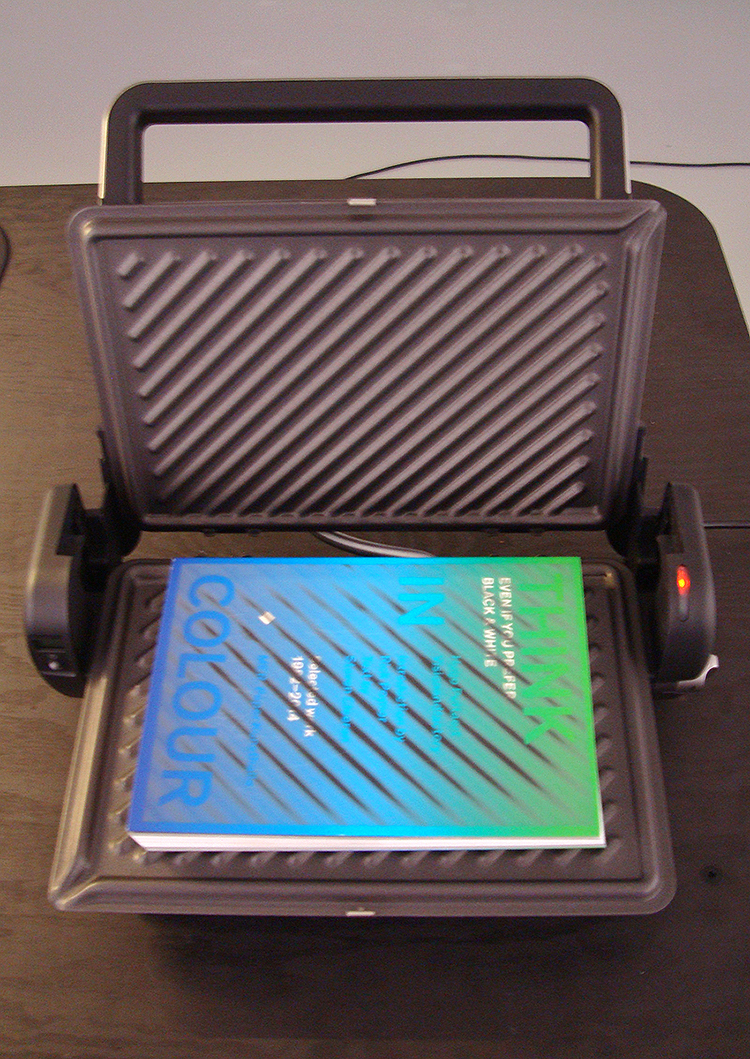
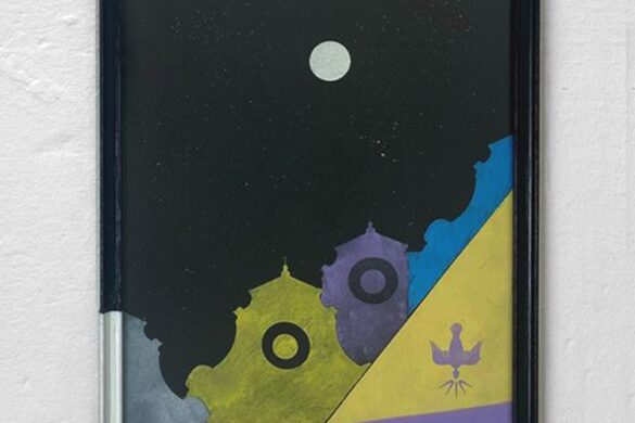
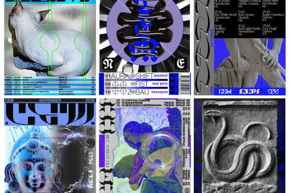
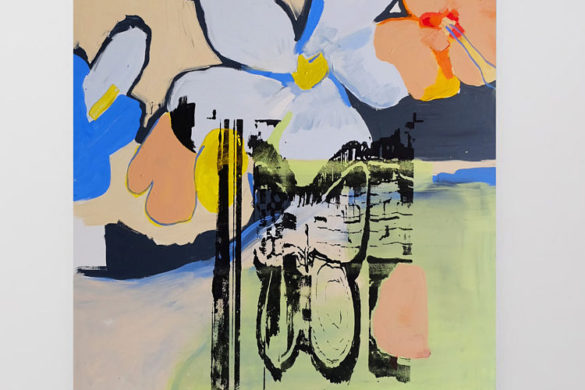
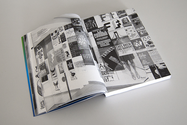
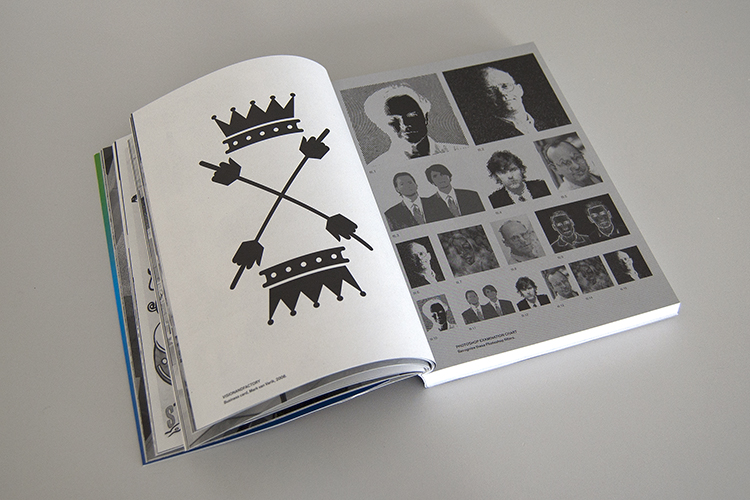
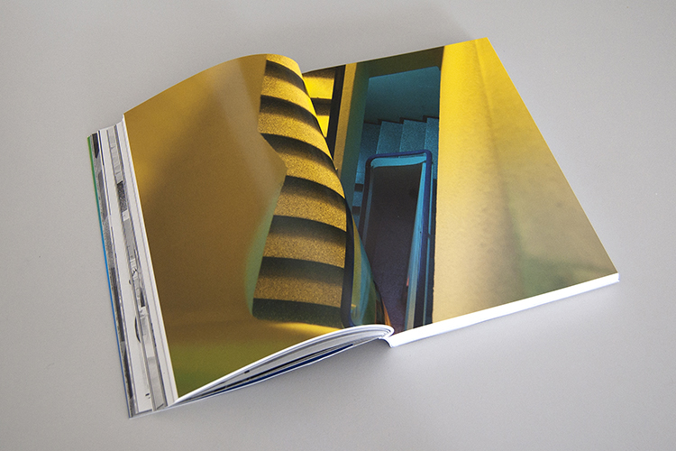
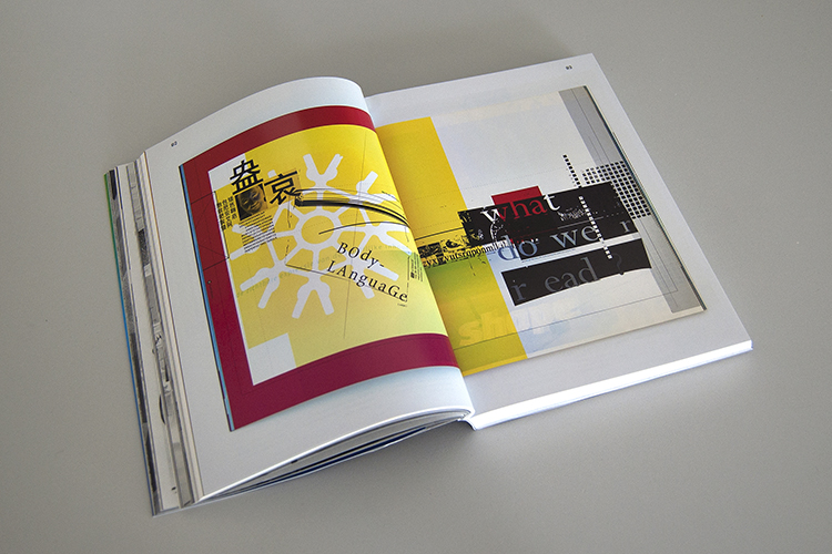
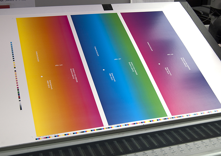
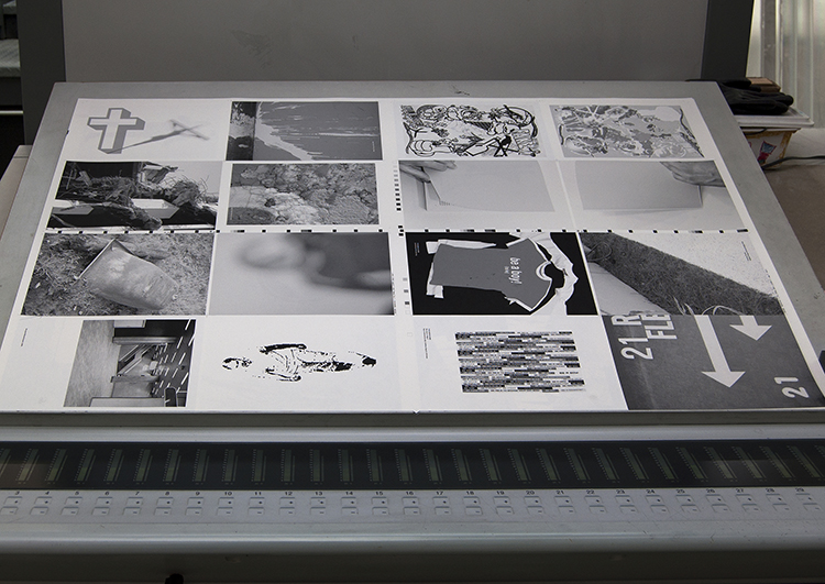
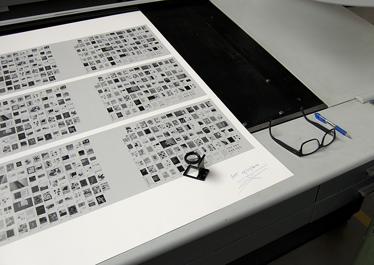
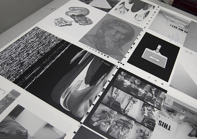
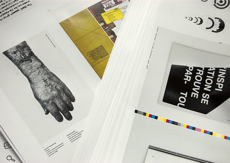
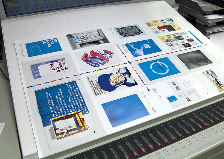
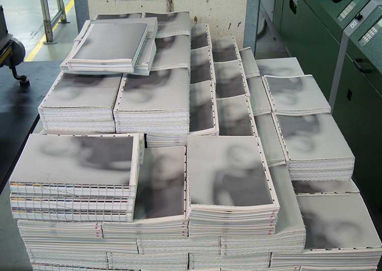
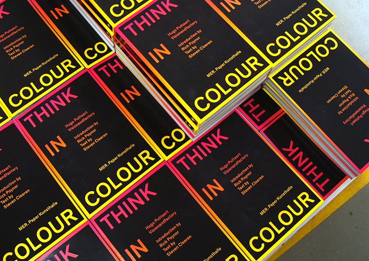
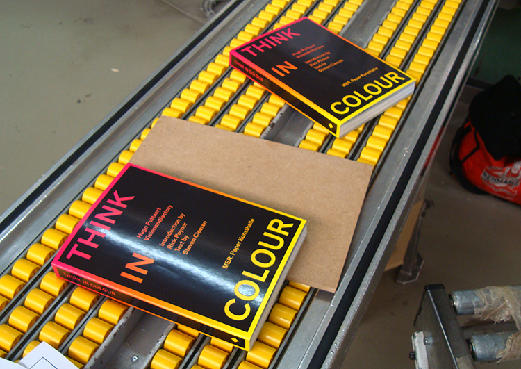
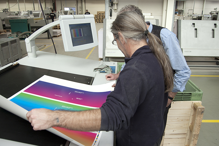
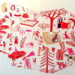
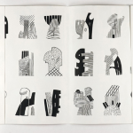
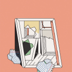
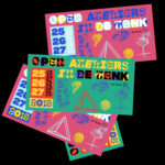
…and here are some more beautiful images to show you how the book was made.
http://www.thinkincolour.be
http://www.merpaperkunsthalle.org
You might like...
 Tooled Up | Shoreditch Design Triangle
- Lucy Merriman | Interactions
- Office x Ogilvy & Mather | IBM Smarter Planet
- Sean Thornhill
- mous. magazine | Interview | Bonnie Stevens
- Johnny Abrahams
- Graphic Designers Moonlighting as Musicians, and Vice Versa
- Carmen Segovia
- Marta Veludo
- TwoPoints Design Studio | New Dash Marshall Identity
- Jeremie Fischer
- Damien Correll
- Rebecca Bird
- Rosie Emerson
- Davy Denduyver
- Blush


marcroy@peopleofprint.com