We’re told not to judge books by their covers, but there are some publications whose form is so bold and inventive, that they invite us to do just that. McSweeney’s Quarterly Concern is one of them.
Founded in 1998 by novelist and entrepreneur Dave Eggers, the quarterly is the flagship publication of McSweeney’s publishing, a small but significant empire based out of San Francisco. At its conception, the quarterly was funded through selling $100 lifetime subscriptions – the same price as a two-year subscription at the time. Eggers thought the fledgling print magazine wouldn’t last longer than that two-year marker. Seventeen years later, the quarterly isn’t going anywhere (although its lifetime subscribers were eventually divested of their eternal promise) and can now be regarded as a veteran on the print publications scene. A literary journal first and foremost, it prints both well-known names such as Jonathan Franzen and Robert Coover and first-time authors.
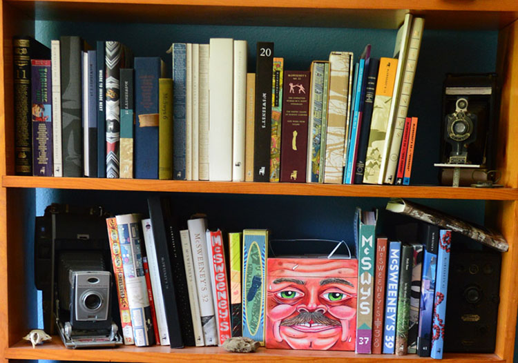
But it’s the quarterly’s design and form that really make it stand out from other literary journals, and even its design-savvy younger compatriots. McSweeney’s marries great writing with a complete redesign of every issue, swapping softcovers for boxes, heavy illustration for simply presented text, cloth-bound hardcovers for loosely collected newsprint pamphlets. There is an issue in a box that looks like a human head; an issue with two spines; another which folds out into four sections; one that is presented like a newspaper.
It could be at home in the design section of any bookshop, but as it is, among the neat rows of journals on the shelves, the quarterly creates a craggy silhouette, a burst of colour among the tasteful whites. This was where I first discovered it, like candy in a health food shop, bright and somehow naughty – an invitation to touch, to look, to open the issues not protected in shiny cellophane and explore what was inside.
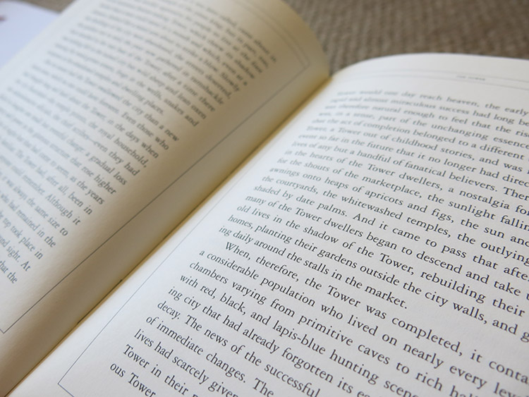
Where the outside is showy to the point of shouty, the interior of the quarterly is concerned with a more formal consistency. Almost every issue is printed using the elegant Garamond typeface, giving the text a quaintly old-fashioned look, a solemnity at odds with the quirky house style. Garamond has become something of a signature for the McSweeney’s brand – the website, McSweeney’s Internet tendency and the Believer magazine all use it – and the elegant simplicity of the serif typeface allows the content, the words themselves, to take centre stage.
McSweeney’s celebrates the physicality of print, the book-as-object that we were told would die with the advent of the Internet. While its outer form could be accused of superseding its inner content, who can complain when that form is so exciting in itself?
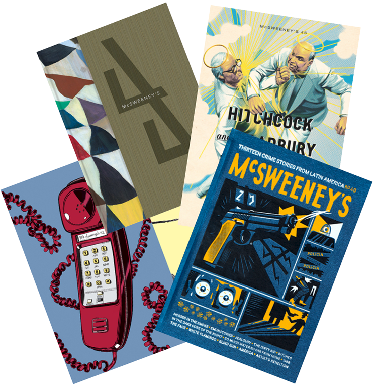
Louisa’s Top Five McSweeney’s Quarterly Concerns:
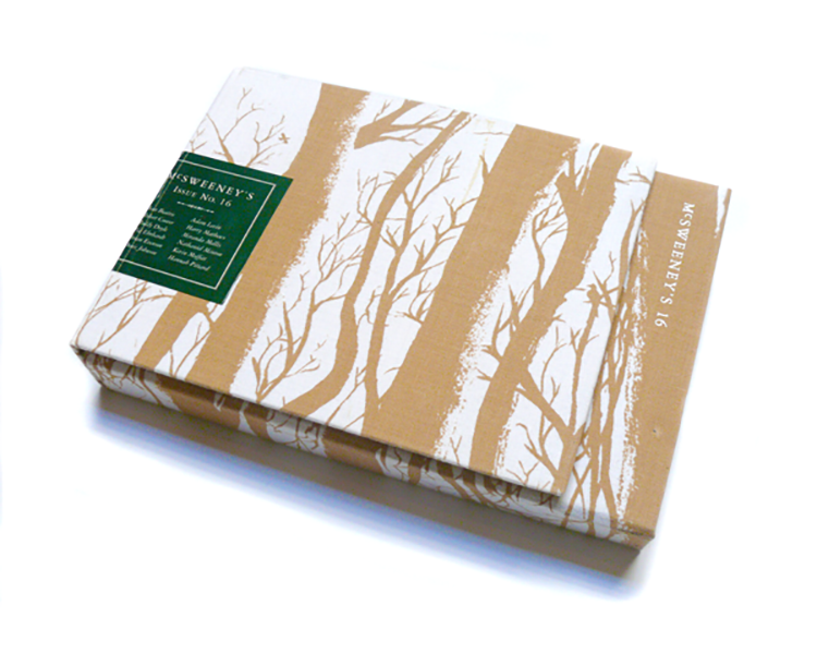
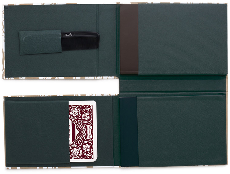
A book which folds out into four hard-backed sections and whose cloth cover is printed with the delicate silhouettes of trees; dark green end papers complete this issue which is as much an object of curiosity as a book. Inside its flaps can be found a book of short stories, a novella-pamphlet, a large set of playing cards that tell a story, and a comb. Yes, a comb.
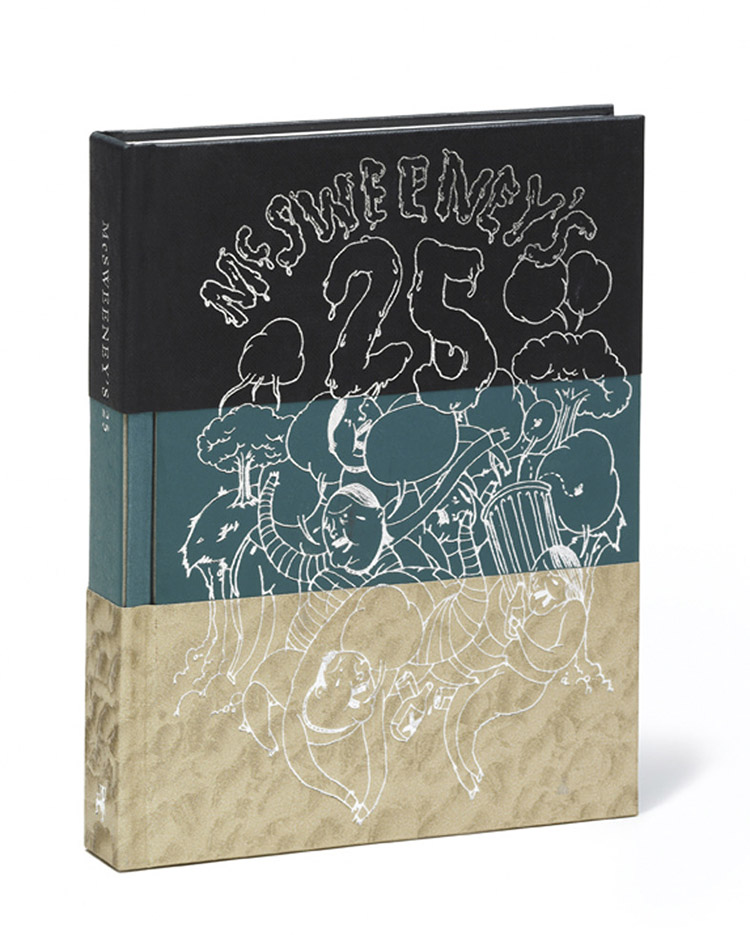
Issue 25
This was the first McSweeney’s I ever bought, mostly because it was the cheapest issue in the bookshop and I could fit it in my bag – easily the most stylish publication that had ever been there. But that’s not the only reason I love this issue; the layered paper of the hardback cover, with an embossed illustration in silver, give it a rich, tactile finish, while inside, the stories are simply and elegantly presented, each one preceded by a colourfully illustrated horse-with-attitude by Amy Jean Porter.
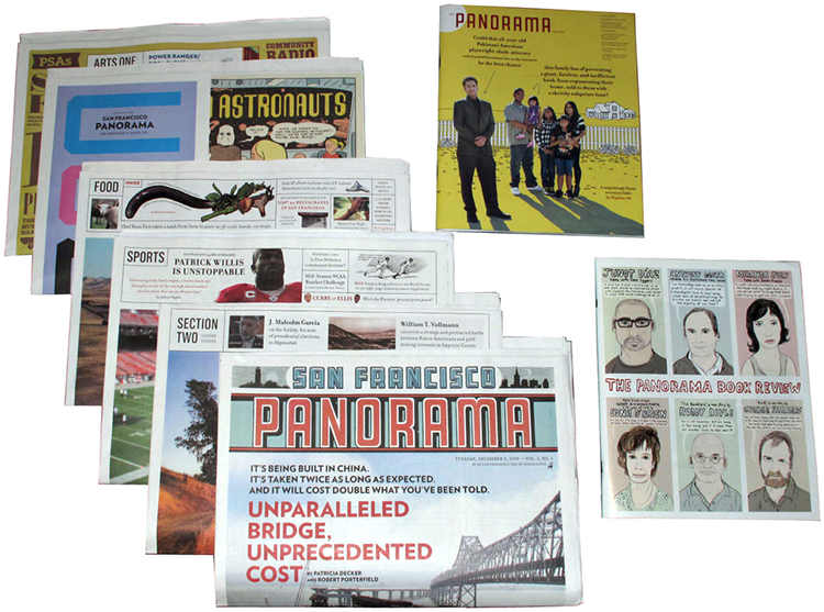
For this issue, McSweeney’s Quarterly Concern was transformed into The San Francisco Panorama – a Sunday newspaper with all the usual segments: sport, food, art and culture, news and magazine. But this newspaper is written not by journalists but novelists, and its cartoons are provided by the excessively talented Chris Ware. When I first got my hands on it (sadly, I did not get to keep it), I spent an afternoon happily immersed, hidden behind its broadsheets.
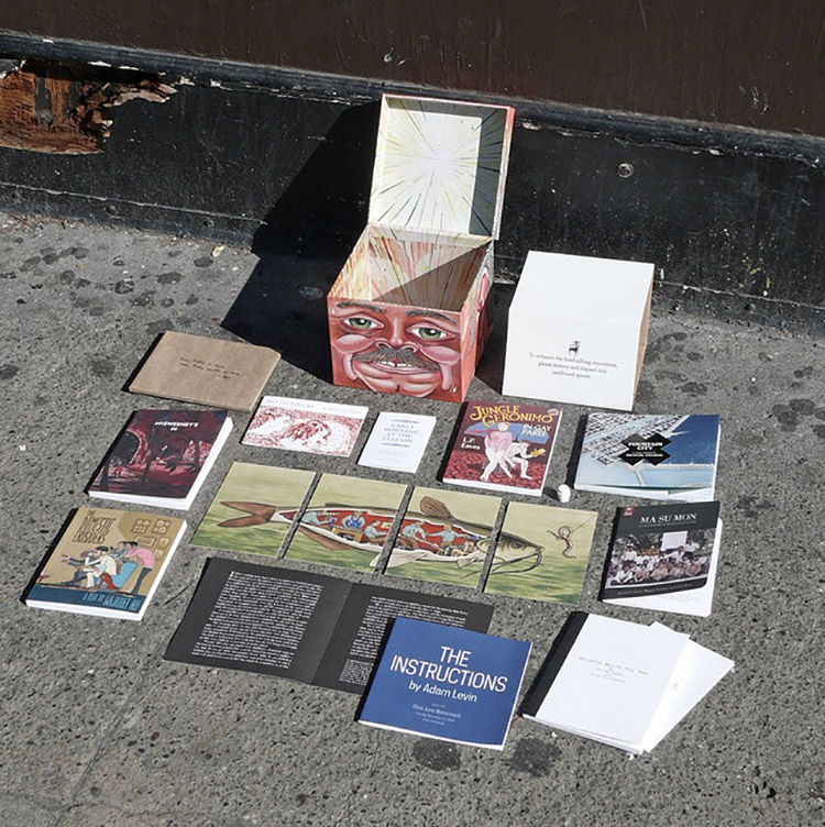
You’d have to clear an unusually large section on your shelf to fit this issue; McSweeney’s 36 comes in the form of a large square box, printed to look like a balding, pink and sweaty human head. Rattling around inside this cuboid skull is a booklet of oral histories, a painting split over four postcards, a two-act play, a collection of letters and a 150-year-old excerpt from a Scottish minister’s book, among other printed treasures. At this point, it barely counts as a magazine any more – Brian McMullen, McSweeney’s Art Director, compared it to sifting through the contents of someone’s mind. I wouldn’t mind having such a fantastical assortment of things in my mind.
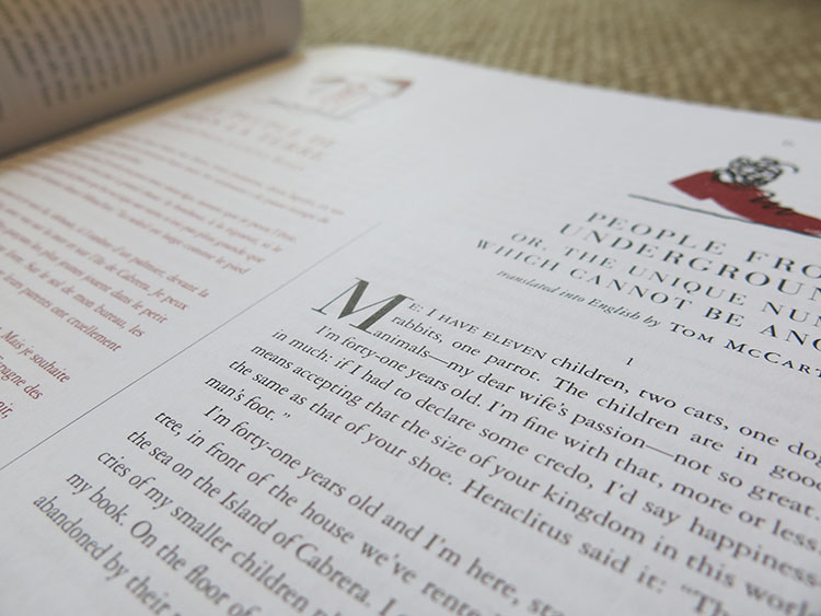
The partial softcover and layers of thick paper make this an unwieldy, floppy issue, but it still makes my list because it is such an incredible conceit. Guest Editor Adam Thirlwell gave twelve stories to six different authors, who then translated them in and out of English – do the maths and that’s 12 stories in 18 languages by 61 authors. Pretty impressive. The book itself is a wide oblong, allowing two stories to be presented in parallel on the page, each printed in either black or red to create a striking visual contrast. In the UK, you can buy a less visually rich, but more compact and easy-to-read version, published by Portobello.
McSweeney’s is currently running a Kickstarter campaign – donate here to keep this independent publishers going!
You might like...
 Diane Bresson: Tangram
- The Nito Basket Culture of the Philippines
- Noritaka Minami
- Sorbet
- Hall of Fame :: ‘Hoya’ basketball collection
- Jamie Reid
- A—B :: An Independent Publisher of New Photographic Art
- Mal Fisher: Classic Chairs Series 1
- Josh Freydkis
- Bonjour Jean Jacques
- Drop Dead x Akin
- Bbblob
- Dan Mumford
- U-P
- Aaron Draplin: Limited Edition Print for The Beauty of Letterpress
- YELLOW by OFFLIFE


- McSweeney’s Quarterly Concern - May 22, 2015