Presenting Tap Type, a new and exciting collaborative project launched on the 26th of March 2017. We spoke to designer Rich Norgate who kindly gave us an insight into the creative process and general happenings of the project. Scroll down to read on..
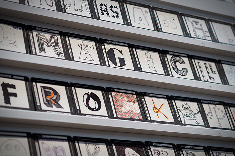
 Rich describes “this is a project we’d been working on with The Print Project in Shipley and the customers of Magic Rock Tap. I’d wanted to work on a self-initiated community typography project for a while. Since launching our Taproom, the venue presented a perfect opportunity to build the project around our community of customers. Over a year ago I designed a run of beer mats that we placed on tables in the tables and bar in the Tap, inviting people to draw/design letters or numbers based on either their name or age. My intention was to build a full typeface taken from the unique and varied entries that were handed back in at the bar. The beer mats were in circulation for a few months and I was overwhelmed with the amount of submissions.
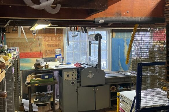
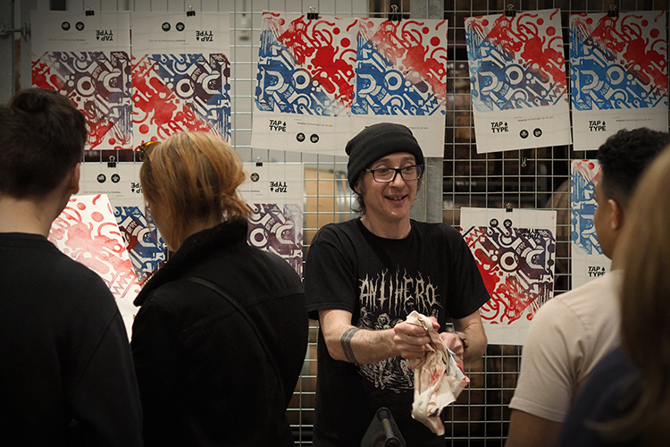
 A big part of the project involved Nick at The Print Project, Nick’s work has been a big inspiration to me and I’ve wanted to work with him for a long time. He works in a very traditional way, using a variety of original letterpress machines. If you’re not familiar with it, letterpress printing is technique of relief printing using a printing press. Objects like engravings or plates made out of wood are used to make these impressions.
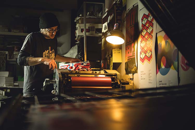
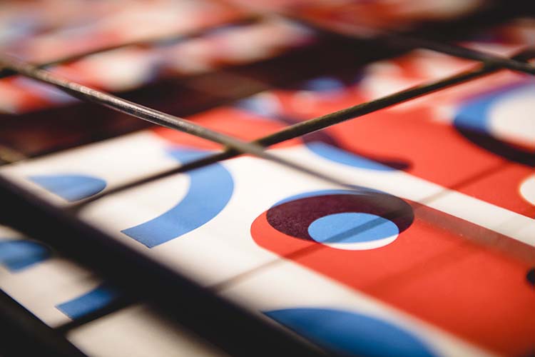
Traditionally type foundries would create a typeface in wood or metal. In his studio, Nick has the ability to cut wooden plates out using a laser cutter, and we used this method to create unique and customised shapes taken from the chosen beermat submissions. Whilst modern technology has allowed this flexibility, the process of printing is still traditional, using an inked up roller on the impression, which is then pressed onto the paper.
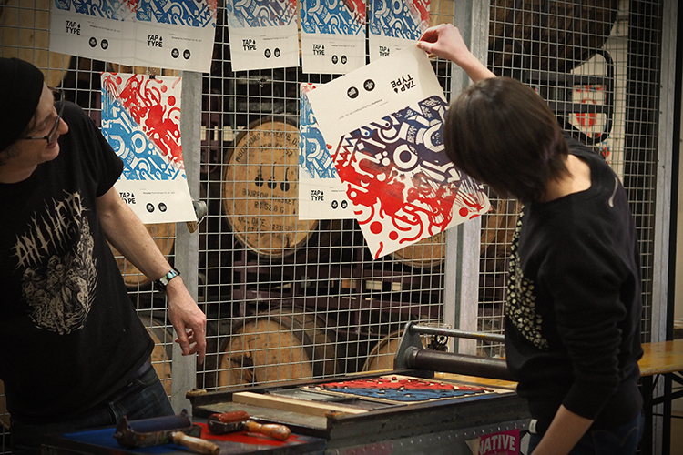
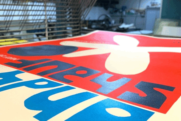
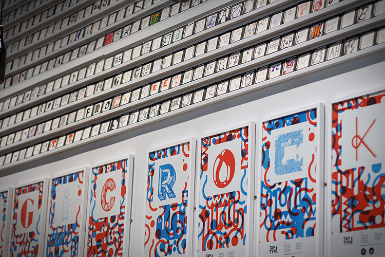
 Once I started to look through the submissions it was apparent early on I didn’t have enough to create a complete bespoke typeface. However I did have enough submissions to spell out ‘Magic Rock’. Each poster has its own layout and is printed in red and blue. A big part of letterpress printing is the charm of the process itself, you end up with a tactile feel that sometimes can be lost in the modern day equivalent. You also have the ability to print overlaid colours which creates another level of texture and detail.
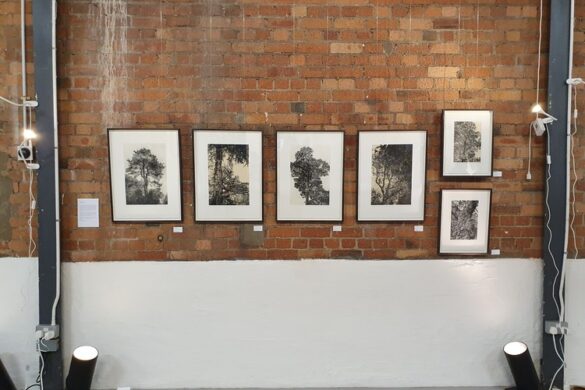
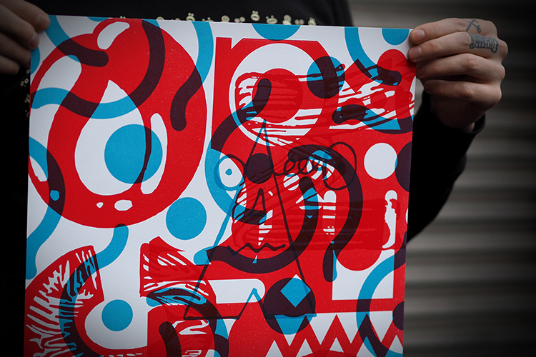
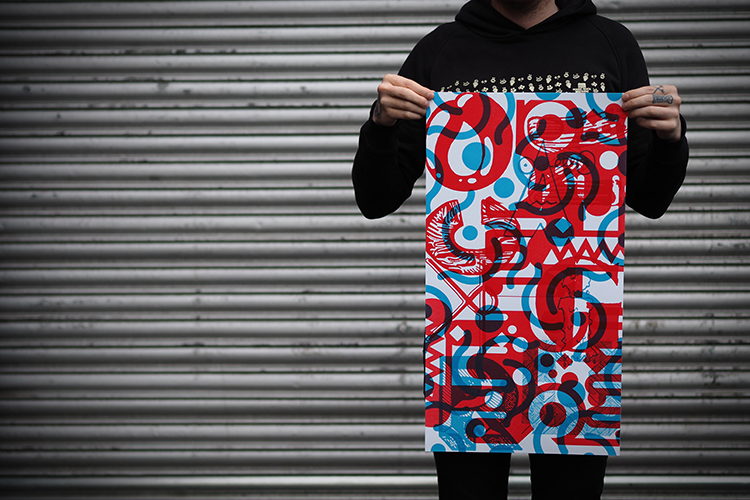
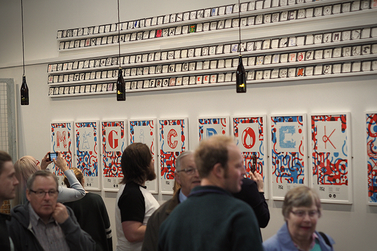
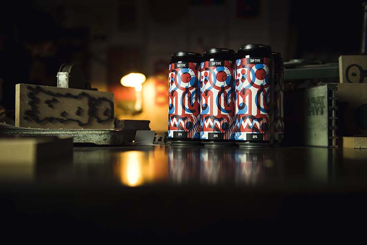
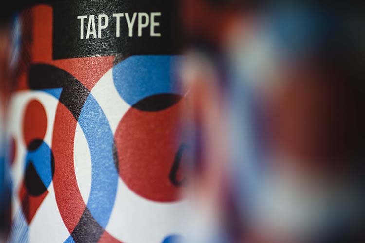
There are 9 individual type posters forming the exhibition plus an individual montage of all the letters. I created a montage from the individual prints to create the label for a new beer “Tap Type APA” that we’ll be launching in conjunction with the exhibition. In addition to this we exhibited all the submitted beer mats.
Both the beer and exhibition were launched on Sunday 26th of March (Mother’s Day). We had a great turn out and both the beer and prints were received well. It was great to see so many kids working with Nick on some live printing on his press.
The exhibition will run until the end of June, limited prints are available from the Taproom and they’ll be in our online shop soon.
Tap Type APA is a super drinkable 6% American Pale Ale using Citra and Mosaic T90 and Cryo hops in the whirlpool and dry hop respectively, allied to a malt bill of Golden Promise, Wheat, Oats and Acid Malt. The 500ml cans are available to buy from our Taproom and online via our website.”
You might like...
 Sneak Preview :: Druck Berlin :: Mike Zimmerman
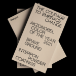
- Filippos Fragkogiannis & Georgia Harizani | AkzoNobel Colour of the Year 2021, Brave Ground
- Studio Gruhl
- Welcome Skateboards
- Scott Smith
- Dawson Murray
- M/M (Paris)
- What If x Pomme Chan
- Sleep Sparrow
- Sallie Harrison | Geometric LA
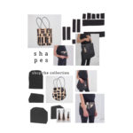
- Aeand Studio | s h a p e s
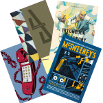
- McSweeney’s Quarterly Concern
- Heretic Studio | London’s Best Screen Print Trio
- P.A.M SS14 :: ‘Acid Poke’
- Seán Jospeh Brennan: Uselessness
- Hall of Fame :: ‘Hoya’ basketball collection


- Posterzine™ Issue 46 | Marylou Faure - September 16, 2019
- Posterzine™ Issue 45 | Mojoko - September 13, 2019
- Posterzine™ | Karl Grandin - August 21, 2019