This month we’re excited to present our Official People of Print Members who have created some amazing Riso books, prints and zines. Our community innovatively illustrates the capabilities of this printing method, how it can be used to create a range of outcomes and as the basis for amazing new working relationships and collaborations.
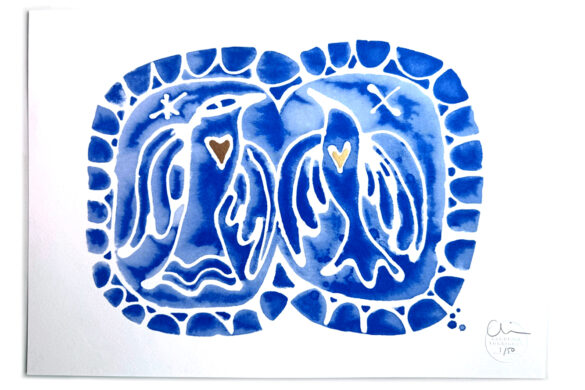
Sebastian König: Today we cancel everything!


 Today we cancel everything! is a spiral bound children’s book limited to 100 copies on metapaper printed by the Berlin Riso printer Drucken 3000 and illustrated by Sebastian Koenig. This twenty-four paged two-coloured Riso printed book tells the story of Wim, a boy who doesn’t want to go to school in the morning. His father understands this well, and so the whole family stays at home and coincidentally all of the people in the city do the same.
Lol Gallimore: Everything Is Copy

 Everything is Copy is a Riso printed publication with French fold binding by Lol Gallimore. It features an assortment of mottos and scribbles Lol accumulated in her sketchbooks over a couple of years. The books were organised in a random manner, with all three copies having the same content, but put together in a different order than the rest.
Lol started this project towards the end of her studies in response to a confusing time she was experiencing. She intended for it to be a tool for herself for sentimental purposes, not to be seen by anyone. “I wanted it to be a joyful expression of typography and colour. Not focused on making it particularly precise, I let the Risograph lead the way” states Lol. The resulting publication is fun and playful, with a combination of fluorescent paper and vibrant inks.
“I used Risograph because of the nature of the machine; speedy, experimental and charming” explains Lol. There’s an element of unpredictability when printing with Riso, and for Lol this printing method produced some happy accidents. The book became something people were picking up and flicking through, and ended up being one of her favourite projects. Lol hopes to make part two in the future with the same pink, blue, orange and red inks.
www.instagram.com/lolgallimores
Greg Meade | Habitats Print Studio: Habitats; Terrace of the Future on the Refuse of the Past

 Habitats; Terrace of the Future on the Refuse of the Past was originally conceived after a visit to the Wellcome Collection, London. Bringing the idea of revisiting the concept of terraced housing in the modern age, Greg wanted to create a piece that reflected the trend of reclaiming “the refuse of the past” relating to the post-industrial landscape surrounding his current studio base “…which is becoming a melting pot of contemporary domestic architecture, with the major architectural players competing for land“.
Whilst still getting to grips with Riso, this project provided Greg with the opportunity to test the limits of what the machine could do with what was essentially a very simple design. He soon came to realise that the project was, despite its basic shapes, over-reliant on registration to get the print result he was after. The machine also threw up the full set of its nuances from track marks to smudges and paper jams. Having attempted numerous incarnations using four colours, Greg eventually decided to revert to three.
“Initially this felt like a defeat, in that it was a compromise based on the technical limits of a machine. As a linocut printmaker too, I’m not used to having to give in when something doesn’t work” says Greg. The resulting print reflects both the simplicity of the design and the abilities of the machine.
“My habit as a designer can often be to over complicate something, so this project in particular has been key on my learning journey with Riso” concludes Greg.
www.instagram.com/h_a_b_i_t_a_t_s
Loulou João: Wild White West Vol.1

 Loulou’s zine series Wild White West tells the story of Polly Focket, a science fiction depiction of a girl belonging to the African diaspora. The zine follows the beginning of her journey navigating through a wild, wild, wild, white world.
Loulou aimed to bring hyped digital techniques together with the stencil printing process through her use of 3D objects built in videogame and 3D software, which she then combined with the Riso printing method. By taking this digital aesthetic out of its online context, telling a story using an analogue form and using colours that are impossible to reproduce within a digital framework, Loulou illustrates that in this digital age print still matters. As a bridge between the digital and the analogue she also added some hand drawn short stories to further reflect her theme.
This project was Riso printed at Sad Biscuit Studio in Ghent, Belgium; a studio she co-created to make stencil printing more accessible to people in her area.
Lizzy Joelson: The Dance The Dance is the first print of a soon-to-be series of dancing ladies by graphic designer and art director Lizzy Joelson. The piece is inspired by vintage record covers. “Riso printing is perfect for this project because of the unexpected layering, representing how your dance moves can evolve to the rhythm” says Lizzy.
Johan Elmehag: RISOKOMPIS

 RISOKOMPIS (Swedish for Riso-friend) is a collaborative poster project between two participants who do not know one-another. The posters are created around a specific topic, but the participants do not see what the other has designed until the two layers of the poster are Riso printed. This approach opens up the opportunity for unexpected coincidence and successful mishaps. As a printing technique, Riso is very suitable for the project as it creates prints one colour and layer at the time.
Anyone who wants to participate is assigned a secret design partner and a mutual topic. The participant is given a theme to take inspiration from (e.g. typography or illustration), but can also work with a technique they feel most comfortable with. Participants have a period of two weeks to complete their design.
The project is run by Johan Elmehag and John Schulisch who you can get in touch with below to learn more about becoming a participant, and be paired with an unknown second half.
www.instagram.com/svenskrisoforening
Saki Matsumoto: The Lost Spring
 For this original Riso printed book Saki collaborated with writer Anna Bobreková. She took inspiration from two concentrated sources when creating her illustrations: the first being Japans religion, which she is accustomed to, and the second being Czech folklore and Pagan celebration. Saki also had to study narrative illustrations and how to create them effectively. These narratives and notions of storytelling are old traditional customs which are inherited, and have remained a part of this region of Czechoslovakia through celebrations and festivals. Saki aimed to find the correlations of feelings and behaviour towards nature between Japanese culture and Czechs’ through research of traditions and mythology. The duo used material from the oldest Japanese story of Gods “Kojiki”, and the Czech spring festival “Masopust”.
www.behance.net/The-lost-spring
Dotto: Tiny Guide City Riso Prints

 In Tiny Guides Danielle Molyneux of Dotto studio has been documenting cities she’s visited with a typographic response inspired by each place. Danielle wanted to create a feel and mood of each city through colour, shape and type – a simple response driven by personal experiences. These responses include flowering spring blossom, the sign on a shop and the music playing in a café.
She wanted to keep it really simple, so limited each guide to three colours. “I love the way Riso layers up and creates depth, pattern and texture. I also love the imperfections, the playful misalignment and how you can’t completely predict the result” says Danielle. The limited colour choices with Riso meant that Danielle had to think carefully about what would work; a challenge that she thrived in. She is looking forward to experimenting more with some new designs soon.
Tiny Guides are designed by Dotto, printed by Risotto Studio and photographed by Laura Hutchinson.
Shop Tiny Guides on Department Store.
BROKENLOGO: Riso Prints 
 After refurbishing an old coffee table and TV stand in his flat Ian, of BROKENLOGO, decided to try and develop the designs into a set of prints as a personal project. Looking for a low-run, low-cost medium he chose Risograph and Assembly Press based in Bristol.
The imperfect finish Riso gives to what are perfect vectors on screen makes each print unique in someway. After the three original prints (‘i’, ‘ii’ & ‘iii) were well received, the size was doubled for print ‘iv’ with the incorporation of metallic gold and produced by Risotto Studio.
With the initial four prints quite minimal in style, Ian’s next designs are likely to be more adventurous with the use of overlaying of colours and imagery, and perhaps another printing medium.
You can shop Ian’s print series on Department Store.
Sandrine Anne Sautejeau: Devendra Banhart Poster
 Sandrine Anne digitally created this design for a Devendra Banhart concert in Santiago de Chile. For this project 20 limited edition 2 colour Risographs were printed, with all the final copies signed by Devendra Banhart and herself. The posters were printed in collaboration with La Mano Ediciones, a Chilean print shop that specialises in screen print and Risography. The team conducted various print tests on different types of papers, before finalising ultimately that a textured paper worked best for the design.
Fours and Eights: Tricorn
 Tricorn is a Riso project by foursandeights (hellomarie and luckydarren) which formed part of an exhibition put on in December 2018. The project was based on unearthed photographs of the Tricorn Centre – a brutalist icon in their home city of Portsmouth – which were taken in 2001. The building was later demolished in 2004.
These prints were constructed in a way that ensured they were part of a unique edition. The collaborative team made eight sets in total. The prints are composed of crops and clippings of all of the proofs the pair took while settling on the halftone treatment for the images that were to be included in the show. The crops were deliberately and purposefully made in a way to accentuate the form of the brutalist architecture. Some were left as is and some residual shapes were blacked out with markers.
The Risograph then became the compositional device. The first shapes were dropped on the scanner and the rest of the composition was crudely attempted around how the first element fell. The process was repeated to offer variety, and the two sets were flipped between the first and second passes so that the quadriptych would be distinguishable as a set. The crops of the proofs were then recycled so that the pair would not be able to remake the set.
On the process of Riso printing Marie states; “The idea of working physically and spontaneously on the Riso is one that excites us, not ever really being sure of how things will come out until they do is very rewarding because they always look smart layering some hot colours”.
Fleur Ellis: Names and Numbers
 Names and Numbers was created during a weeks workshop at the Adidas headquarters in Germany where a group of their designers were asked to approach typography or ‘naming and numbering’ in a different manner than before.
This book is the outcome of the many talented designers working at Adidas, showcasing all the beautiful typefaces made during the workshop. The book is paper back, Swiss bound and printed on recycled paper. It is handmade by Fleur with a Risograph printed cover.
Browse all of our Official People of Print Members and view their projects on our membership website. You can learn more about the perks of joining our community and how to apply here.
Want to know more about our membership? Give us an email at members@peopleofprint.com.