This month we’re stoked to present a selection of silkscreen projects from our community. Screenprinting is a technique that involves forcing ink through a mesh screen onto a surface. By making certain areas of the screen impervious to the ink, a stencil is created which blocks the printing ink from passing through the screen. The ink that passes through then forms the printed image. Below, we check out some awesome screenprints created by our community, from printed bottle labels, to silkscreens on wood.
Natalya Balnova: Paranormal Field Trip

 Paranormal Field Trip is a two-colour silkscreen poster printed and designed by New York-based printmaker and illustrator Natalya Balnova. Printed in an edition of 15 at 15×22″, the design features green lettering and simple black illustrations that are characteristic of Natalya’s aesthetic.
Emma Studd: Screenprinting on Wood

 Emma Studd uses the process of screen print to create original one-off works of art predominately on paper, but now also on wood. By using the screen as a drawing tool she explores the relationship between colour, shape, and pattern. Emma loves playing with the transparency of colour and texture: exploring how they interact and overlay in predictable and unpredictable ways, allowing the process to define the outcome. This latest body of work has all been printed on marine ply panels to see how the colours sit and change on the surface, allowing the texture and warmth of the wood to become a part of the piece. Connections was selected for the RA Summer Exhibition 2023.
Wen Ching Yiu (Krystine): You Are the Apple of My Eyes

 You Are the Apple of My Eyes was created by Wen Ching Yiu for the 20:20 Print Exchange 2023 curated by Hot Bed Press. She used 7-layer screen print on gloss silver paper to create a mirror-like effect for the audience, conveying that the random printmakers who luckily received her print were the chosen ones. “Be playful with the screen-printing materials,” says Krystine.
Abigail Fairhurst: Cat Trio

 Based on her Cat card which shares the same design, Abigail Fairhurst wanted to be able to offer a rainbow of cats as a print. This series is part of her new screenprinted collection, which includes the trio design and bigger single cats which will be completed and available on her website at the end of January.
Mandy Doubt: Bird’s Custard

 Wanting to push themselves by printing a super neat 5 colour screen print at their home studio, Many Doubt created Bird’s Custard. “When printing many colours, you only see the full image when the last layer goes down, the black layer is the key that ties the layers together,” says the printmaker. The test print showed the background layers were not lining up as they’d hoped so they took the decision of starting again: adjusting the design, getting new acetates and screens re-exposed with the new version. This turned out to be the right decision as the new version was very neat.
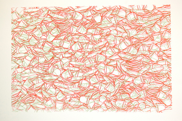
Isabelle Lin: Harubiyori

 Harubiyori is a three colour screenprint (pale pink, bright pink, and dark red) in which Isabelle Lin experiments with a combination of patterns, negative space, and a limited palette. The title is a Japanese word for the light and weather on a calm and clear day in spring.
Richard Peacock: Algorithm, Stolen Hours & Test Transmission

![]() Richard Peacock has been working on some new screen prints from his North London studio. Algorithm and Stolen Hours were constructed from stencils taken from packaging, and another work, Test Transmission, was assembled from geometric shapes Richard cut himself. He hopes to further expand his workshop and offer facilities to other printmakers later this year.
Richard Peacock has been working on some new screen prints from his North London studio. Algorithm and Stolen Hours were constructed from stencils taken from packaging, and another work, Test Transmission, was assembled from geometric shapes Richard cut himself. He hopes to further expand his workshop and offer facilities to other printmakers later this year.
Emily Chappell: That Boutique-y Whisky Company – 10 Year Anniversary Labels


Emily Chappell has been designing graphic novel style labels for That Boutique-y Whisky Company for over 10 years, and as part of their 10th year celebrations, she re-imagined artworks (that she’d previously designed for them) in her own personal “screenprint-style”. The designs were made psychedelic and fantastical, and Emily produced a series of simplified 2-colour silkscreens for the release.
Dungarees + Squeegees: Bespoke Eco-Conscious Screen Printing

 Dungarees and Squeegees are a go-to for bespoke screen print services. Specialising in eco-conscious small runs, they bring designs to life on quality sustainable totes and tees. They have created minimum 30 print orders for creatives like Ellastrated, Georgia Gregory, Luke Crump, and unique brands.
Amber Capwell: 2024 Lunar Astro Calendar

 Astral Lunar Calendar 2024 is a 5-layer screen print of the moon phases for 2024, printed on black 100% cotton paper. The portal is printed with a hand-mixed white/grey and glow-in-the-dark ink. “I wanted to design an Astro calendar that was easier to read with more information within the imagery,” says Amber. The right-hand side is the key for the moon phases; first quarter, new moon, last quarter, and full moon. Inside the new and full moons are the zodiac symbols of what sign that moon phase is in. The lower key is the zodiac signs and their corresponding symbols. These symbols are found in the moon phases and where they fall in the calendar by month. With the majority of the transition of signs occurring in the second half of the month, they are placed accordingly in the spaces between (i.e. Aquarius occurring Jan 20 – Feb 18th).
Studio Kars en Boom: Screenprints

 Studio Kars en Boom’s work combines play, colour, and the simplifying of stories. Through their work, they escape from reality, creating new worlds in which they wish to wake up. In their graphic and illustrative prints, installations, and products, they search for the geometry of landscapes and the shapes and patterns of cities, thus creating a new interplay of lines.
Christa Stoop: Diagonal

 These colourful Screen Prints, titled Diagonal, are based on collages Christa Stoop cut from WOTH, a Dutch magazine. All of Christa’s artworks have an abstract style and tell a story about the daily (built) environment and landscape. These works can be seen as an abstraction of building facades, inspired by the city of Rotterdam where she used to live. She has designed the prints to be modular, e.g. a two, four, or six tableau. For this project Christa worked together with screen print studio Kurtface Nijmegen. The prints are available in an edition of 30 and were on show during Dutch Design Week in Eindhoven.
www.christastoop.myportfolio.com
Browse more incredible work by our community and apply to become a Verified POP Member at www.members.peopleofprint.com.
Want to know more about our membership? Give us an email at members@peopleofprint.com.