Once again, we are excited to introduce some of the innovative projects by our Official People of Print Membership community. This month we are focusing on our very talented Graphic Designers who have worked on some incredible design projects ranging from typography, to tote bags and tabloid papers.
Studio Dotto: Meet the Neighbours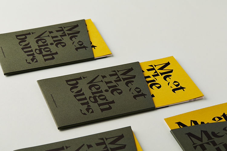
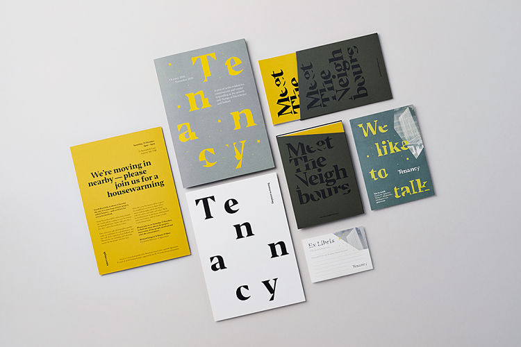
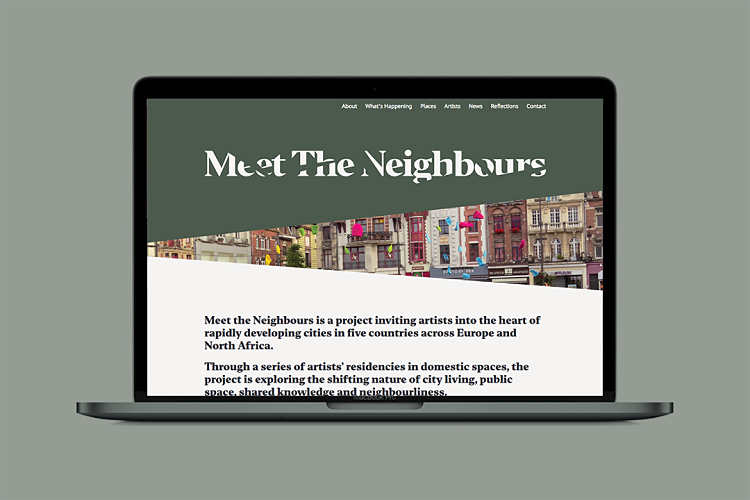 Meet The Neighbours is a collaboration between five companies of artists and producers across Europe including Quarantine, La Comédie de Béthune, Galeria Labirynt, Lublin, Grand Theatre and LE 18. The project explores what the term ‘the public’ really means today. Dotto designed the MTN wordmark and visual identity for the project. It was inspired by the peeks through blinds and glimpses through doorways which provide an insight into the lives of our neighbours. This was developed into a piece of promotional print; a bespoke die-cut A6 folder containing 6 postcards introducing the project with each highlighting one of the partners. Alongside the visual identity and print, Dotto also created the project website. The team developed a series of template pages featuring the peek style images used throughout the creative work. They also added extra details such as an animated timeline and illustrated icons of each of the five partners.
Florian Tripoteau: MYROSLAVA KUTS + FLORIAN TRIPOTEAU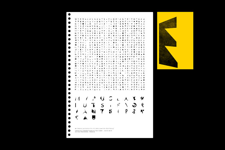
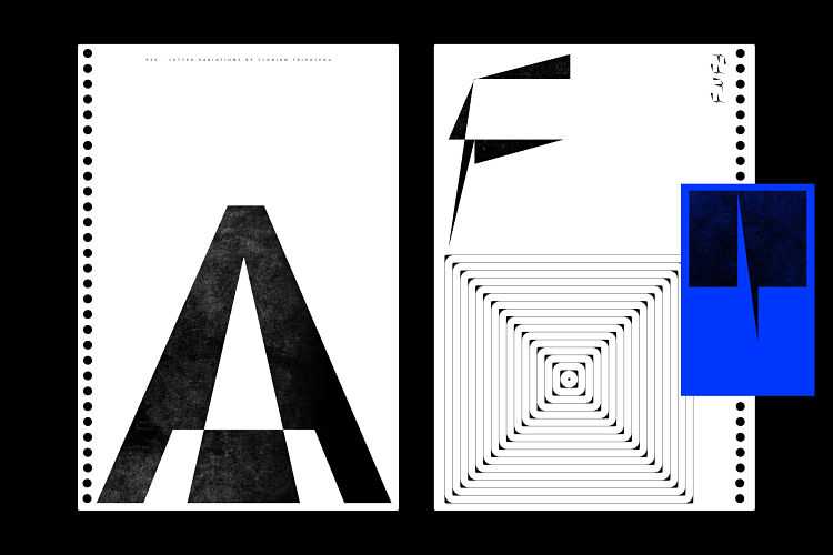
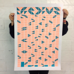
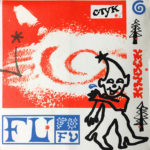
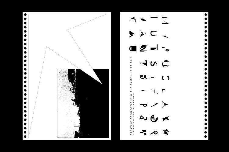 This project was part of Florian’s personal work created digitally using Adobe Illustrator. The visuals and the poster were designed for the release of a 14 minute 42 second recording corresponding to an experimental techno performance, played live by Myroslava Kuts and Florian Tripoteau at thecamp, in Aix en Provence (France) on the 18th of July 2019. The sound piece is based upon some slight variations, slow progression and repetitive patterns, thus the concept of the poster and it’s visual identity had to represnt this. The duo’s visual idea was to start with the line “Myroslava Kuts + Florian Tripoteau” and keep repeating it, whilst slightly editing each letter every time. The final result was 930 different letters from the beginning phrase.
Georgina Estill: Are We Human?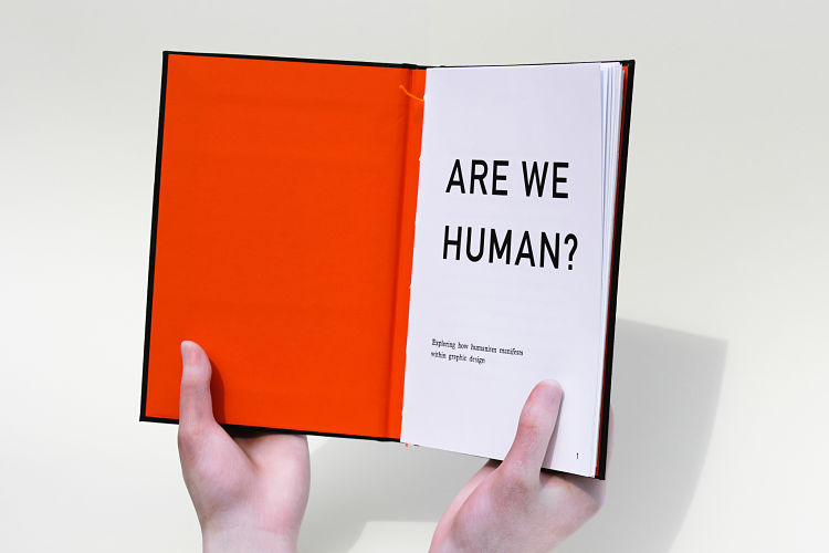
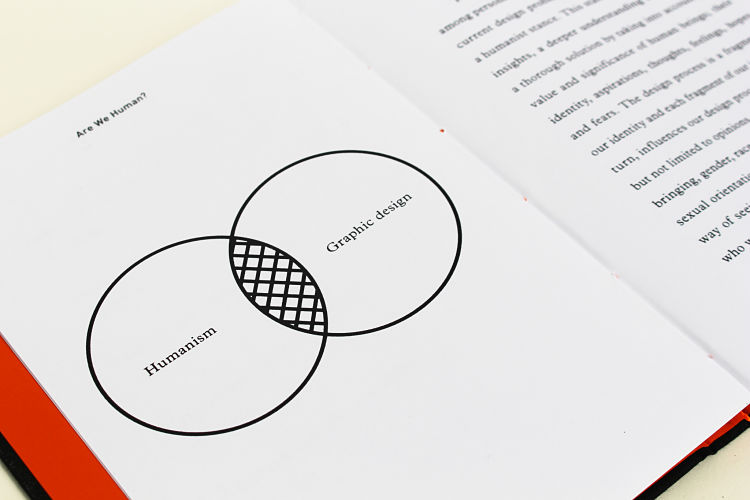
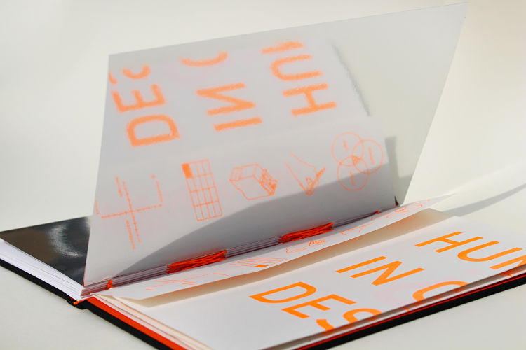 Are We Human? is a graphic artist’s book which explores how humanism manifests within the field of Graphic Design whilst also examining the mental barriers that we face towards designing for social change. Displayed in 3D plaster-printed hands to highlight the manual participation in production, the project is presented in analogue processes (screenprint, contemporary and historic letterpress, hand binding and bookmaking) to emphasise the power and sociological agency of a person. The book recommends working with a social agenda and evoking self-reflection in the design process; a concept reinforced by reflective paper stock, sponsored by Mirri. Typeset in Adobe InDesign in DIN and Plantin, the intrinsic links between humanism produce an unlikely, yet successful typeface combination. Featuring monotone for clarity, and orange which echoes humanity through its energy and enthusiasm Are We Human? embodies what Georgie believes to be the ultimate output for Graphic Design.
www.georginaestill.myportfolio.com
KC Ford: Reality VS Digital Reality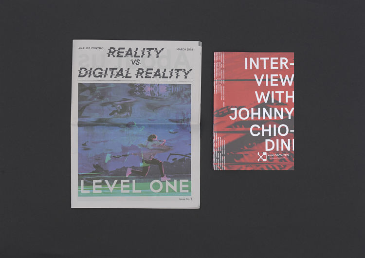
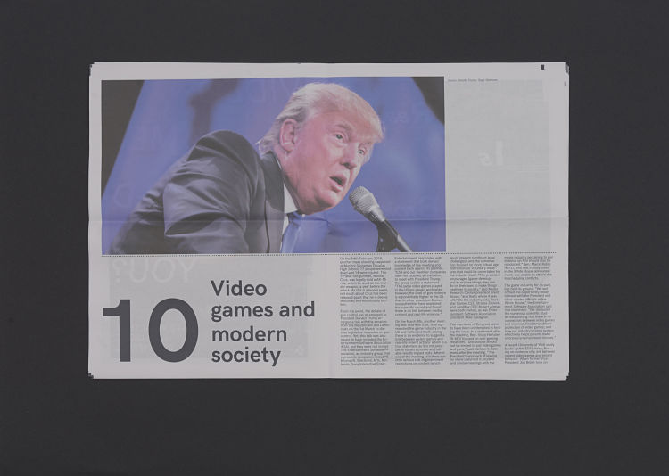
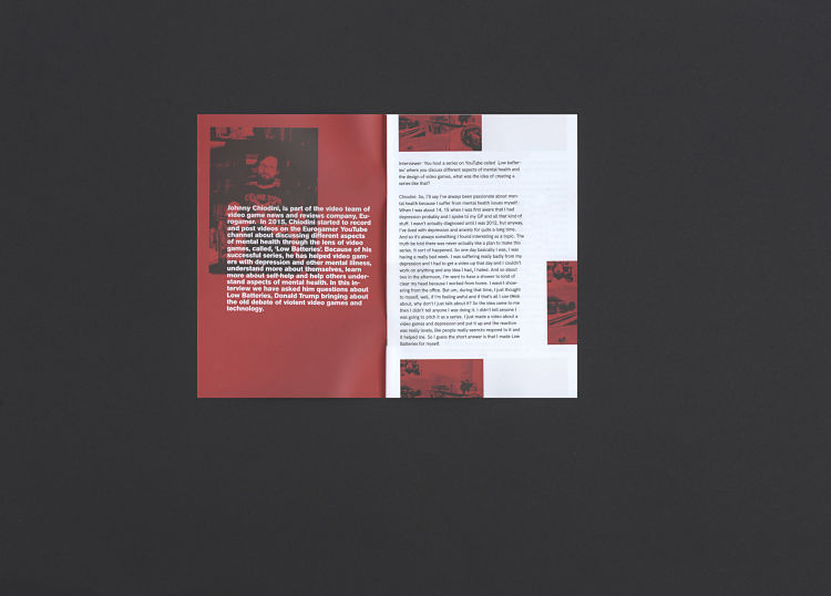 Kimberly Constantine Ford is a graphic designer, illustrator and printmaker from England who studied Graphic Arts at WInchester School of Art. For her Final Major Project KC explored the positive effect of video games on mental health and the negative stigma that media portray about these issues. The project came together in the form of an informative tabloid and a small publication featuring a interview with gaming media journalist, Johnny Chiodini.
Lizz Dunn: Targets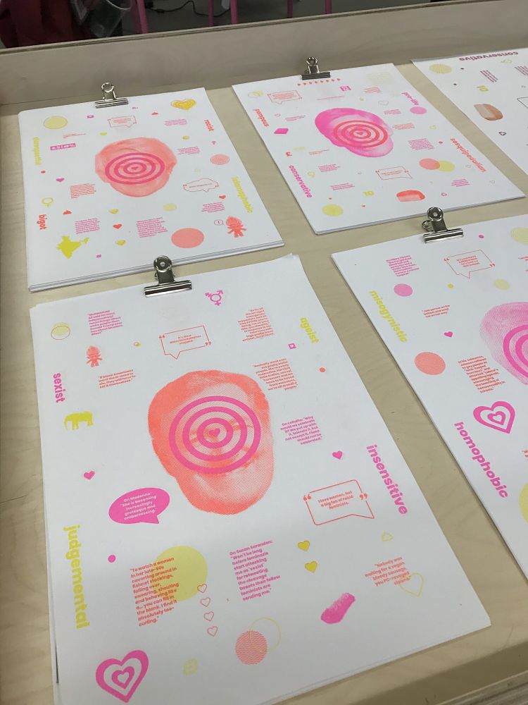
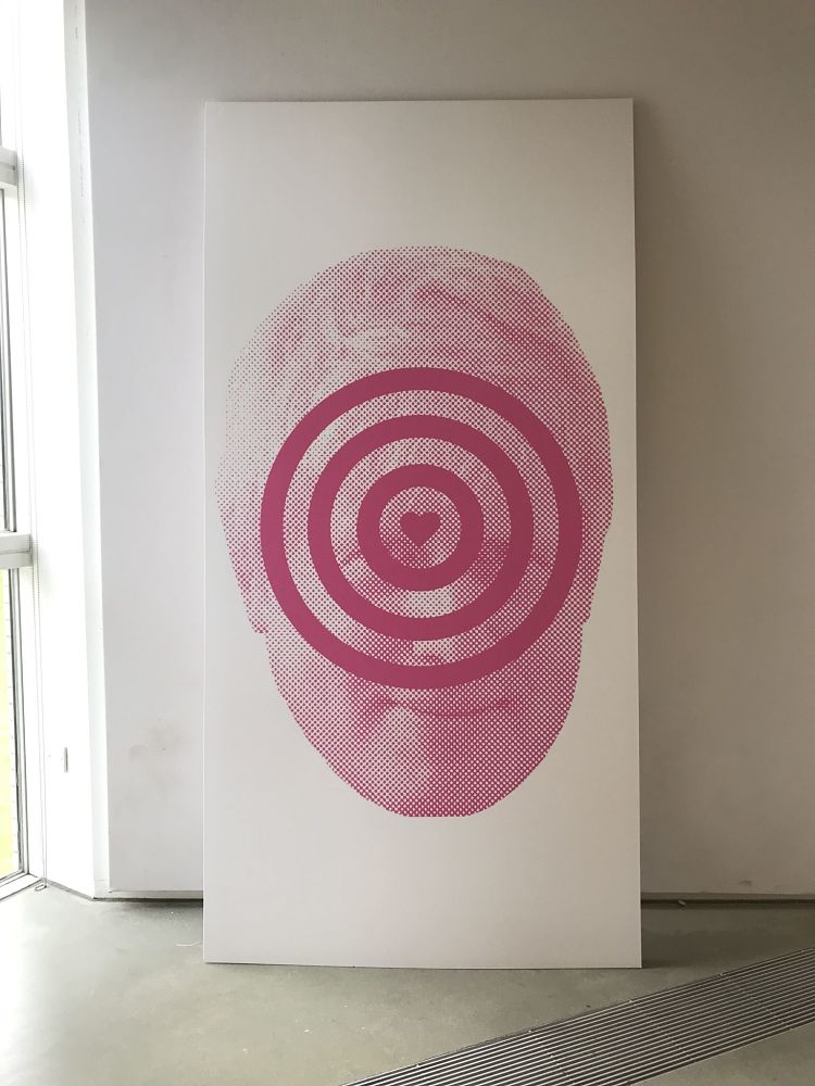
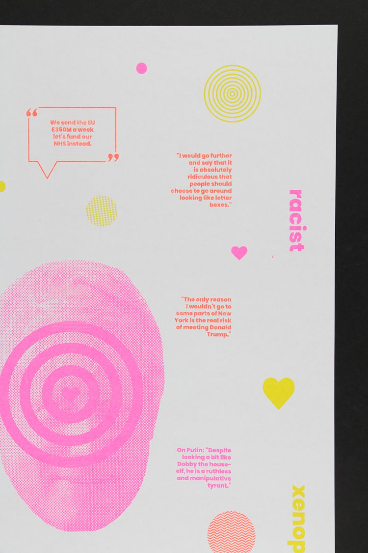 Targets is a project by graphic designer Lizz Dunn which aims to confuse and twist peoples perceptions through the use of colour and design. The importance of colour within the piece is demonstrated by Lizz’s use of the fluorescent inks of the Risograph printer which connote happiness and positivity. This underlying theme within the graphical aspect of the work is juxtaposed with the lexical content, in that the quotes and tweets are all based around highly controversial subjects which can be found severely offensive. The topics that dominate the work include gender, sexuality, identity and the stereotypes that go along with these subjects. In Targets Lizz demonstrates the ability of the media to take the controversial things people say out of context in order to gauge attention. “I have attempted to employ this in a different manner by using colour and symbolism rather than the sole focus being the quotes and their controversy” concludes Lizz.
Emma Hursey: Olafur Eliasson’s Little Sun at the Tate Modern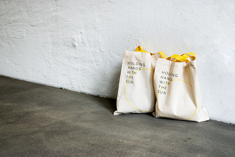
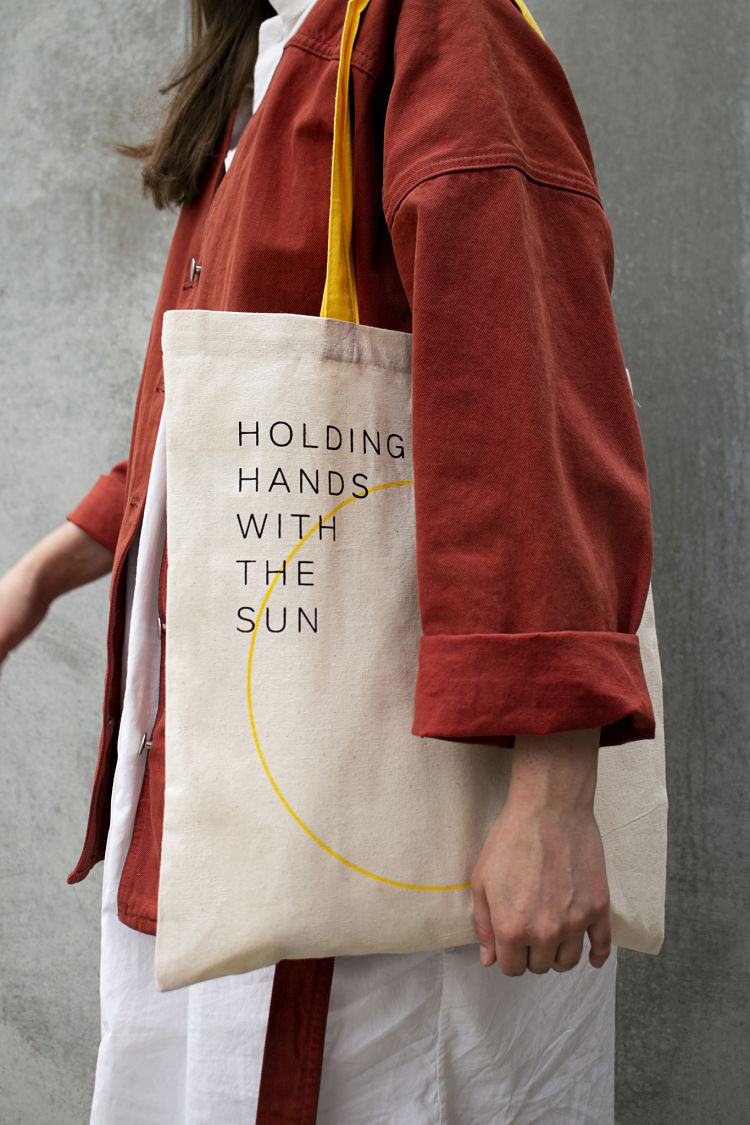
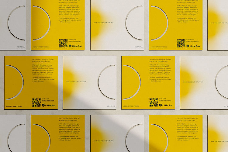 For Olafur Eliasson’s In Real Life exhibition at the Tate Modern, graphic designer Emma Hursey worked with Olafur’s solar energy social business, Little Sun, creating fundraising materials for the event. The campaign focused on a quote from Olafur; “Holding hands with the sun is holding hands with the future“. Emma worked in collaboration with the team on the design of a new tote bag incorporating the notions of this quote which was to be sold in the Tate Modern gift shop. During the exhibition opening numerous fundraising dinners were planned which required Emma to make each guest an information card. Printed on GF Smith Extract paper (recycled from old coffee cups) the lasercut semi-circle both mirrors her bag design as well as playing on the tagline from Little Sun; “We Are All Connected By The Sun“. When the cards were displayed on a table side by side, the circle was complete.
www.instagram.com/doingmedoingyou
Alycia Rainaud: Shades → A journey through feelings and failures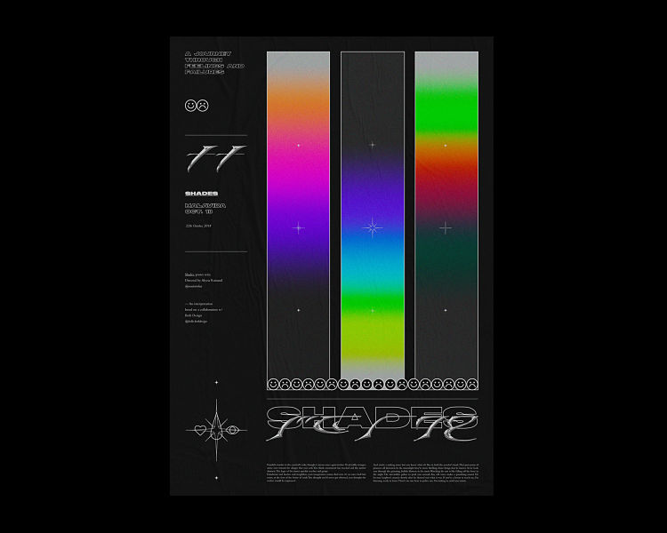
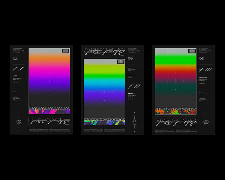
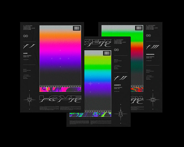 Shades is a poster series created by Paris based graphic designer and digital artist Alycia Rainaud. Each poster explores a different feeling through abstract colourful atmospheres and contrasted detailing. All three posters are meant to follow each other in order to merge into a fourth one, with the aim to tell a story about evolving feelings and failures through time and space. Alycia used Adobe PS, AI, ID when creating this project. Shades incorporates a range of typefaces including NF Ultra, Bembo and custom chrome.
Here Design: The Fife Arms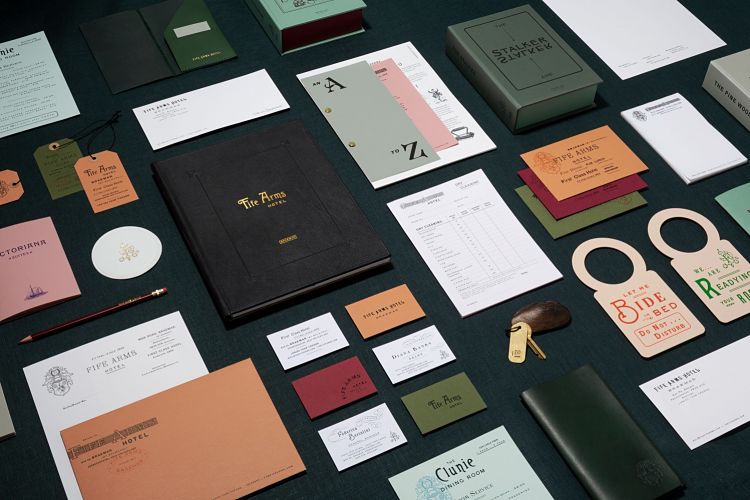
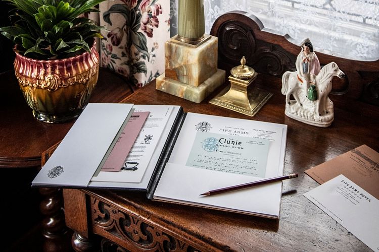
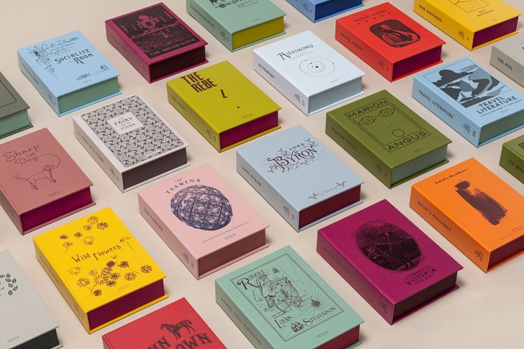 Located in the village of Braemar in the Scottish Highlands, The Fife Arms is a reimagined Victorian coaching inn from the co-founders of acclaimed global gallery, Hauser & Wirth. Bringing together Scottish heritage with world-class contemporary art, Here Design were tasked to create a brand identity that embraced the rich visual history of the area along with the hotel’s outlandish interior design. Supported by a local group of historians, their starting point was to explore Braemar’s rich visual history through the ages. Inspired by their collection of local ephemera, such as catalogues, letters and The Fife Arms’ original signage, their design uses a characterful mix of typefaces, colours and illustrative styles. One of the places this character is most prominent is in Fife’s room books. There is a collection named after every room in the hotel containing not only the room key, adorned with a solid bronze Scottish fresh water mussel, but a bespoke booklet full of fables and tales that explain the stories behind the rooms’ designs.
Emma McDermott: Pink Matter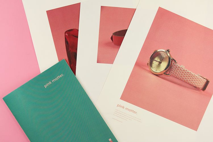
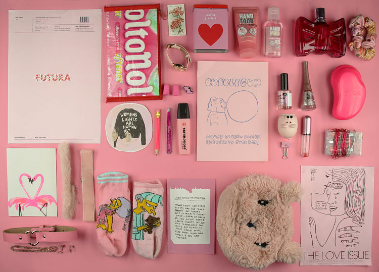
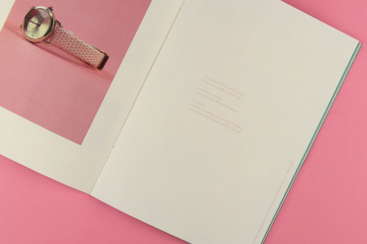 Pink Matter is an exploration of an unaware obsession Emma had with collecting pink objects. Created primarily using Adobe Indesign, Photoshop, a DSLR and a good dose of nostalgia, the publication and poster series illustrates Emma’s obsession with using design, photography and poetry/prose. The publication also includes writing which represents the feelings she experienced when analysing her collected objects. Her use of the delicate typeface, Mr Eaves, portrays the writing almost as if it was as an afterthought allowing the viewer to appreciate the deeper meaning of certain objects when taking a second glance. On the inspiration behind her piece Emma states; “I was very much inspired by not only the memories attached to the objects featured in this project but also the likes of Jessica Walsh and Leta Sobierajski, as I love their use of photography and bright colours“.
Ricco Pachera: Second Record for Glow in the Dark, Sonar Kollektiv Berlin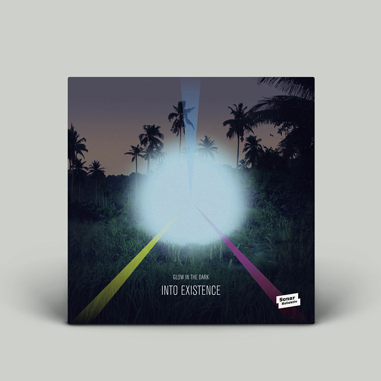
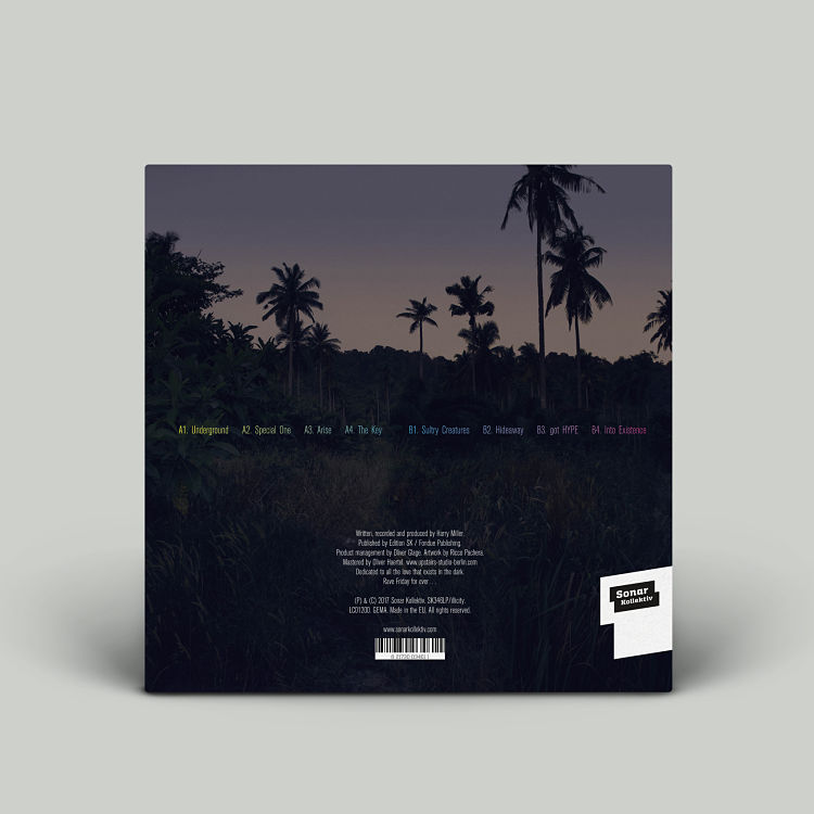
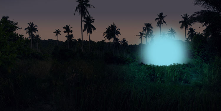 Graphic Designer Ricco Pachera was recently commissioned by Sonar Kollektiv from Berlin to create the second vinyl album artwork for the band Glow in the Dark. The artwork was inspired by Ricco’s recent trip to Thailand where he visited a small island and stayed in a hut located close to the jungle. Similar to the first album cover he created for the band Ricco explains the moment his idea was sparked; “One night when we came back from dinner, I looked in the jungle just before it was getting dark and the same feeling came up like when I created the first cover. That loneliness in the desert“. So Ricco took some pictures of the jungle and created a collage of the palm trees he was inspired by. He darkened his original image in order to create a more gloomy mood and added a blue glow, completing his design in InDesign.
Kirsty Buckley: Pop-up Engines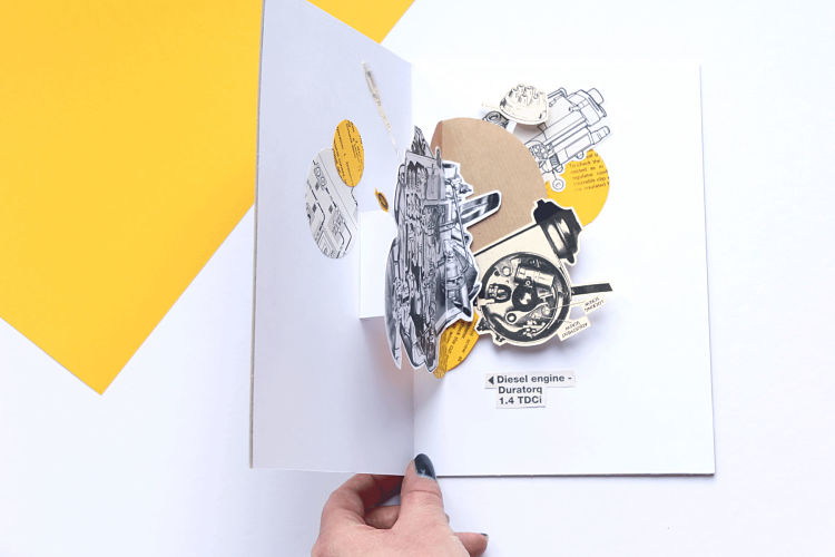
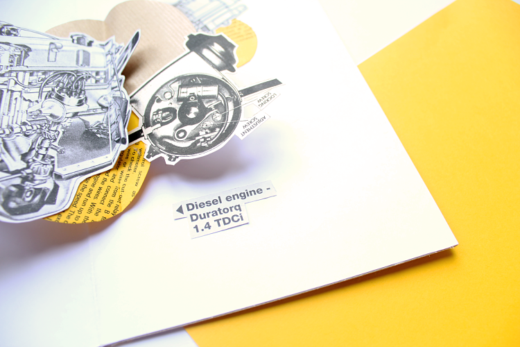
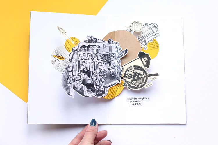 Kirsty Buckley is a Graphic Designer Based in Cheshire. In her recent project Pop-up Engines Kirsty focuses on using old car manuals that have both hand drawn and digital illustrations which she has then repurposed in this small publication. Kirsty has enjoyed exploring how old forms of print can be given a new lease of life, whilst also experimenting with paper engineering and discovering how the two can work together.
Severn Agency: Typographic interpretation of poetry by WWI poet Wilfred Owen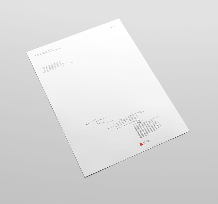
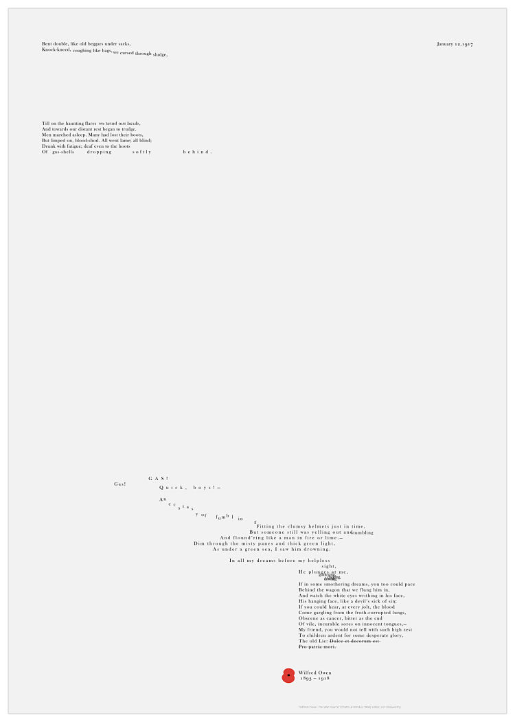
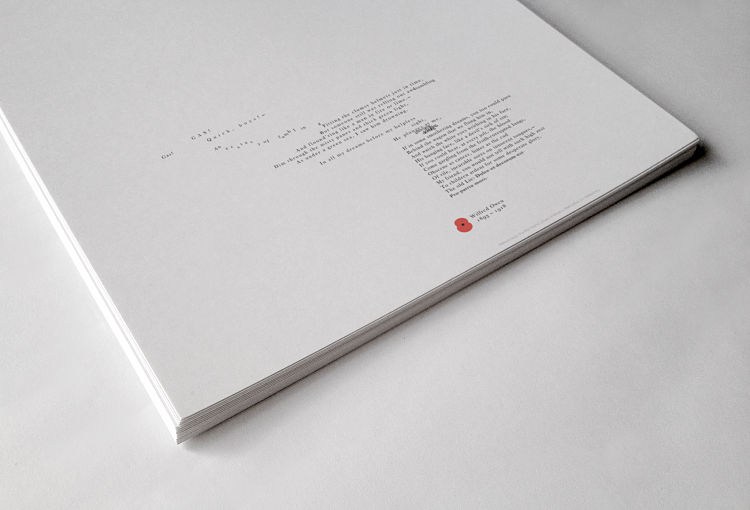 Tony Clarkson of Severn Agency is currently studying for an MA in Graphic Design at Falmouth University. As part of his degree he is currently studying for an assignment titled ‘How can typographic conventions and design inform and imbue the meaning of a given text?‘. The brief was to choose a text and then enhance its meaning through it’s layout. Tony chose poetry by WWI poet Wilfred Owen. In his piece he has used the same weight and size of type throughout in order to strengthen the monotony and the detached, desensitised emotion to the surroundings. “The blank areas add more time to events before the panic of the gas attack, followed by a slow return to the unfeeling attitude of the observer” he explains. Tony will produce a set of four different poems as Giclee prints to complete his project.
Jonathan Spencer: 5000 Years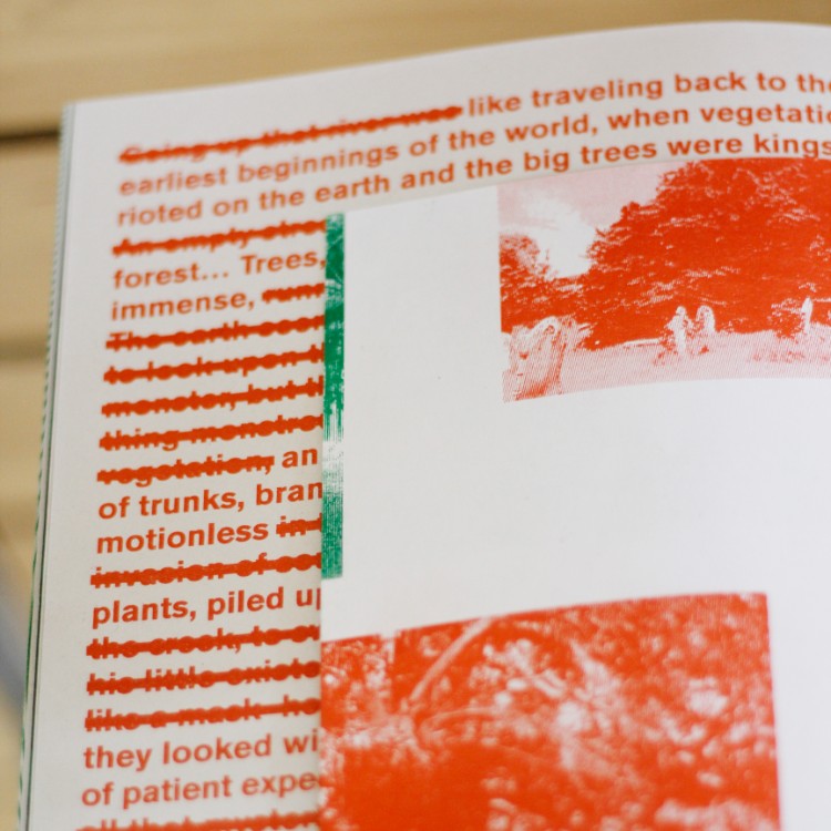
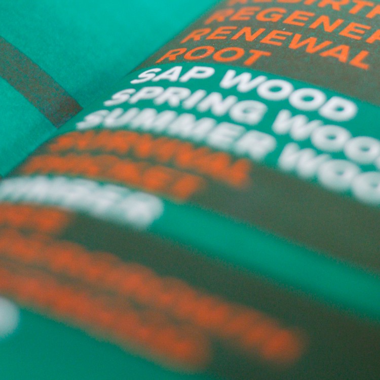
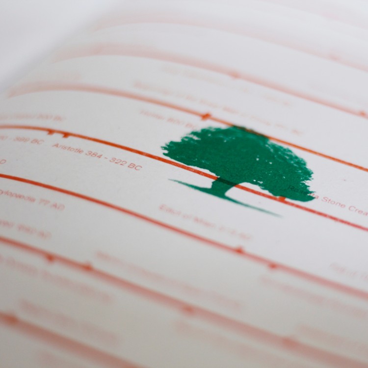 5000 years is the first in a series of short run publications which explores the life span of the Yew Tree. The book forms part of a series of publications in response to the theme of trees and wood; each book focusing on a particular aspect of the subject area. The books are self-produced using a Risograph printer and are part of Jonathan’s ongoing work exploring how the machine can be exploited to produce engaging design whilst using intelligent printing techniques such as overlay, overprinting and halftoning. The two colour book exhibits photography, illustration, typography and text all researched and produced by himself. Jonathan believes it is important that Graphic Design is not just seen as a tool of commerce, but that it stands proud as its own discipline capable of expressing complex and profound content by engaging the curatorial side of editorial approaches. The book was first developed and displayed as part of The Library of TSOIT; an exhibition staged within the basement of a disused a department store as part of the Independents Biennial in Liverpool 2018.
www.instagram.com/JonathanJSpencer
You can view all of our Verified People of Print Members and their exciting projects on our membership site: www.members.peopleofprint.com
You can apply to become part of our growing community of innovators, printmakers and creatives here.
You might like...
- KesselsKramer | Het woekert in Tolhuistuin - May 7, 2024
- Satinder Parhar | Start the Press! Artist in Residency at IKON Gallery - May 3, 2024
- Heather J. A. Thomson - May 2, 2024


