This month we’re excited to present a selection of illustration projects from members of our community. From editorial pieces, to intricate lino carvings, and printed pottery, our members have created stunning illustrations that have been bought to life via a variety of materials and platforms.
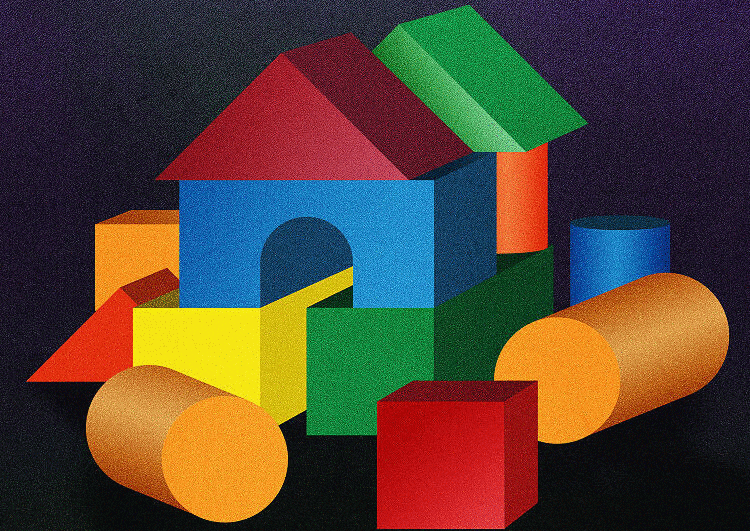
Sebastian König: Editorial Illustrations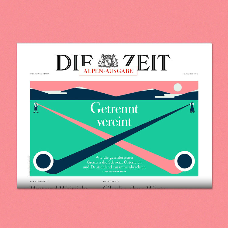
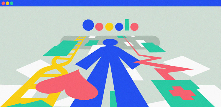
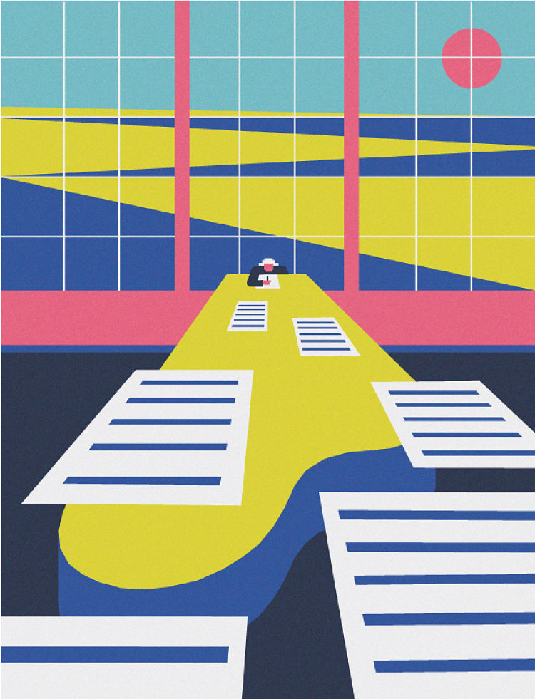 Throughout 2020, Hamburg-based illustrator Sebastian König has been working on editorial illustrations for newspapers, magazines and news sites, including the likes of Die ZEIT, NBC News, Die Wochenzeitung and Cicero Magazine. All of his illustrations are created in Adobe Illustrator.
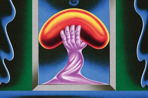
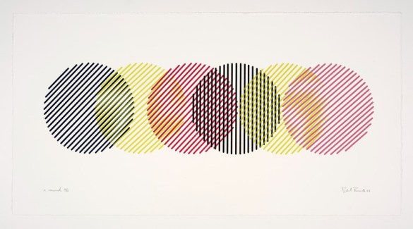
Andrew Clapham: Warning Signs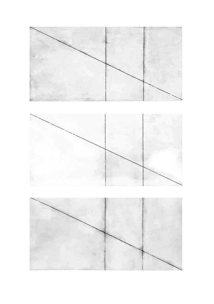
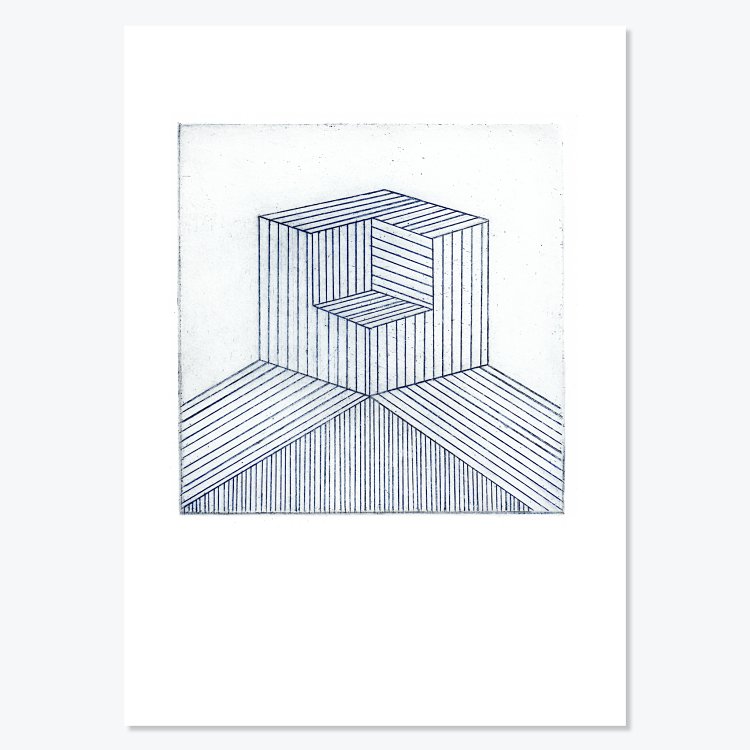
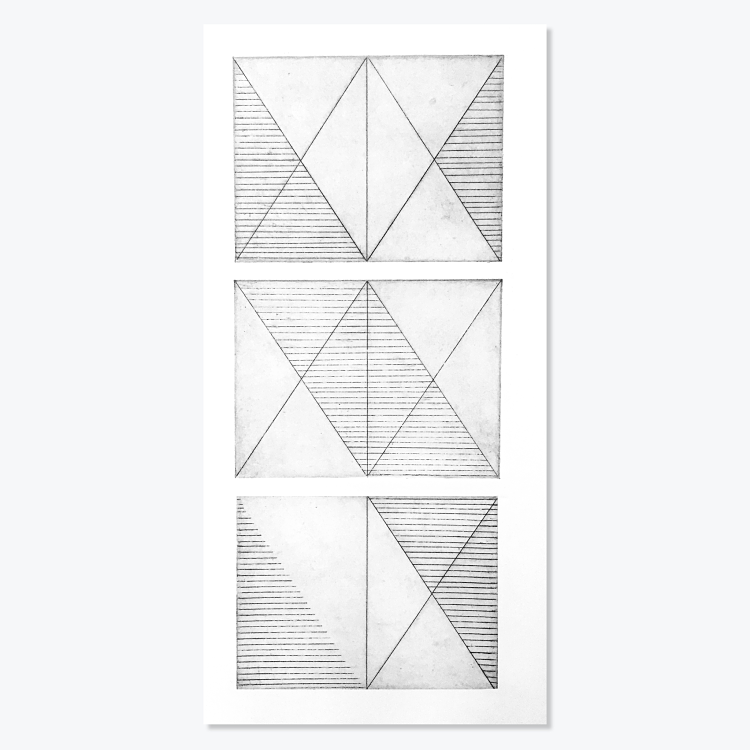 Warning Signs is an abstracted etching in response to found signage and grid systems by printmaker Andrew Clapham. The work explores the relationship between art and design through the fundamentals of image-making and form. This method of printmaking has enabled Andrew to exceed the limits of line work, and to create a dynamic shape and structure through the process of intaglio printing, bound together through a systematic response of patterns and grids. Altogether, the work looks at modernist abstraction’s legacies, specifically Minimalism, Constructivism, and the monochrome.
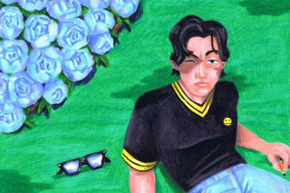
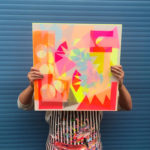
Josephine Obert: Hands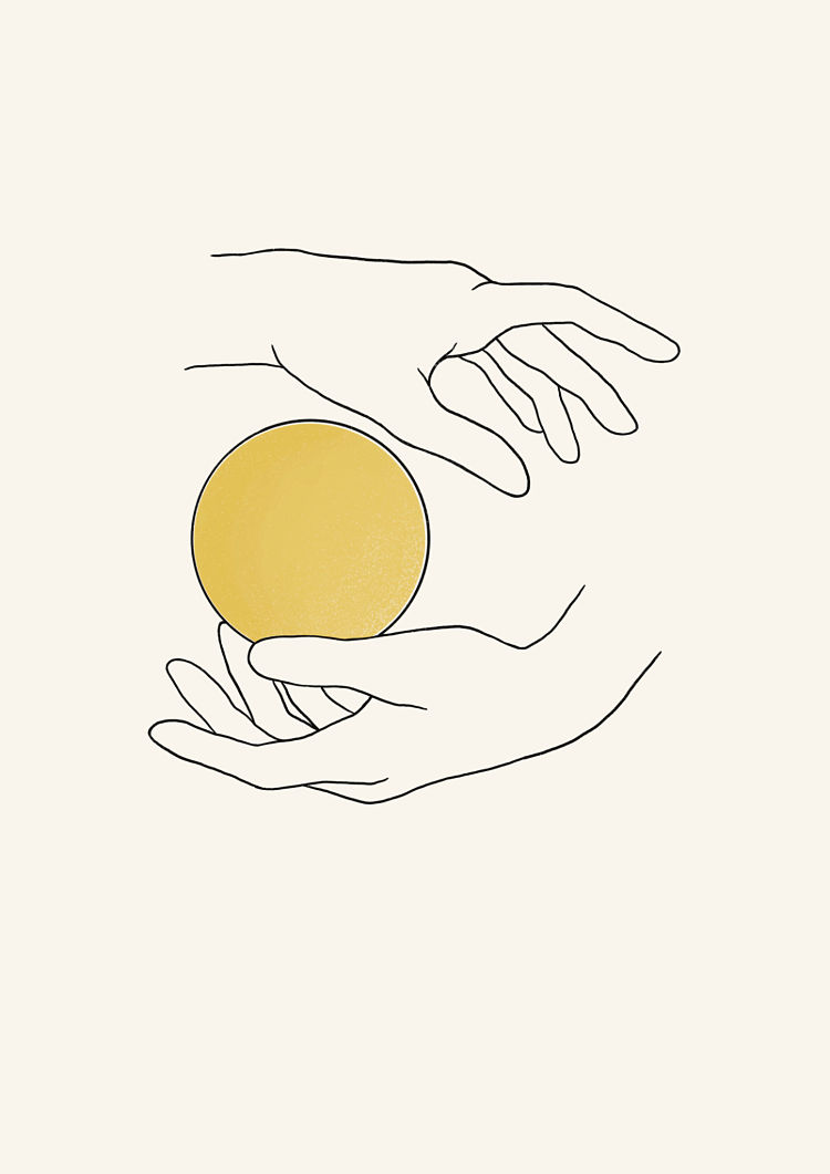
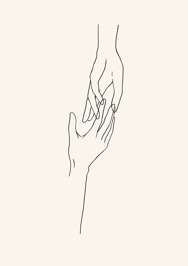
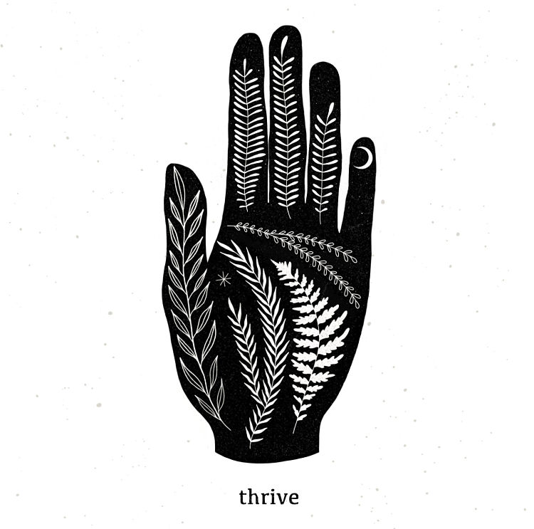 Josephine Obert was commissioned by US singer songwriter Kaila Baće to create a series of album artworks for the artist. After initially requesting to use Josephine’s Thrive illustration, the singer than tasked Josephine with creating two more artworks in the same style for two more singles. While working on the new designs Josephine aimed to adapt them to the song lyrics; a process that she really enjoyed. The artworks were all created digitally on an iPad.
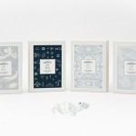
Emma Hursey: Perennial Institute Cultivation Cards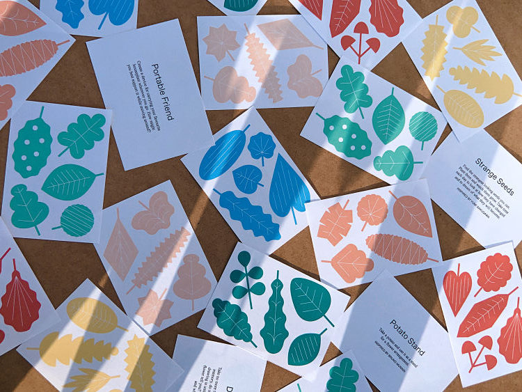
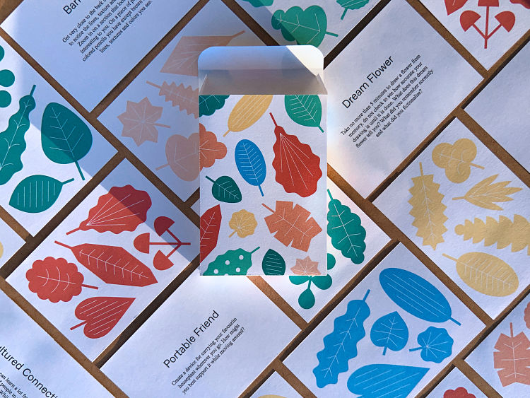
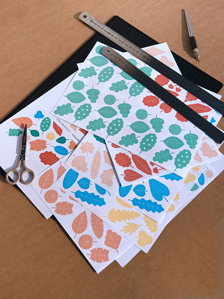 These woodblock inspired illustrations, deck design and packaging were designed by Emma Hursey. Cultivation Cards are a card deck designed by Perennial Institute to reposition one’s focus on a creative process that is in harmony with their socio-cultural and environmental well-being. Each card is based on thoughts and actions that are explored through Perennial Institute’s programming. They’re the tarot cards of the creative-practice-in-collaboration-with-plants world. The format is inspired by Brian Eno and Peter Schmidt’s wonderful Oblique Strategies. The cards are free to download with a donation of any amount to one of the organisations Perennial Institute support. The cards have a do-it-yourself, print-at-home format to make them instantly accessible during lockdown.
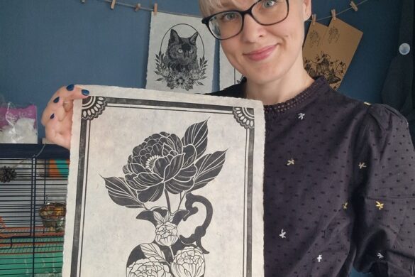
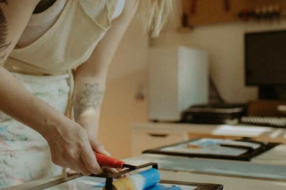
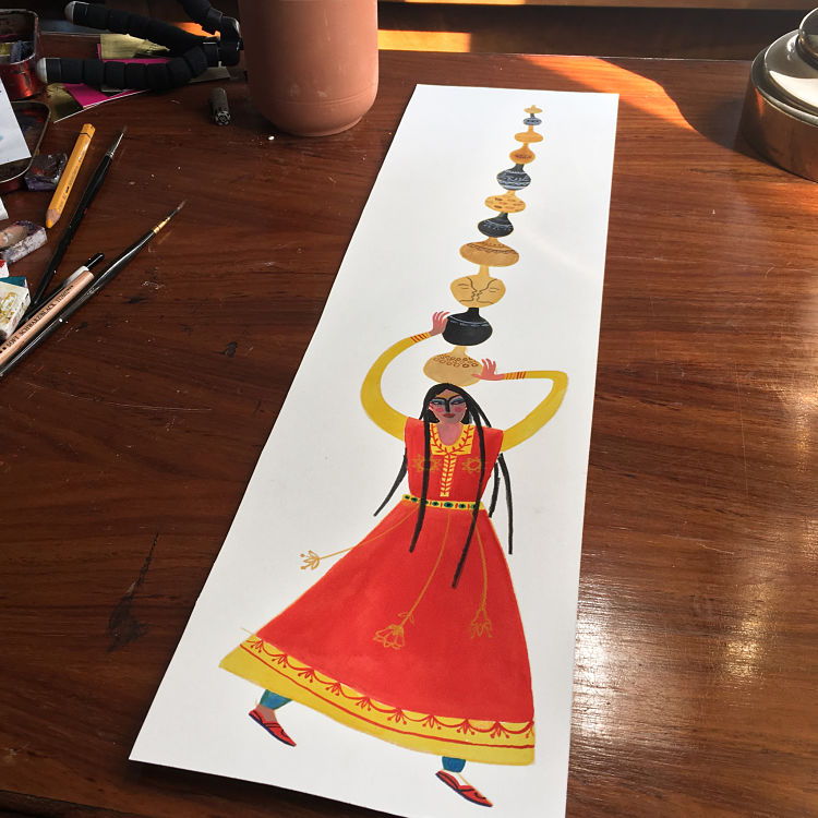
Eimearjean McCormack: Pottery Illustration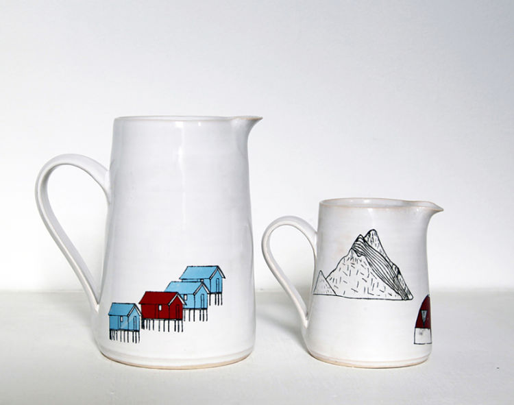
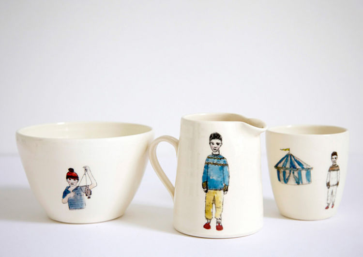
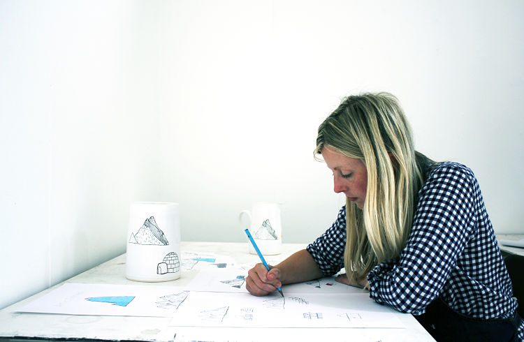 Driven by a love of physical materials, Eimearjean McCormack’s approach to design stems from her visual art practice. Most of the projects she engages with incorporate elements of the handmade including hand drawn illustrations, silkscreen, photo intaglio, Risograph and cyanotype printing, as well as hand binding and laser cut text. By integrating traditional and digital processes related to both art and design, Emma’s creative process evolves naturally with one informing the other. This pottery series is an ongoing commission by Ard Bia which has evolved over a number of years. Each image is hand drawn, scanned and converted to a ceramic decal, then individually applied to each object.
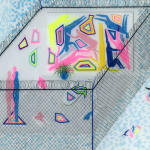
Mathilde Roussillat Sicsic: Illustrations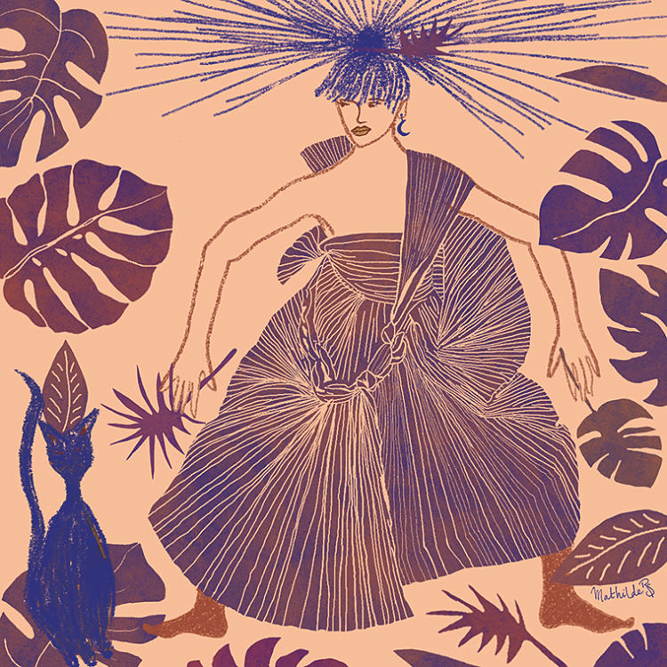
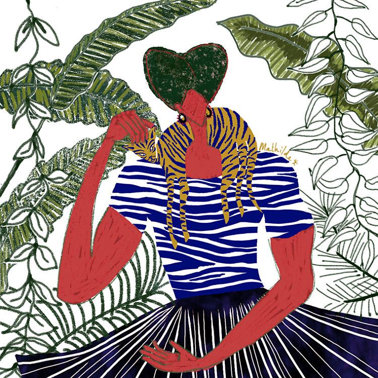 Mathilde Roussillat Sicsic is a freelance illustrator whose work is sensitive to colour and graphic rhythms. The subject of vegetation is often present in her work. “In my job as a textile designer, floral and plant patterns are a big part of the work. At home, I am surrounded by plants and I love the “camouflage” atmosphere that this can create, the play of shapes and rhythms” explains Mathilde. Her works are also inspired by a variety of things including wood, ceramics, furniture, landscapes and her love for people watching. She predominantly practices painting with watercolour and experiments with digital drawing.
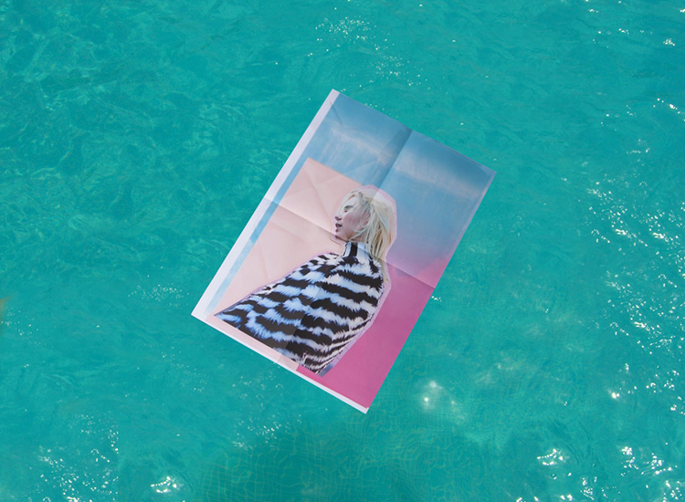
Florian Tripoteau: La Provence Mystérieuse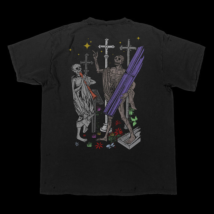
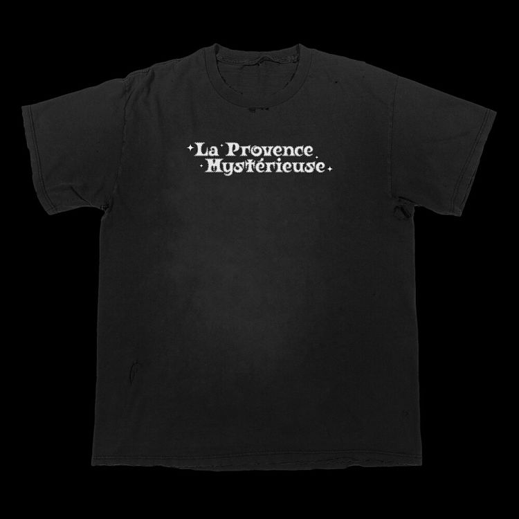
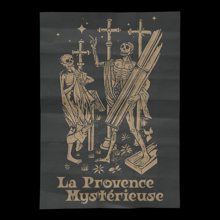 Initially designed for a t-shirt release on Everpress, this metallic gold edition of La Provence Mystérieuse was designed exclusively by Florian Tripoteau for the Librairie Offprint, the book shop of the Luma Foundation (Arles, France). The associated poster will be Risograph printed by Quintal Editions (Paris) on a Colorplan Ebony Black A2 paper. Along with the poster, a special edition t-shirt and sweatshirt will be released on Everpress.
Malo Malo: Errratum Cover
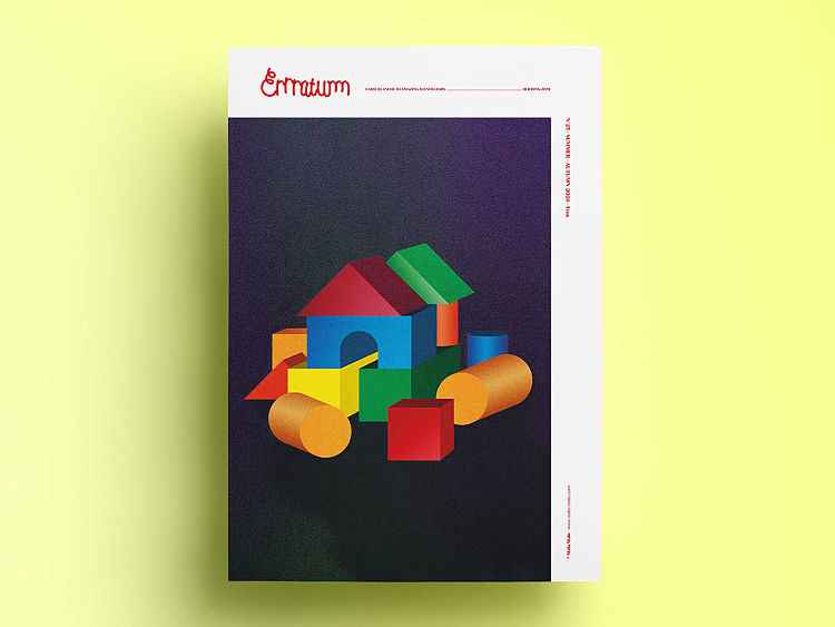 This illustration by Berlin-based graphic design Malo Malo was created for the cover of the newspaper Errratuum. Errratum is a 100% independent, A3 printed newspaper that aims to spotlight and highlight illustrators, giving them more visibility on the contemporary illustration scene.
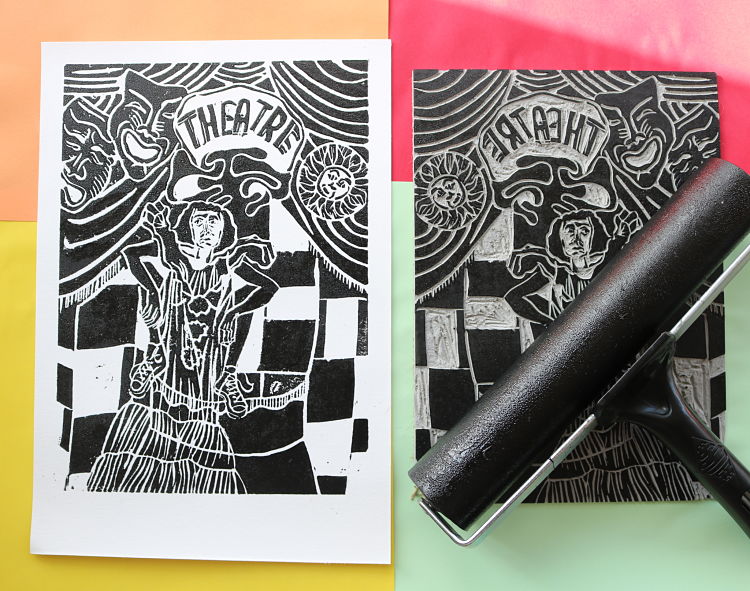
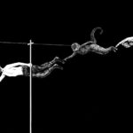
Enea Seregni: Lovecraft & Poe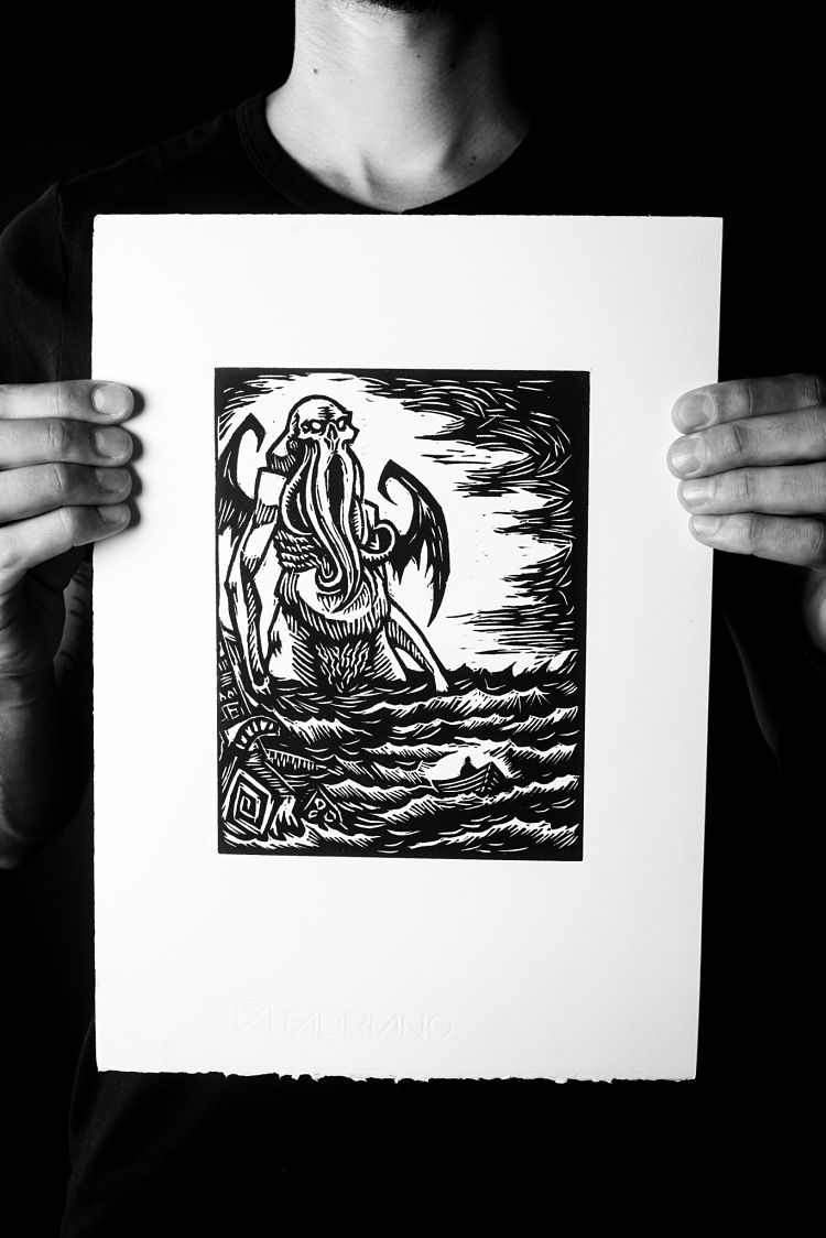
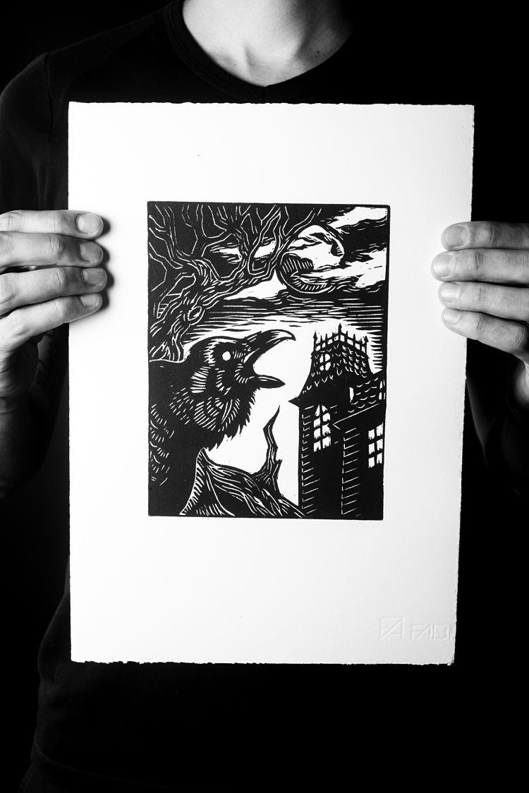
 Enea Seregni’s first foray back into linocut printing was a series of illustrations inspired by the novels of E.A. Poe and H.P. Lovecraft. Depicting horrific subjects is something that Enea finds fun and challenging, as well as reflecting their love Gothic literature. With the passing of time, Enea’s style has evolved, and the subjects of their illustrations have became more and more complex and detailed.
VrijFormaat: Utrecht – Portraits of a City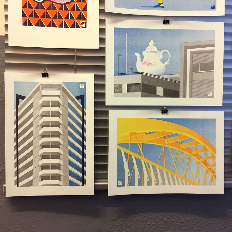
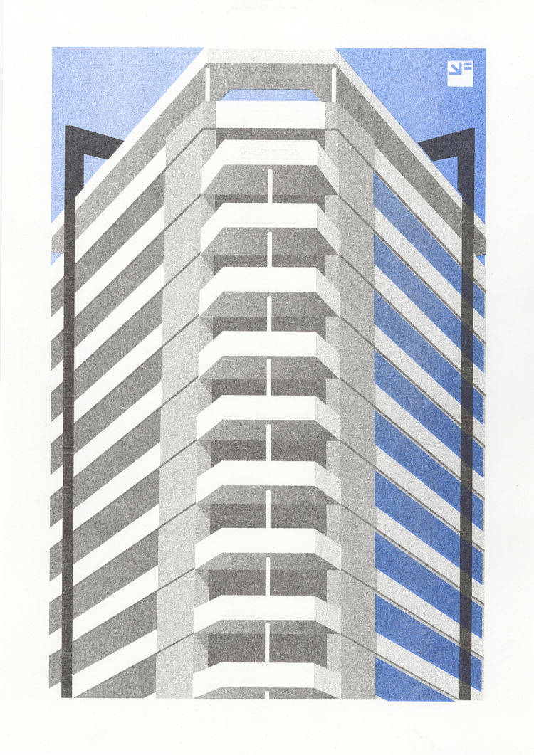
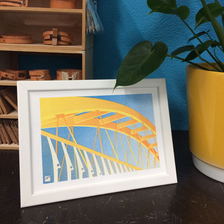 Utrecht – Portraits of a City is a new project by VrijFormaat. It is a growing series of illustrations that they digitally design and then print on their EZ300 Risograph. After living and working in Utrecht for a long time, they thought it was about time they created a series of architectural portraits about their hometown. They decided to showcase not only the touristy hot spots, but the views they see while cycling from A to B, things they love or love to hate, and views that interest them because of the graphic lines; beautiful details, weird contrasts, and impressive ugliness. The first three prints in this series are The Teapot, The Yellow Bridge and The Neudeflat.
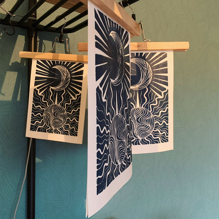
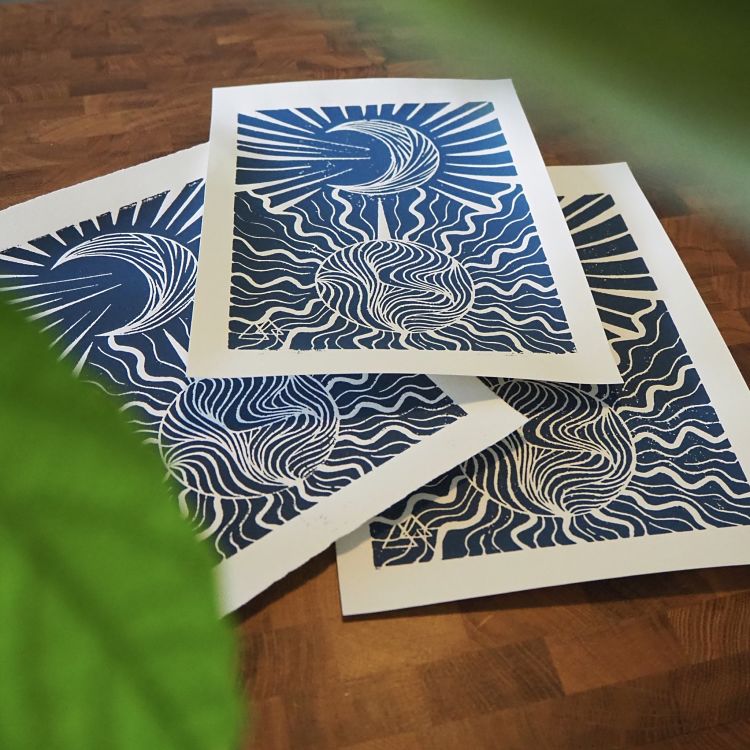
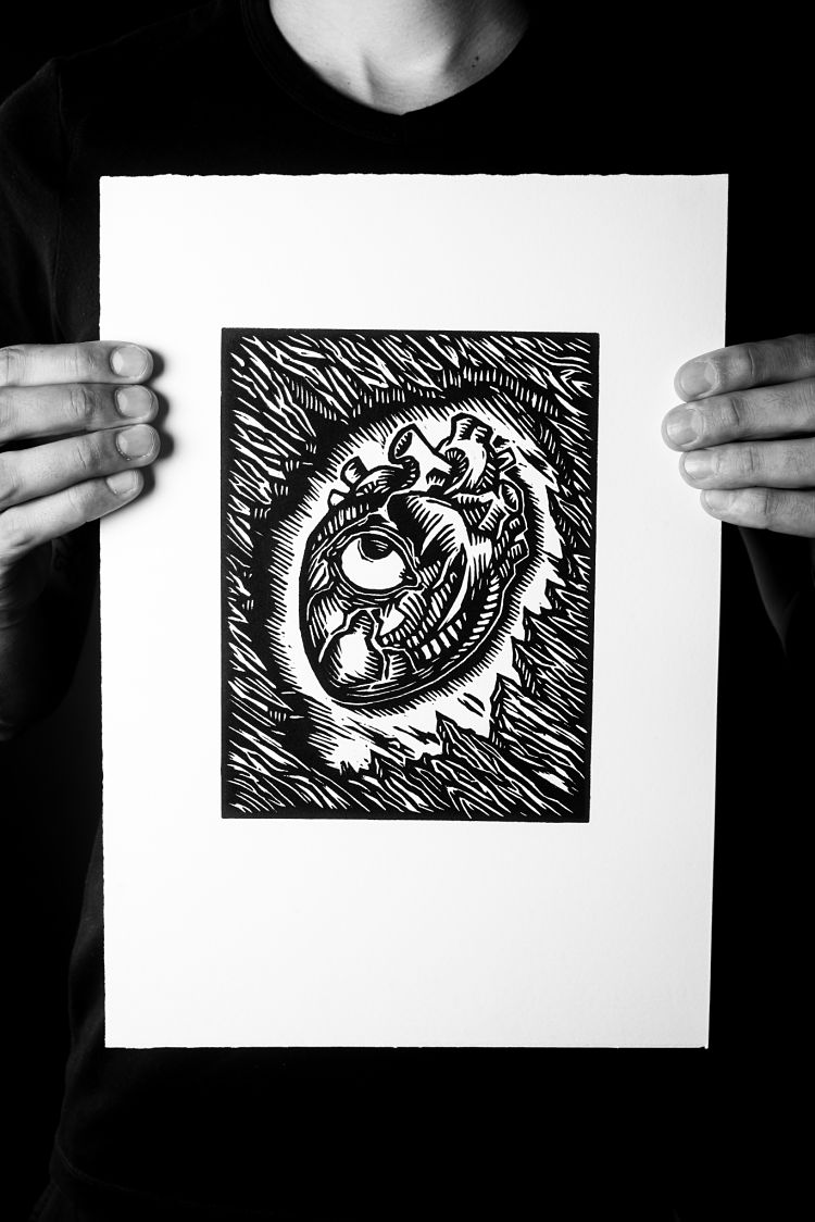
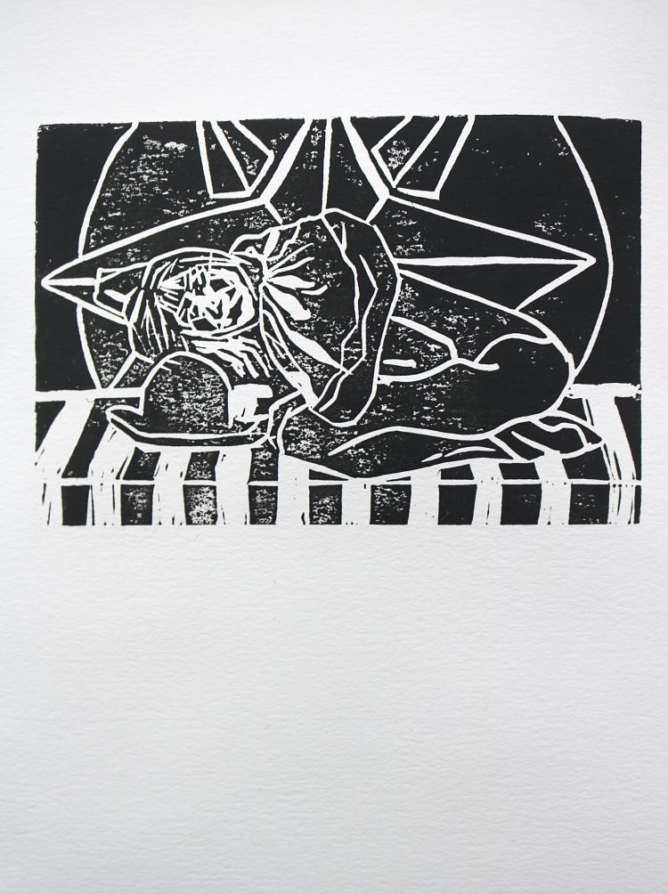
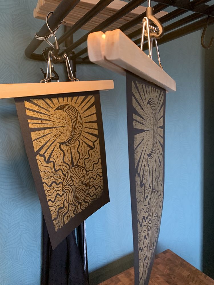 Last year, after quitting inktober early because she was burnt-out, Sabine van Rooij was feeling a little uninspired. Her mother had just passed away, and she was feeling grateful for the moments they’d had together. Sabine started on a journey of creating more art as a form of therapy, and suddenly had the idea for this illustration which she bought to life straight onto a lino block. “I absolutely love this print, especially in gold on black” describes Sabine.
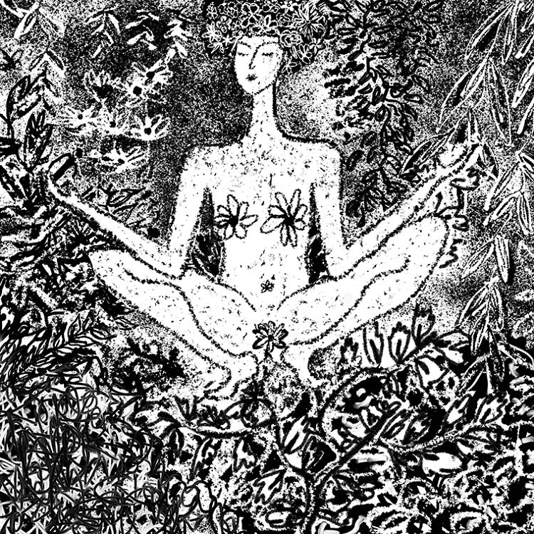
 This series of watercolour illustrations
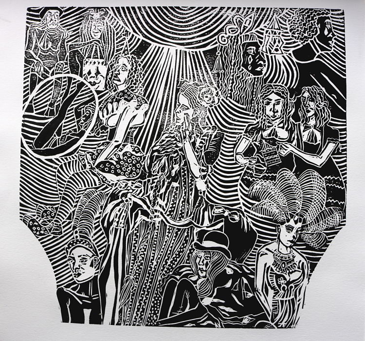
 Alexandra Motiu has recently been working on a new series of illustrations based on themes around the circus, which she has brought to life as a collection of linocut prints. She describes; “...thinking about this balance that the circus represents between rebellion against society and being its biggest prey, I believe that we should find in it a way to take back the notions surrounding it“. The prints also represent Alexandra’s interest in the grotesque and carnivalesque.
You might like...
 Chris Brown | Surf Camp Wandawega Book & Film Released
- Pink Line Press
- SintLucas
- SOFA Universe
- Sarah Ransome | Moroccan Prints
- Darren Cullen
- London Print Studio
- Classic Aquavit
- Mark Whalen
- Emer Tumilty
- Pressing Matters: Issue 8
- Printeresting
- UAL Screen Printing at Museum of London
- Chris Idema
- Zoe Anker: Print Process
- Le Petit Néant | The Small Nothingness


Want to know more about our membership? Give us an email at members@peopleofprint.com.
- Enea Seregni | MONSTERS! Collectible Cards - April 19, 2024
- Mark Frendo | Danger UXARD - April 18, 2024
- Sue Lewry | The Creative Cycle - April 17, 2024