This month People of Print are proud to present a selection of block printing projects from the talented members of our community. From reinterpretations of the alphabet, to political artworks and lockdown diaries, our members have brought a variety of projects to life through the carving of wood and lino blocks.
Dos Tres Press: Optical Migraine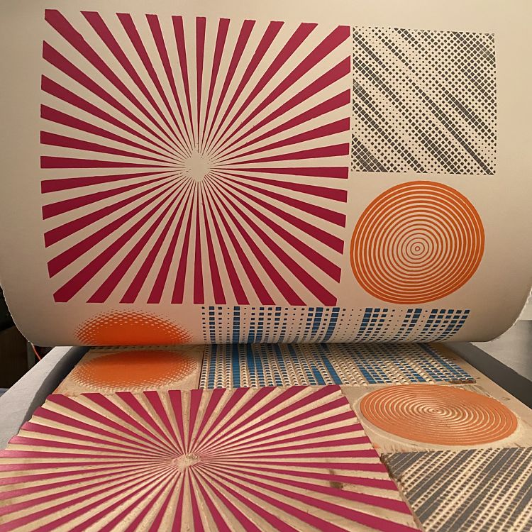
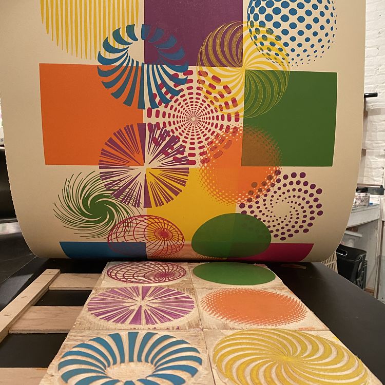
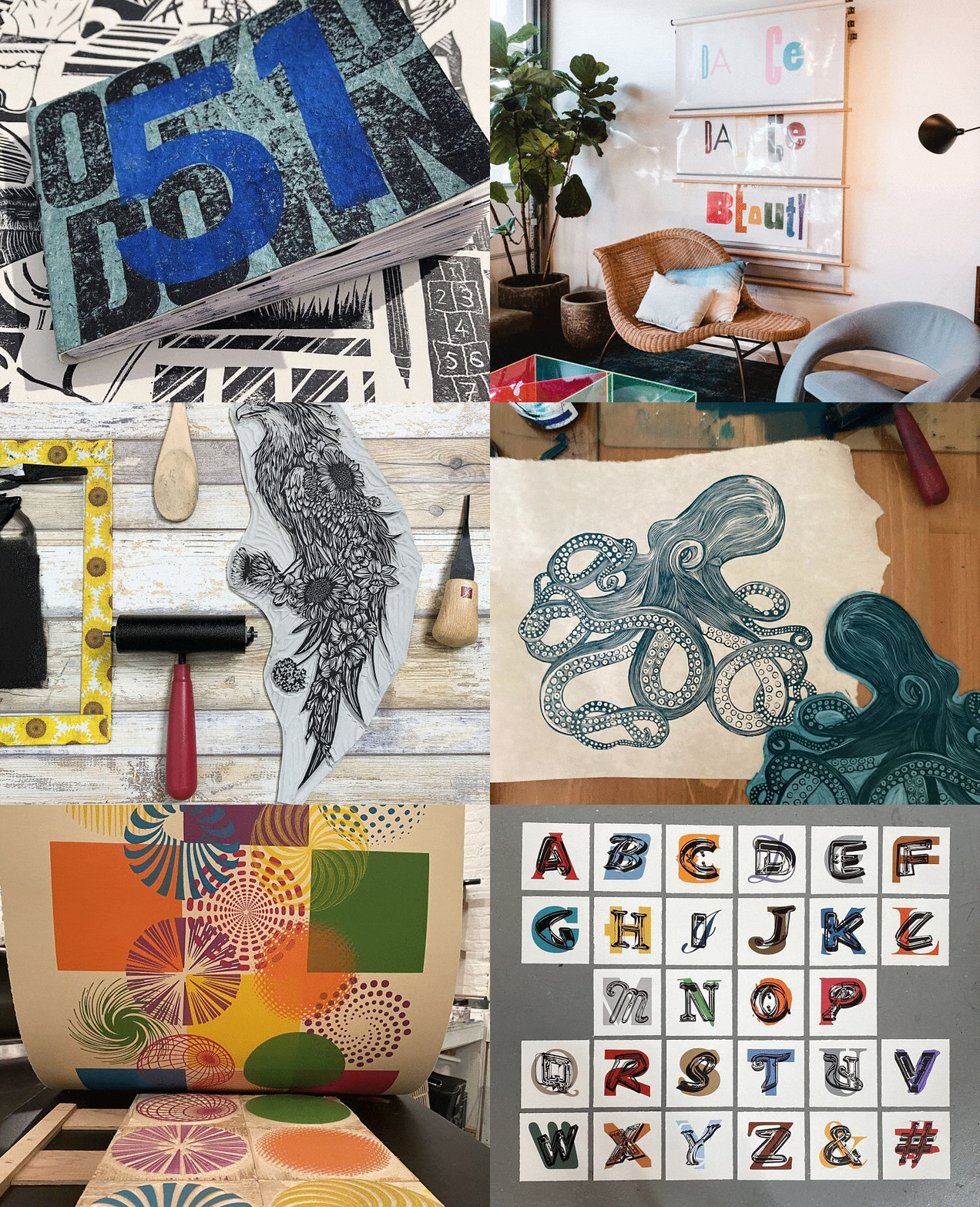
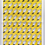
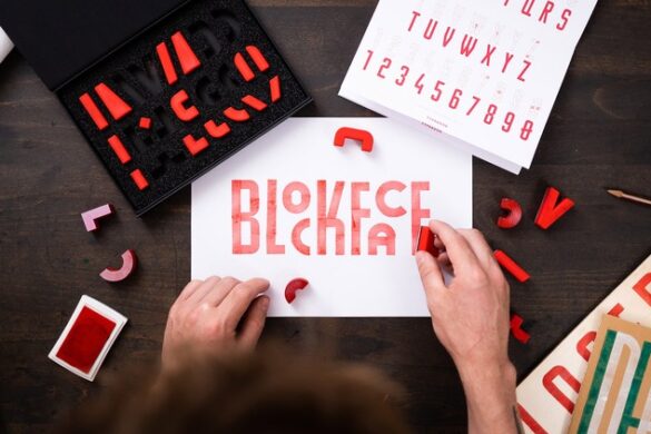
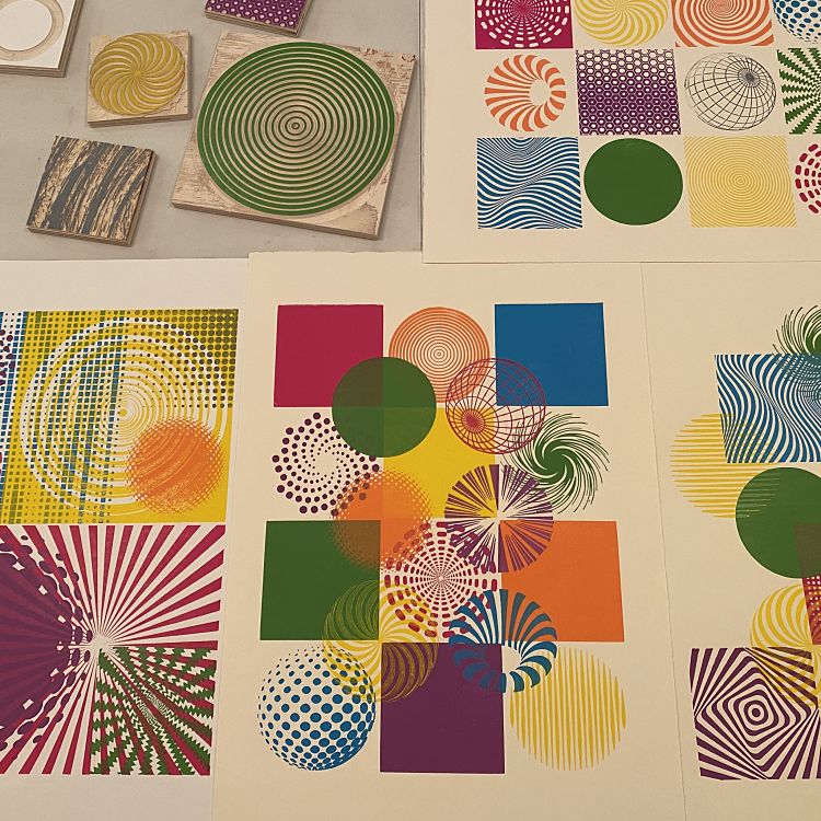 Optical Migraine was influenced by the process of arranging movable type and the vast amount of digital information we take in daily. The icons were sourced using patterns and halftones generated on a computer, pen and ink drawings, screenshots and commonly used graphic vectors. The designs were put through a CNC milling process to generate over sixty modular woodcuts. Each square section can be placed in any position on the space of the paper using a grid-like registration system not unlike a type tray. “As an auteur printer, I am at my best when not bound to making the same impression more than once. The infinite possibilities of this project result in exiting printing sessions, didactic colour studies and collaborative tools” says Alexis.
Lemuette Prints: Reductive Three Green Crickets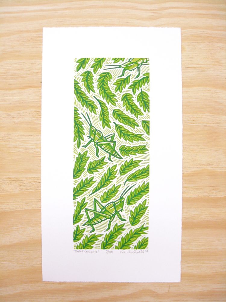
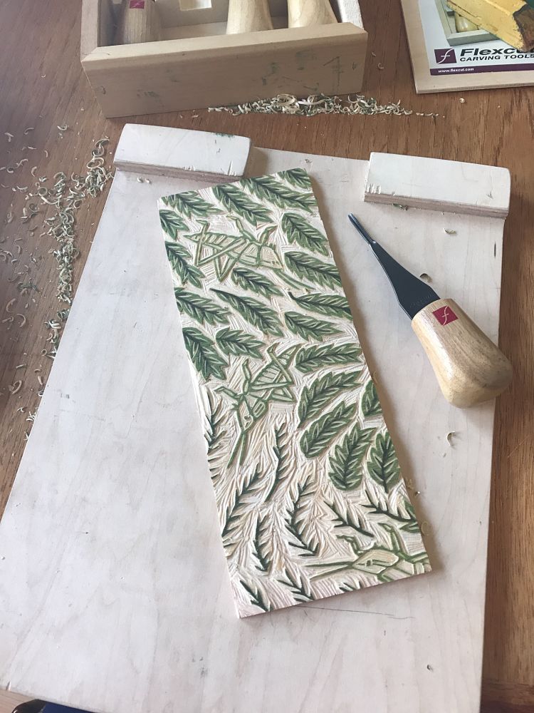
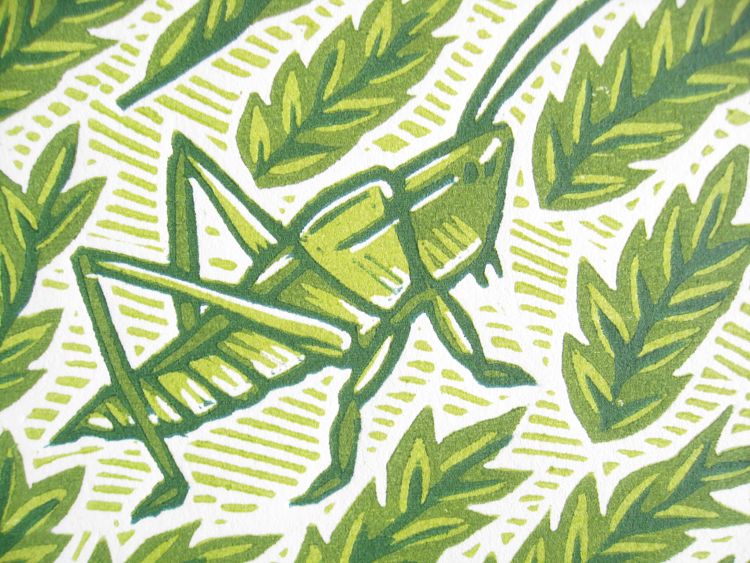 This 3 layer, reductive print by Lemuette is of three green crickets surrounded by little leaves. “I always loved trying to find these little critters hidden in the tall grasses of the fields behind my house when I was growing up” describes the printmaker. Reductive printing is a process that uses one woodblock for multiple layers of colour by carving, printing, carving, printing, carving printing until there isn’t much left on the woodblock. For this design, Lemuette started with the lightest shade of green, gradually getting darker. They comment; “The toughest part of reductive printing is thinking about two layers at a time. You really have to know what your plan is and basically think two layers at a time; carve away where you want the previous colour to stay on the print but also keep what you want the next colour to show”.
Dave Lefner: Neon Alphabet Series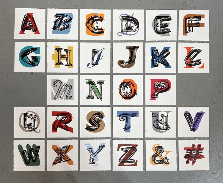
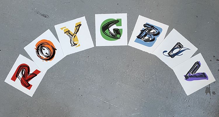
“I’ve always had a love of typography, typefaces and fonts. I’m fascinated by the personality in the design of each individual letter and the innate power of words” says Dave. As a professional artist, his main muse comes from the colourful optimism of vintage neon signs in the bright daylight, along with the shadows they cast. In this series, Dave wanted to distil these graphic letterforms into the striking simplicity of colour and shape alone. Each print is 8in x 8in and printed with oil-based ink on Rives BFK with hand-deckled edges in an open edition.
Blockforest: Drawlloween 2020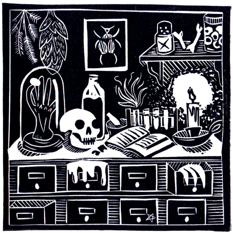
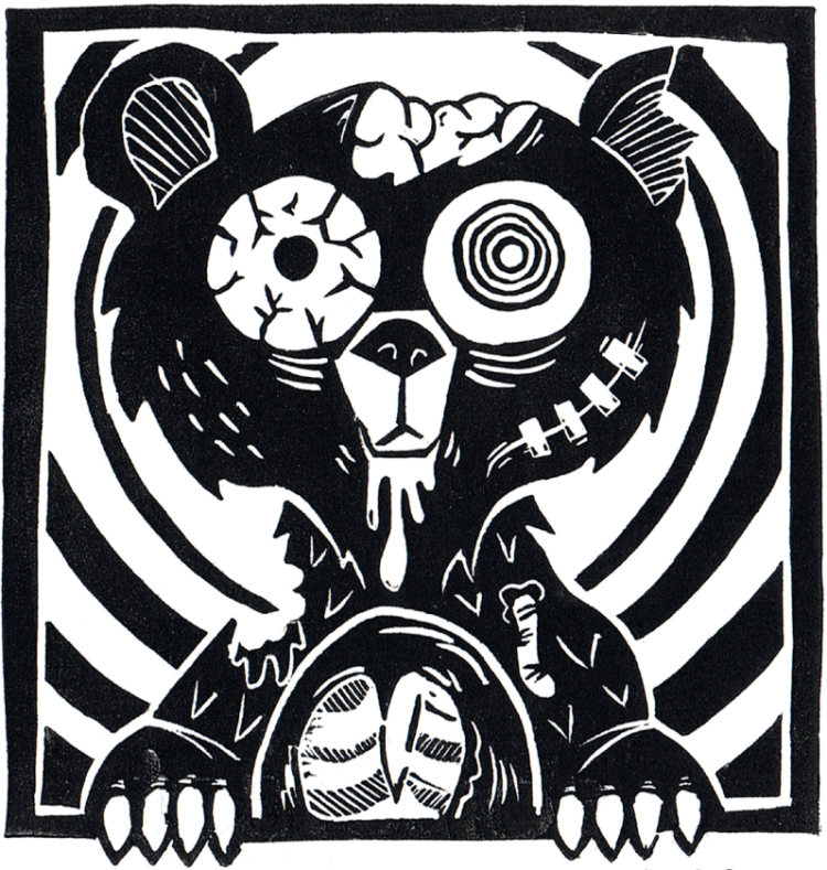
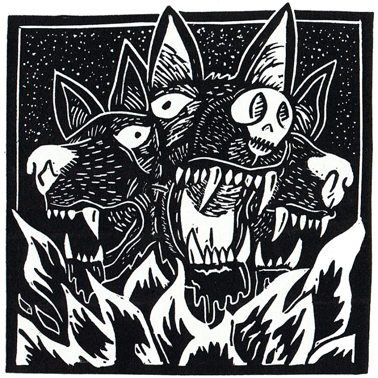 Blockforest recently completed their third year of Drawlloween; an Instagram art challenge based around spooky and seasonal prompt lists given by other artists. Being a linocut artist, that meant 31 linocut prints in 31 days which was no mean feat! “I find it an excellent opportunity to push myself to react to a daily prompt, creating each linocut piece from concept to execution in a 24 hour period. The pressure of hitting a daily deadline has created some really interesting results, with some of the complication from overthinking a design removed resulting in pieces that can feel a little more freeform and powerful in my opinion.”
Bronte Adam: Winter Wonderland Scene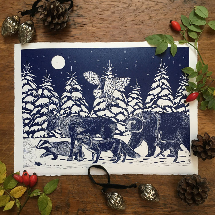
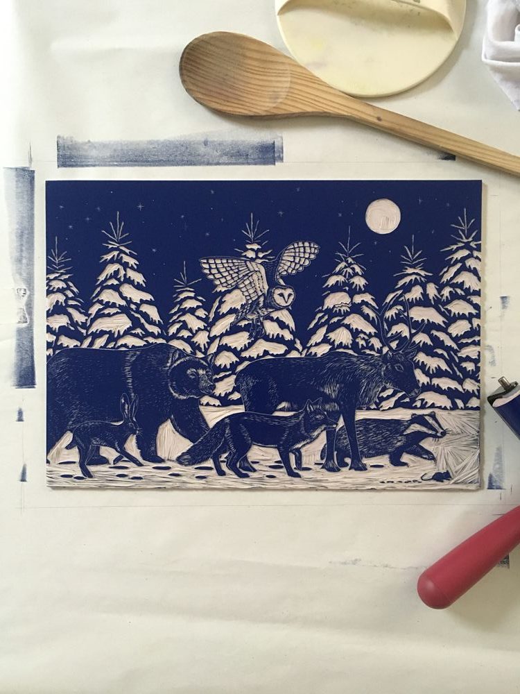
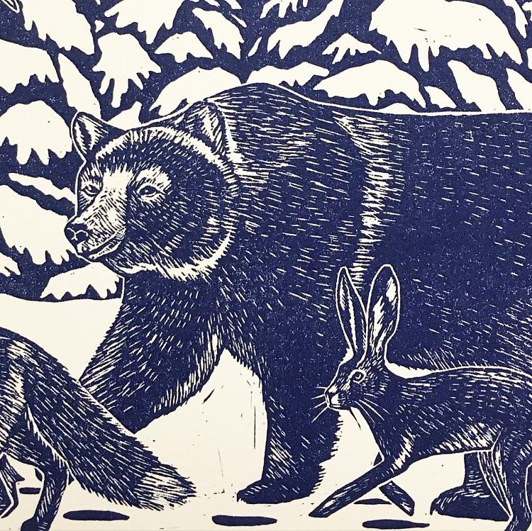 Printmaker Bronte Adam created this linocut print of a winter wonderland scene with animals travelling home for Christmas. “I wanted this print to give a sense of togetherness and hope for people when life feels so unsure at the moment” says Bronte. She often creates bold lino prints, so this was a rewarding challenge for the printmaker due to the fine details on each of the animals. “I particularly love how it looks like the light of the moon is reflecting on their hairs” states Bronte.
Letterpress PLAY: Posters for a Cause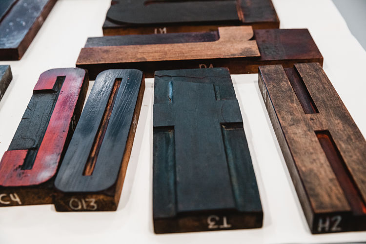
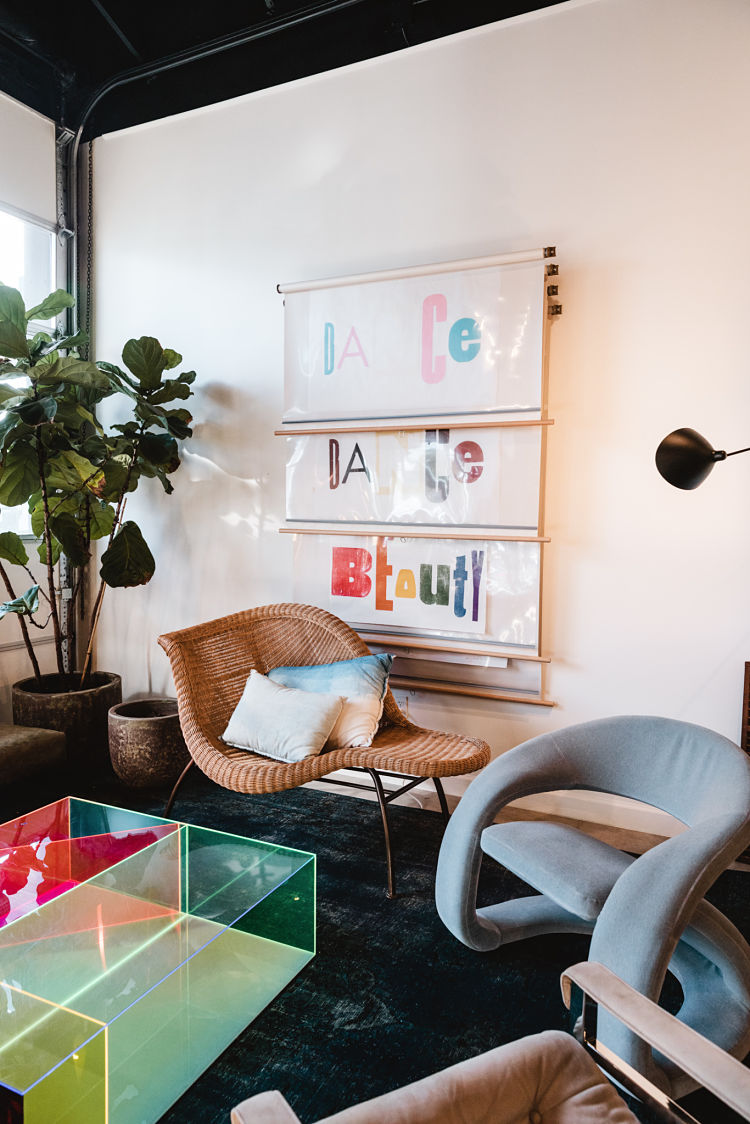
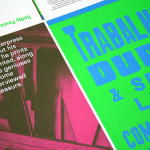
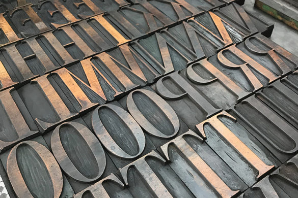
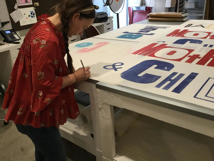 Letterpress PLAY’s Posters for a Cause are composed from their hearts and printed by their hands. Each poster is 38 W” x 25 H” and made using found wood type on Japanese Mulberry paper. 100% of profits from the sale of the posters go towards a charity that supports children, such as The Movemeant Foundation, Raices Texas, and Out Youth.
StfacatPrints: According to Maitre ES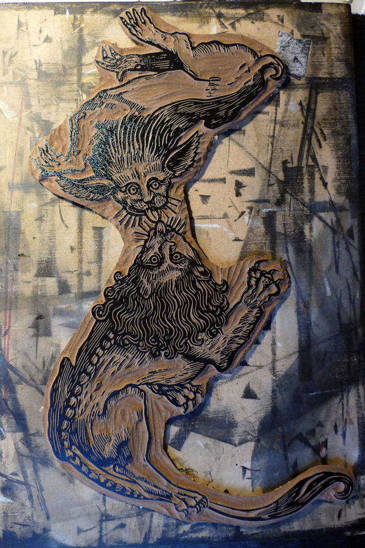
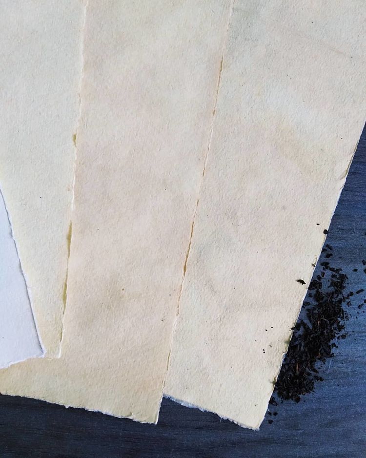
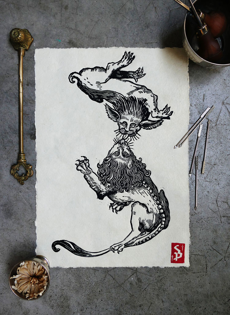 StfacatPrints’ latest linocut was made on DLW linoleum sheet with Pfiel tools. The piece is a reinterpretation of a burin engraving by Maitre ES, an anonymous late Gothic engraver from approx 1446. He produced an alphabet which includes 23 letters composed mainly of characters or animals, in postures espousing the outlines of the letters to form them. Stephanie’s engraving represents the letter Z and is printed in black Cranfield colour ink on a 120g cotton handmade paper that she dyed with tea. The tea tincture gives an aged appearance to the cotton paper, reinforcing the old side of the engraving, reminiscent of parchment.
SPIEGELSAAL: Block Prints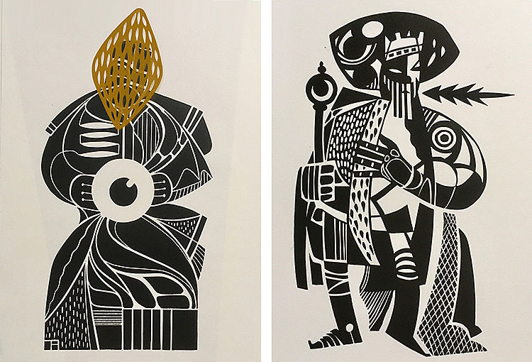
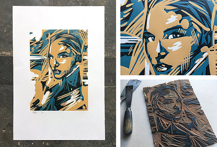
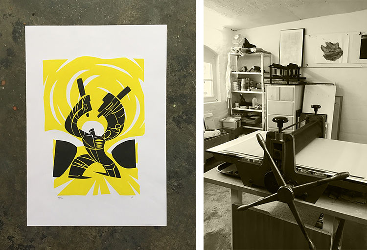 SPIEGELSAAL is a design and illustration studio based in Hamburg and Duesseldorf, Germany, founded by Torsten Jahnke and Jochen Mönig. While Torsten in Hamburg takes care of all screen printing matters, Jochen in Duesseldorf has discovered relief printing to explore the graphic world beyond. “Beside the sheer fun of printmaking there is no such thing as a big master plan, even though the style is derived from the experiences we have made in screen printing. The restriction to clear, simple forms and a very limited colour palette becomes a design principle” says Torsten. In addition to printing experiments and monoprints, small editions (up to 20 pcs.) are also produced which are often released on their online store.
Ridge + Roots: From the Ashes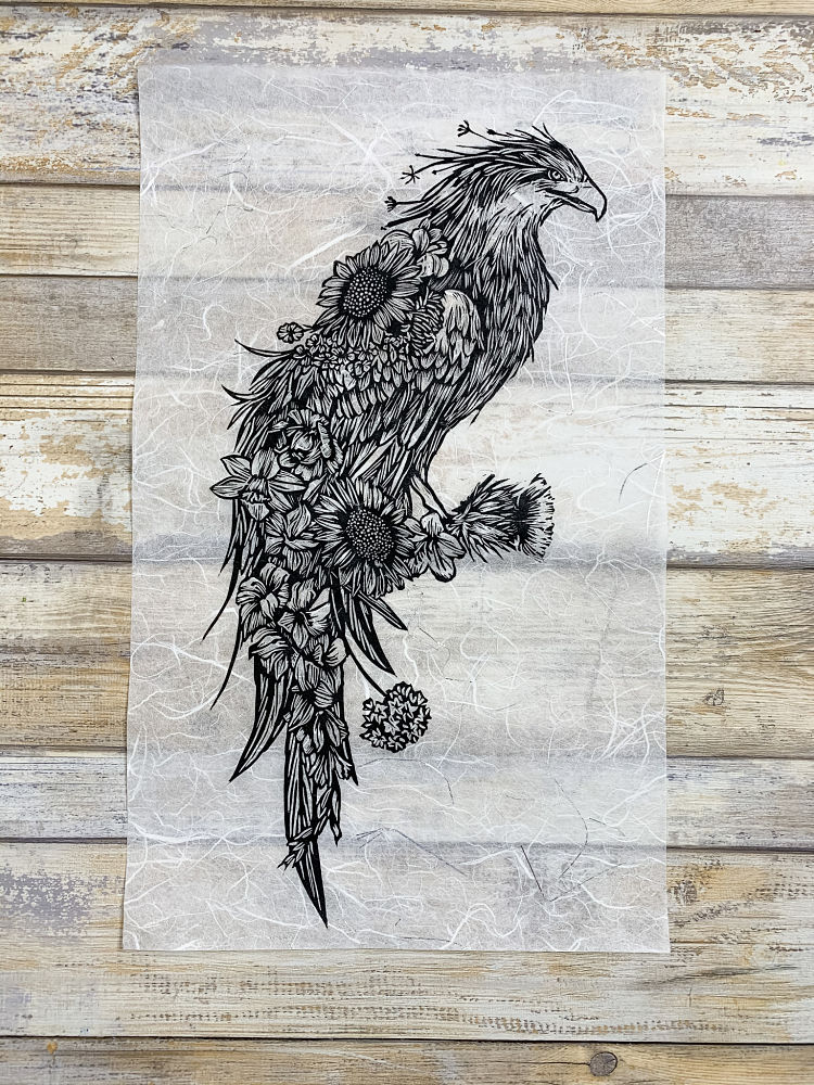
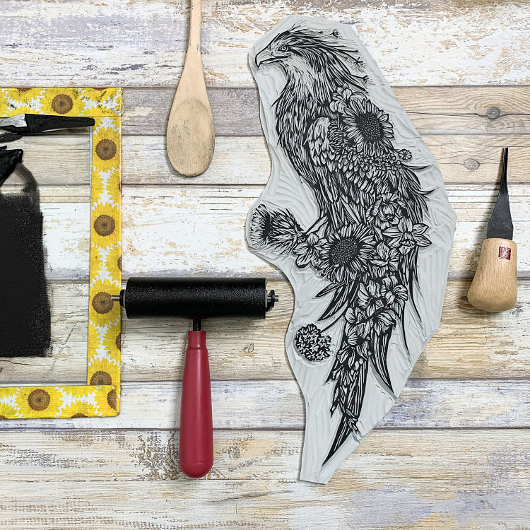
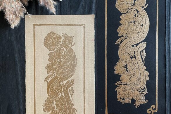
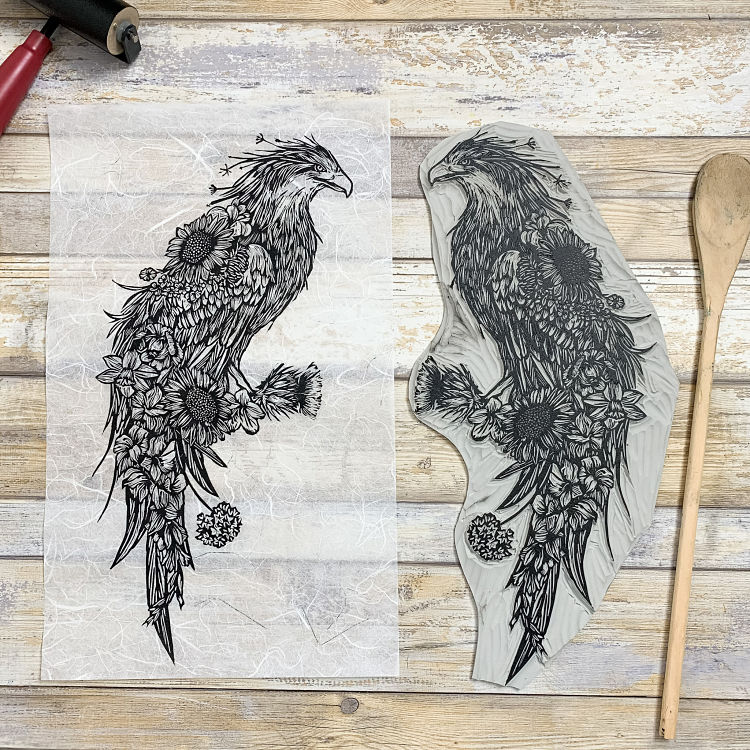 From the Ashes is an original linocut print depicting a phoenix by Ridge + Roots. Botanicals peek out from within the feathers of the phoenix, to represent symbols of strength, resilience, and growth. The phoenix was modelled from an eagle, a symbol of strength and freedom, as a reminder that though we may be faced with challenges throughout life, we are inherently stronger than we feel and there’s a sense of contentment on the other side of hardship. “2020 has been a year of uncertainty, fear, and struggle, and my hope is that this imagery embodies a symbol of hope and resilience as we travel through these unprecedented times” says the printmaker.
Sabine van Rooij: Flower Girl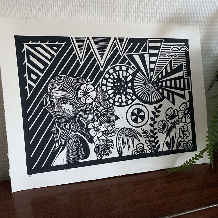
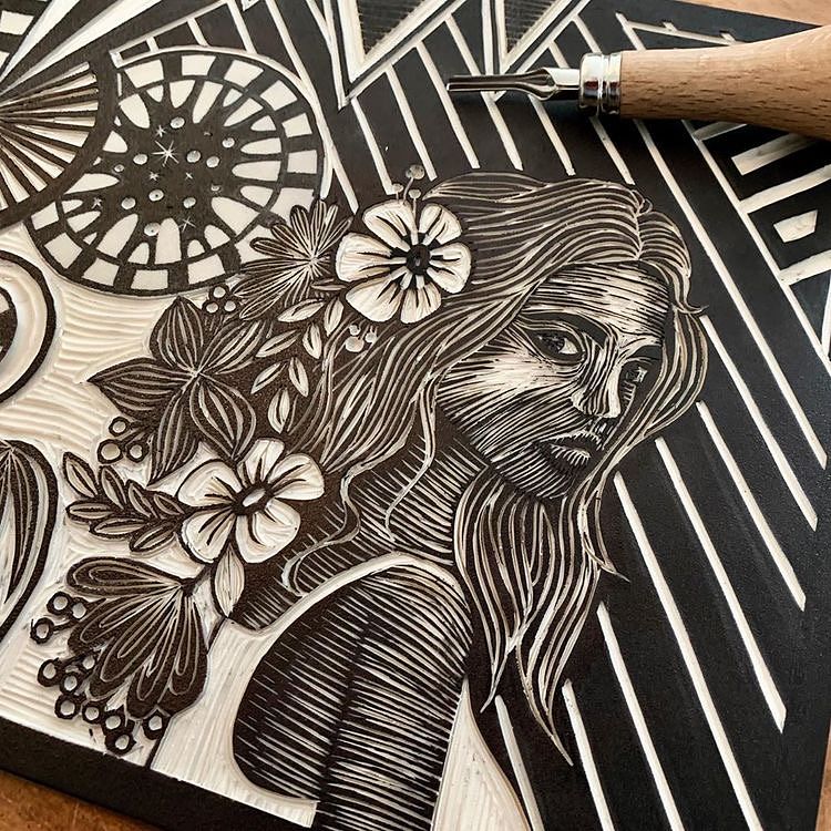
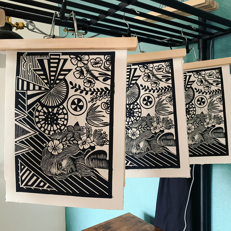 Almere-based Sabine van Rooij’s Flower Girl block print includes both geometric and natural, more flowing forms, creating a striking juxtaposition that is characteristic of her style as a printmaker. “I really like to combine clean lines and round shapes to create a more playful whole” describes Sabine.
(de)conceptualise: Giving Up Control 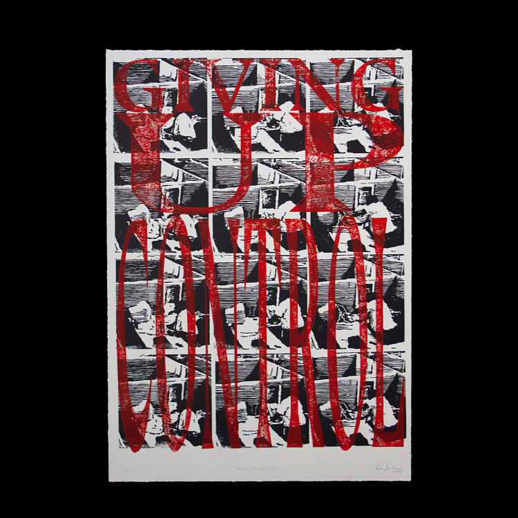
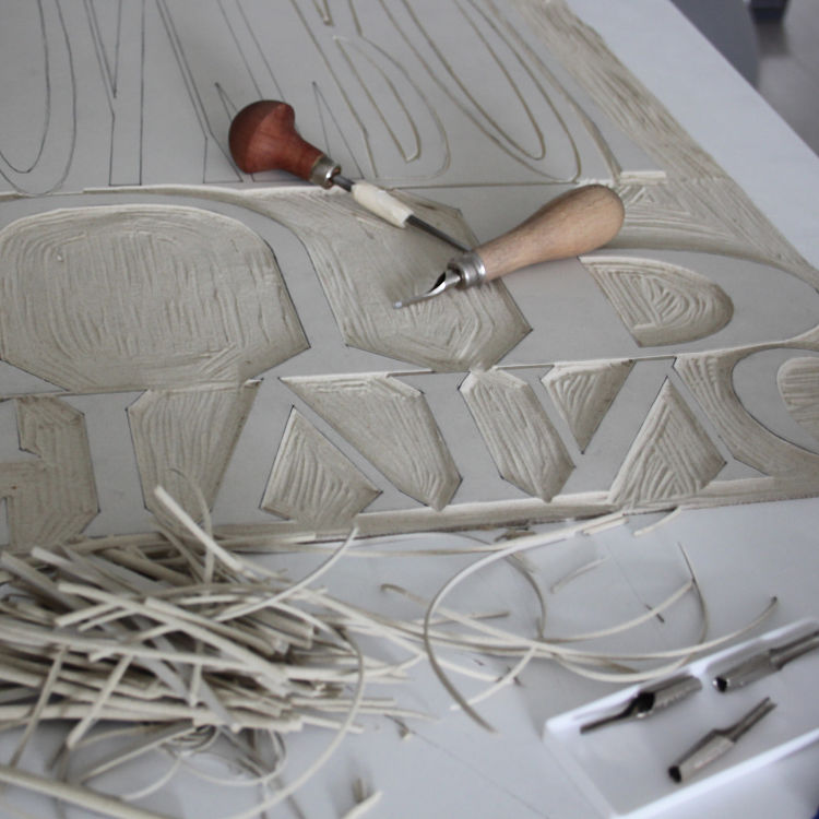
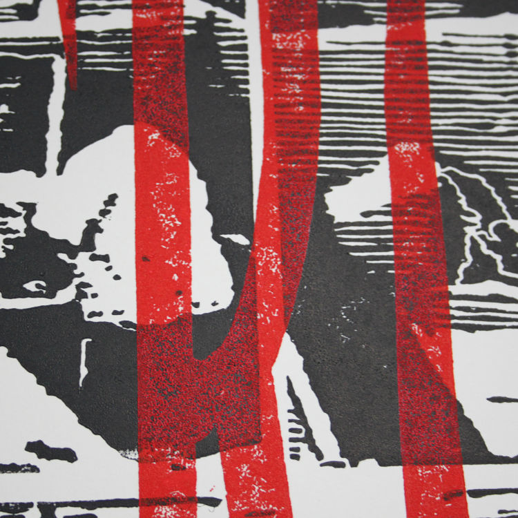 This 4 block print marks the beginning of (de)conceptualise’s second series: SUR(REAL): When the surreal is more real than reality itself, a series exploring the behaviours/events/things that look surreal because of how real they are. “This print was based on the idea of the exponential evolution of technology and living in a technocratic society where technology is more valued that the people that use it” explains the printmaker. Giving up Control portrays the idea that we are actively giving up control but becoming more aware, as well as the idea of repetition and how it is used by advertising.
Amy Rose Hey: Stonehenge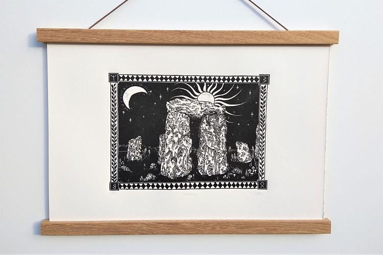
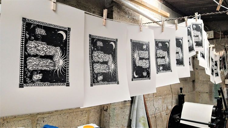
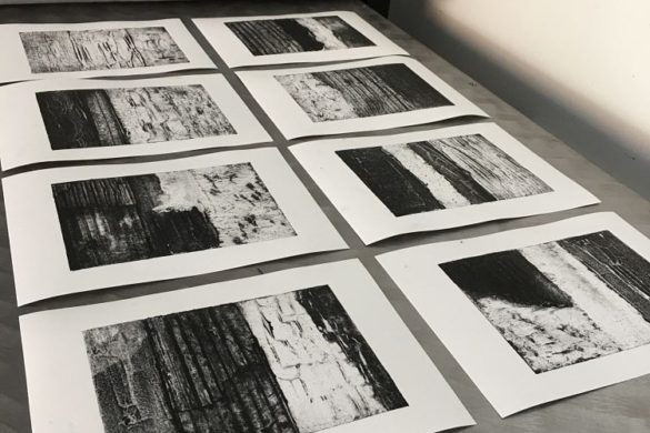
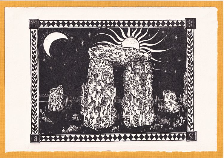 Stonehenge is the first print Amy Rose Hey made in a series of artworks inspired by Britain’s stone circles. To illustrate the curves, cracks and mossy textures of the stones she created a visual language of lines, swirls, hatching and repeated patterns. “I intentionally drew textures which look subtly like eyes staring from the rocks, to evoke the strong spiritual presence of sacred sites and their mysterious history” states Amy. The piece is printed in Cranfield carbon black traditional relief ink on cream Fabriano paper, and was pressed on an antique etching press.
Moatzart: A Terrestrial Paradise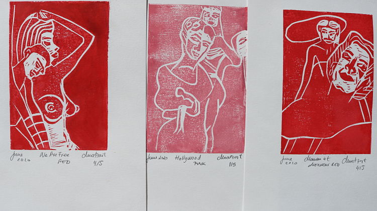
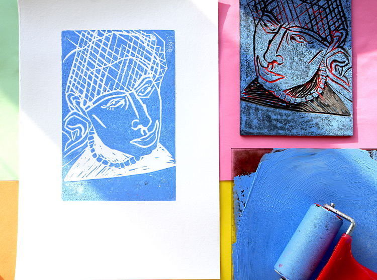
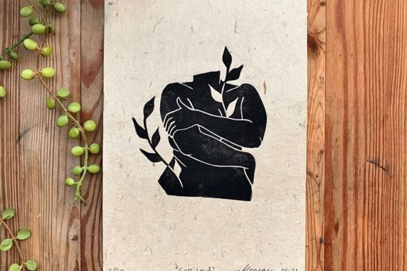
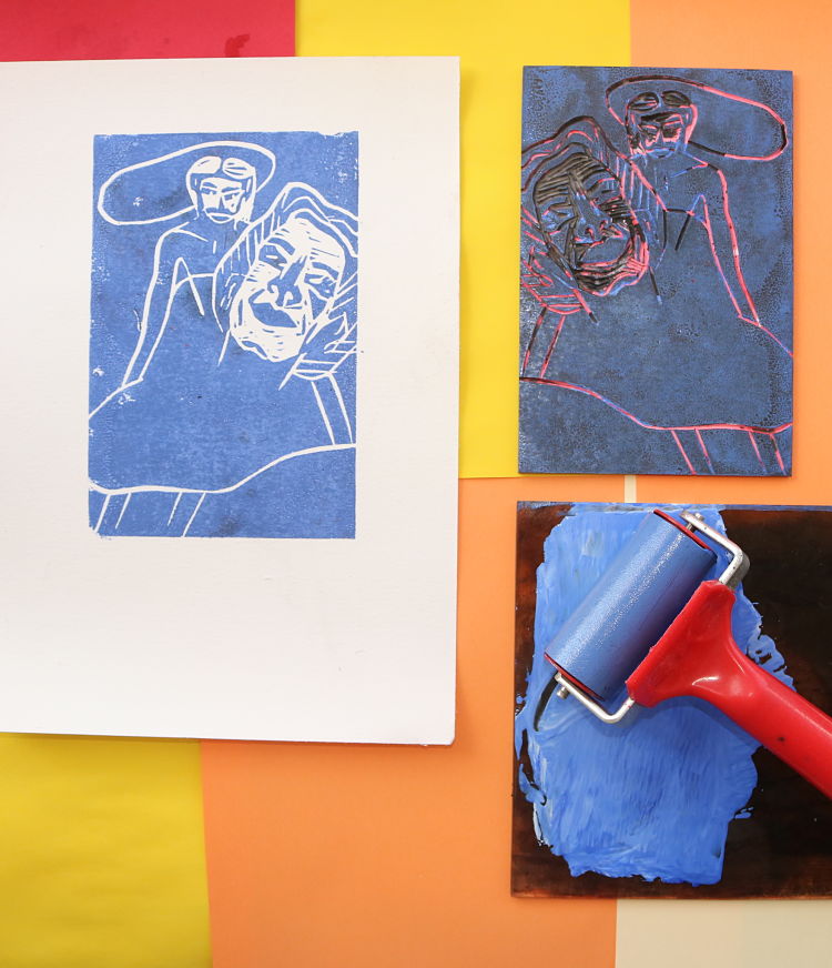 These linocut blocks by Moatzart form part of a series entitled A Terrestrial Paradise. The prints are modelled from a large collage which exclusively used the female form in order to investigate the strength that female characters can hold in art, which has historically not been the case.
EneArtworks: Cosmic Horror Dead Guys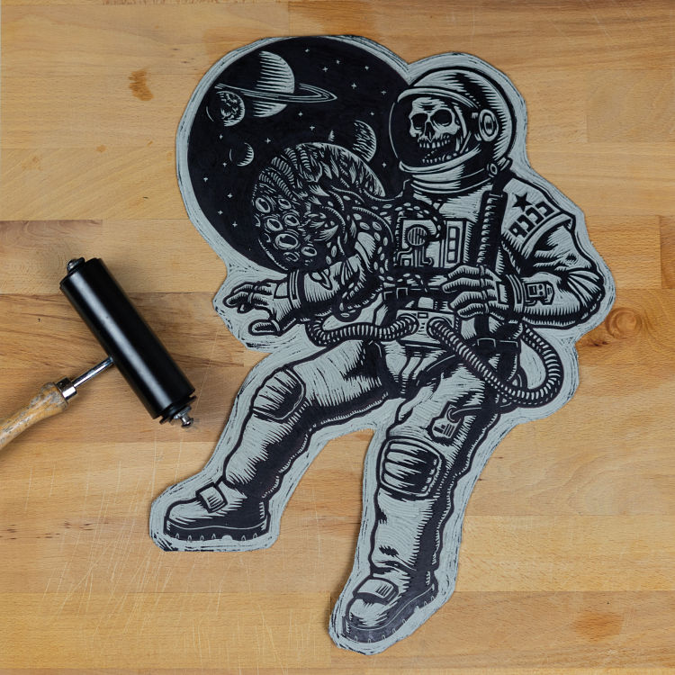
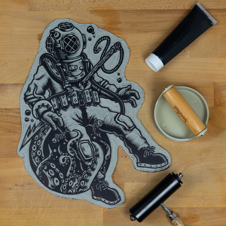
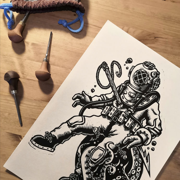 Enea’s favorite theme is horror, and with this project he decided to challenge himself by paying homage to cosmic (or Lovecraftian) horror. “Afterall, fear of the unknown is a feeling as primordial as it is hard for artists and illustrators who have tried to depict it” says the printmaker. Literature and cinema have imagined all sorts of weird and fantastic worlds, which Enea tried to condense all into two subjects inspired by the depths of space and the abyss of the ocean. “The death’s of these unfortunate guys is a warning to anyone who dare challenges forces too eldritch and incomprehensible to deal with” states Enea.
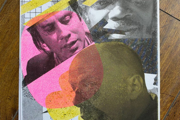
Céline Blanchard: Block Party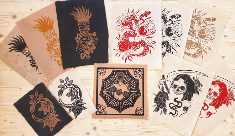
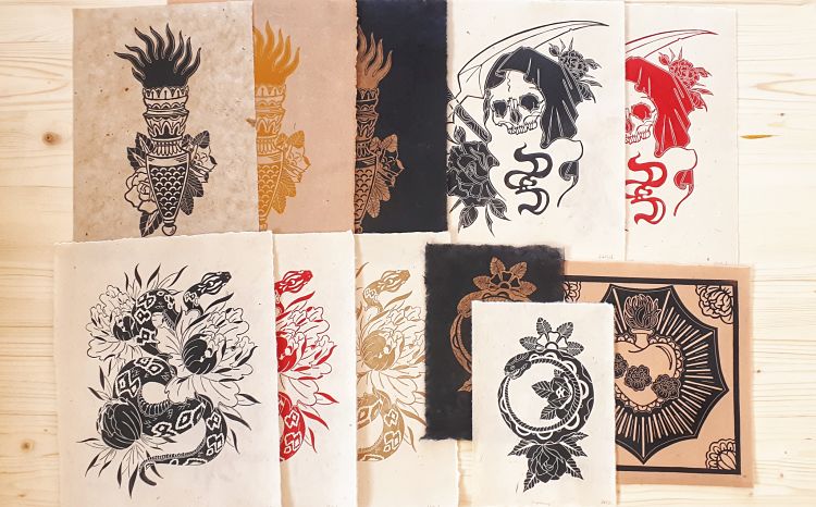
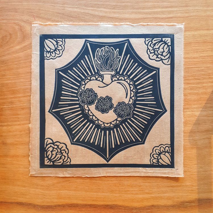 Celine recently participated in the Instagram Block Party challenge that ran between September and October created by Ridge + Roots. The challenge prompted printmakers to carve five blocks of linoleum or wood in five weeks. Each week, an optional theme was given, with themes including; community/connection, Harvest, Renewal/resilience, warmth and spooky/mystical. “This has been a fun and instructive experience, pushing the limits, struggling to create, organising each week, testing my press, the new handmade paper received, playing with inks… I Loved it” states Celine.
Blue Chisel Studio: Deep and Solemn Silence, Virginia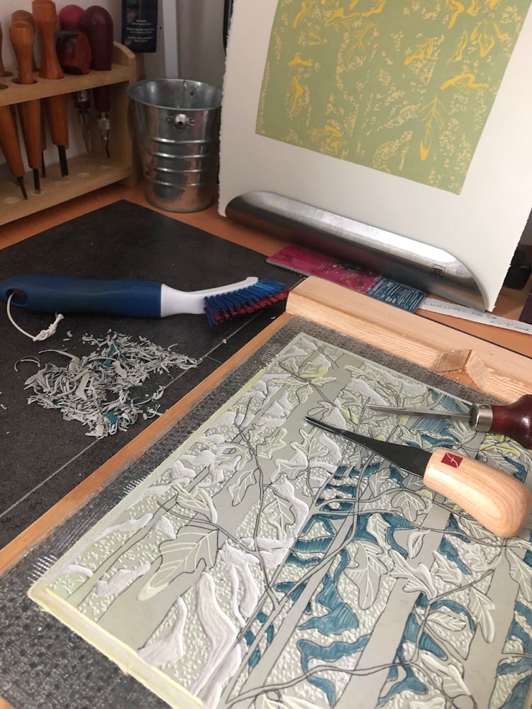
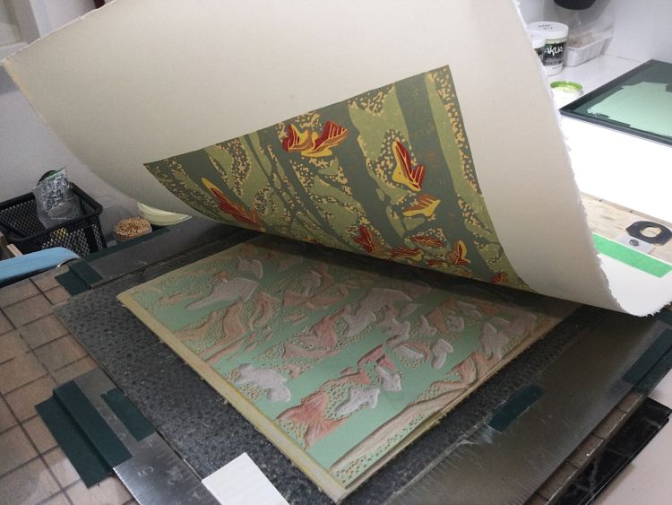
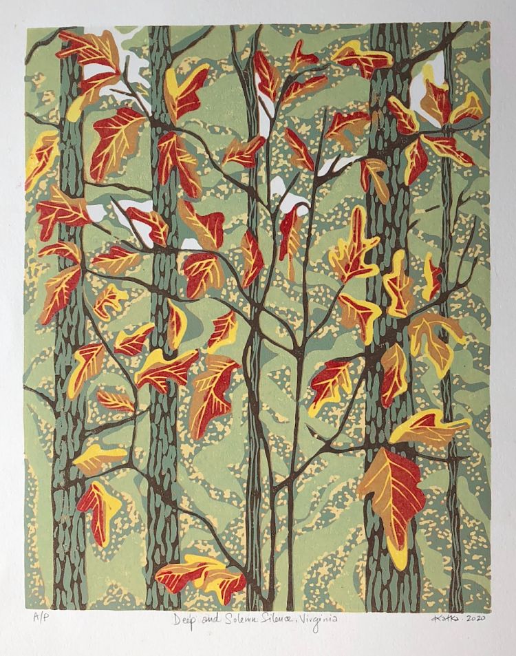 Deep and Solemn Silence, Virginia is a reduction linoleum print by Canadian printmaker Kat Goetz of Blue Chisel Studio. The 9-colour piece was printed from a single block, and was inspired by the beautiful and silent fall landscape in Virginia, US.
Amy Cundall: Octopus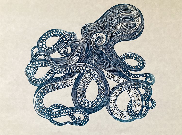
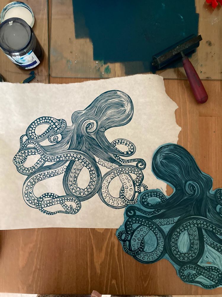
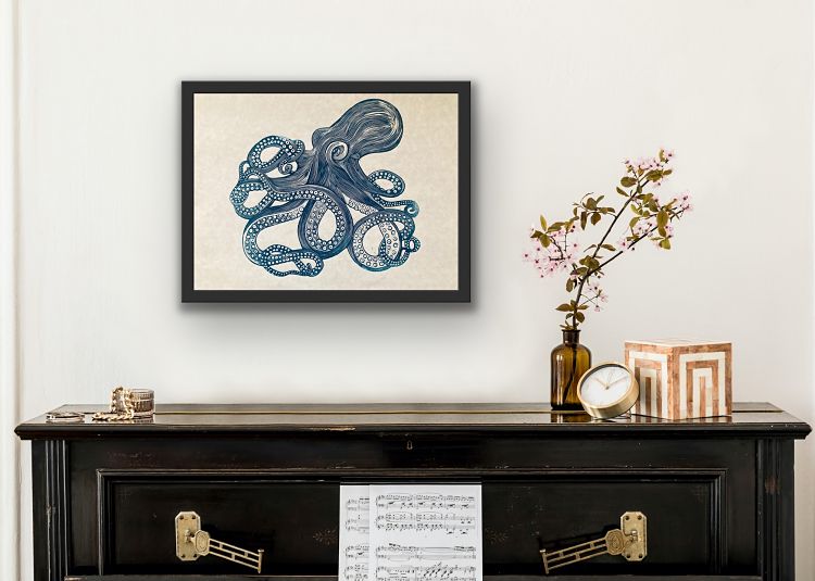 Amy Cundall’s latest linocut piece is entitled Octopus. The print is typical of her aesthetic which draws inspiration from Victorian engravings. Amy hand-printed the block onto Japanese Sumi-e paper using a mix of lovely green and blue hues with traditional oil based ink.
Chrissy Emmerson: 51 Days of Lockdown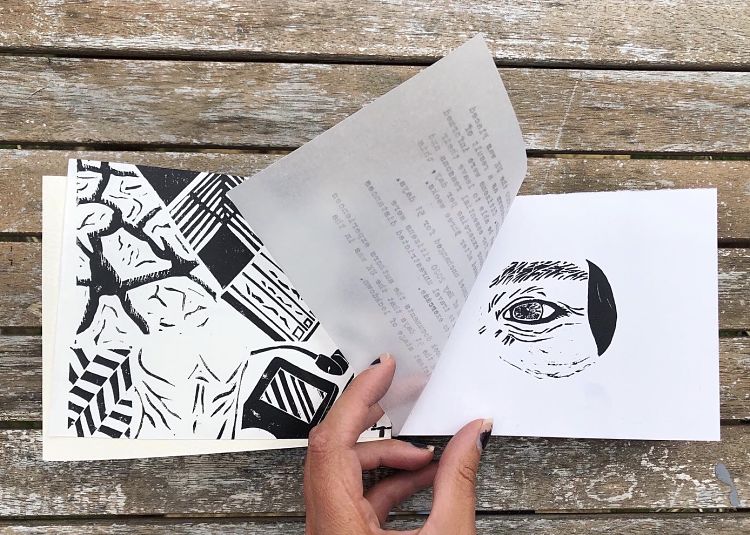
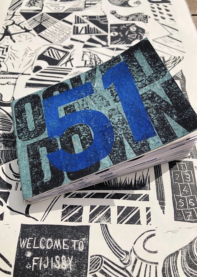
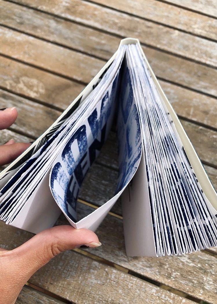 This project is a result of the UK’s firsts Covid lockdown. 51 Days of Lockdown is a block print book and accompanying poster that documents Chrissy Emmerson’s daily experiences living alone for the strictest section of a national lockdown. A print representing each day has been bound by hand into this book, created out of lino offcuts and paper supplies found in her home studio. “Having now relocated to Cornwall with my partner this new lockdown the UK is now facing looks to provide some very different experiences, so I am intrigued to see what I produce during these new restricted times” states Chrissy.
Our membership community celebrates printmaking both industriously and creatively. Check out all of our members’ profiles and apply to become a Verified POP Member at www.members.peopleofprint.com.
You might like...
- Enea Seregni | MONSTERS! Collectible Cards - April 19, 2024
- Mark Frendo | Danger UXARD - April 18, 2024
- Sue Lewry | The Creative Cycle - April 17, 2024
