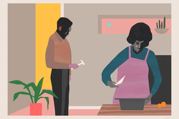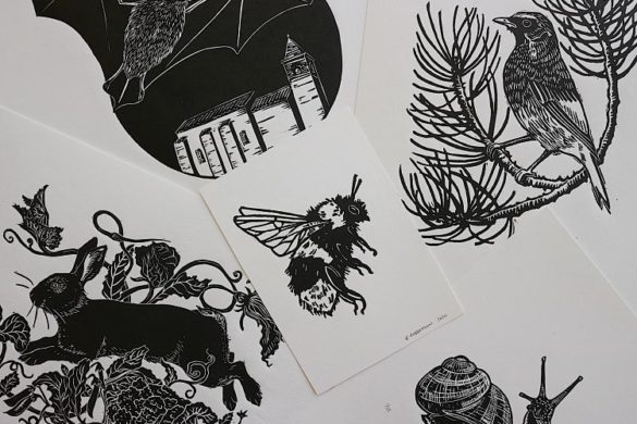
This month we’re excited to present a series of relief print projects from the talented members of our community. From woodcut, to linocut and 11-layered reduction prints, our members have used a wide variety of relief printing methods to bring their designs to life.
Neu Haus Press: Neu Haus Press & Laser Relief Print Collab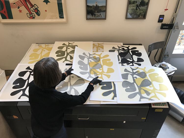
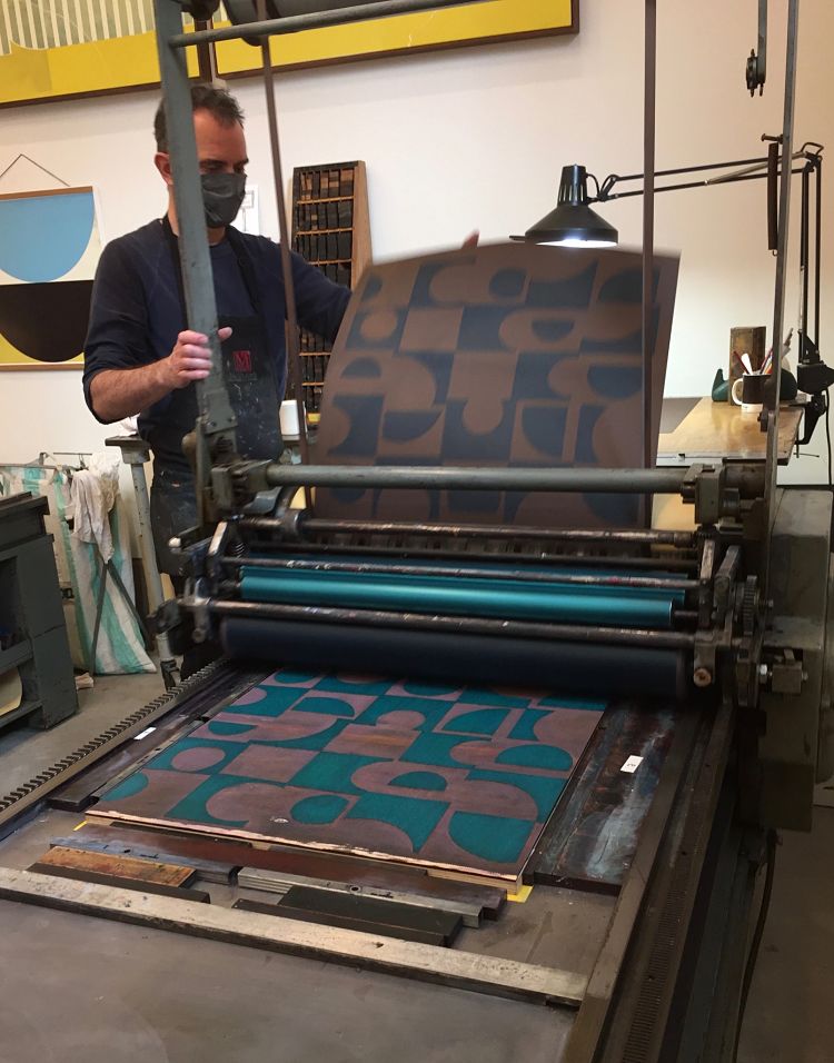
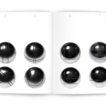
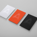
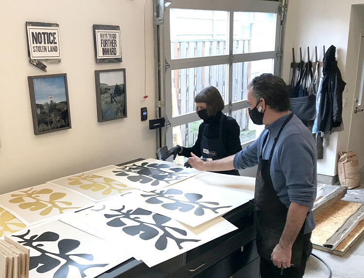 This past year Neu Haus Press have gained the capability to create their own laser engraved woodblocks in their studio; a new tool which has opened up opportunities to produce large scale wood blocks for their Vandercook 232P, both for their own work and artist collaborations. To start off 2021, they worked with MonicaArts Design for her Bauhaus Design Series thus far consisting of Bauhaus Botanical and Bauhaus Circle-Square. Monica created original designs which were then engraved by their large laser cutter on birch ply, sanded, shellacked and built-up to type high on a birch base to be printed on their large Vandercook proofing press.
Christy Powell: Floating Boats & Dragons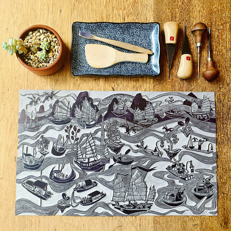
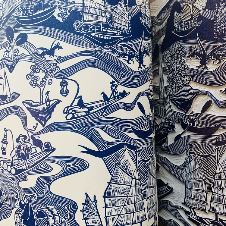
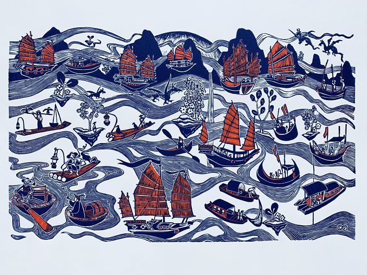 Christy Powell was asked by Broken Pencil Magazine, a Canadian mega-zine that focuses on independent indie arts, to participate in Canzine 2020 (a festival of zine culture and underground print). For the first time Canzine was to be featured on a virtual platform, and Christy was tasked with submitting an illustration for one of the landing pages. The requirements were to provide an artwork that would be placed in an area called “Shippers Sail” and to contain 21 individual elements that would be used as a clickable button for navigation to other pages within the festival. In keeping with her own style of artwork, Christy used linocut and produced a relief print with 21 individual boats/ships/junks in keeping with a ‘sailing’ theme, and interconnected them with floating mist and mountains. The piece was printed in Phthalo Blue ink, with red hand painted later to make each boat distinct.
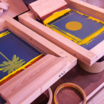
Stellabox: Carving a Piece of Norwich History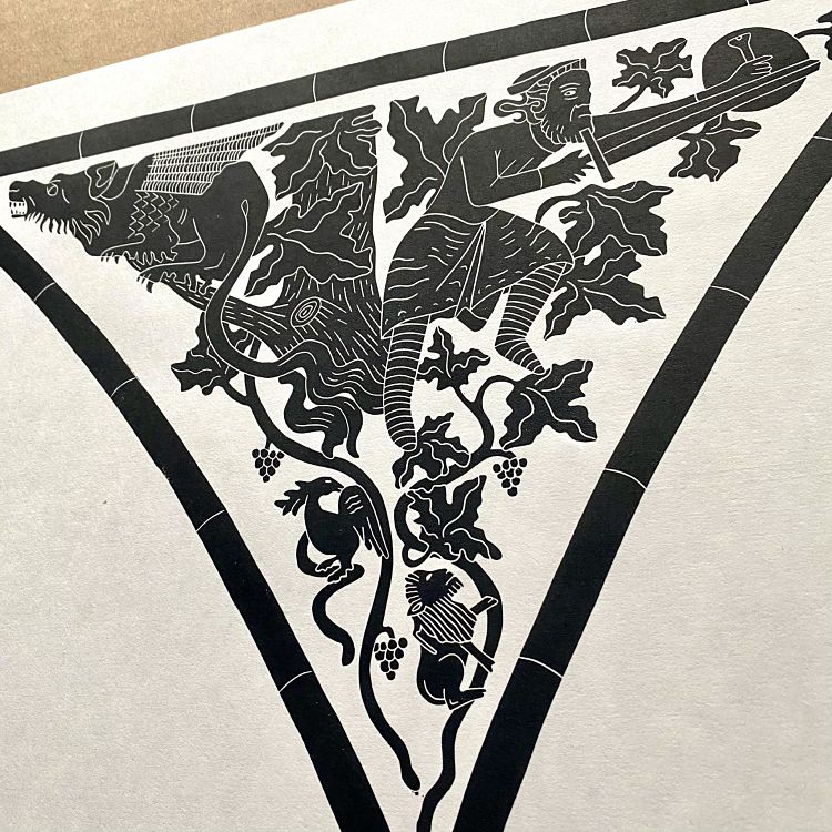
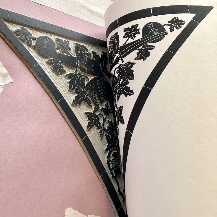
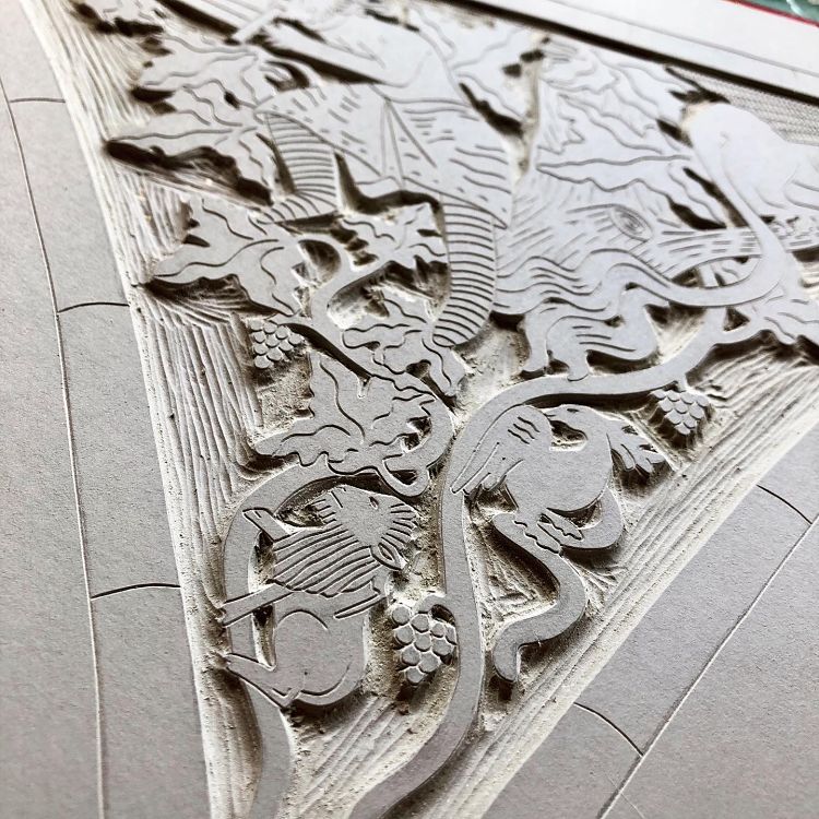 St. Ethelbert’s Gate is an A3 linocut print based upon the archway motif at the entrance to Norwich Cathedral in Norfolk, close to where Haychley Webb of Stellabox is based. The inked up block was printed onto Japanese HoSho paper using her trusty wooden spoon, with the dark grey colour paying homage to the original stonework. The design also features a small lion and a phoenix in the tree branches beneath a sword-wielding knight and a fierce dragon. “The original archway has these two main characters facing each other but I felt it created a more playful note having them back to back as if to say he’s behind you!” says Haychley.
Alexis Nutini: Harmonograph Optics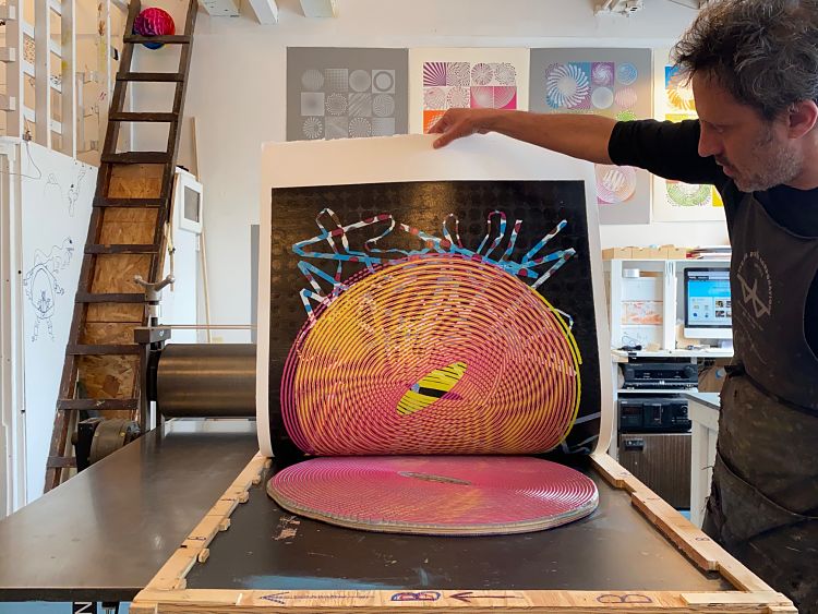
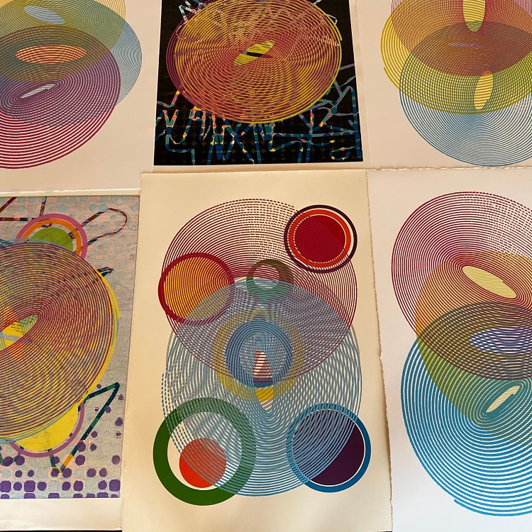
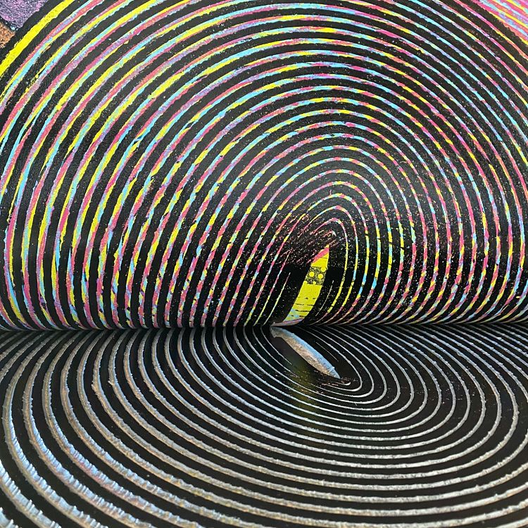 The concentric spirals for this series of woodcut monoprints were generated using a harmonograph drawing apparatus. This tool employs pendulums to create a geometric image as it swings and looses momentum. With it, Alexis Nutini made freeform drawings focusing on concentric ovals, using different markers to achieve a range of line weights. The drawings were then digitised and milled into woodcuts with a CNC router. By overlapping the spirals, changing colours and printing order, Alexis was able to generate moire effects and unexpected optical results.
Dave Lefner: The Music Goes Round and Round… (Treble Clef)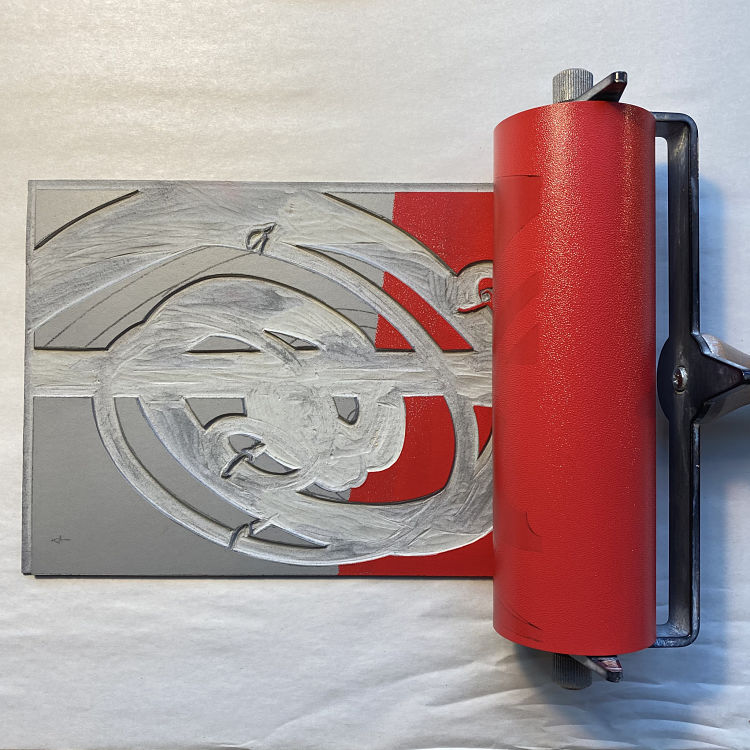
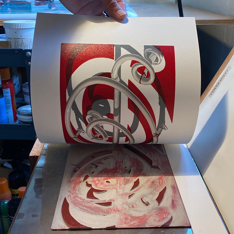
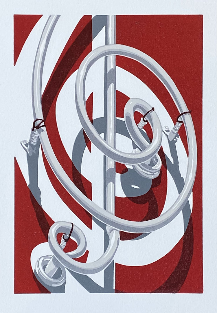 Linocut printmaker Dave Lefner was honoured to be asked by Alice Clarke, creator of the IG Printmakers’ Showcase, im_printed, to be part of a 2021 print exchange with the open-theme of “Circle”. Dave’s entry was The music goes round and round… (Treble clef), a reduction linocut in 7 colour stages, printed in a limited edition of 12 on A4 paper.
EneArtworks: The ‘Black and White’ Out of Space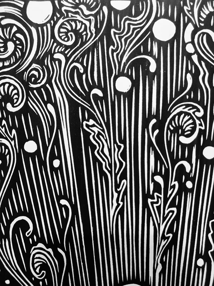
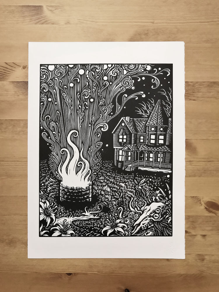
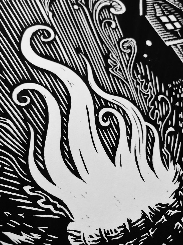 Enea Seregni specialises in the creation of horror-themed linocuts. Over time this has led him to illustrate horror literature classics, such as the novels of H.P Lovecraft. In this latest effort, Enea returns to the theme of cosmic horror with a print dedicated to The Color Out of Space. In the piece, he questions whether “it is possible to convey the idea of a weird, iridescent substance from another planet by working only in black and white”. He does this by focusing solely on the eldritch and strange shapes coming from the miasma of the well, looking at the effect they cause on the surrounding environment.
Stfacatprints: Magic Castle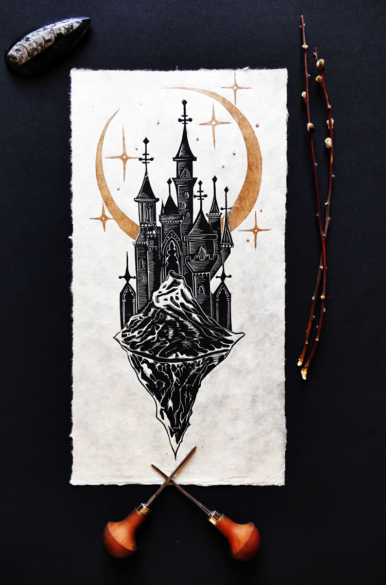
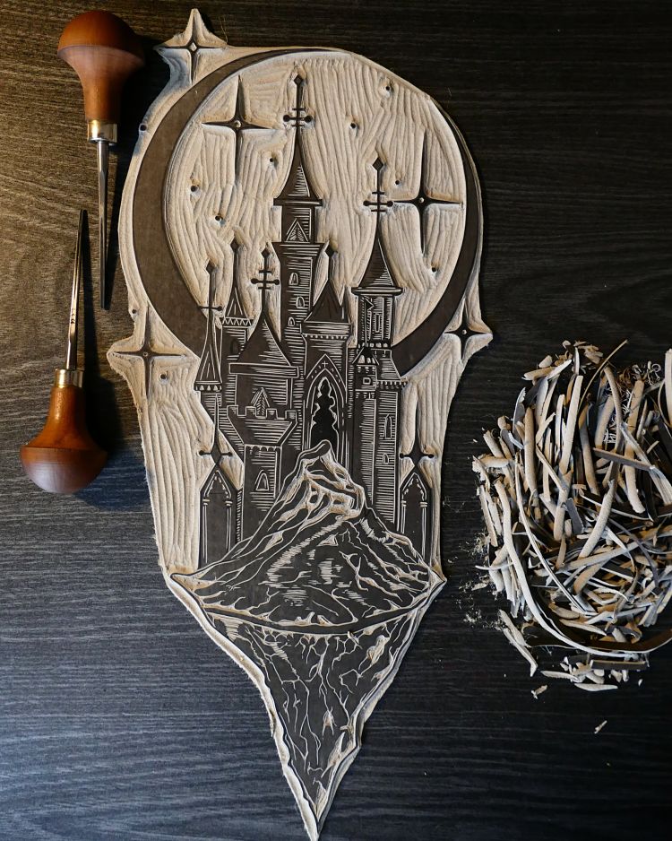
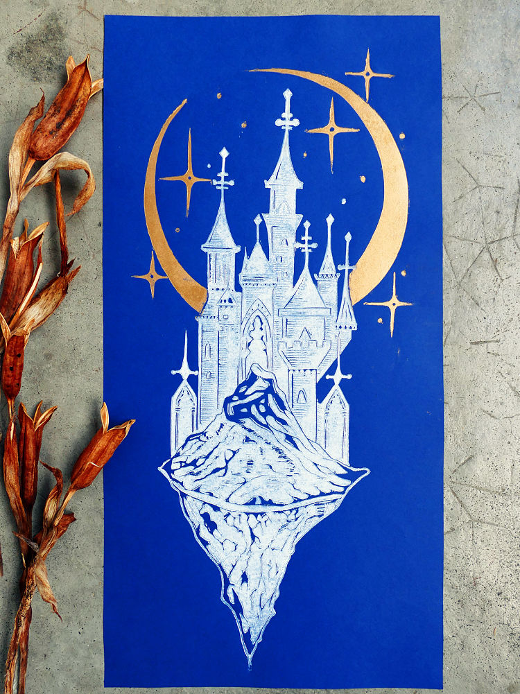 Magic Castle is one of Stfacatprints’ latest linocuts which was printed in 2 colours; black and gold, on a natural Lokta paper in 20X40 format. Inspired by medieval and fantastic castles, the castle featured floats in the air on its rock, thus approaching the moon. “This engraving is an invitation to dream and to escape from this world which has become so complex but there is still hope” says the printmaker. She also printed it in white and gold on ultramarine blue paper.
Margaret Mallows: Winter Shadows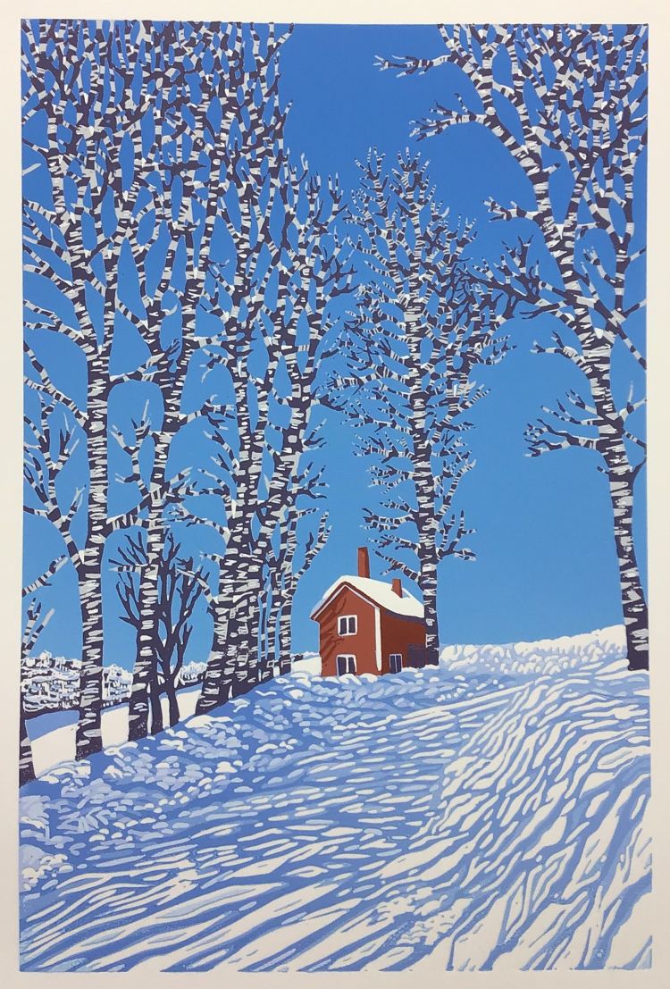
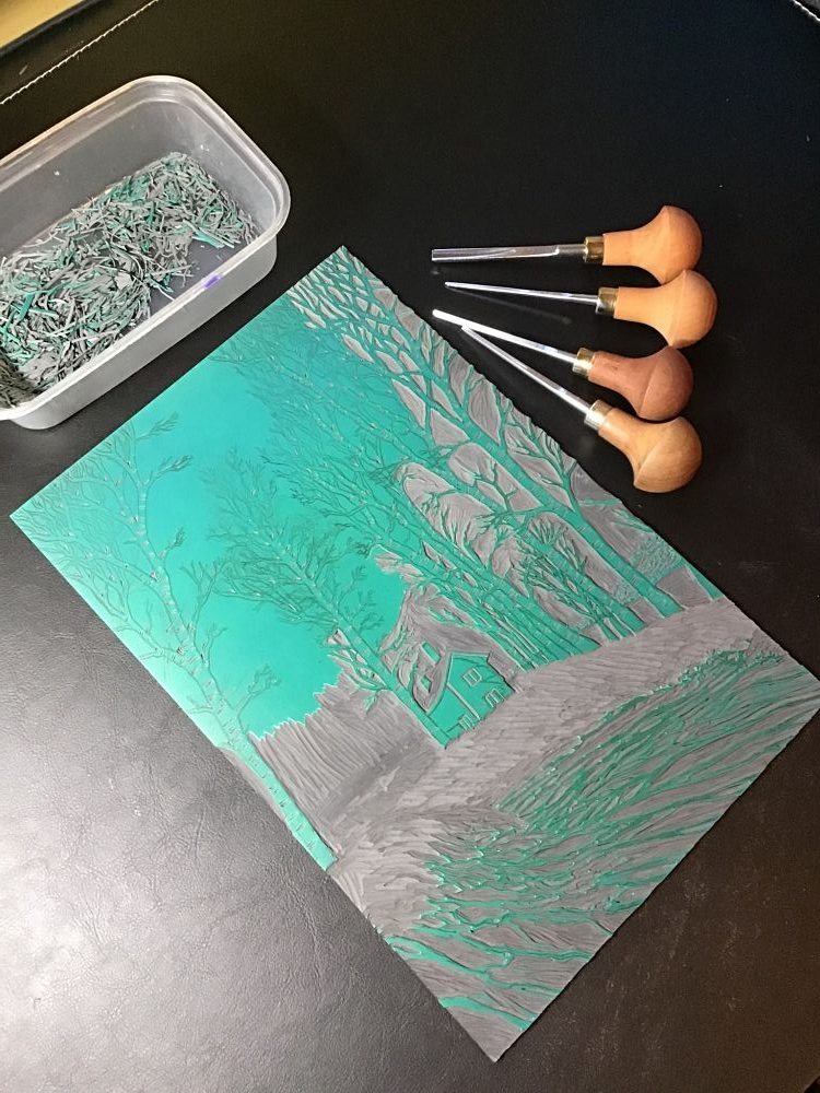
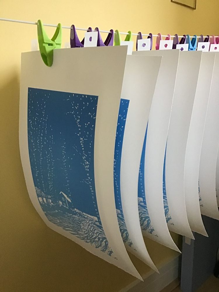 Winter Shadows was inspired by photographs of Finland, taken by Margaret Mallow’s daughter. The piece is an 11 colour reduction print, using just one piece of lino for the entire print. After drawing the print onto lino, Margaret first cut away all areas to remain white, then rainbow rolled the sky colour. After cutting away areas of sky she started adding more layers, carving areas to remain after each printing. Once all the blues were added to the print, the last layers were printed for the cabin, and finally the dark colour on the trees.
Emil Underbjerg: Spirit War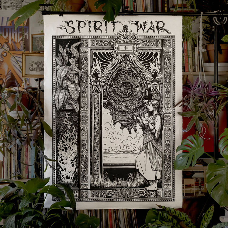
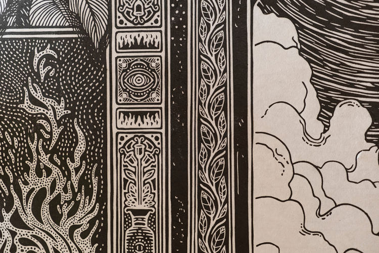
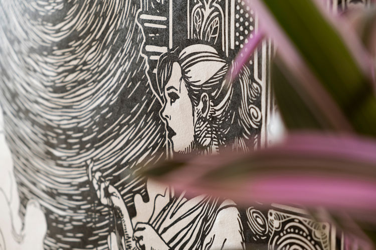 Spirit War is the culmination of almost 200 hours of work spread out over the last 2 years. It is the largest and most challenging linocut print Emil Underbjerg has ever made. Measuring 100x140cm, Emil printed it entirely by hand with just a bone folder. “The process of making this piece has been transformative for me, letting myself make this, without listening to my fears, has been such a great learning experience and has given me the courage to continue explore and to push myself and my art even further,” says the printmaker.
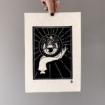
L’Empressée: Going Back To It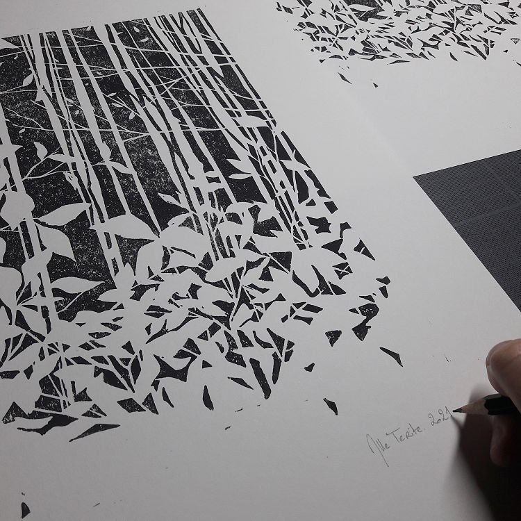
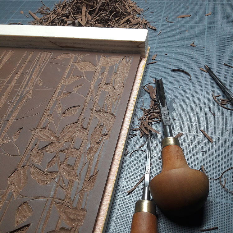
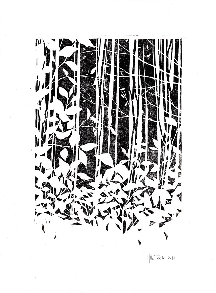 Through her work, Mlle Terite plunges the viewer into a dark and poetic universe where nature regains its rights and redefines its relationship with humans. Recently, Mlle has been developing a polymorphous artistic practice combining drawing, painting, wall sculpture, and installation. She hadn’t practised linocut in a long time and accepted the challenge for her first collaboration with the print-focused gallery, L’Empressée. Mlle states; “For this project I wanted to focus on the empty space becoming the subject of the artwork”.
www.en.lempressee.com/mlle-terite
Shelly Brown: Love Is All Around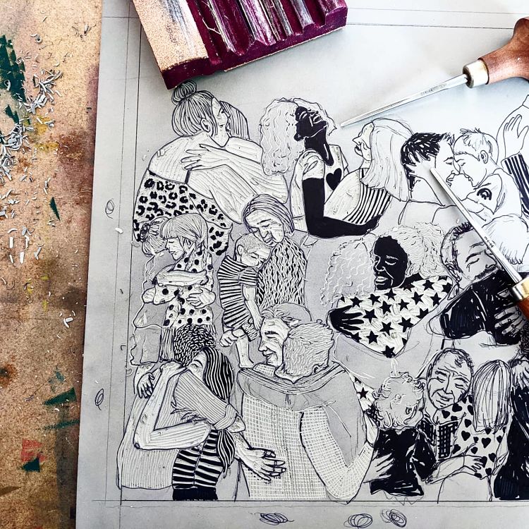
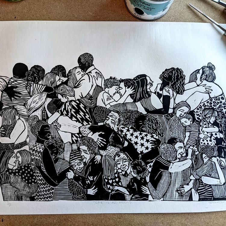
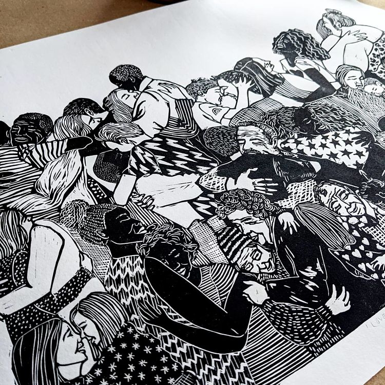 Love Is All Around was inspired by the opening (and closing) scene of love actually, where people are waiting at the airport for their loved ones to walk through arrivals. “That scene gets me every time… Maybe because my family are all over the world and that is a reality I have seen so many times . the huge emotional embrace when you finally have them within reach,” says Shelly. The linocut print is all about the joy to come after Covid; the embraces, the love, and the relief.
www.shellybrownillustration.com
Emily Woolford: Mary Shelley
 Emily Woolford is a printmaker who is heavily inspired by literature and the Gothic. For this abstracted linocut of Mary Shelley, Emily spent some time exploring paintings of writers from the Victorian era, and was interested in how dark the clothing and backgrounds were in comparison to their skin. Emily often includes text in her work as she is passionate about letterpress and language, once again reflecting her love of books.
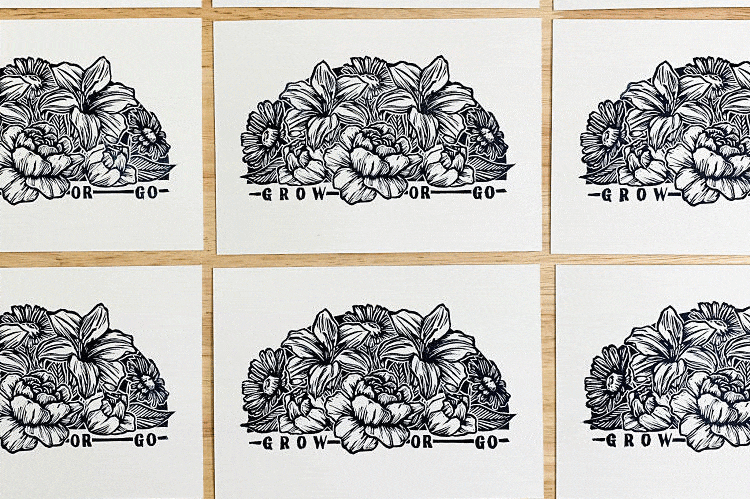
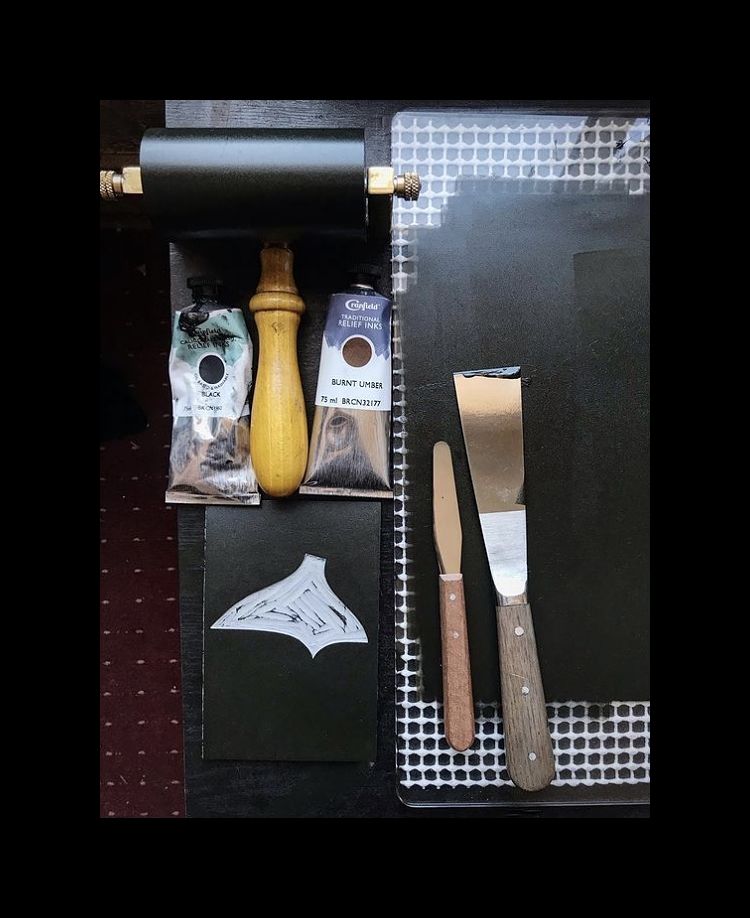
Ridge + Roots: Grow or Go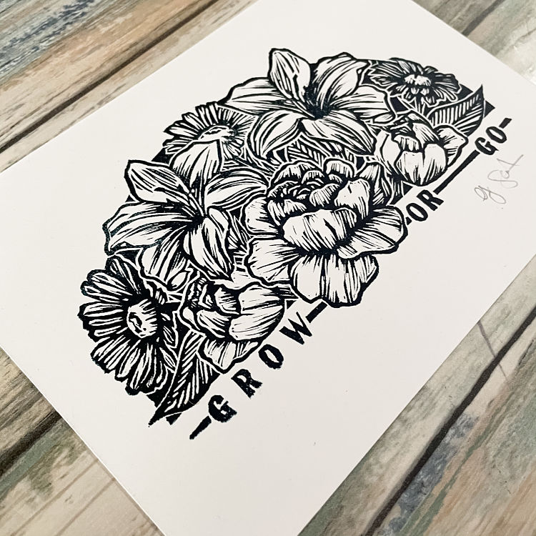
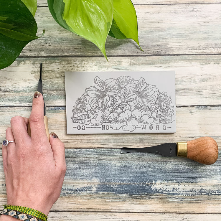
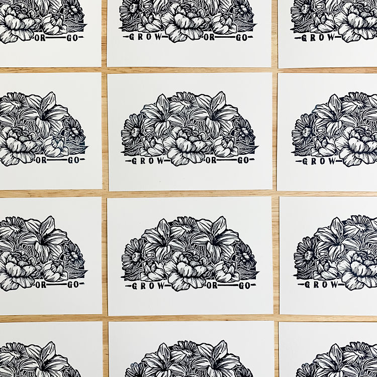 Grow or Go was created during the Relief Conspiracy print exchange with 376 printmakers across 26 countries and 5 continents. The concept was inspired by two trusted colleagues who would often say, “Grow or go” (with a shoulder shrug) in response to many events in life. The matter-of-fact response typically prompted reflection; “the idea being that we should always be surrounded by people and experiences that encourage and support our growth. If not, well, I suppose the answer is quite simple,” says Gina. This relief print was created as a message of encouragement to make decisions that support growth, instead of fitting into places you have outgrown just because it’s comfortable.
Melanie Wickham: Hedge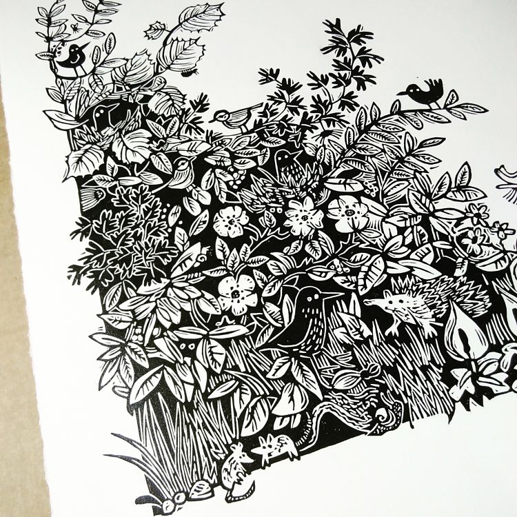
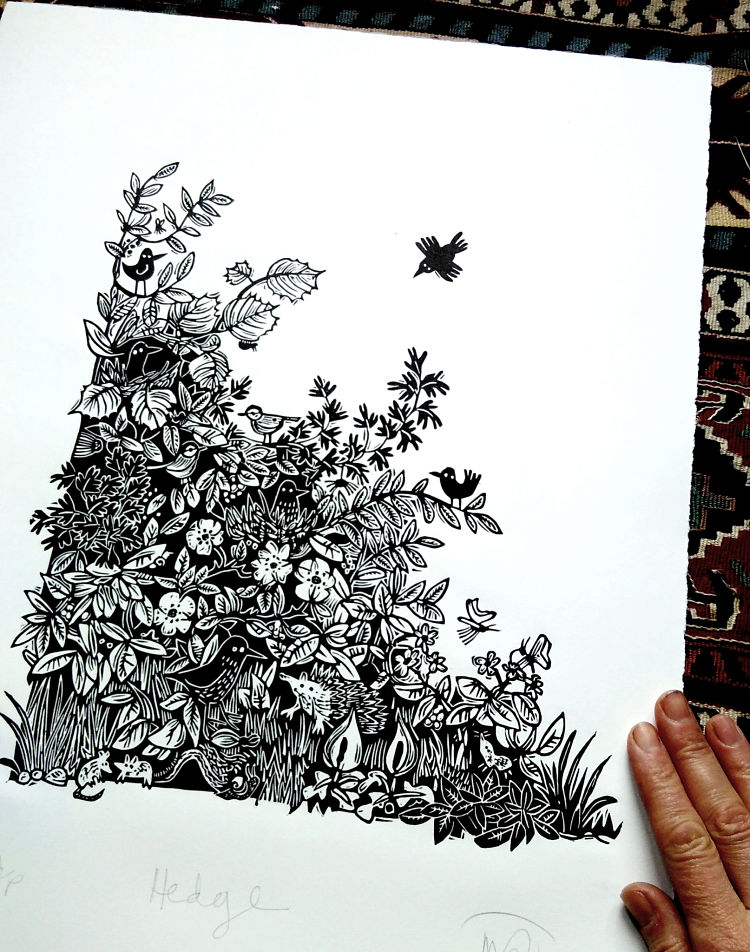
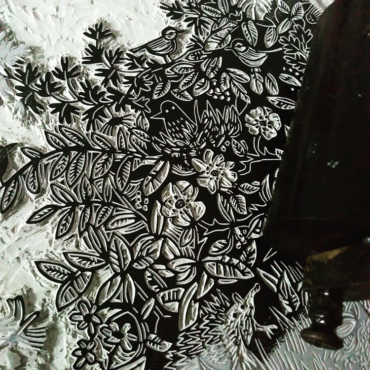 When creating Hedge, Melanie Wickham challenged herself to avoid a focal point (like a real bustling hedgerow), so that the viewers’ eye has to travel around the image and discover all of the different animals and plants within the image. The piece size is 31 cm x 27 cm in size and was hand burnished onto Somerset Satin paper.
Blockforest: Spirit Guides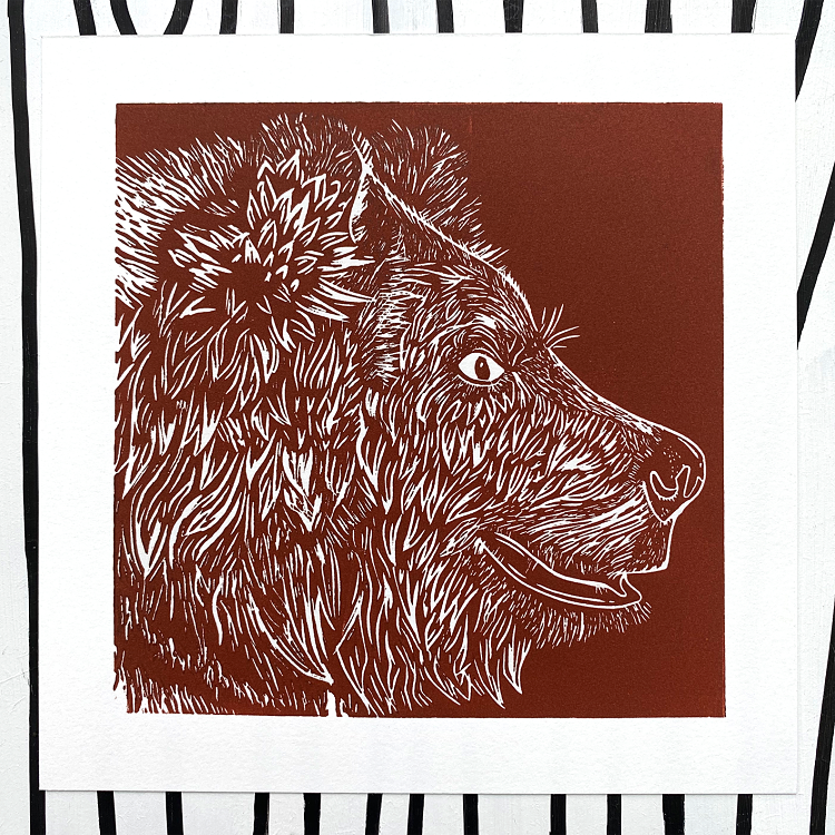
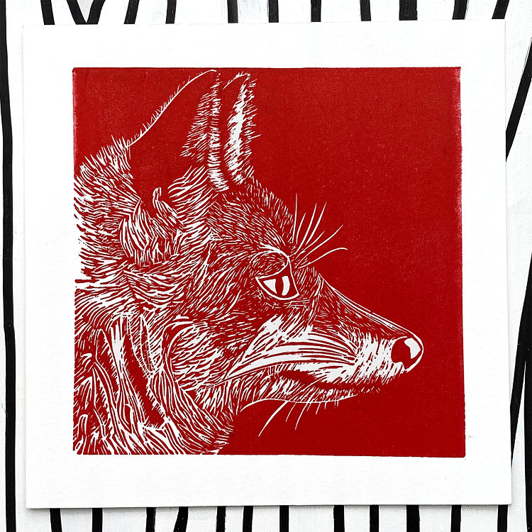
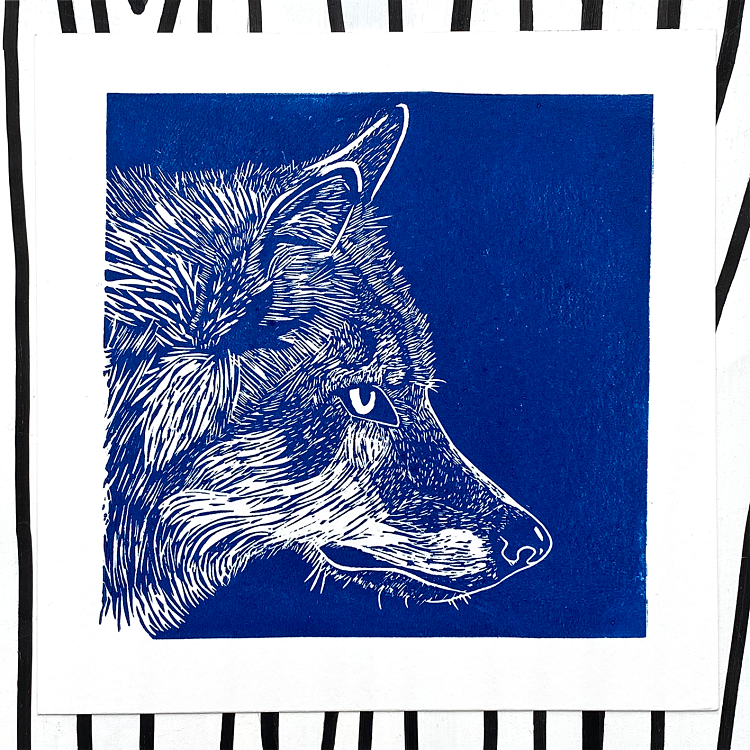 With the ongoing pandemic, Mikey of Blockforest has been in search of guidance to help him through the trials the world is currently throwing at us all. “For me, that led to exploring themes of nature, renewal, and looking to more spiritual avenues, with this series being inspired by the concepts of spirit and animal guides” says Mikey. This short series of three such guides: The Fox, The Wolf and The Bear, was an opportunity for him to explore how to capture the beauty of these animals in linocut, as well as a meditation on how to explore and embody these guides characteristics as a way to combat the stresses of the modern world.
Letterpress PLAY: Bandanas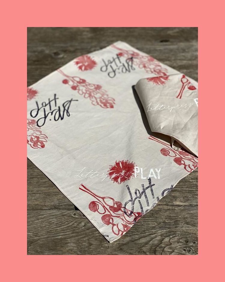
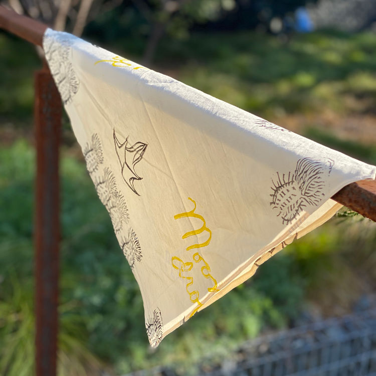
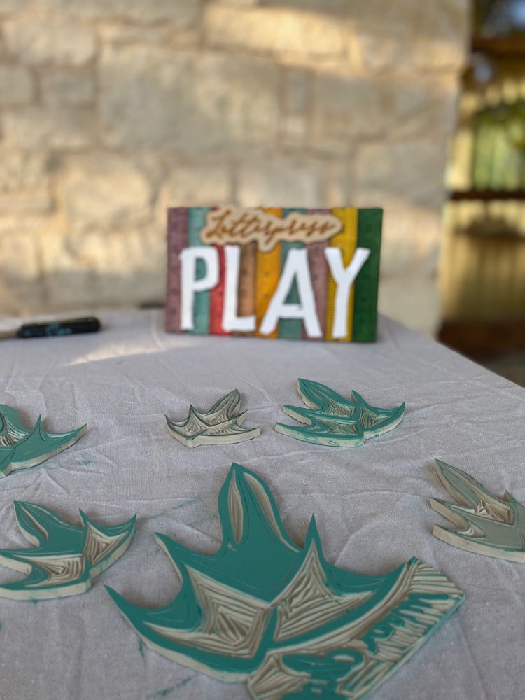 Letterpress PLAY use all types of printing mediums, from letterpress printing, to screen printing, and block printing. Their organic cotton bandanas feature both blocking printing and screen printing, and the team create their own natural dyes to give their bandanas a unique colour. Before COVID, they enjoyed interacting with their local community, particularly young children, and teaching them the art of relief printing. They can’t wait to resume this once COVID is over!
Hannah Chiarella: Tiny Houses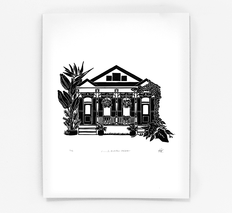
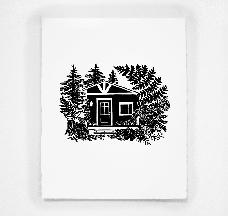
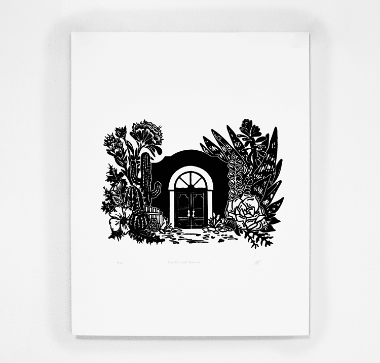 For the last couple months Hannah Chiarella has been working on a series of “tiny houses”. These homes might seem normal at first, but are shown to be diminutive, nestled in a larger-than-life garden. From a quintessential DC rowhouse, to a mission-style southwest adobe, these tiny houses live amongst the plants in a fantastical world. Are they home for fairies in a giant’s garden? The whimsy of the proportions make you wonder how they can exist. But regardless of the story each of these prints become an extraordinary garden refuge and the perfect little home.
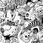
Strange Meadows: Snake and Poppies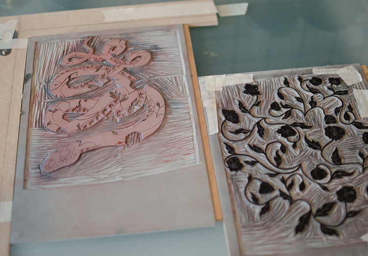
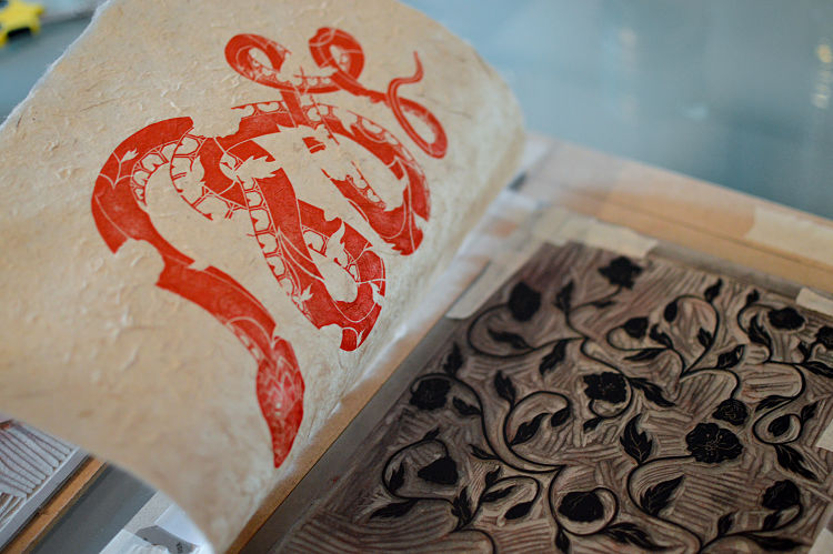
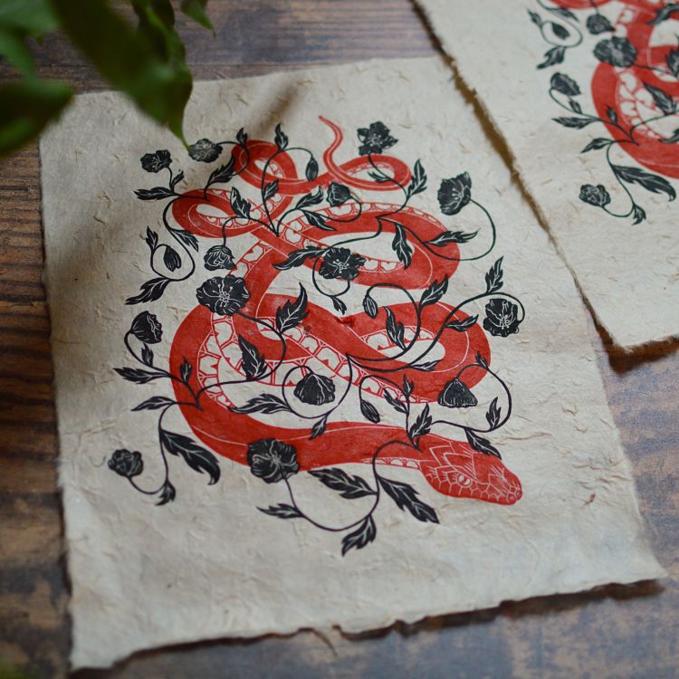 This relief print by Strange Meadows features a snake design with botanical elements. For the piece Megan started out by sketching each layer of the print on separate pieces of glassine paper, using reference images along the way. For the botanicals, she opted for poppies, feeling that their “wavy petals were excellent for adding lines and movement”. The piece was created from two lino blocks which were hand burnished with water based ink onto lokta paper.
www.instagram.com/strange_meadows
Coxswain Press: Luna Moth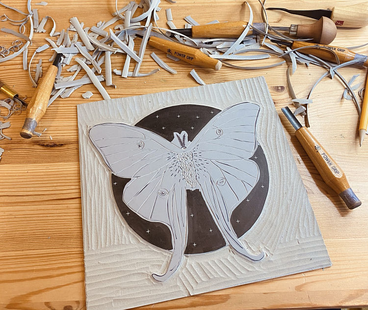
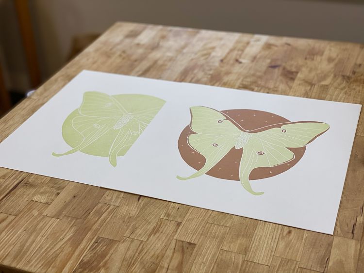
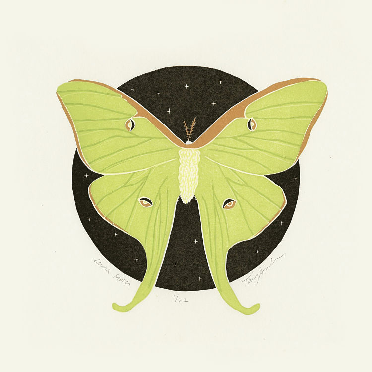 Luna Moth is a new limited edition block print from Coxswain Press. A combination of two separate reduction blocks, the piece was printed by Taylor Cox on a vintage Vandercook printing press using five separate colour passes in order to create a deep depth of colour.
Alexandra Motiu: The Neverending Story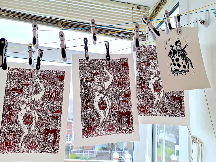
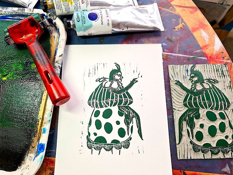
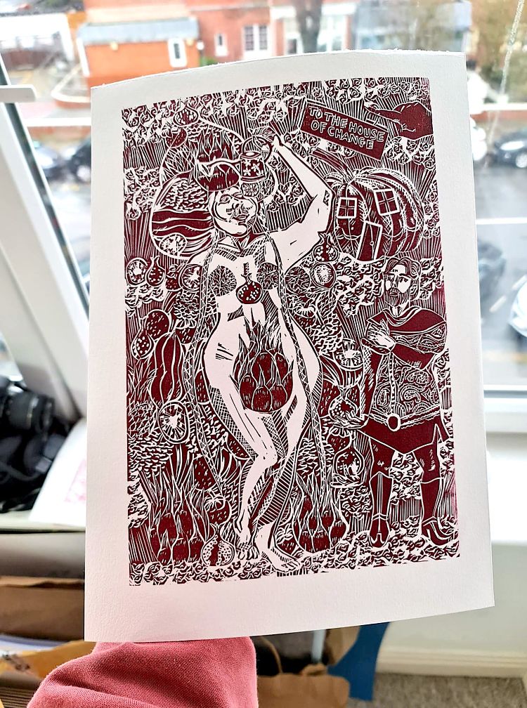 Alexandra Motiu has recently been working on a new series based on the children’s novel The Neverending Story by Michael Ende. As an homage to the book, this collection will have prints primarily in dark red and dark green, inspired by the book itself where the writing alternates between the two colours; one representing the story in the human realm, and the other the story in Fantastica. This linocut print features Dame Eyola, who is a large, gigantic mother like figure, rotund like an apple.
Mary Ann Testagrossa: Heart Centred Art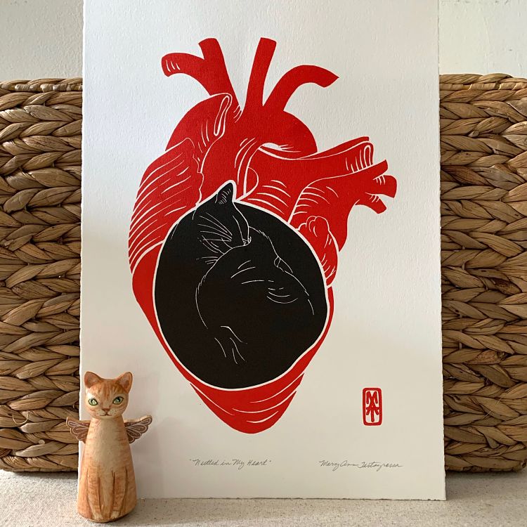
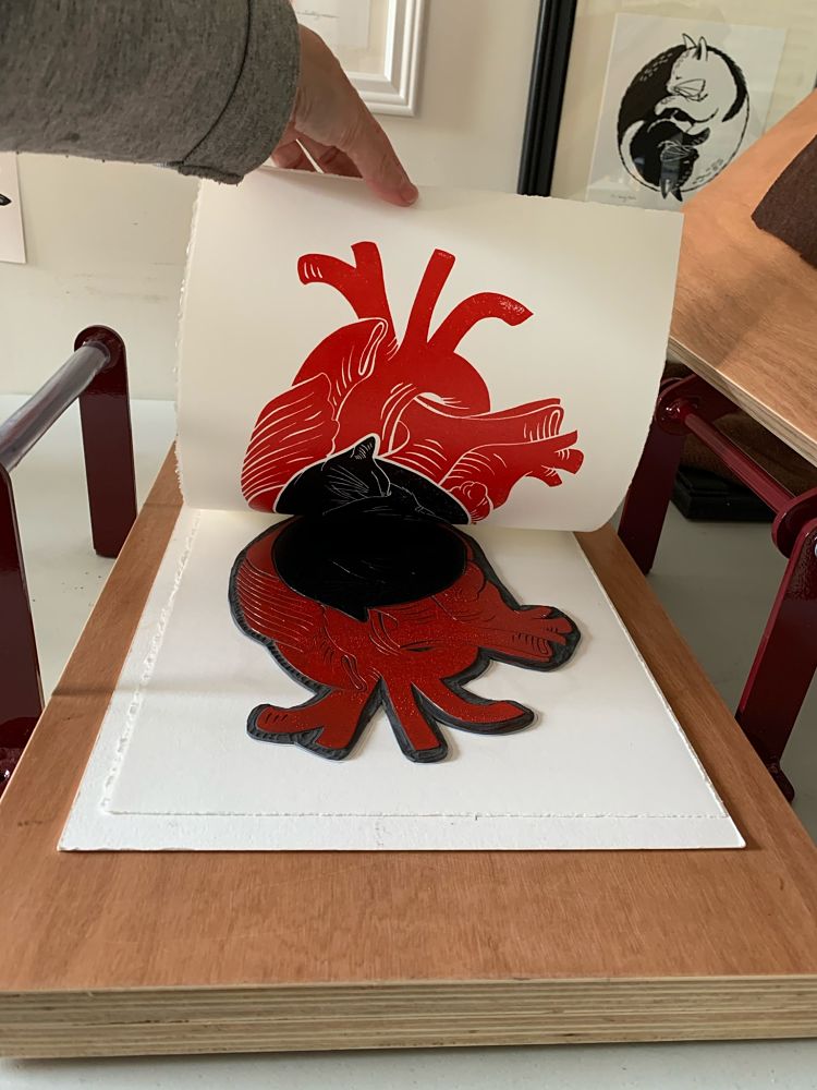
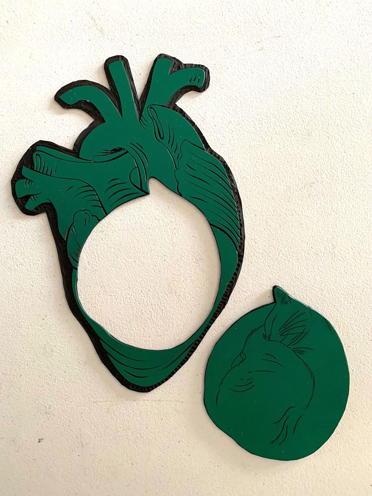 Nestled in My Heart is a relief print Mary Ann completed late last year. It is the combination of two of her favourite images to work with; cats and hearts. “This piece in particular came after the loss of a very special cat of mine. It is a reflection of where he now resides” says Mary Ann. This was her first time using gomuban, or Japanese vinyl, as the plate. She used what she likes to call a “puzzle” method of cutting the carved image apart to create the two colours of the print. To print the piece Mary Ann used Calico Safewash inks on Stonehenge paper.
Check out more projects by our members at www.members.peopleofprint.com. Anyone working with print can apply to join our community and benefit from a heap of perks here.
You might like...
 Typologie Issue 01
- Vans | These Projects Are Ads for Creativity
- Megan Hopkin: Printing Through The Pandemic
- Hüman After All – Weapons of Reason
- Heretic :: Robert Bellamy x Walls
- The Quiet Life :: Stormy x Paris Capsule Collection
- Pop & Pac
- ICNY X Monkey Time :: Capsule collection
- Sarah Maycock
- Miniprint
- Black Bee Studios
- Parky
- Versus Versace SS13 Campaign
- Ken Carbone: Colour and Digital Devices
- ‘Born Poets’ Print Series by IdleBeats
- Museums Press


Want to know more about our membership? Give us an email at members@peopleofprint.com.
- Horizons by Angus Vasili - April 24, 2024
- Caroline Tomlinson | Homewards - April 23, 2024
- Vetro Editions | Right Click Save - April 22, 2024