This month we’re excited to present an exciting array of graphic design projects from members of our POP community. From beer can designs, to weekly planners and packaging design, our members exhibit many great talents in the field.
Georgia Harizani and Filippos Fragkogiannis: 2021 Weekly Index

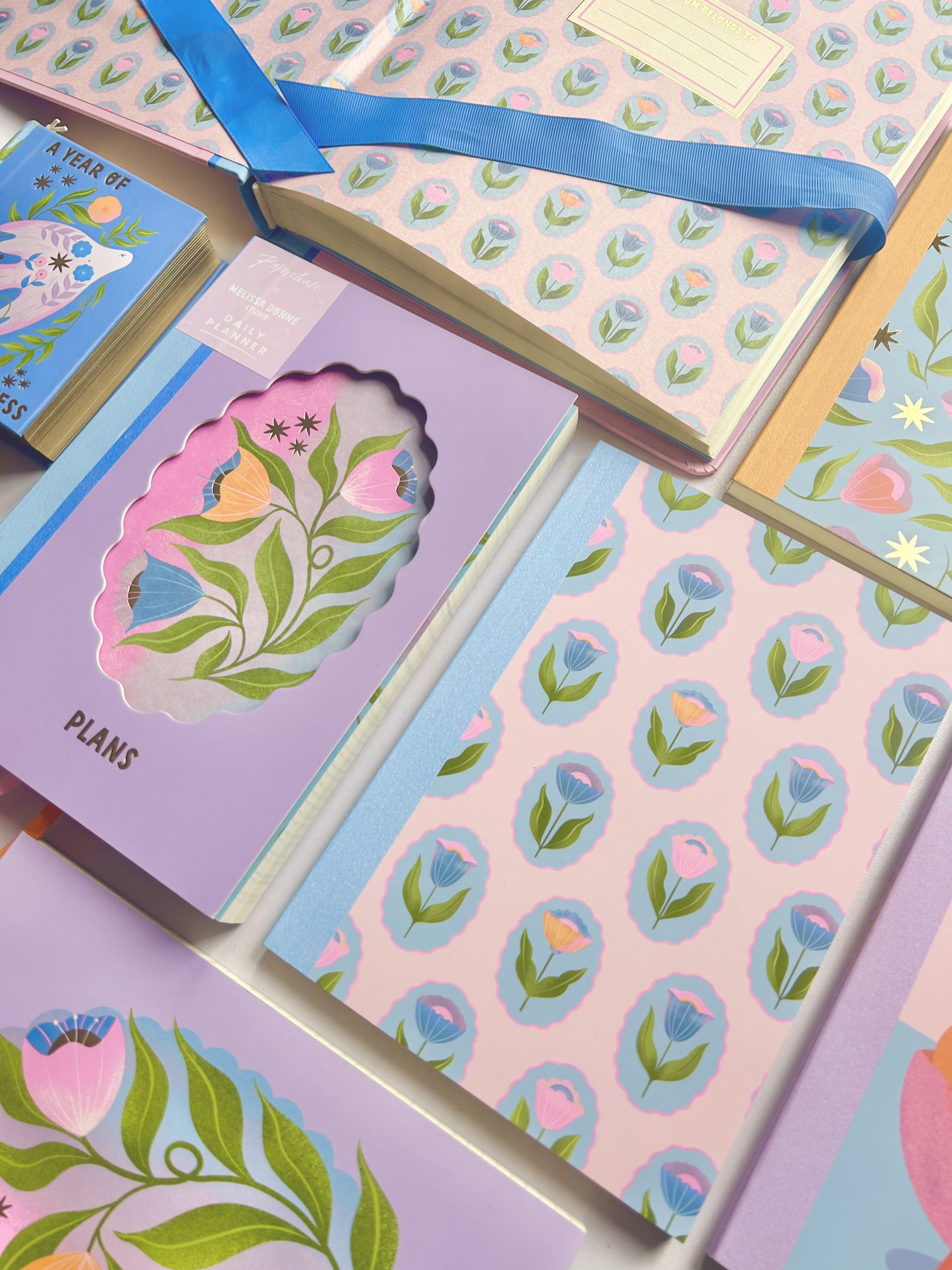
 The 2021 Weekly Index is a corporate gift for friends and associates in the form of a compact agenda. Designed by Georgia Harizani and Filippos Fragkogiannis, the 12x18cm book is practical and lightweight. Its use is defined by a temporal system prioritising weeks rather than days or months. Clearly assisting one’s navigation by indexing on the top right, it seeks to encourage organising notes and ideas in a short-term framework of a well-structured routine. With 52 consecutive weeks and space for corresponding notes, the Weekly Index is ideal for any active, organised user. Printed on Colorplan’s high quality 135gsm paper from Perrakis Papers, it provides an excellent note keeping experience.
Concrete Nature: Spot Design Market

 Concrete Nature collaborated with Spot Design Market to create the visual identity for a series of markets including their Winter Edit in 2019, and their Spring and Summer Edits in 2020. The studio created a unique colour palette for each event, as well as posters and flyers alongside digital visuals for their social media campaigns. As a primarily physical entity, Spot had to adapt this year to exist online, and the studio expanded Spot’s digital toolkit to create dynamic, engaging and eye-catching visuals that stand out from the crowd while being true to their core values and identity.
Mario Carpe: Collective Arts Brewing

 Collective Arts Brewing is a craft brewery in Hamilton, Ontario, Canada. It is a brewery that combines the craft of brewing with the talents of artists, musicians, photographers, and filmmakers. Collective Arts Brewing invites artists to submit their work in bi-yearly Calls for Art. Mario Carpe’s project, World Eye, was selected to be the image for the beer IPA No. 5 in 2017. Collaterals were also created, from t-shirts to glassware. After the success in 2017, Mario was asked to create the graphic art for the No. 15 in 2020. IPA No. 15 is a throwback to the legendary IPA No. 5.
Daan Rietbergen: Printshop iP2700


Printshop iP2700 is a project that started in quarantine at home, during the Covid-19 outbreak earlier this year. Daan decided to fine-tune the printer he got from his grandmother, and for his first print release designed a new grid-based, monospaced typeface, Rosdar. People can choose any character, word or sentence and Daan will make a custom A5 print for them. When he designs a typeface, Daan works with one strong basic principle. This principle determines the graphic language and the rules he imposes on himself sometimes outweigh the legibility. In this case there is an undulating movement in all the characters. Specific parts are exaggerated, for example the belly of the lowercase ‘a’. The typeface is not consciously inspired by other languages or scripts, but many people see similarities with languages including Armenian, Cambodian, and South Indian scripts such as Malayalam and Telugu.
Studio Turbo: EKWC Project


Raoul Wilke of Studio Turbo recently designed a rather peculiar publication for the European Ceramic Work Centre to celebrate its 50 Year Jubilee. The publication consists of two ceramic tiles, multiple booklets, postcards, and folded posters. This stack of printed matter is held together by a colourful rubber band that empathises that the publication will grow with the centre when more content is created. Being a Ceramic Work Centre, the publication needed something that was made with clay instead of paper. “It took some persuading and a lot(!) of experimenting but in the end the ceramic covers came out beautifully” says Raoul. The tiles reflect all the fantastic properties of clay in a way paper could not have done, due to the fact that clay can evoke a memory. Every scratch, dimple and fingerprint accidentally created when handling the wet clay is clearly visible in the ceramic tile.
BangBang: The Unscented Company

 The Unscented Company (TUC) commissioned BangBang to review the design of their 4L and 10L refill stations, as well as their expedition boxes. The objective was to make the main surface of their many refill boxes more appealing, and to add a pleasant touch to their daily expedition boxes. Due to a format change of the 4L and the 10L boxes, now glue-free, the team were able to use contour lines on the main surfaces to represent the products. This decision eases the identification and use of the refill stations, at home and in stores. As for the expedition boxes, a bilingual description of each product, in English and in French, was applied on the box in their respective typographic weights. The two boxes for special shipments were illustrated by hand, namely a wave and a mountain representing TUC’s two product categories (Home + Body). That way, every kraft cardboard box from TUC goes well with all of their products.
Charlie Jennings: Will Scott Portfolio

 Will Scott is a UK-based photographer working with architects, designers, developers and built environment professionals. Scott doesn’t have a background in architecture, as many of his peers do, and he considers this an advantage in his work: “I feel it gives me a different perspective when it comes to communicating the designer’s ideas and intentions to the world” he says. Will commissioned Charlie to produce his latest portfolio which he planned to send out to prospective clients. The tabloid format gave it a unique look and feel, and allowed for large scale imagery with a tactile touch. The newspaper showcases a mix of client work and personal projects. Bold typography was used on the front to create a bold statement.
Emma Hursey: Flowers

 Flowers is a publication by Emma Hursey exploring the act of photographing flowers as a measurement of time. The book is sectioned into regions of Europe, with each chapter correlating to a moment in her life. Colourful flowers flood the pages, broken up by an essay that runs throughout the book, delving deeper into the themes. It’s a self-initiated project, made just as a marker of leaving Europe for Australia, where the seasons are topsy turvy and the flowers entirely new. The font used is Voyage by Violaine & Jérémy‘s type foundry.
Bruno Oppido: Festival of Animation Berlin

 For the Festival of Animation Berlin, graphic designer and art director Bruno Oppido and his colleagues brought to life some of Berlin’s most unbelievable true stories. The team developed a poster campaign in which they invited illustrators to share their own vision of “In Berlin, only animation beats reality”. These posters resulted in a series of vibrant, colourful prints spread across city’s most creative areas and train stations.
Browse more incredible projects by members of the POP community, and apply to become a Verified Member at www.members.peopleofprint.com.
Want to know more about our membership? Give us an email at members@peopleofprint.com.