This month POP are proud to showcase a selection of publications created by members of our community. From fictional story books, to letterpress look books, and humorous zines, our members have shown great talent across an array of printed formats, helping to promote and preserve indie publishing.
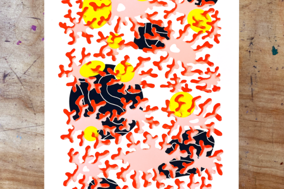
Soul Traits Studio: Chaos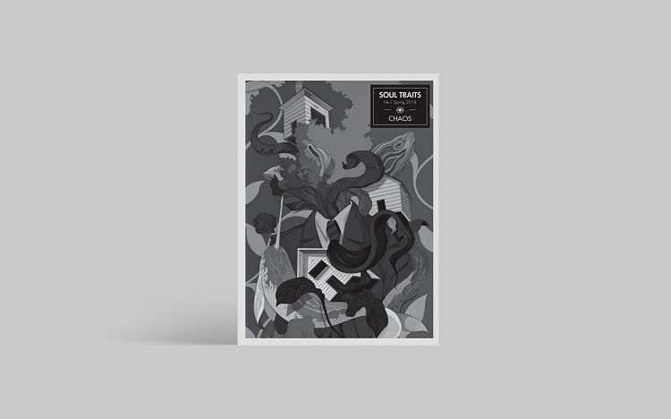
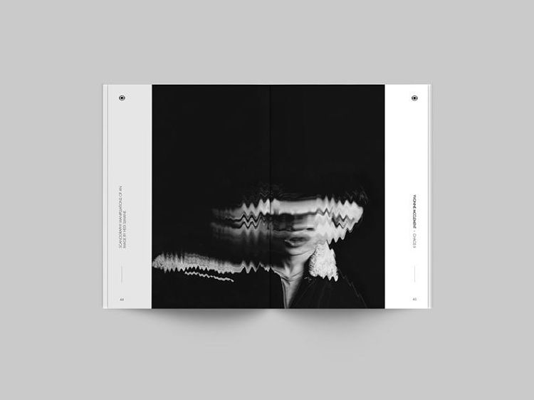
 Chaos is based on the self-titled photographic project by Daren You. Printed in a limited edition of 300, the zine covers the fields of illustration, photography, collage, and creative writing. In its printed pages, one can find an eclectic range of international creators, both established and emerging. The theme of each issue is defined by an initial project; a starting point for creating that takes the contributing artists into different experimental and exploratory directions. Contributors for this issue include; Denis Galocha (cover design), Daren You, Nikos Papachristopoulos, Spyros V, Nicola Alessandrini, Nelson Ferryman, Camila Dunster, Jonathan Sirit, Sarah Wickings, Yvonne McClement, Vorja Ilustración, Thedotisblack, Anastasia Papaleonida Pountza, and Andrei Alexandru Burcea.
Saki Matsumoto: The Lost Spring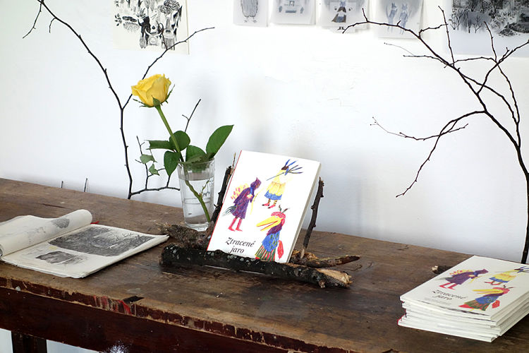
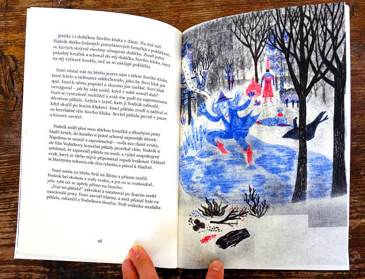
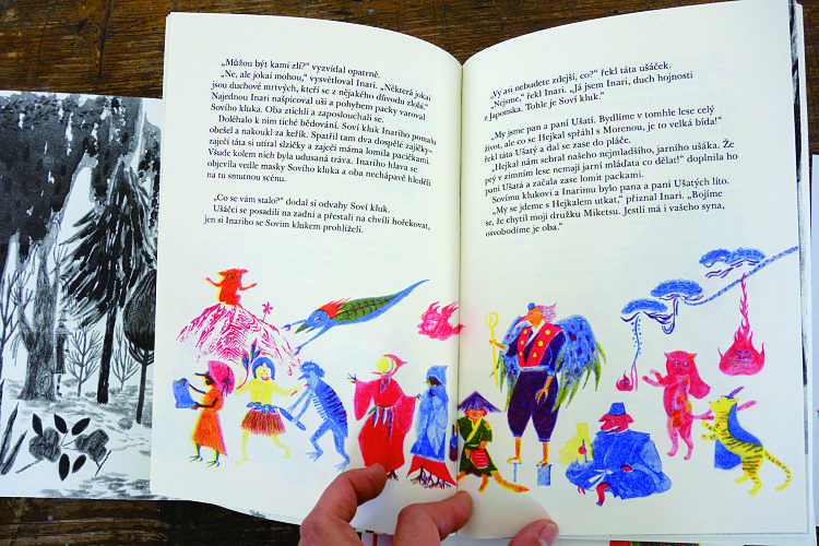
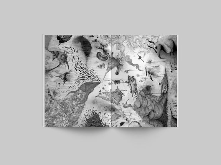
Saki Matsumoto was inspired to create the illustrations for the riso printed publication, The Lost Spring, by her understanding of Japan’s natural religion, and Czech folklore and Pagan celebration before Christianity. She also analysed a concentration of sources of narrative illustrations in order to learn how to create them effectively. Saki discovered that these narratives and notions of storytelling are old traditional customs which are inherited, and have remained a part of these regions through celebrations and festivals. Therefore, Saki wanted to find the correlations in attitudes towards nature between Japan and The Czech Republic through research of traditions and mythology. Together with writer Anna Boberkova, she decided to use the Japanese god of harvesting, Inari, as a main character in the story. They are portrayed as a bridge between Japanese and the Czech nature. The material the duo chose was from the oldest Japanese god’s story Kojiki, and the Czech spring festival, Masopust.
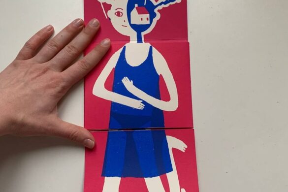
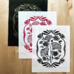
Julia Humfress: Wood Words Letterpress Look Book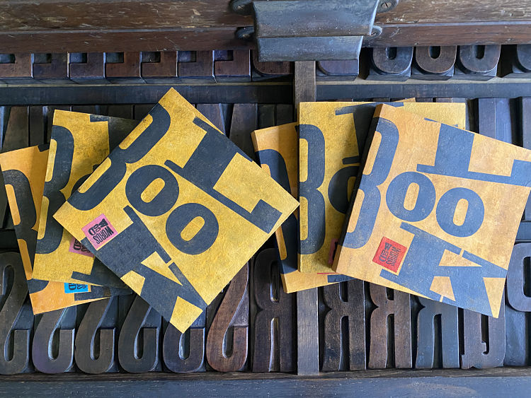
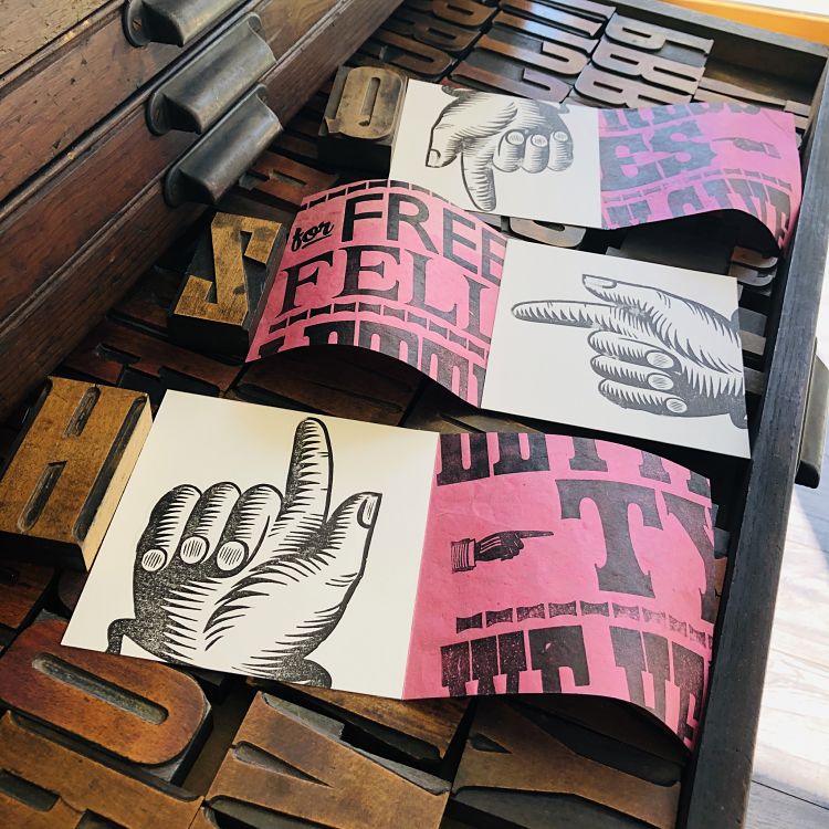
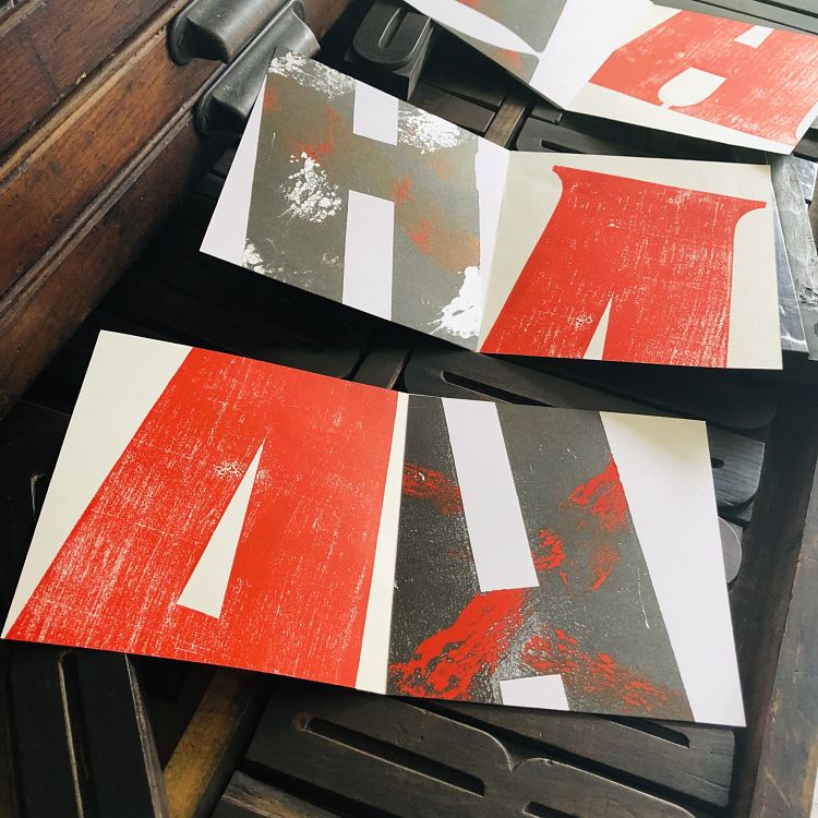 This tiny book was an opportunity for Julia Humfress to create and indulge both her loves; magazine design and letterpress printing. Each book is unique, and uses a variety of images printed on differing paper stocks which have been glued and bound in. The spread was designed using two contrasting prints that visually connect, and allow for the beauty of the wood type to shine. Restricting herself to the materials available in the studio before lockdown generated its own form of creativity, not least the small page size of 140mm x 140mm. This format forces the large wood type to be cropped on the page, in turn focusing the eye on the detail of the forms and the spaces that surrounds them. The Wood Words type collection contains only wood type, and all of it is over 72pt (1 inch) in size, with the largest in the collection over 16 inches high. Each original print reveals the style, character and history of these letterforms, bruises and all. The book reflects the design and style of the Wood Words studio and gives a glimpse into the loveliness of letterpress, and the inky world of wood type.
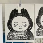
Anja Bartelt: Do You Want a Peas of Me?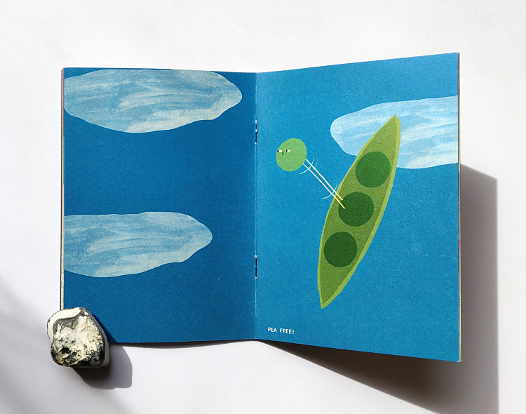
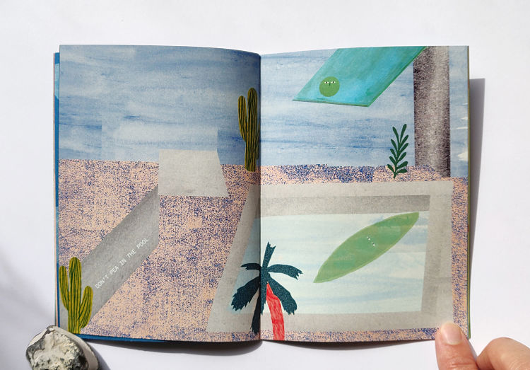
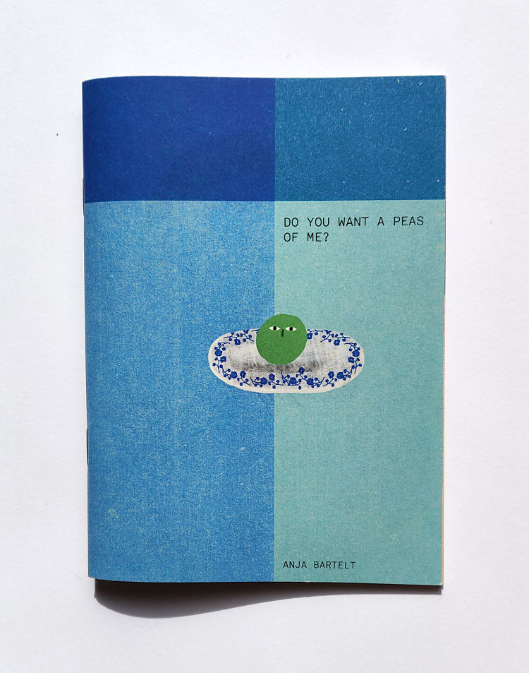
Berline-based illustrator and designer Anja Bartelt created the zine Do You Want a Peas of Me? as a funny and tongue-in-cheek approach to talking about feelings. The idea for the zine originated after Anja considered how many words contain the “pea” sound, so she decided to create some illustrated puns. The publication is typical of Anja’s style, with soft colour toned images that have a glimpse of humour.
www.cargocollective.com/anjabartelt
Bianca Tschaikner: Lake City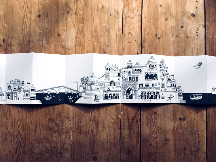
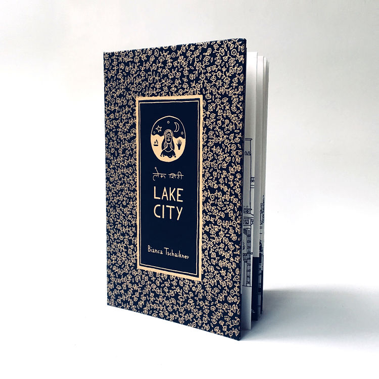
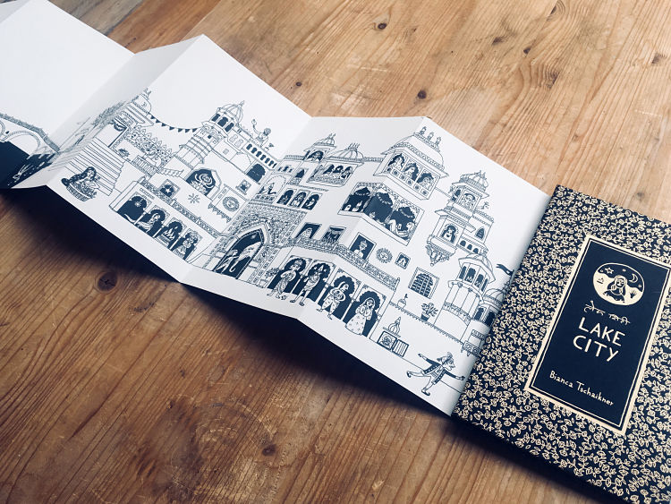 Printed in an edition of 300, Lake City is a three meter long leporello drawing created by Austrian artist Bianca Tschaikner during a two month long stay in the city of Udaipur in Rajasthan, India. The book was created while exploring the city, and drawn in it’s streets, taking inspiration from the aesthetics of Indian miniature painting and by ornamental details found in Udaipur. Lake City takes the reader for a tour through the city, documenting things seen, experienced, memorised, and fantasised by Bianca. The illustrations blur the line between imagination and reality, and thus reproduce the feeling one gets while strolling through Udaipur, capturing the overwhelming surreal and beauty of a city with its people, gods and animals. Palaces swimming on lakes, goddesses showing their tongues, women floating on the water riding on swans, and horses disguised as baby elephants: all these are images found in Udaipur and become part of a fantastic portrait of the spirit of the city. The book was printed by Naveen Printers, a printshop specialising in art books located in New Delhi, India, and has been concertina-folded which required manual gluing. The book block was printed with offset lithography, and Lake City‘s cover was screen printed with golden ink.
Dotto: GIRLFANS Untold
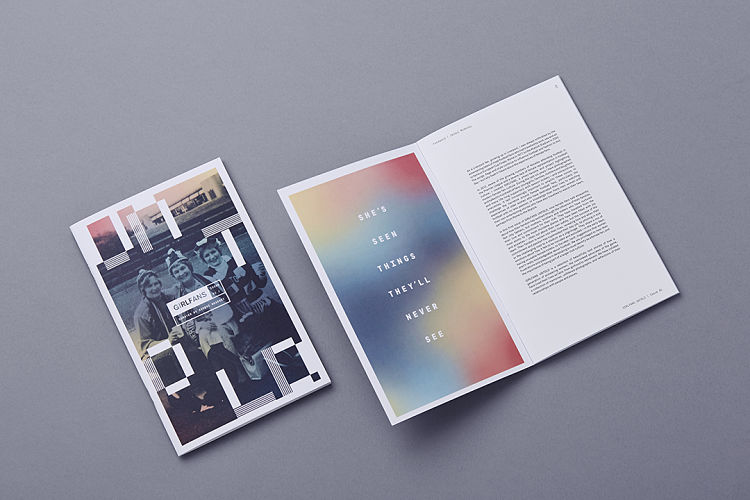
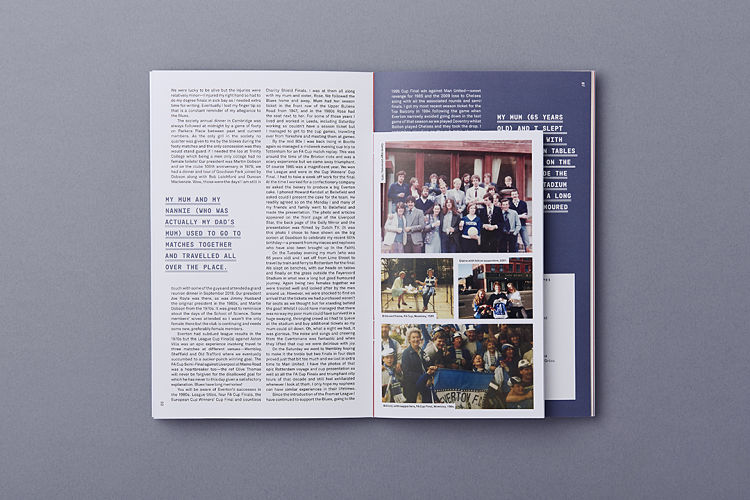 GIRLFANS is a project documenting female football fans. Initially created in 2013 by senior fashion lecturer Jacqui McAssey, her ongoing project is ‘intended to give female football supporters visibility and a sense of belonging in football culture‘. Dotto was commissioned to design GIRLFANS Untold; a zine featuring the experiences and recollections of nine life-long fans. On the project Jacqui states, “It’s been so good to rep older supporters. Women who are often overlooked by their club, ignored by merch designers, essentially missing from history…” The publication was printed in a limited edition run of 100, which have found their way all across the globe.
Kelly Belter: NEST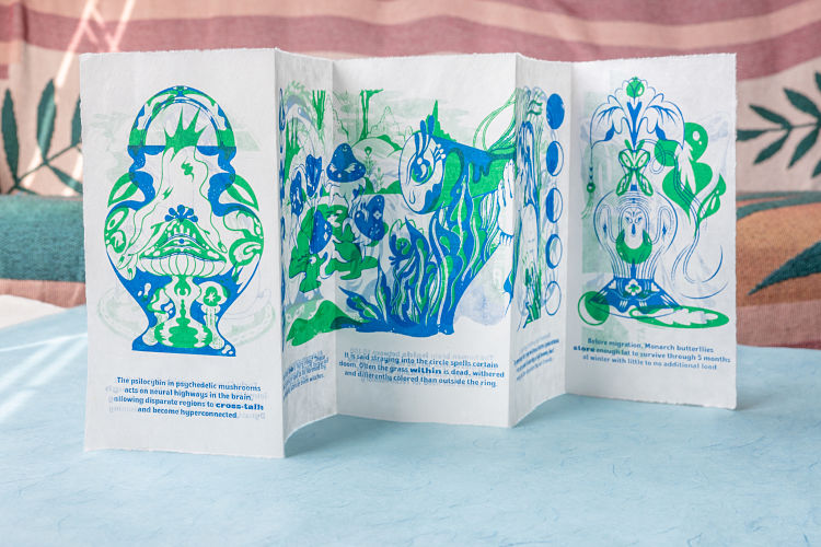
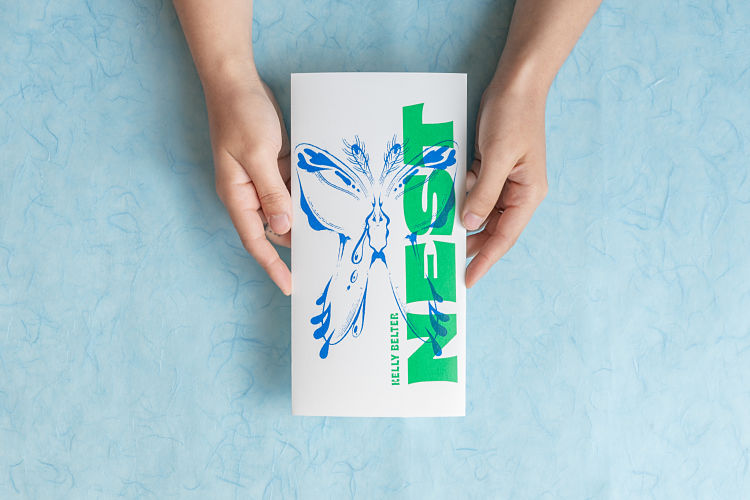
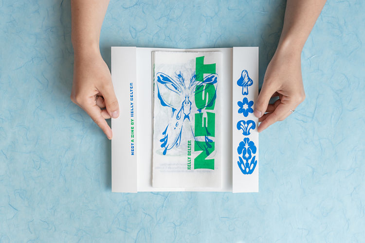 NEST is an accordion style screen printed publication that explores the hidden delights ‘nested’ within psychology, nature, and human history. Kelly aimed to create a zine that reminded people of the strange surprises waiting in all the little corners of our world. After spending time researching odd facts and information, she created seven two-layer illustrations that were inspired by her new-found knowledge. The zine was printed on traditional Korean paper called ‘hanji,’ which Kelly bought in large sheets and tore to size. She then pinned and tabbed each page, and printed both sides with bright green and blue inks. NEST is designed to sit within a screen printed sleeve, but the publication can also fold out into a large print for display.
www.kelbelter.com
Available on Department Store here.
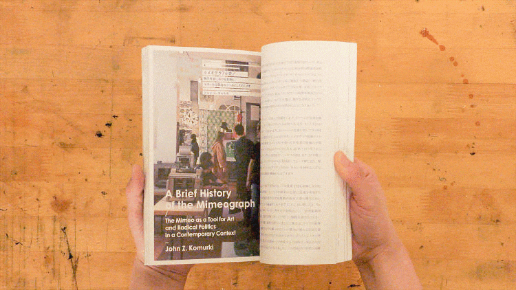
Tomoko Kanzaki: The Past and Future of Mimeograph
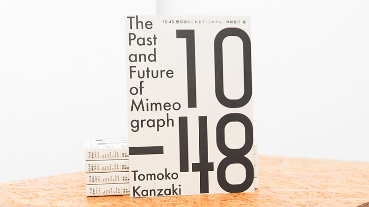
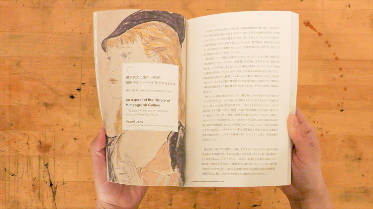 The Past and Future of Mimeograph is a compilation based on 10-48.net; a special site dedicated to mimeograph printing. Printmaker, Tomoko Kanzaki, created the publication in order to bring the art of using the mimeograph machine to contemporary printing and culture. The book also acts an archive for the data that Tomoko has gathered. Included in the publication are contributions by print experts both Japanese and overseas, records of experiences, collections of modern printed works, and an introduction to the technique of mimeograph printing. The 200 page publication is written in both Japanese and English.
www.10-48.net
Grab your copy from Department Store here.
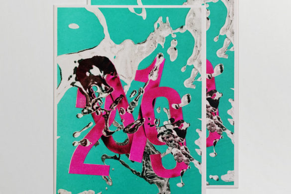
BEAST Studio: Ghosts Metro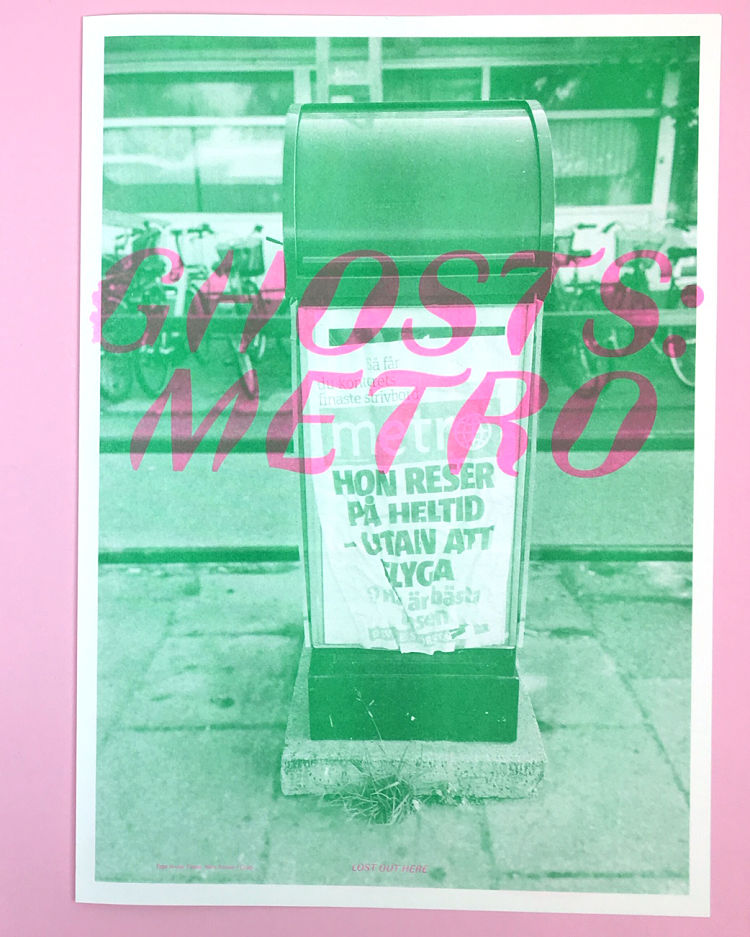
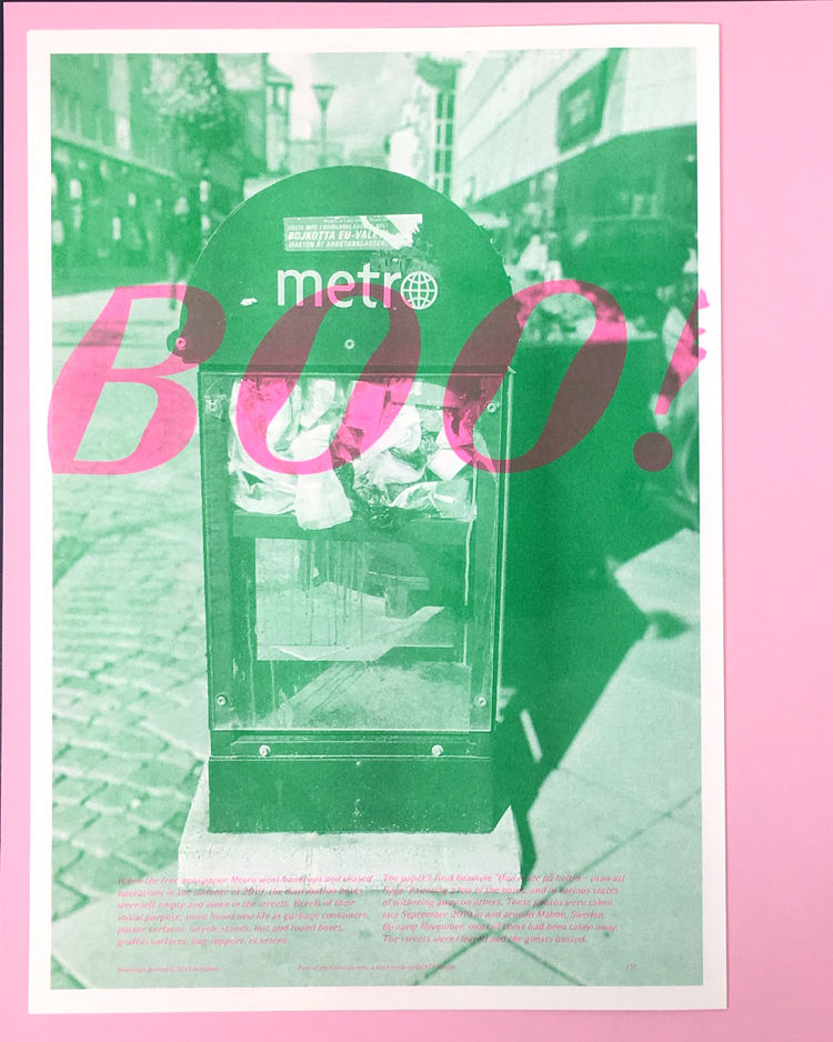
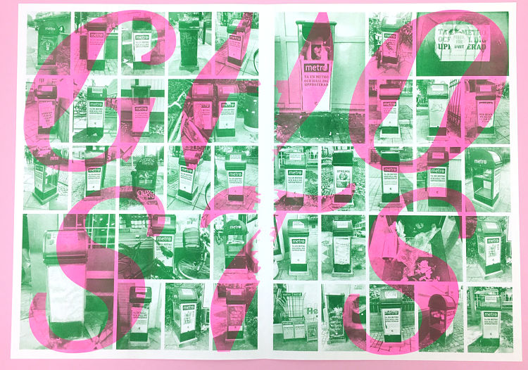 Ghosts is an ongoing series chronicling artefacts of the city that have been abandoned, left behind, covered up, faded, or re-appropriated in interesting ways. This first edition has been Riso printed in Green and Fluorescent Pink, and is A3 in size, folding out into a horizontal A2 poster. The publication was dreamt up after the free newspaper, Metro, went bankrupt and ceased operations in the summer of 2019. This left the distribution boxes empty and alone in the streets. Bereft of their initial purpose, some found new life as garbage containers, poster surfaces, bicycle stands, lost and found boxes, graffiti surfaces, and bag support. The paper’s final headline ”Hon reser på heltid – utan att flyga” haunted a few of the boxes, and was in various states of withering away on others. The photos included in the publication were taken in late September 2019 in and around Malmö, Sweden. By early November, most of these had been taken away. The streets were cleared, and the ghosts busted.
Mat Denney: Sleepwalking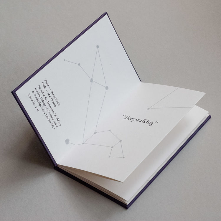
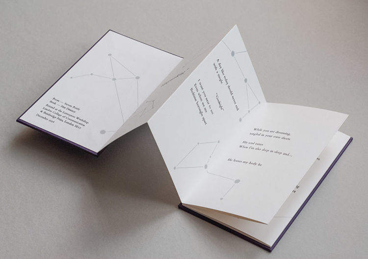
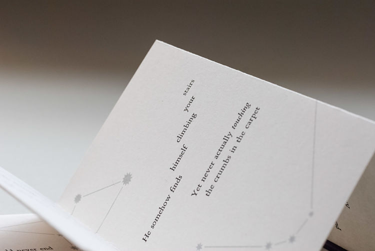 Sleepwalking is Mat Denney’s first artist’s book. The text is a poem written by his husband, the writer and artist Steven Pottle, and tells of a sleepwalker’s soul journeying through the night to visit their lover. Mat has implemented the narrative format of a concertina, with its linear, unfolding structure a metaphor for the protagonist’s flight. “I treated the text as concrete poetry, setting the lines in meandering clusters to match the rhythm and cadence of the stanzas; rising and falling as the sleeper climbs steps and passes through walls” describes Mat. The 11-point Bembo type was handprinted on London College of Communication’s FAG Swiss Proof press in purple-black. He then screen printed the constellations in metallic silver to create a visual counterpoint. Mat’s choice of constellations also have hidden meanings, an example being Canis Minor appearing under the line “puppy dog scampering”. The publication is hardback bound in Colorplan Amethyst, in an edition of 18. Mat also create a special one-off, which was cloth-bound in royal blue and presented in a matching clam shell box.
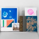
Danii Pollehn: Botanical Inspiration Book – Victionary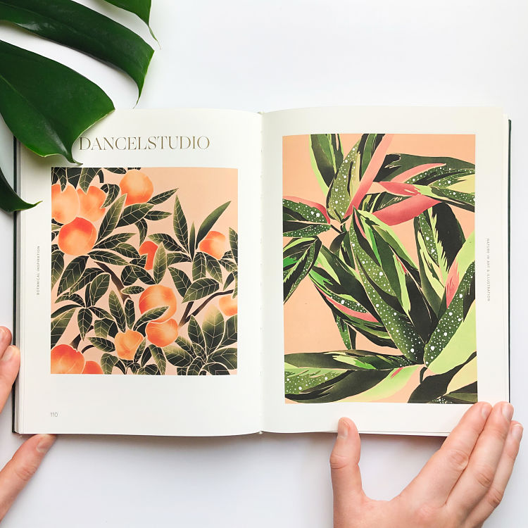
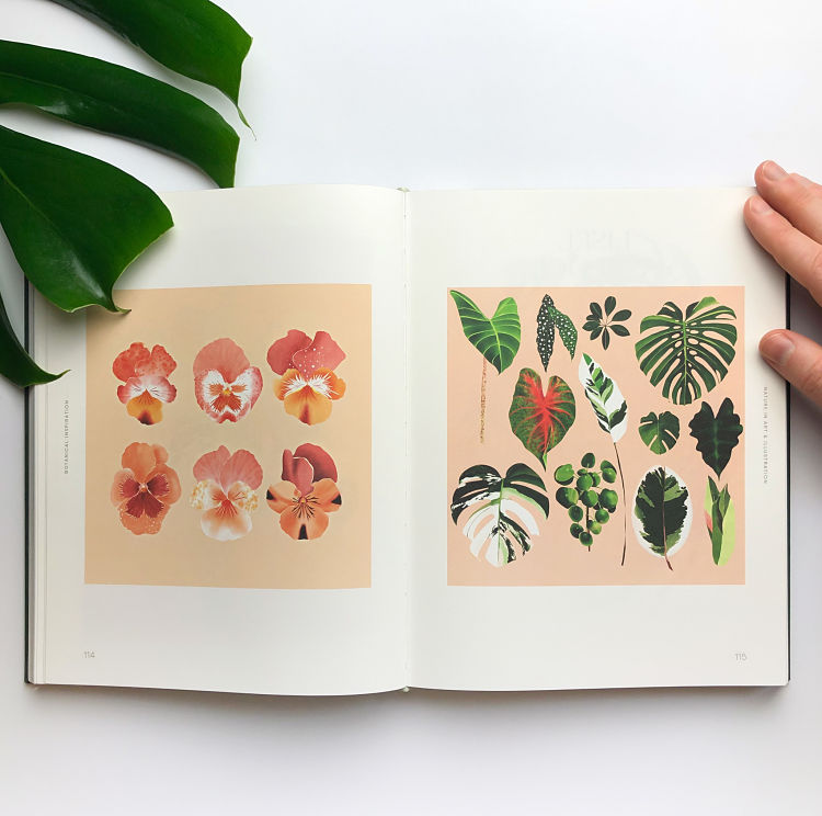
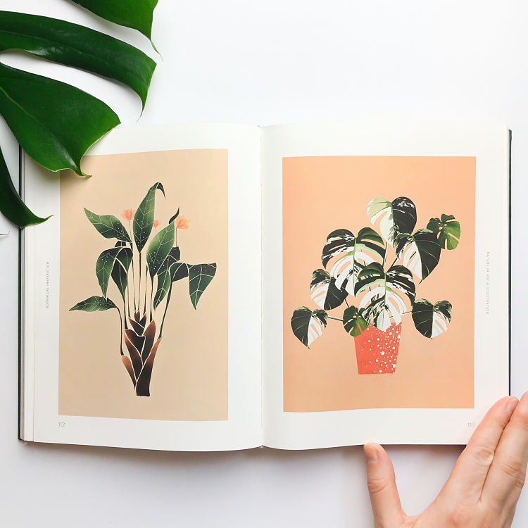 Danii Pollehn was super happy to be included in the Botanical Inspiration Book by Victionary. The publication is a beautifully designed and curated book with many of Danii’s favourite Illustrators included. Throughout 2019, Danii concentrated on working on botanical illustration, creating a body of work that is more digital, which now defines her visual aesthetic. Most of Danii’s illustrations that were included in the book were created during a vacation she took to Sri Lanka, where she worked on developing her creative process with various programs which were executed on an iPad.
Torsten Jahnke: Das Räkel – Das Gigpöster Zeitung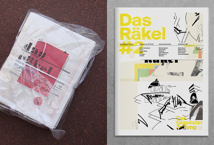
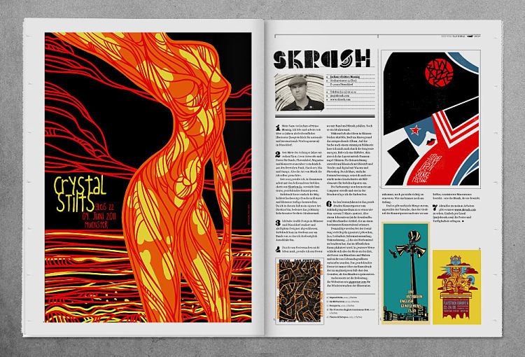
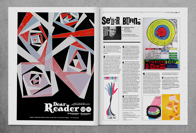 In 2011 and 2014, Torsten Jahnke, of print and design studio Spiegelsaal, released two issues of Das Räkel – Das Gigpöster Zeitung as an unofficial printed bulletin for the website posterkrauts.de. As a means to promote the prospering gig poster scene in the German speaking countries, the newspaper (and the website) featured basic information about gig poster and screen printing, round table talks, interviews, and lots of posters. Every participating artist got a double page feature that included up to 5 posters, and nerdy detailed print information such as edition, printing method, and number of colours.
Check out more of the incredible work by members of our community at www.members.peopleofprint.com. Anyone working with print, creatively or industriously, can apply to become a Verified POP Member. APPLY HERE to learn more about all of the perks we offer.
You might like...
 Otto Kaan
- Karolis Strautniekas
- KRSNA + BRRR
- An Archive of Collected Ephemera & Printed Material from Anthony Burrill
- Barbara Kruger
- In Haus Press
- Foilco Gains B Corporation Certification
- Jefferson Cheng
- Suzi Kemp (for Brutus Trimfit)
- Workhorse Press
- Ellie Fox :: Fashion Blog Contributor
- Stoffdoktor
- Herr & Frau Rio
- Rachel Hiemer
- Finchtail Tablet Stand
- Jeremy Olson


Want to know more about our membership? Give us an email at members@peopleofprint.com.
- Vetro Editions | Right Click Save - April 22, 2024
- Enea Seregni | MONSTERS! Collectible Cards - April 19, 2024
- Mark Frendo | Danger UXARD - April 18, 2024