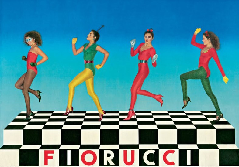
Fiorucci was once an unquestionably cool Italian brand and a breeding ground for everything new and upcoming. To be precise, in the 60s and 70s. Think primary colours, loud advertising and disco scene. It was most famous for its stretch designer jeans, however, garments were almost the least important part of the enterprise. “He made shopping theatre before every brand decided to put on a show. He was the first to exploit pop art, music and celebrity.” – his website says. A controversial brand launched bikinis, thongs and monokinis in 1974s Italy. The provocative advertising following that was confiscated by the police from Elio Fiorucci’s home. “Vulgarity is not measured in centimetres of cloth. We are born naked; all dressing is hypocrisy. In my life I have always tried to free the naked body from vulgarity.”
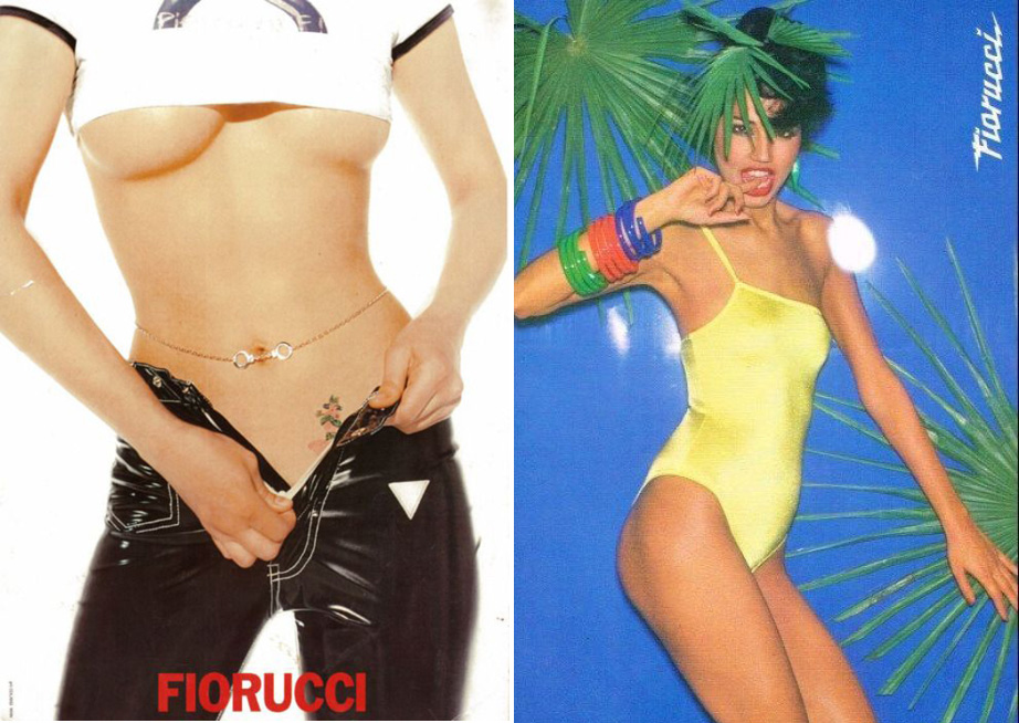
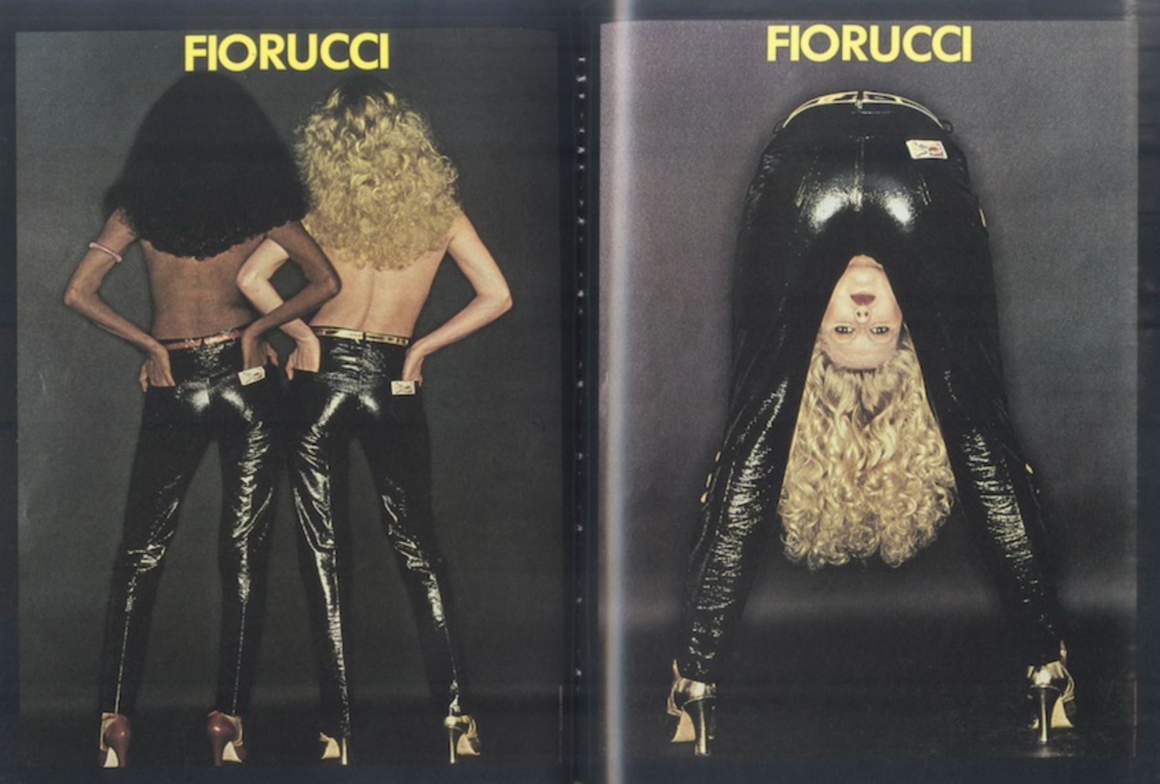
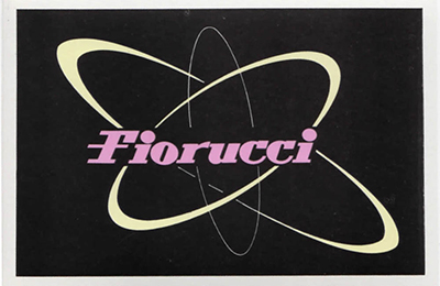
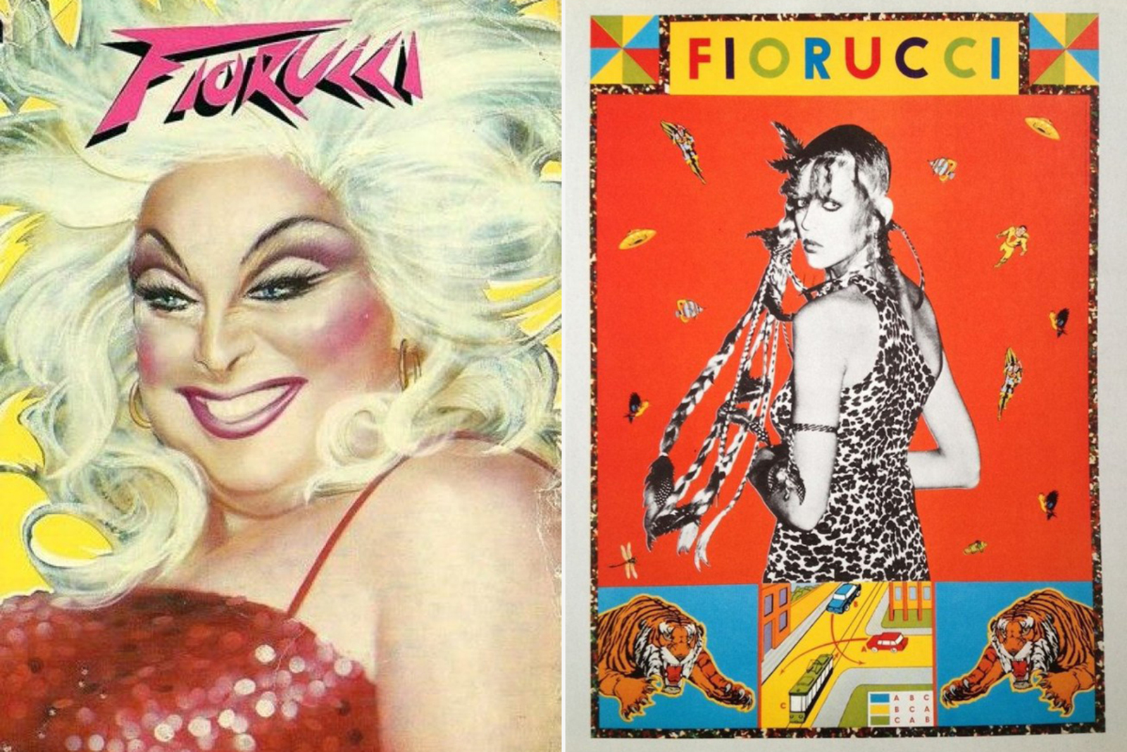
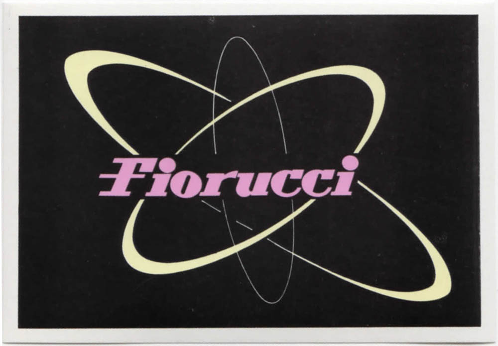
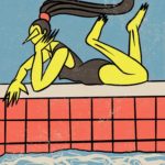
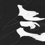
Fiorucci has always been a graphic invention with its typography, colours and used objects. The 1984 sticker book is a memorable high point in Fiorucci’s retro-affected graphic design. All of the themes (Electron, Swim, Romance, Dance, Pin-Up and Story) work within the postmodern American graphic kitsch of 1950s through a quirky, post punk, hardcore and science fiction aesthetic. The sticker book has around 200 Fiorucci’s wicked sexy advertising in it. Get a glimpse of it here. Due to Elio’s recent death in summer of 2015, the fashion brand is trying to relive its roots and is working on a website relaunch. So far, the visual imagery of both Italian and American websites are fascinating.
www.fiorucci.it
www.fiorucci.com
You might like...
 Marta Eir
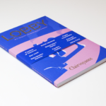
- Fail to Plan, Plan to Fail
- Manual for Speed | Artist Residency Cycling Kits
- Landon Larsen for Fiks Magazine
- Alexandra Ramirez: The Beauty of Solitude
- Damn Fine Print: Andrew Weatherall Tribute Print
- Hansje van Halem
- Jérémie Solomon
- LOBBY Magazine
- Anthony Burrill Woodblock Prints @ Beach London
- Vans X MoMA
- Element #003 | Hansje van Halem | The Artist Series Cover
- Lottie Hughes
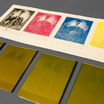
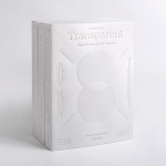
- PALETTE 06 :: Transparent
- Samuel Eckert
- Moonassi Series by Daehyun Kim


- Pip & Pop’s Psychedelic Trip - December 20, 2016
- Filip Pagowski. - December 19, 2016
- Kingsley Ifill - December 16, 2016