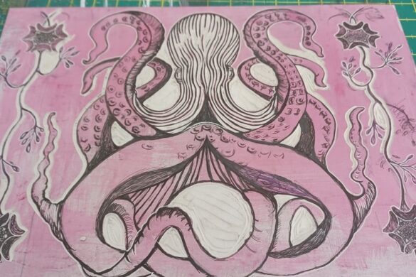
We’re excited to introduce two new projects by Graphic Designer and Official POP Member, Hui yeon Hwang. Hui’s signature graphic aesthetic of textural, collage-like layers and bright and colourful character has been reinterpreted in both these projects with great success. She created a brand new identity for the company Ildetex, and also worked on a series of posters for the Nike Running brand design team as a source of inspiration for their next season.
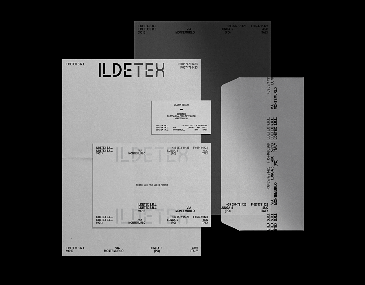
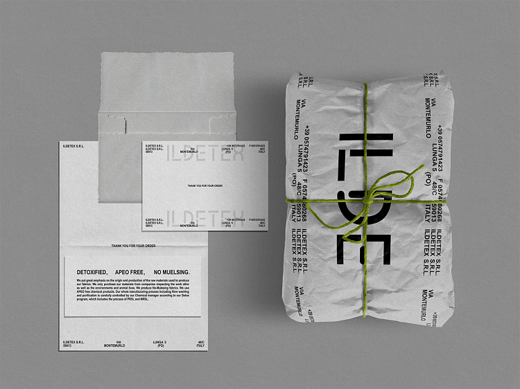
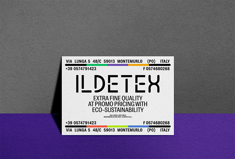
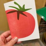
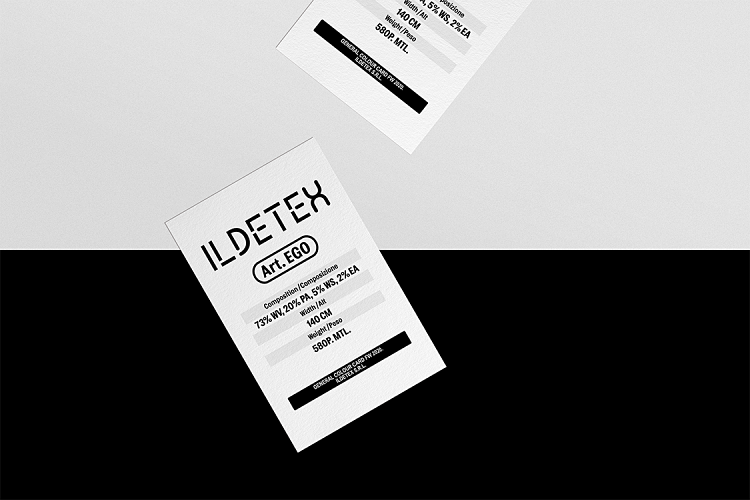 Ildetex is a newborn company based in Prato, Italy; a small town next to Florence that is famous for companies and factories that produce both high-end and low-end textiles. These companies normally conduct their business internationally for fashion labels all around the world. Although Ildetex are a textile company, they aim to sell finished products directly to customers. They produce very high-quality cashmere and wool, however Hui was commissioned to create an identity that would help promote them to a more general consumer crowd, thus her design needed to be customer-friendly, yet professional. She began her design process by making a sans-serif logotype inspired by the form of textile structure. “I focused on a very clean look overall for the identity, but for a little bit of friendly mood I added some curved ends to the logotype” explains Hui. This subtle touch might not be a large, noticeable design feature, however it totally changes the identity because every other element is made to be paired with this logotype.
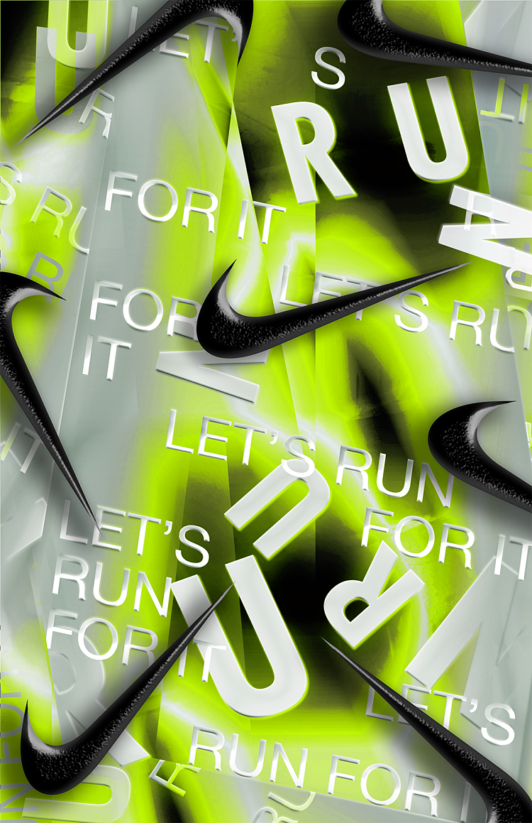
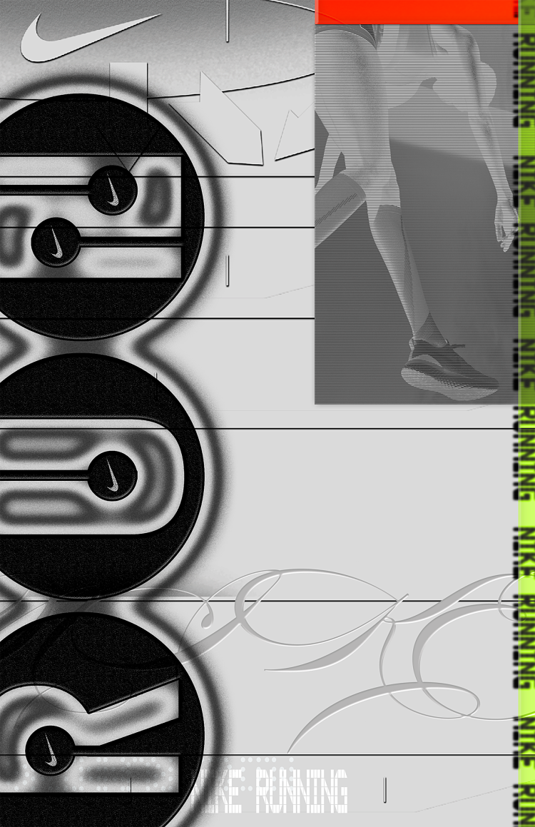
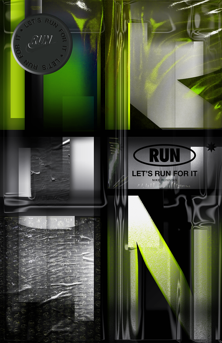
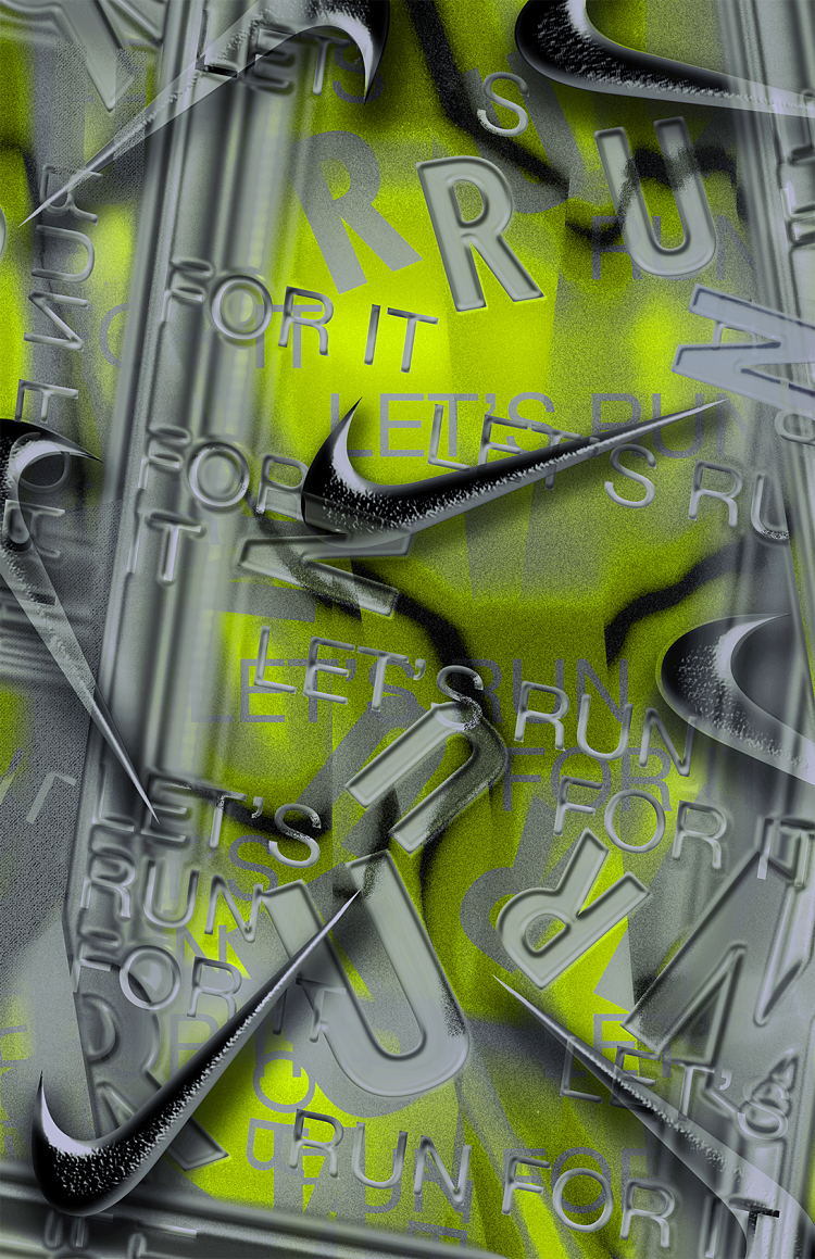
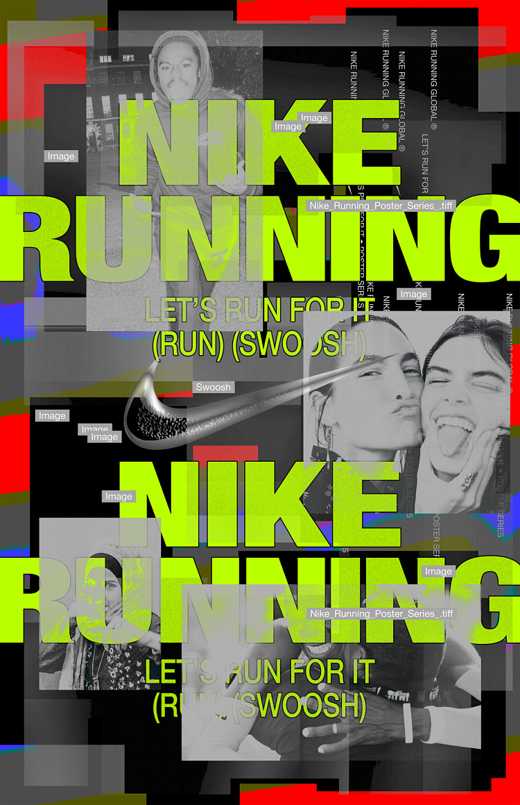
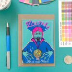
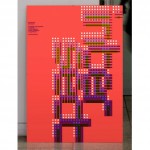
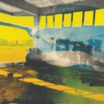
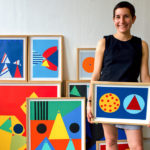
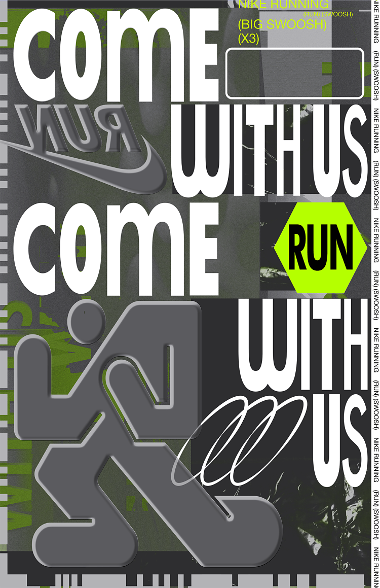 When working with Nike Running, Hui was provided with some keywords that would be a source of inspiration and content for the posters, such as; rave/club culture, (Neon)Vert colour, light and inviting manner and the use of Helvetica and Futura fonts. Using Vert as the main theme colour was harder than she expected because Hui normally uses multiple colours at once for poster designs due to her image layering. Secondly, Vert colour has a specific mood that is often associated with a rave and party theme. Thus, Hui decided to focus on aiming to deliver “different feels of Vert ironically“. She experimented with random techniques including the creation of weird running human forms in 3D and 2D, as well as making surreal images that neutralise Vert’s connotations. Although Nike didn’t want their posters to be too dark, Hui added some darker and spiky elements in order to reinterpret the theme and create new impressions.
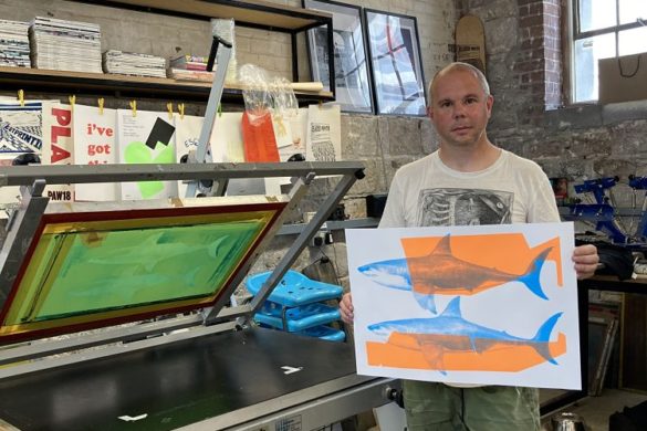
Want to join our growing community of creatives and printmakers? APPLY HERE.
You might like...
 Lovely Package
- Stay Lucky Club
- PRINT ISN’T DEAD Quarterly Magazine
- Zhang Xiao
- FAKEDCANDID
- The Quiet Life :: Stormy x Paris Capsule Collection
- MuirMcNeil :: Four New Typeface Systems
- Pressing Matters Magazine
- Cyril Galmiche
- Stefania Patrikiou | Urban Landscapes
- Golden Green
- Birdsfoot Studio
- Penguin Books Great Ideas
- Eimearjean McCormack
- Hofer
- Laura Obon

Want to know more about our membership? Give us an email at members@peopleofprint.com.
- Enea Seregni | MONSTERS! Collectible Cards - April 19, 2024
- Mark Frendo | Danger UXARD - April 18, 2024
- Sue Lewry | The Creative Cycle - April 17, 2024