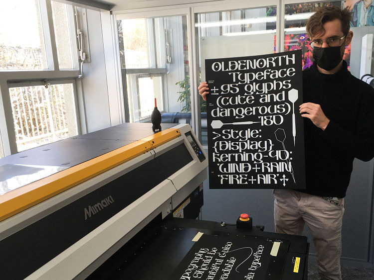
Peter Roeleveld is a third year Graphic Design student at the University of Arts in Utrecht in the Netherlands. Although he has a background in graphic design, Peter says; “I’d rather call myself a young type designer that loves both digital and analogue workspaces”. Over the past two years he has discovered the process of making a typeface: “Making typography is a very patient process and it can take months to complete a typeface meaning I have developed a strong feeling for my own project. It fascinates me that other graphic designers are willing to work with my typography where they create their new rules using my work. I see my typefaces as an ingredient that can be used for anything else”.

 Even though Peter’s process of creating a typeface is mostly digital, he loves to explore its physical purpose on paper and other materials. During his studies he stumbled upon a special UV-flatbed printer. This printer, discovered in his academy’s print room, is capable of printing on a variety of materials including stone, wood, metal, glass, plastic, and even water! As well as being able to print on any relatively smooth surface, the UV printer can also print multiple layers on top of each other, creating an embossed effect. “…This UV-printer is a perfect transition of my work going from digital to a physical space where my passion for typography and graphic design comes together,” states the designer.
 So far, Peter has mostly been printing his typographic work with white ink on black Plike black paper, and has recently begun to experiment printing colours in layers. He explains; “With this learning process I hope to print more colourful compositions of my own typographic work in the future, and have plans to combine this technique with silkscreen layers”.

 Although his work absorbs some sort of input from the typography he witnesses every day, Peter can’t quite put his finger on exact sources of influence; “I can never choose whether I like Swiss type design like Helvetica or ancient handwritings that are barely readable. And that’s why I think my work comes together when combining the ‘legible and ornamental’ parts”. He concludes; “For me, typography should be ornamental but also readable”.
 www.peterroeleveld.com
@peter_roeleveld
Want to know more about our membership? Give us an email at members@peopleofprint.com.
- The Body Knows the Ritual: Haviva Seligson’s Shofar - April 3, 2026
- What the Music Feels Like: Yeara Chaham’s Collage Response to Sade - April 3, 2026
- Kichizi: Aysha Lilani Brings East African Visual Language to the Slopes - April 1, 2026