Ken Carbone is a designer, artist, musician, author and teacher. Along with Leslie Smolan, he formed independent branding agency CSA (Carbone Smolan Agency) in 1976 in New York City, working with the likes of The Louvre, Morgan Stanley, Christie’s and the Chicago Symphony Orchestra. Last year, the design firm formed a strategic alliance with independent creative consultancy 50,000 feet, which has offices in Chicago and New York working across strategy, content development, brand expression and digital activation. In this guest piece for us, he looks at how digital devices have changed our sense of colour.
With millions of colours available at the click of a mouse, are we being force fed a spectrum of commerce ready tones? And why does a relatively limited palette dominate the brand universe?
 During my career as a graphic designer, I relied on many colour matching systems in my work; Color Aid, Pantone, Toyo, CMYK, and others. These were functionally beautiful systems for design expression, mostly for print. For thousands of years, we perceived colour in this realm of subtracted color where light is reflected off a surface or object to produce its hue. However, at the dawn of the 21st century, the seismic shift to digital technology and additive colour—HTML, HEX, RGB, HSB—created a homogenous palette best viewed on a bright, highly polished, glowing screen. This evolution “hot-wired” colour for a new age.
This game-changer for global brands provided new tools for the colour integrity, competitive power, and product distinction that’s critical in our omnichannel world. I welcomed this evolution, but when I turned off my laptop and looked at the world, the experience of colour was profoundly richer, broader and more sensual than what appeared through the pixels on my screen. I began to question whether my sense of colour was being compromised in some way due to the day-to-day exposure to the bombast of digital colour.
In 2018, I made a pilgrimage to “recalibrate” my sense of colour. In January of that year, the French painter André Derain was the subject of a retrospective at the Centre Georges Pompidou. Along with Henri Matisse, Derain founded a radical early 20th century art movement that celebrated a bold, high chroma, saturated use of intense colour. Called the Fauves, these artists set their landscapes, portraits, and still-lifes ablaze with colour combinations and hues that defied naturalistic realism. Widely rejected for their approach, The Fauves (translation: wild beasts) demonstrated that color could give form new meaning. I always loved Derain’s work for his courage to challenge convention and his audacious use of colour, which looks as riveting today as it did a century ago.
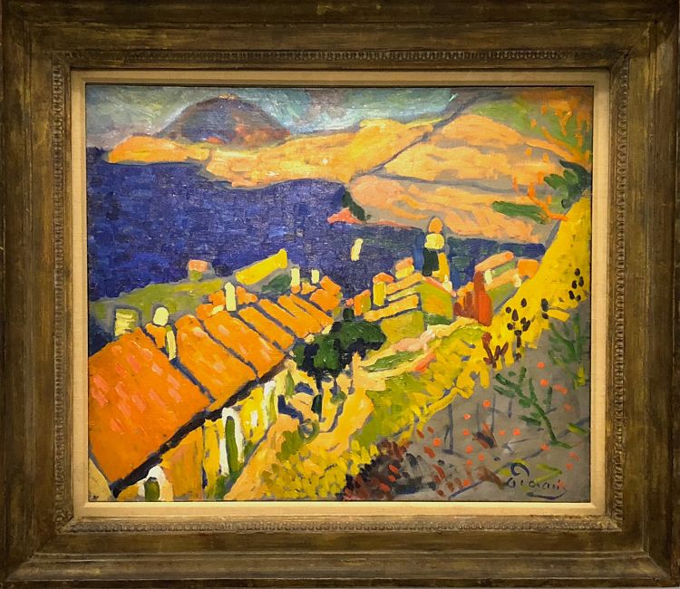
André Derain Collioure 1905.
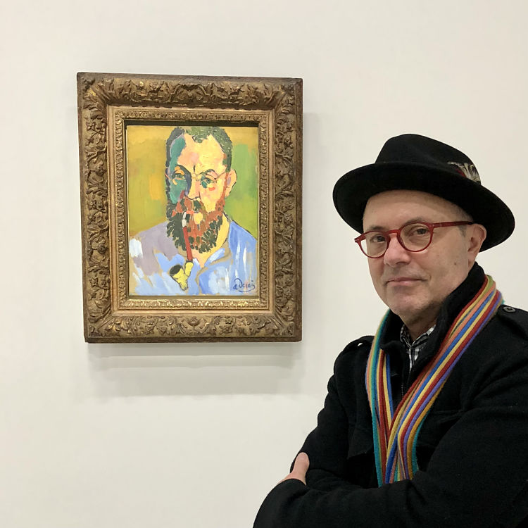
André Derain’s portrait of Matisse. (A personal favorite!)
Seeing this exhibition was pivotal for two reasons. It reinforced my belief that natural, organic colour activated by reflective light has a depth and complexity that computational colour, transmitted by a lit screen, will never successfully reproduce. However, I also recognised that we live in a multisensory age of bits and bytes, pixels, and backlit screens that are an extension of our very existence. Given this reality, oil paint on a canvas doesn’t stand a chance, and the authenticity of real-world colour is irrelevant.
A new colour sensibility that reflects “function over form” dominates the commercial imperative of brands. If T Mobile “pink” appears inconsistently across a dozen digital platforms, it’s a minor problem if it always registers as pink to the consumer. In addition, the velocity of contemporary life and the many performance demands of colour in the digital universe leaves little room for subtle distinctions: the bigger the brand, the bolder and brighter the hue to avoid being lost in the crowd.
It’s been suggested that computer engineers created the algorithms that govern how digital colour works, as this Minute Physics video by Henry Reich explains.
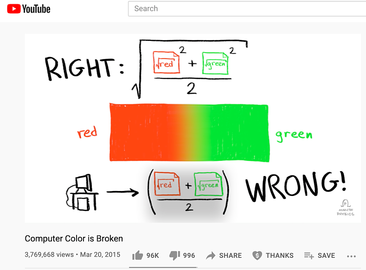
Henry Reich gives a math lesson on digital color.
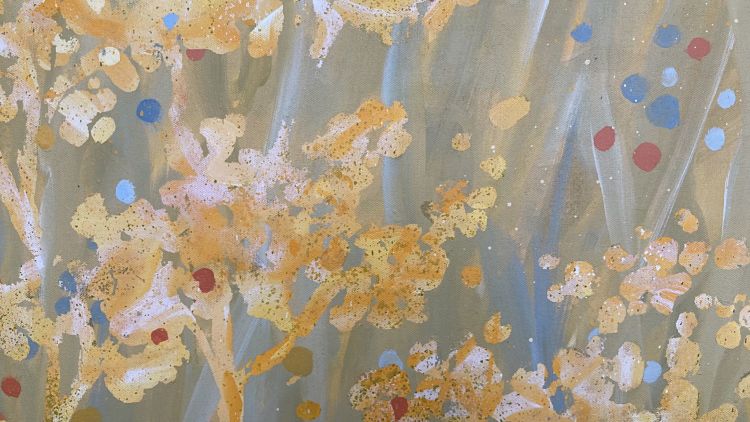
The maths is dizzying, but the net result is that computational colour will naturally be a compromise to accommodate the multiverse of digital outputs and technical limitations. As a painter, I spend much more time in awe of the alchemy between a mix of cobalt blue and yellow ochre than changing colour curves in Photoshop. However, I also note how my painting appears on my laptop or Instagram as this is the first place where a potential collector might see my work. I’m usually unhappy with the results, but my expectations are unrealistic. I then make the necessary adjustments adhering to the technical dictates of our digital devices.
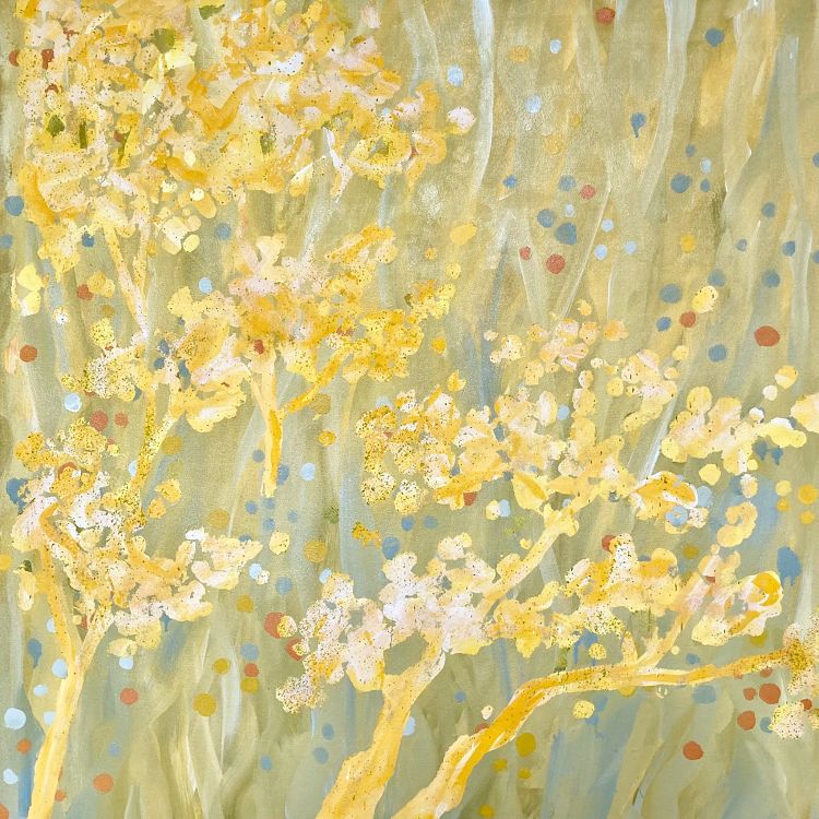
A recent painting photographed on my iPhone.
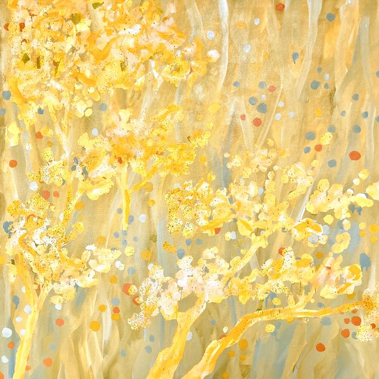
The same painting adjusted for correct color.
I advise keeping one foot planted in the analogue, organic world of reflective light as a teaching experience when it comes to colour today. All the answers are there in every leaf, meadow, or sunset.
The screen-based nature of commerce through the lens of today’s multinational brands and their designers requires modern tools and high-performance colour systems that communicate urgently and effectively for enhanced brand recognition.
Finally, like many advancements in the 21 st century, balancing what is gained with what is lost is a very personal choice.
You might like...
- Autobahn - November 26, 2021
- Alphabetical - November 12, 2021
- SOFA Universe - November 8, 2021

