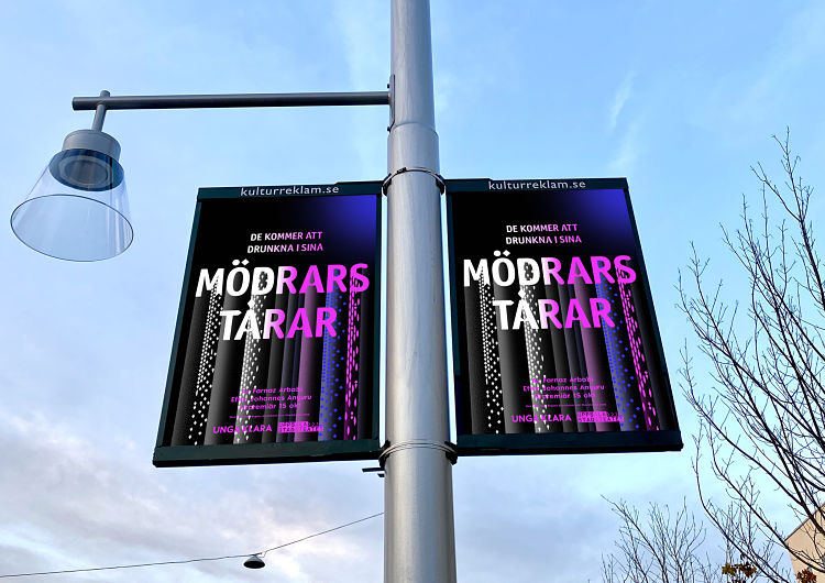
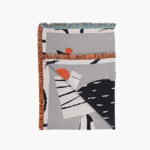
Parasto Backman’s work has long stood out for its roots in disrupting what we’d expect of “typical” Swedish design: out with minimalism, in with challenging the western perceptions of what “good” design is, and should be.
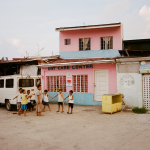
Backman, who teaches as Senior Lecturer at the Master Program in Visual Communication at Konstfack University College of Arts, Craft & Design alongside her studio practice, strives to embed intersectional perspectives directly into the thinking, and the look and feel of her work. Her clients are usually very much long term partnerships, and usually hail from the cultural side of things; including art galleries, architects, theatres and book publishers. For Backman, 2020 was a surprisingly busy year, which saw her continue to work with existing clients, design a fair few books, and create the visual identity for a company that helps unite Swedish locals with those who are new to the area.
Throughout all of her projects, however, are firm beliefs in not accepting what might be seen as the design “norm,” and embedding far wider-reaching moral values throughout her strategy and visual outcomes. We had a chat with her to find out more.
 Tell me more about how you use an intersectional approach as a design method.
My background has quite an important role: I’m born in Sweden, but I have roots in Iran. I didn’t have any connections to art or culture. So my impressions and frames of reference came from completely different places: I have had one foot in the Swedish culture and one in the Iranian. Quite early on, I understood that one aspect of my references wasn’t really accepted within the dominant tradition of [Swedish] aesthetics—I just couldn’t really verbalise that. I would say now, looking back, the mixture of different styles and cultures characterise me and influenced my view of what was considered the accepted “good”, normative and so on. The dominant traditions here in Sweden of the more modernistic approach of form follows function was something I struggled with for quite a long time.
How does your work play out that sort of antithesis to inherited “good taste”?
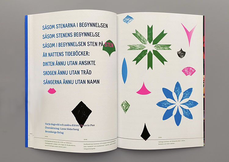
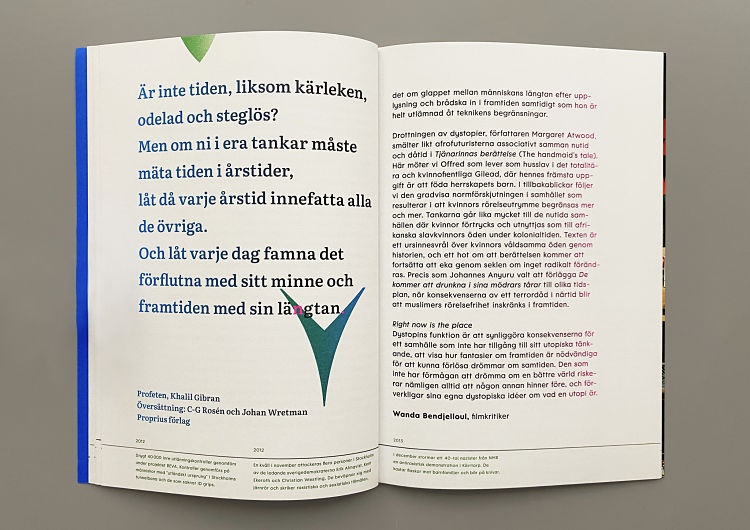
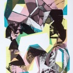
If I compare the way I work to the dominant traditions—what we are used to—I would say I work more with complexity. Instead of simplifying, as I think is more common, I do the opposite: I work with a lot of layers, and I add stuff instead of simplifying. Everything depends on the project, of course. I usually start with a framing of research around the subject area, which is quite important for me to be able to be free within it.
 Do you ever have any kind of pushback with clients who aren’t used to your approach?
Now, because I’ve been running my studio for quite a long time, clients that approach me want something created outside of these dominant frameworks. Some of them say, ‘Oh, I love this project, I would like something similar.’ Then I always say ‘okay, but I worked with that for like six months or a year. What you want is something different, and I will need time to get there.’ It might be something similar, but it also It might also be something else.
I work a lot with with like, the cultural sphere, so there’s usually more space for being creative. Of course sometimes I will have to compromise, and sometimes they will have to compromise. And that’s sure, yeah,
Why do you think that most of your work has been with cultural clients? Do you think it’s simply because of that what you just mentioned, that room to be creative? Or is there more to it in terms of the alignment of your ideas?
I think it’s a mix of both. I would love to do more like commercial work as well. But there’s often so many more people who have to have a say. The clients or projects I work on most usually have a smaller working group, it’s more of a dialogue. But of course, there are more commercial clients who are more daring. There’s quite a lot of clients who really don’t understand the impact that design has.
 How did you first get into design?
That was quite a long journey. It started at high school, I had some friends back in the suburb where I grew up—it’s quite far outside of Stockholm with a real mix of people. Three of my friends got famous with their music overnight: I think I was about 15, and it was such a huge thing because two of them had roots in Ethiopian Ethiopian, one of them in Eritrea. They got super huge and they had quite a lot to say about the visual identity around them. It was an important moment for me and it struck me as when I actually understood the impact of visual communication. They made something possible that I really didn’t think was possible, at the beginning.
After that, it took me several years to even locate like the art schools in Sweden, because I had no one around me that went. A friend of a friend wanted an assistant in their advertising firm, so that was my way in. After I went to art school I started to understand the different codes, but also found my approach. I studied my bachelors at Beckmans College of Design in Stockholm, and for maybe the first year, I really tried to fit more or less with the modern, traditional approach; but then in the second year, I was like, ‘Why should I?’ And I started to question things. Around that time, I started to formulate what my practice is now.
 How did those experiences that you had impact the way that you teach? What do you think are the most important things that students need to know if they want to get into similar work to you?
I would say that it’s my experiences and I also encourage an approach where we talk about how to reflect on design choices and put them in a broader context, and also to reflect on the dominant traditions within graphic design. With that, I don’t mean that there is a right or wrong: if you want to work in a modernistic tradition, do that. You need to know that that is also a choice, and it has a history. It’s not just ‘there’.
So there’s a lot of dialogue around looking at the methods they work with. As a teacher, I don’t think I’m the one who will give them the answers. We ask questions together, and we investigate, and we experiment, then we do different things. I think that’s quite important, and it’s quite the opposite of my experience from my education.
 At the end of last year, you mentioned you’d started an artistic research project. Can you talk about that at all?
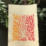
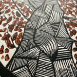
It’s something that I’ve, that I’ve been thinking about for maybe three years or so, but started it last year, more or less, and it’s going slowly. The project is based on Iranian feminist publications from the early 20th century, or from the Iranian Revolution in 1979. Its’ issues are related to feminism and eurocentrism, which is central to my practice, but what I’m trying to do with this project is to try to make space for more perspectives within graphic design, partly by making available a material history that introduces matter that is not Western as its starting point. The project is translating the material with methods that also reconsider things like bilingualism.
A few years ago, I came across like low res image of a cover that I just hadn’t seen, and I’ve looked at a lot of feminist publications and collections—an illustration of a woman [and text] which means ‘women’s voice’ in Farsi, in Persian. When I got researching, I understood that there is an archive in Amsterdam with quite a lot of material from that magazine. It was all one woman’s initiative. She was quite a prominent feminist in Iran at that time [1920s], but she was also from a rich family, she had a lot of money. So when the Iranian revolution happened, she had died, but her family smuggled the archive out from Iran to save it, which is why it’s in Amsterdam.
I hope to work with both Farsi and Latin because I want this material spread. so more people can access it. The research is around how to materialize it—how to make a publication that can communicate both to Farsi speaking people and to people who read Latin scripts.
 Any project highlights from 2020?
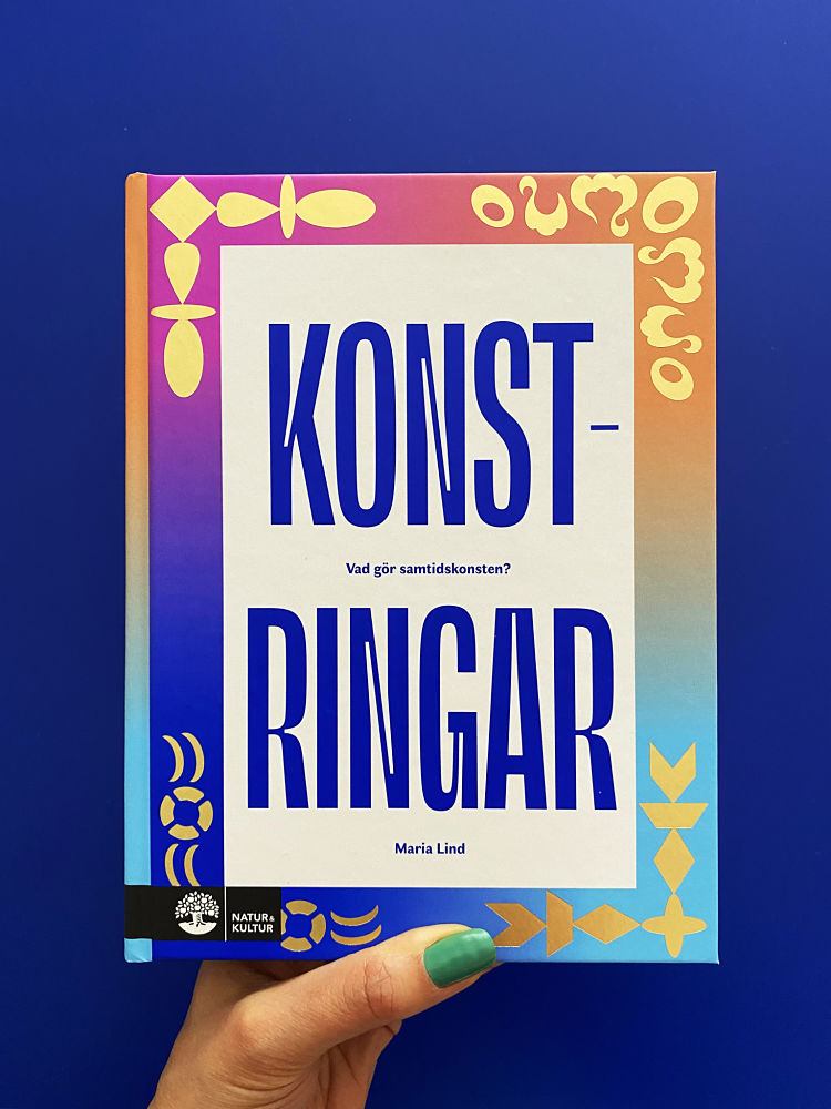
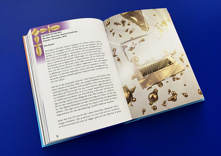
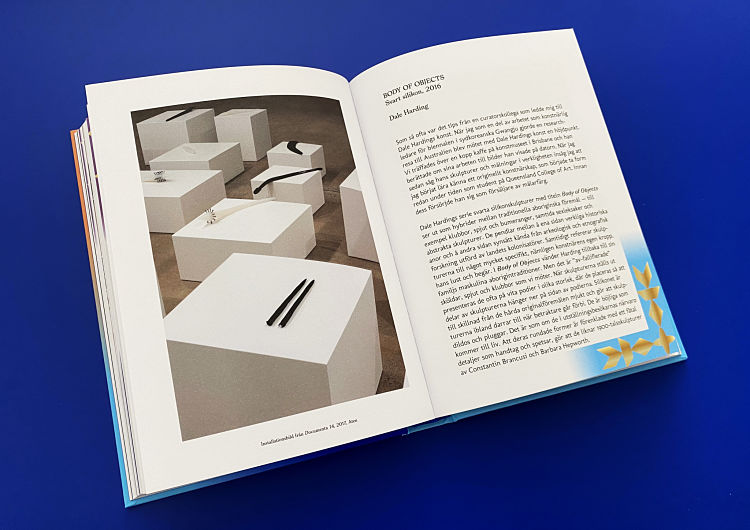
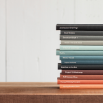
I’ve been working on quite a lot of books. One was for [Swedish art critic and curator] Maria Lind, and the idea was to make contemporary art more for everyone who might be or could be interested in it. She made a selection of 20 artists, so I’ve tried to make a more dynamic design looking at the idea of the white cube. The artists can broadly be split into four categories, so the ‘white cube; is more or less in the middle of the book, as they wanted to present the artwork that way, and there’s four corners—one for each theme—and I work in the margins.
You might like...
 Brian Flaherty
- Michael Mercer Brown
- Jeroen Heeman aka Erosie
- CHOCHO: BESTIAS by Olivier Tenedor
- What If x Pomme Chan
- Marine Laroche
- Helmo
- Tissue Magazine
- Atelier Bebop
- FiftyThree x Moleskine :: BOOK
- DeckStarter
- Huf SS13
- Exhibition :: ODD VOLUME
- Dominic Hawgood
- Leave Me Hanging
- Jeremy Pettis – “Twenty-six types of Animals”


- Autobahn - November 26, 2021
- Alphabetical - November 12, 2021
- SOFA Universe - November 8, 2021