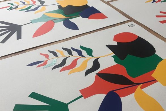
This month we’re stoked to present a selection of poster designs by members of our Official POP community. From posters raising funds to support charitable causes, to gig promo, and learning a new language, our members have used the poster format alongside printmaking techniques including Risograph, screen print, and letterpress for a wide range of projects.
Gemma Wilson: Peter Pandemic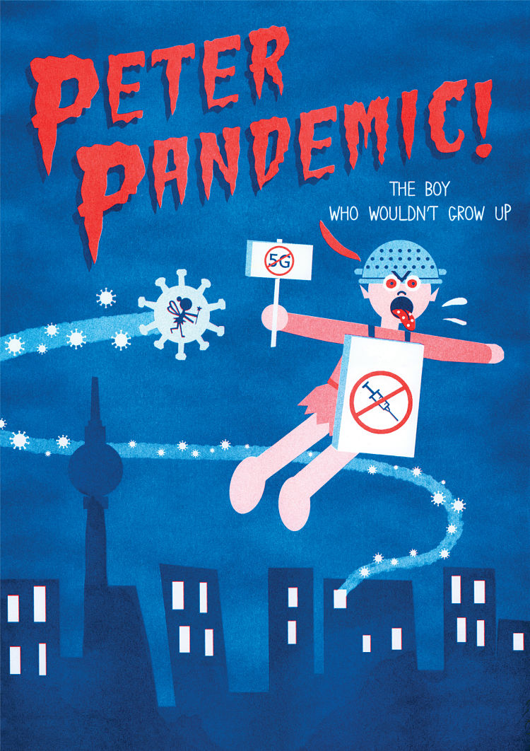
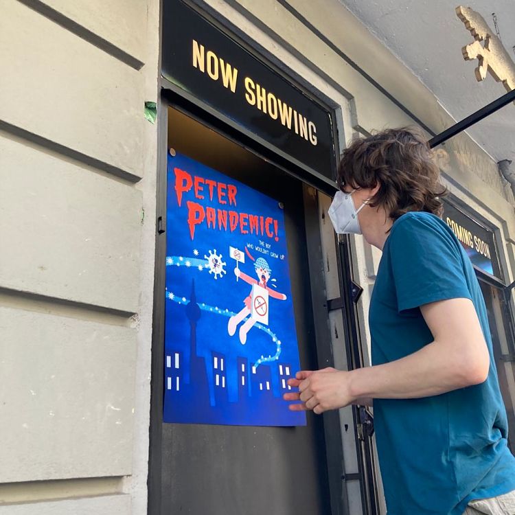
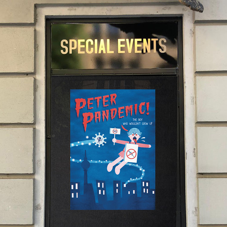 Peter Pandemic is part of a series of made-up movie posters by artists of Studio Tampopo, imagining life with and after corona. The posters were showcased during this years 48 stunden Neukölln art festival in the window displays of the cinema Wolf Kino in Berlin. The original two coloured Riso printed posters are still available from studiotampopo.com with a portion of the proceeds donated to the cinema.
Takako Copeland: Hiragana Poster
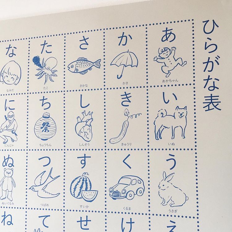
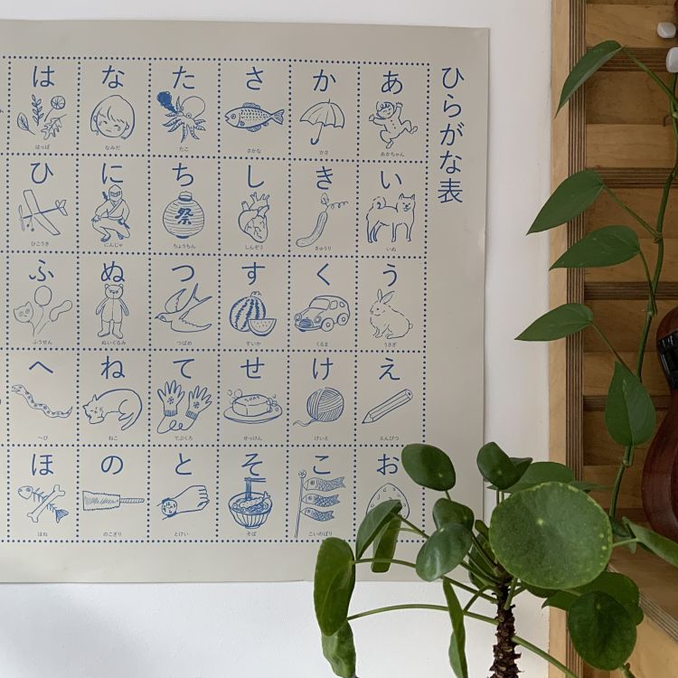 This illustrated poster, Hiragana, showcases the first step to learning the Japanese language. Takako orignally made this poster in 2018 to help her daughter learn Japanese. Now in a second edition, it has been lithographically printed 140 gsm off white sugar paper, at almost A1 size by a highly skilled printer in East London. “I chose each sample vocabulary very carefully from my childhood customs, food I used to enjoy, or household objects and experiences from growing up in rural countryside in Japan,” explains Takako. Putting up this poster will help one to learn hiragana; you can colour it in, cut them up to make flash card sets, or just enjoy the illustrations of some slightly retro and obscure Japanese objects.
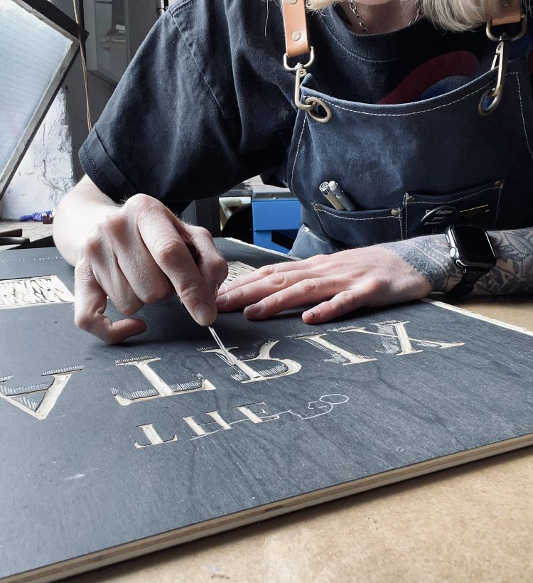
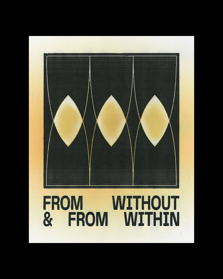
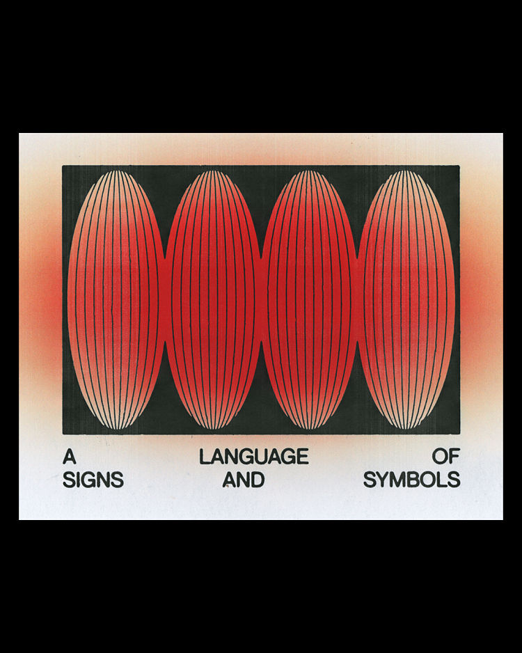
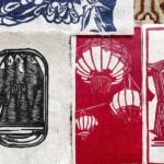
David Mascha: Letterpress Posters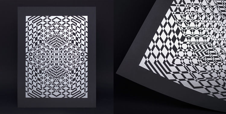
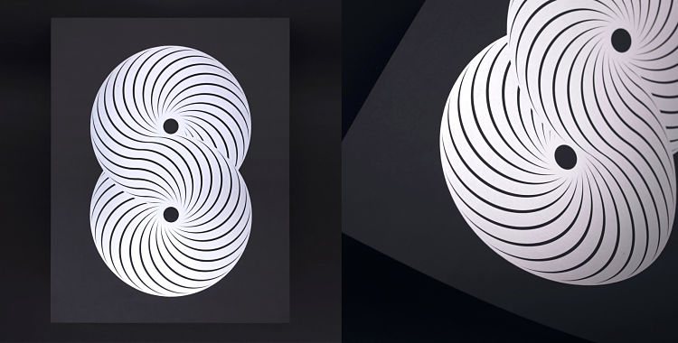
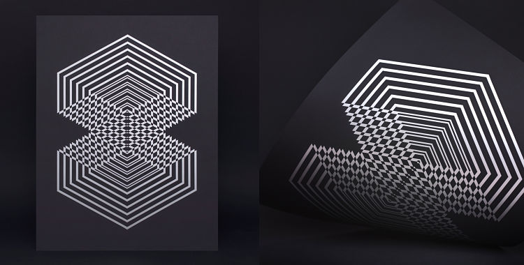 Vienna based artist and designer, David Mascha, has been working on a number of posters inspired by Opart and Geometric patterns. All posters were printed with silver ink on a black rubberised paper which creates a beautiful contrasting effect. The smooth surface of the paper is ideal for letterpress printing and offers excellent quality for complex and detailed works of art. All posters are signed and numbered and hand-printed on an old German FAG standard proof press.
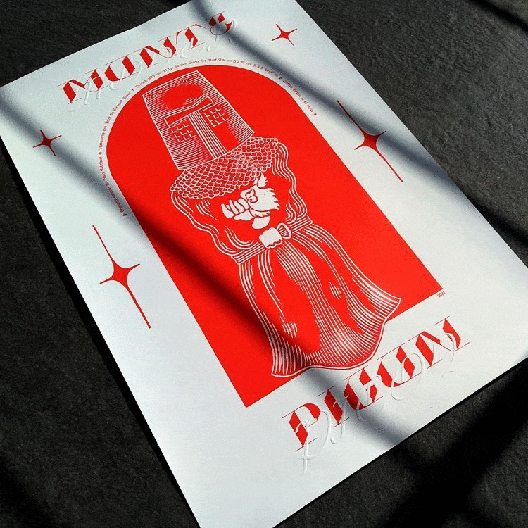
Clément Cases: Monty Picon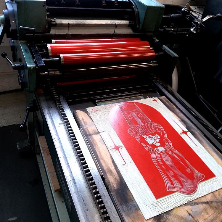

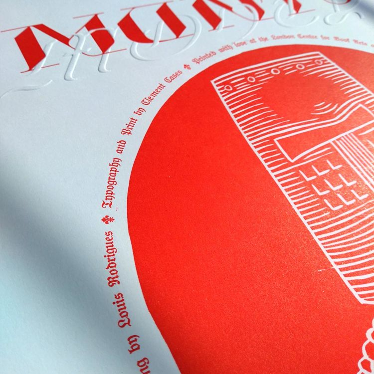 Monty Picon was produced as a collaborative poster, with input from a traditional illustrator, type-lover, and printmaker. “The idea was to combine our love of absurdist humour with the possibilities of handmade printing. So we worked on a visual referencing the Monty Python,” describes Clement. He continues; “The challenge was to push each machine and know-how to its maximum to try and get a unique result”. The poster is produced from a combination of engraving on lino, embossing, letterpress printing with magnesium plate, and a metal type melted for the occasion. It is composed of a central part made by Louis Rodrigues in linocut and typography designed Clément Cases; the goal was to intermingle two types by playing with the printing possibilities. The final part was the informative text which is printed in metal type, whose letters they melted in one of the rare foundries still in activity in London.
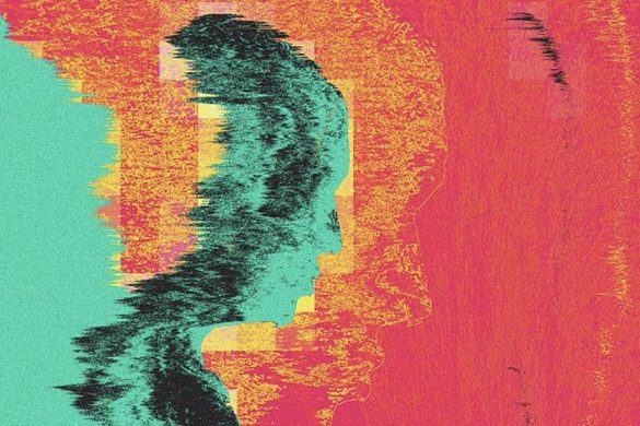
Flycatcher Press: Déjà vu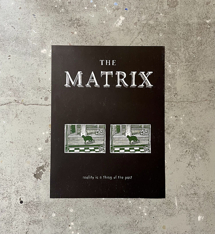
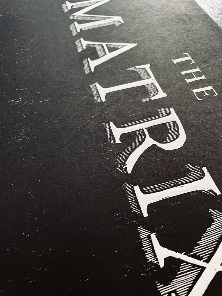
 This poster was created firstly as a technical experiment, and secondly as fan art. “I wanted to take depict the iconic glitch in the matrix scene and illustrate it, but also try combining large-scale woodblock and linocut printing in the same image,” says Phoebe of Flycatcher Press. She describes; “I especially like the way the wood grain comes through the background, and the imperfection in the carving of the text that gives it a certain pixel-ish look”. The colour palette was inspired by the Matrix movie itself, using the iconic “hacker green” and black, although Phoebe also experimented with printing the linocut in red/black.
Phillip Janta: DONOTS Tour Poster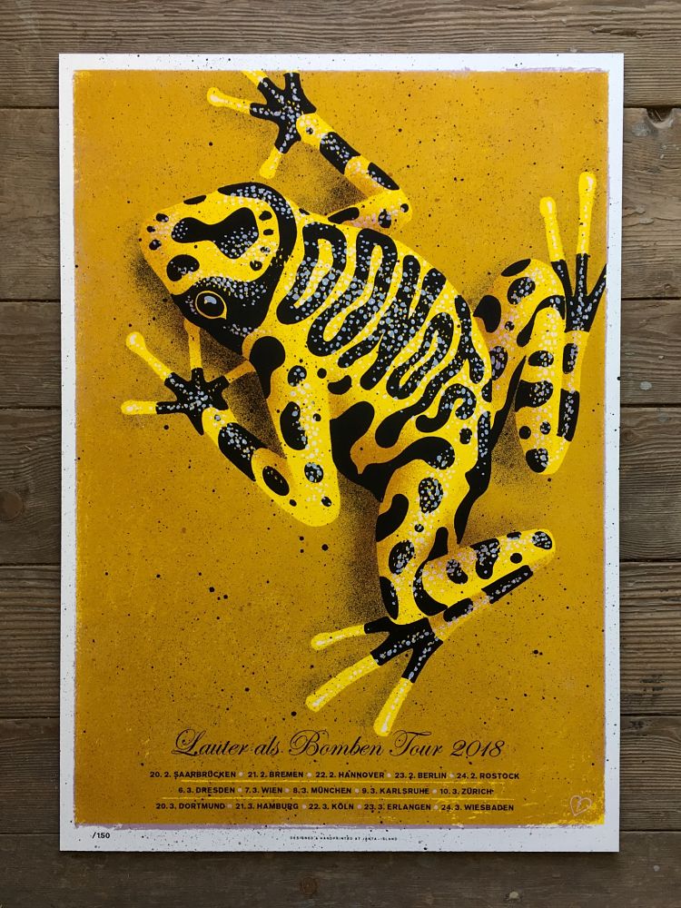
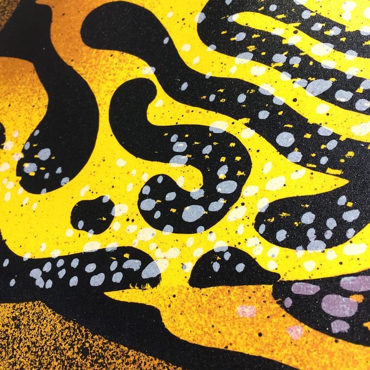
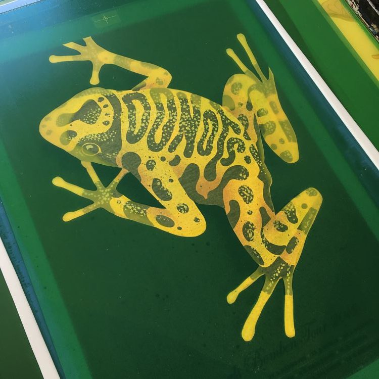 Phillip Janta created this Tour Poster for the German punk band DONOTS in 2018. Because of the yellow cover of their album Lauter als Bomben, Phillip decided to use a yellow poison dart frog for the poster and included the name of the band on its skin. The poster is a six colour screen print, and all six layers were created by hand, using a pencil, a brush, a toothbrush, a sponge, and many more analogue tools. “I was really surprised about how the 3-D effect comes out in the final result,” describes the printmaker. It was printed an edition of 150 which is now sold out.
Amélie du Petit Thouars: Plaisirs Coupables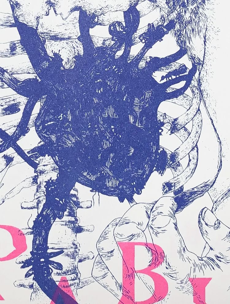
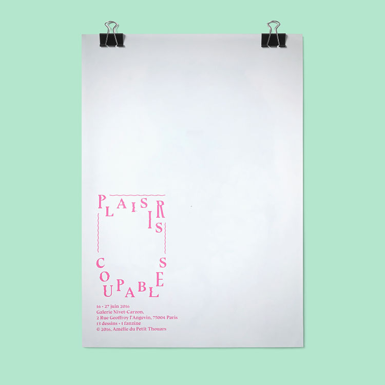
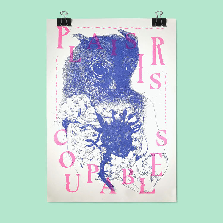 This poster was designed with love for Amelie’s first exhibition. She took a drawing from the series she exhibited and created a customised title from the font she had selected to communicate for the whole project. The piece is a double-sided A3 Risograph poster, printed in 2 colours in Paris. “It holds a special place in my heart because I tried to create a whole atmosphere around a project that took me 5 years to finish,” says Amelie.
Gavin Ambrose: Chroma
 Chroma is an ongoing collaboration between Gavin Ambrose, based in Brighton, and Patrick Thomas, based in Berlin. The project is a series of experiments in all forms of print including Risoraph, spray paint, screen print, and lithography. This poster explores the CMYK printing colours using screen print. There are four sets of posters all using the same square artwork that is rotated through 90 degrees. Each of the sets starts with a different colour, Cyan, Magenta, Yellow or Black (K), that then has the additional colours printed in the CMYK sequence. For example, the poster starting with Cyan is then printed in Magenta, Yellow, and finally Black. The poster starting with Magenta has Yellow, Black, and then Cyan. The resulting edition is an exploration of the subtle differences the printing order makes to colour. The shapes used are from Patrick’s extensive collection of packaging ephemera. Printed in an edition of 50, at 50cm x 50cm.
Alexander Khabbazi: Line & Gradient
 Alexander’s poster series titled Line & Gradient came about through the desire to blend digital and analogue processes in a seamless fashion. Using an old and broken inkjet printer, digital compositions were printed onto the cheapest cartridge paper available and rescanned back into digital format. During this process, the fun began; the printer and scanner are jogged and jolted to create a variety of authentic analogue messiness. “When it comes to what’s digital and natural, you can’t trick the eye with digital effects. Sometimes there is no replacement for the real thing,” says Alexander.
Tanya Brassie: Public Service Posters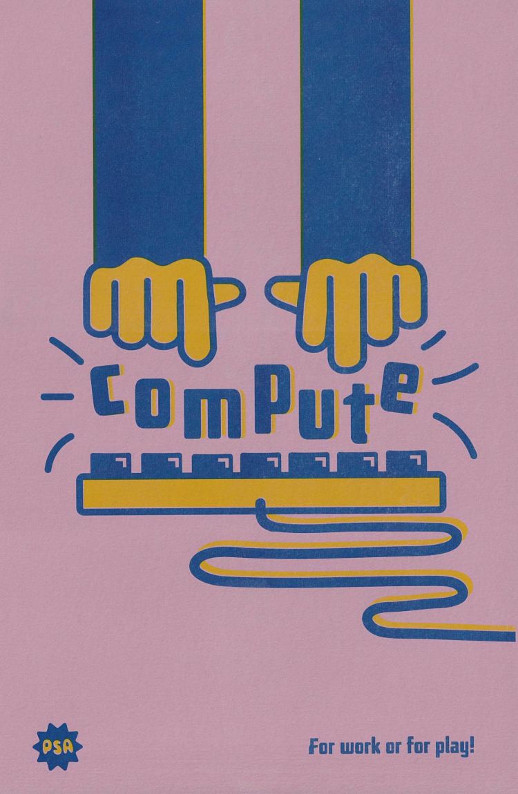
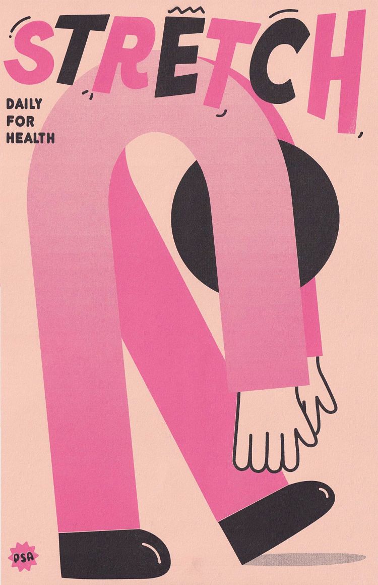
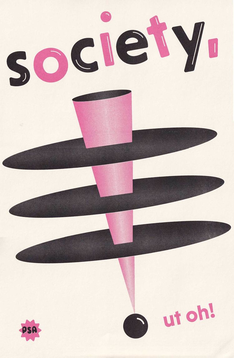 Tanya’s Public Service Announcement (PSA) poster series is an ongoing personal project born from her love of posters, soviet propaganda, and the idea of propaganda in general. The collection consists of vibrant, playful Riso printed posters that are intended to give an imaginary audience (or herself) general life advice. The series is also a go-to project when she feels creatively stuck; “just make a PSA poster, I tell myself and usually the ideas start to flow”.
Agata Rawecka-Deelen: Portraits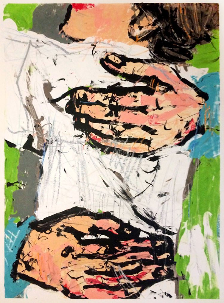
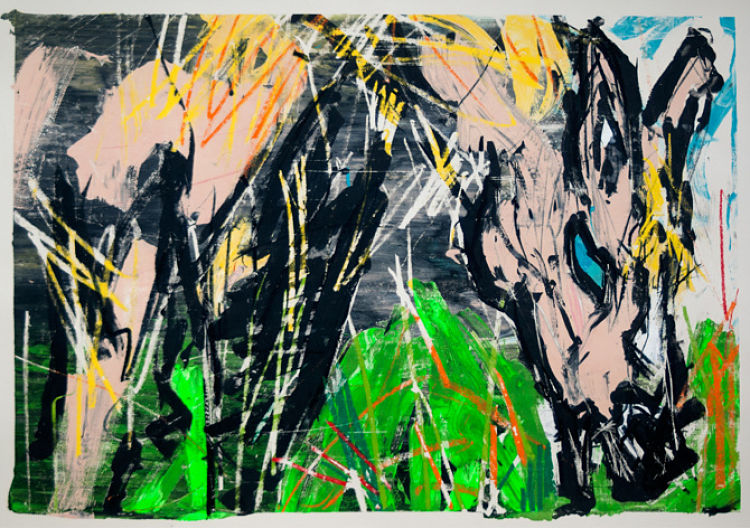
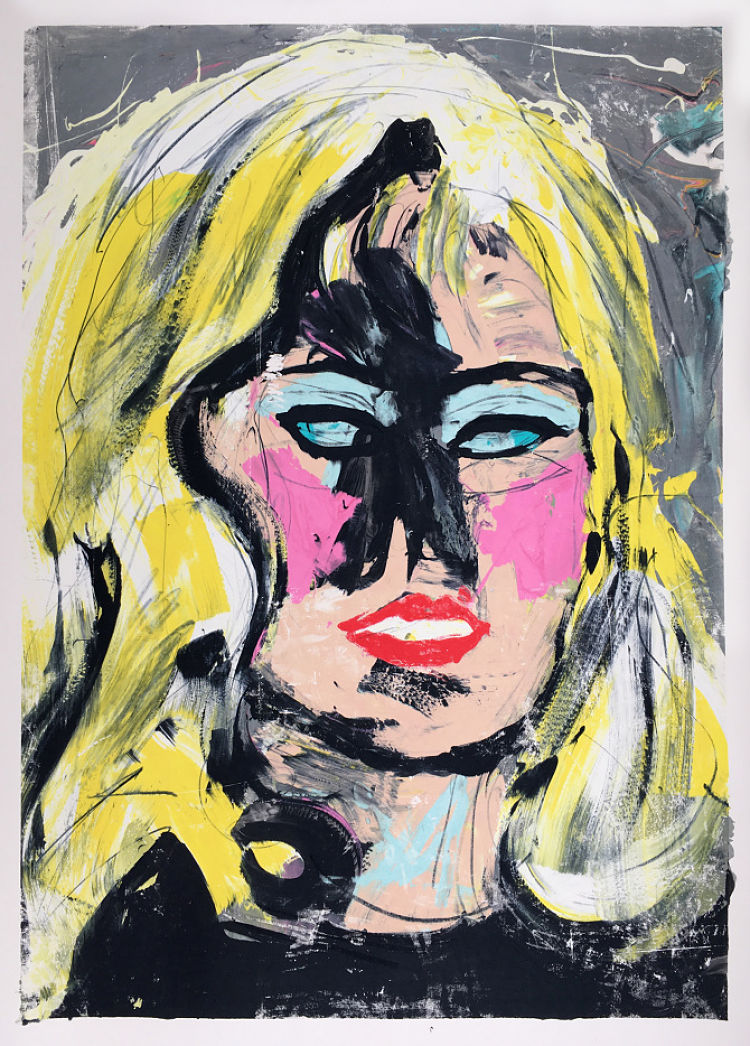 London-based visual artist, Agata, has created a series of posters focusing on portraiture conveying her feelings about feminism, emotions, love and anger, and the soul. Her expressive posters are created using a unique combination of screen printing, mono-printing, lithography, painting, and drawing.
Alastair Keady: Silk Purse / Sow’s Ear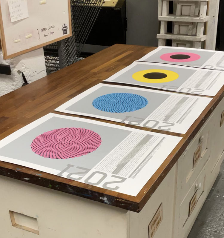
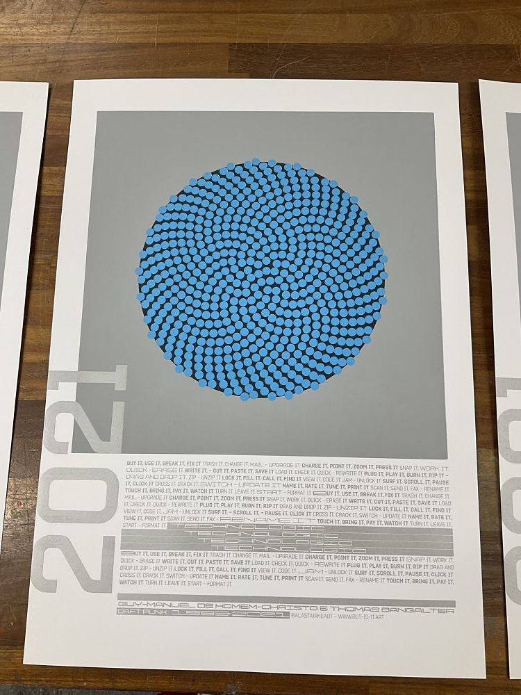
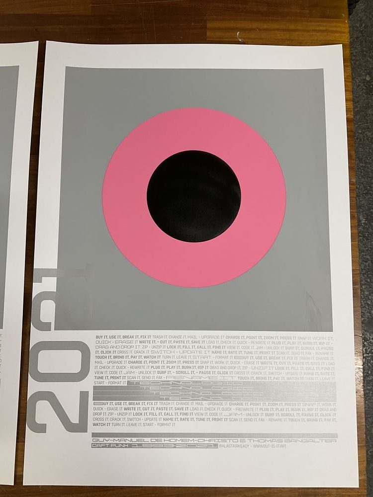 With a bunch of prints from his ongoing Allsorts edition that failed quality control – mostly smearing in the flat grey ink – Alastair decided to put them to use, rather than go in the make-ready bin. He created a series of commemorative/celebratory posters, marking the year that has seen the rollout of vaccines, and the end of Daft Punk. Silver type, with the lyrics to ‘Technologic’, have been overprinted on four different untrimmed Allsorts prints. The posters will be distributed around Dublin pubs and cafés gig notice boards, once they re-open for indoor business on July 5th.
Luke Matthews: Feet In The Streets Protest Poster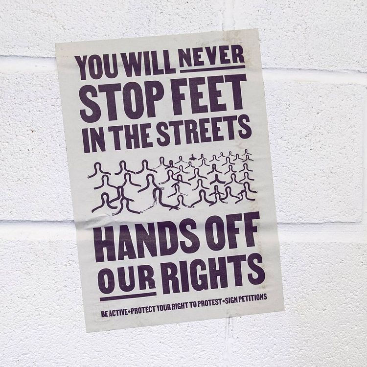
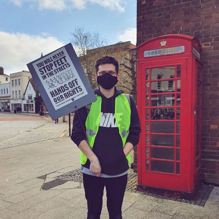
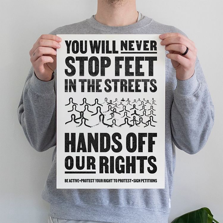 In response to a recent bill and the Sarah Everard vigil in London, Luke worked with another creative to put this Feet In The Streets Riso-printed protest poster together. “This protest print was created in collaboration with Sam Lightfinch – a fantastic copywriter. Stick it up in the streets, put it in your window, send it to your MP. Be active,” says Luke. The money spent on the print covers the postage cost and there was no profit from its sales. Some people chose to frame their poster, some people stuck it to banners at protests, and others plastered them around their towns and cities. “When reactionary art moves from the digital space into people’s real lives it can make a big difference.”
Margaret Mallows: Your Planet & Do Not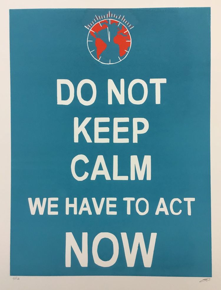
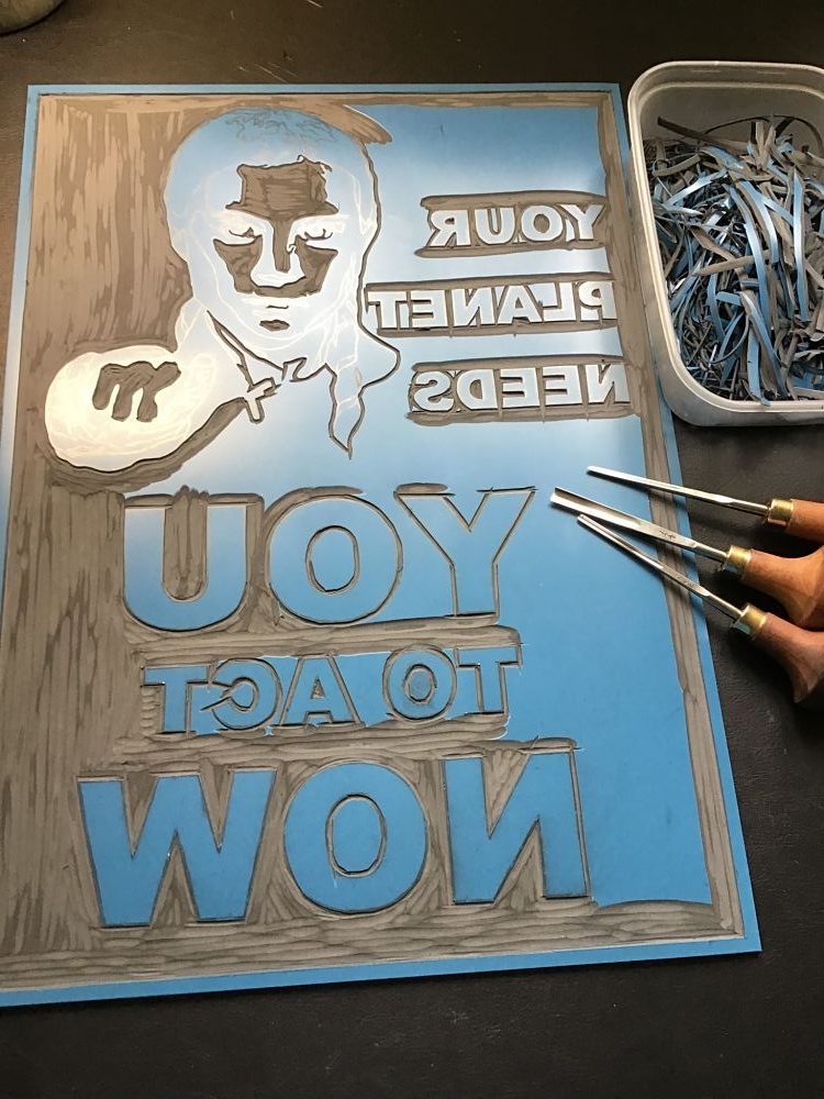
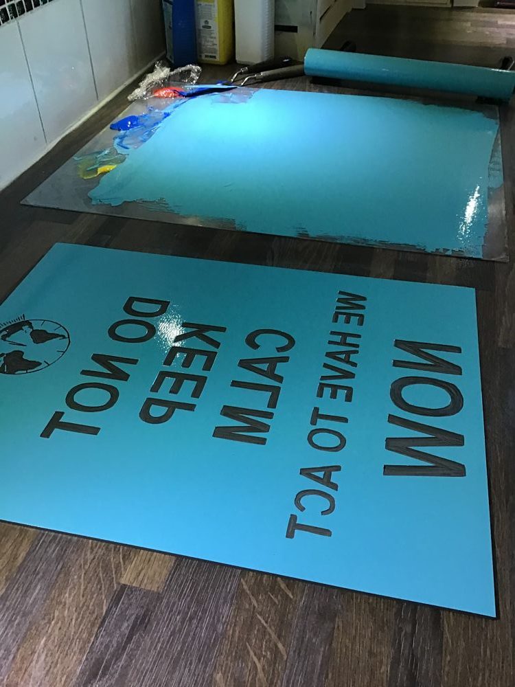 Margaret’s posters Your Planet and Do Not were linocut prints made as an entry for a global art competition to raise public awareness of climate change. “I felt that a poster style submission would put across the message well in a way that that is easily understood by all audiences and for added impact I used styles of image used in wartime to convey messages,” explains the printmaker. These are limited edition lino reduction prints with image sizes 30 x 40cm. Whilst a variation from Margaret’s normal lino prints, she enjoyed the simplicity of each image; and Do Not was a shortlisted entry for the competition.
www.artfinder.com/margaret-mallows
Anna Wilson: Art in Public Spaces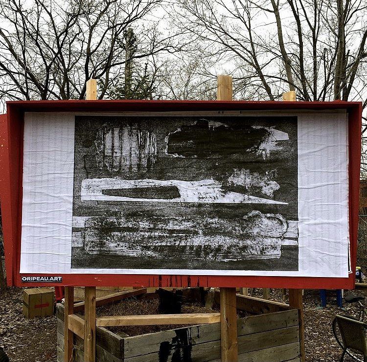
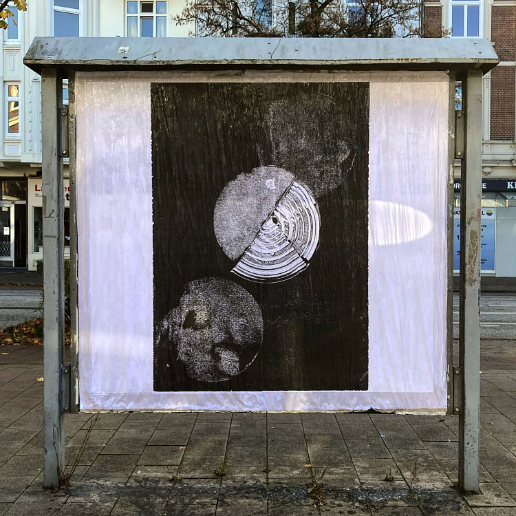
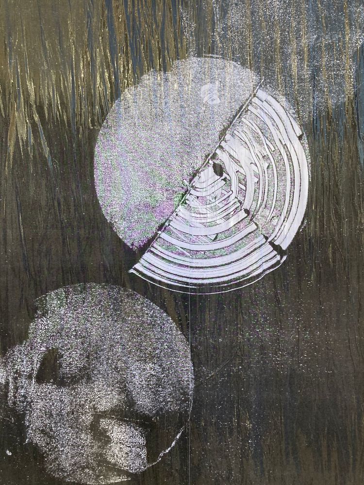 Melpomene is a collagraph print based on Greek mythology by Anna Wilson. Melpomene; initially the muse of song and chorus, eventually became the muse of tragedy. This piece was exhibited as part of Oripeau urban display panel in Montreal, Canada, exhibiting visuals in urban public spaces. Anna also recently created a second monoprinted poster; I have waited so long for you, based on longing and the search for something unobtainable. This piece was exhibited as part of Studio Othertypes poster wall in Hamburg, Germany, dedicated to graphic exploration in a public space. Both poster walls enabled the work to be seen on a large scale highlighting the delicate marks made during the printmaking process, allowing the public to experience the work in a new light.
Mario Carpe: First World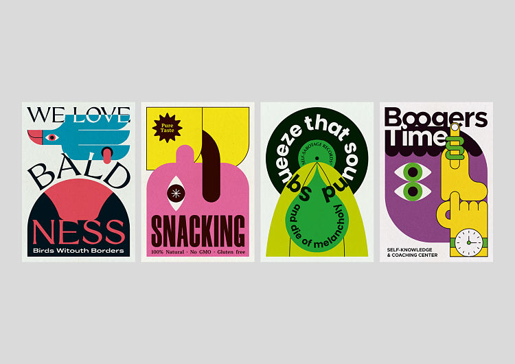
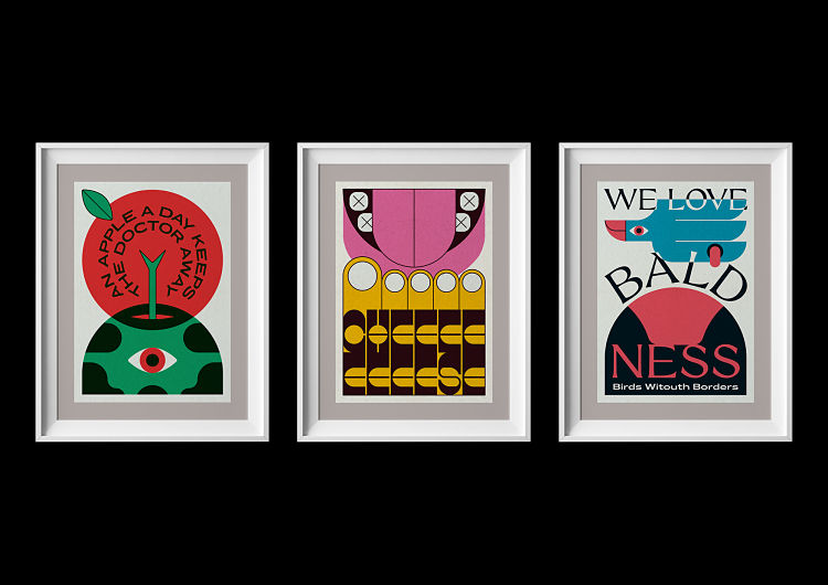 First World is a collection of poster prints by graphic designer Mario Carpe showcasing a raw mix of reality, irony, and humour. The artworks Snacking, Boogers Time, and Cheese have been published in an exclusive collaboration with 180 Hilos. Both human beings and aliens are able to purchase these prints in a limited series of 25 signed and numbered.
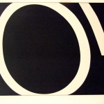
Fresh Lemon Print: Line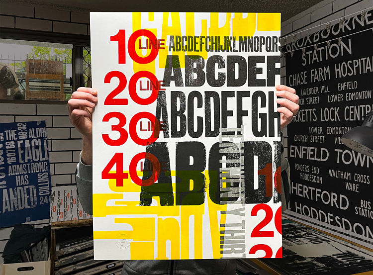
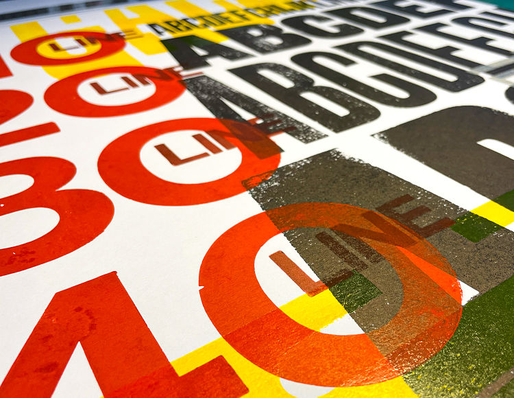
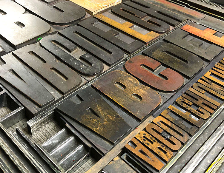 Line is a type specimen sheet with a difference created by Phil Gambrill of Fresh Lemon Print. The letterpress poster was hand inked and printed using original techniques. It showcases a selection of oversized vintage wooden type at increasing sizes; 10 line, 20 line, 30 line and 40 line typefaces. It is overlaid with an even larger 10 inch (60 line) wood block type with a type scale in Helvetica.
Filippos Fragkogiannis: Moncler Specimen Posters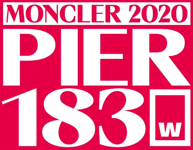
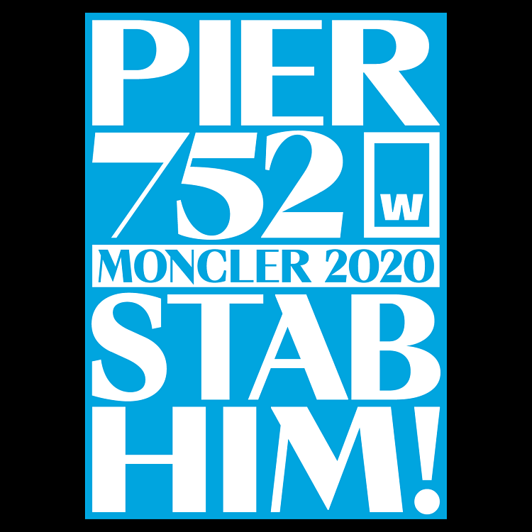
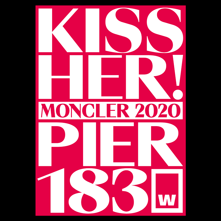 W Type Foundry’s Moncler, designed by the talented David Súid, is one of Filippos’ personal favourite typefaces. It’s unconventional features of caps in lowercase and variable specification add an almost rapacious feel to the letters. The character shape and structure is reminiscent of noir imagery, hinting at the romantic and illicit. From the universe of horror fiction literature, Dracula, carrier of the undead curse, is one of the most exciting and inspiring personas. Inspired by the classic novel, Moncler sets to explore the renaissance art movement, its form, and temperament. Drawing from the noir, the two posters vividly describe a plot set in two different harbours – as remote locations- where the two emotionally charged stories unravel. Playfully depicting intimate stories unfolding in the dark of the night, the posters depict concealed, emotionally charged, narratives. The contradictions present amongst female and male, attraction and repulsion, passion and revenge, red and cyan, warm and cold, create a juxtaposing habitat presenting Moncler’s diverse character.
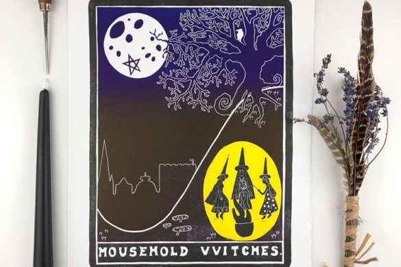
Anna Jane McIntyre: Once Upon a Time There Was a Witch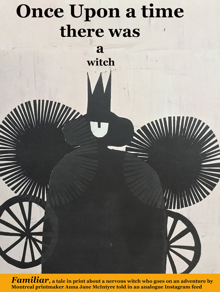
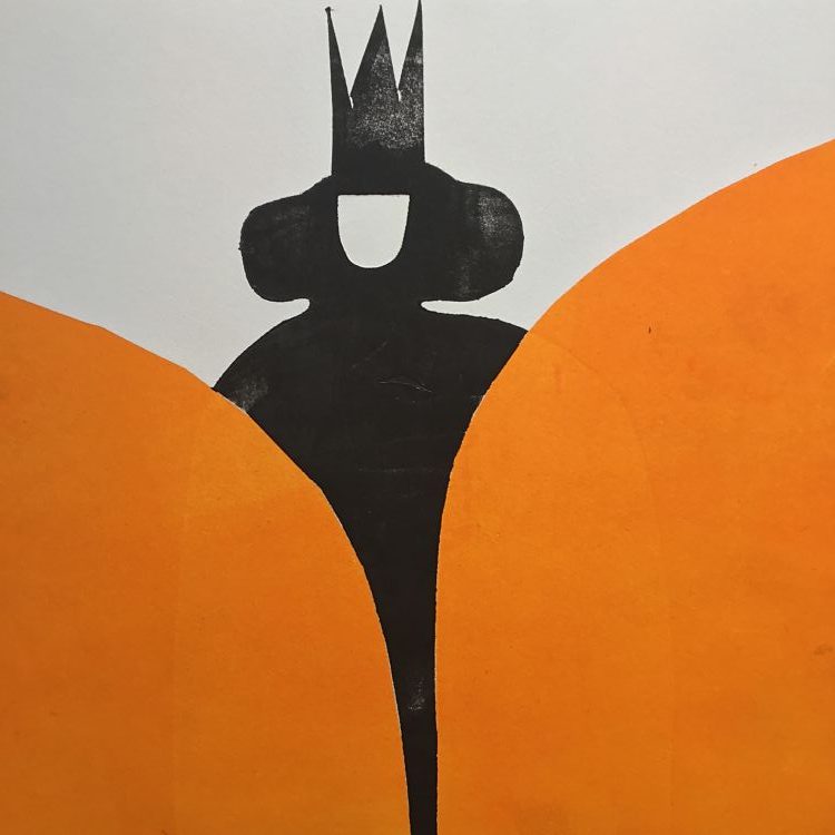
 These posters are part of Anna’s incomplete cut-paper-printing story about a witch who goes on an adventure. “I love to write, but often find it challenging to do the illustrations after I have created the story. With this process I discovered it is much easier to make the illustrations first,” says the artist.
Spiegelsaal: Elbphilharmonie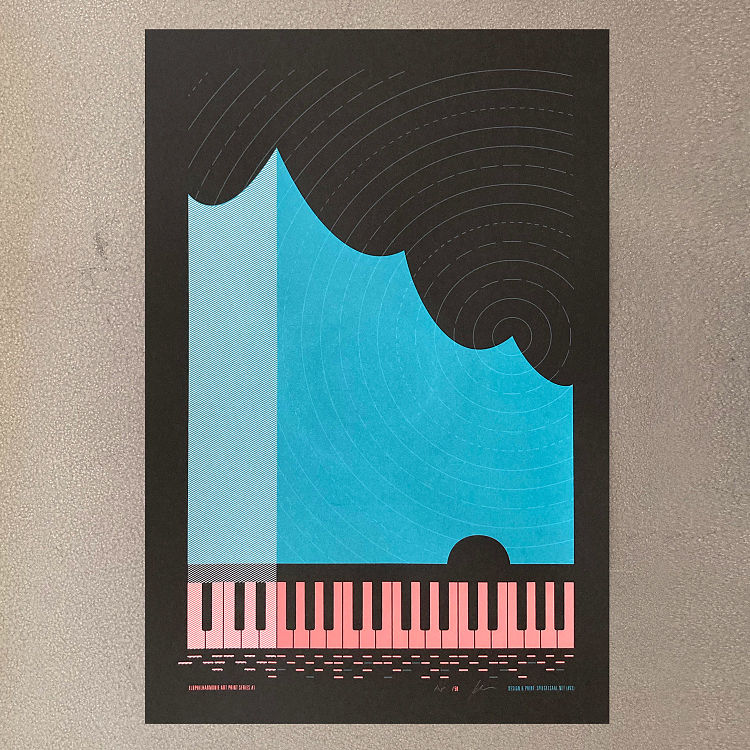
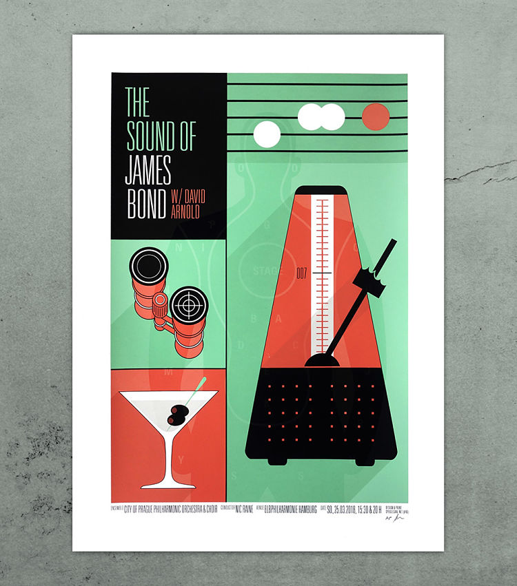
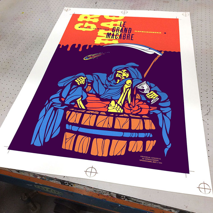 Since 2017, Spiegelsaal (and two other Hamburg based screenprint studios) create and print two gig posters per season for shows at Hamburg’s landmark venue Elbphilharmonie. So far, the broad musical spectrum included Brad Mehldau’s idiosyncratic jazz meditations, György Ligeti’s opera bizarre Le Grande Macabre, David Arnold’s James Bond musical extravaganza with full orchestra and quire, and many others. Up until 2020, the only chance to get the posters were either at the shows or at the Elbphilharmonie shop, but ever since the pandemic shut most cultural activities down, there is also an online shop.
Check out our membership directory in full and apply to join our community and benefit from a heap of perks at www.members.peopleofprint.com.
You might like...
 Gogy Esparze
- ONLY NY | Summer Totes and Skateboards
- Kingsley Ifill
- Team Shrig :: Fourth Plinth
- Pierrick Calvez: Ylin-Ylan
- Julia Kostreva
- Spassky Fischer
- Nadia Resta
- Dr Banana
- Creative Mess
- Alana Macleod — ‘Solace’ Collection
- PUTPUT
- David Hockney. A Bigger Book | TASCHEN
- OMG Kitty
- Ellsworth Kelly
- Opening Ceremony :: AW15


Want to know more about our membership? Give us an email at members@peopleofprint.com.
- Vetro Editions | Right Click Save - April 22, 2024
- Enea Seregni | MONSTERS! Collectible Cards - April 19, 2024
- Mark Frendo | Danger UXARD - April 18, 2024