Being design director at a yogurt company might not sound like too much of a big deal, but in the design world, if that yogurt company happens to be Chobani, you’ll know that’s a pretty impressive job title.
That title belongs to New York-based Canadian design director and illustrator Gabi Lamontagne, and the rebrand she worked on was deservedly given a fair few accolades, scooping Dieline’s Best of Show prize, three Gold Pencils and Cannes Lion recognition. But why? For one thing, the approach to typography was a refreshing riposte to the omnipresent cool, calm and frankly often boring mid century modern sans serifs that were being used by every “aspirational” brand and their dog.
 Naturally, the quirky, slightly retro but altogether pretty fresh designs were soon much-aped by other brands and designers across pretty much everything. The Chobani work was inspired by 1970s type design and the illustration styles that could be found in the era’s health and wellness books. The inhouse design team worked with type designer Berton Hasebe, who had previously drawn a soft Times which was tweaked to become the rounded serif used for the Chobani logo.
“At first, I was quite surprised by the impact of it,” says Lamontagne. “The brand needed something that felt warmer and optimistic. It had to communicate the joy and power of good food…Since 2017, we definitely saw a lot of brands stepping away from the sans serif. I think the rebrand helped to diversify typographic trends.”
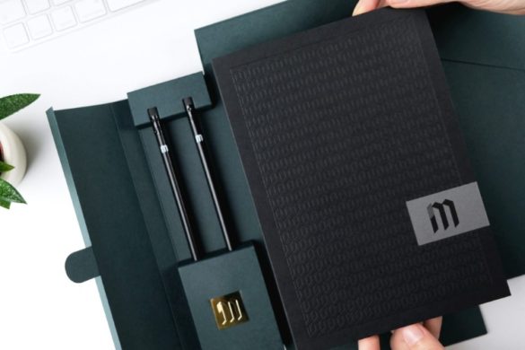
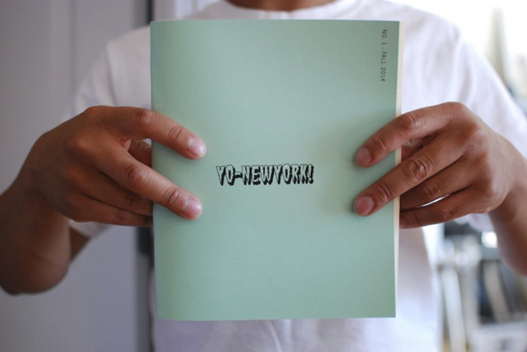
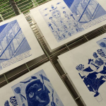
 In terms of her practice more generally, Lamontagne studied graphic design in Montreal, where she co-founded the screen printing atelier Charmant & Courtois, which operated from 2009 until 2018 and offered silkscreen and riso printing services. “Because I was spending so many hours at the computer for school and freelance work, I started creating zines and posters with brushes in my spare time,” says Lamontagne.
“Illustration keeps influencing my creative process in every aspect, it helps me solve compositions in an unexpected way, think of colours differently and to be a lot more resourceful.”
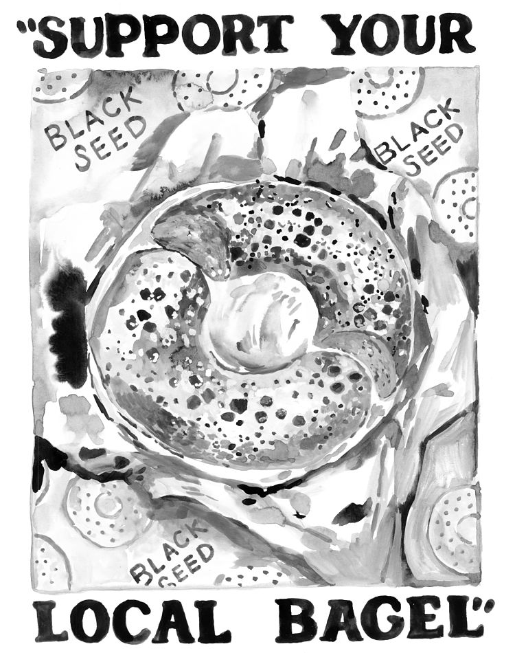
 Recent projects that have stood out for Lamontagne on a personal level were those from last year, which were both in a way related to the challenges of the pandemic. One came pretty early on, in the shape of Merch Aid, an initiative put together to raise funds for NYC restaurants by RGA called Merch Aid. She chose to support Black Seed Bagels, and painted a bagel framed by the text “support your local bagel.”
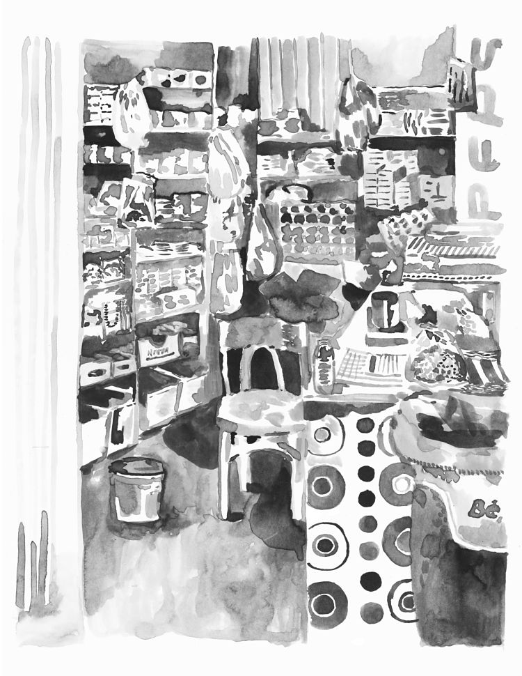
The second was a riso print she created a few months back for Beirut Editions, a series of commissioned works sold to raise funds for disaster relief after the explosion on 4 August. “I decided to paint the Dekkene of my friend’s uncle. They are the Beirut equivalent of a bodega,” Lamontagne explains.
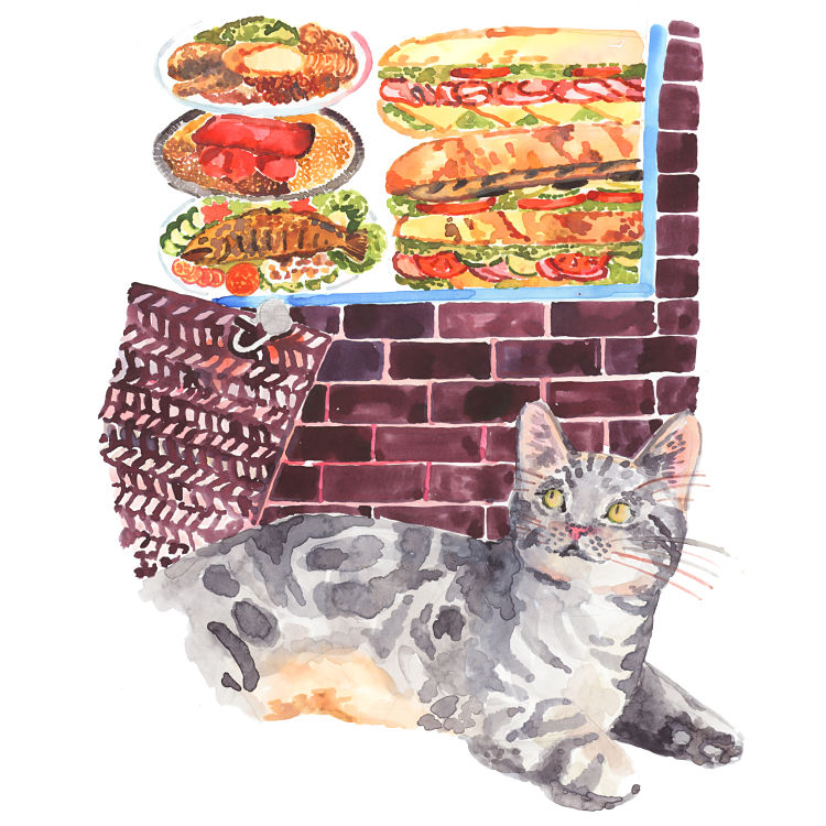
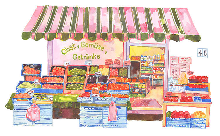
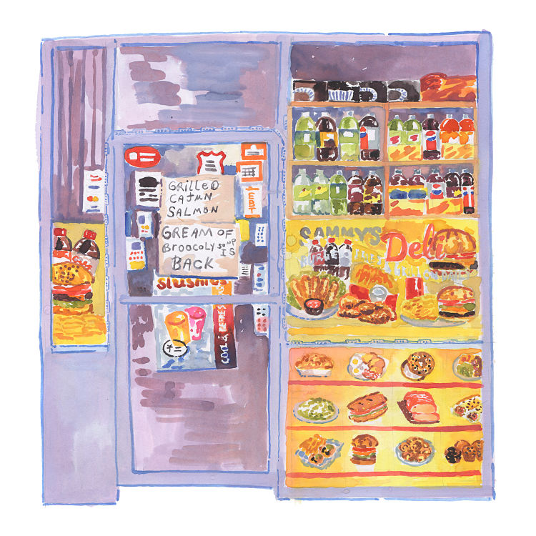
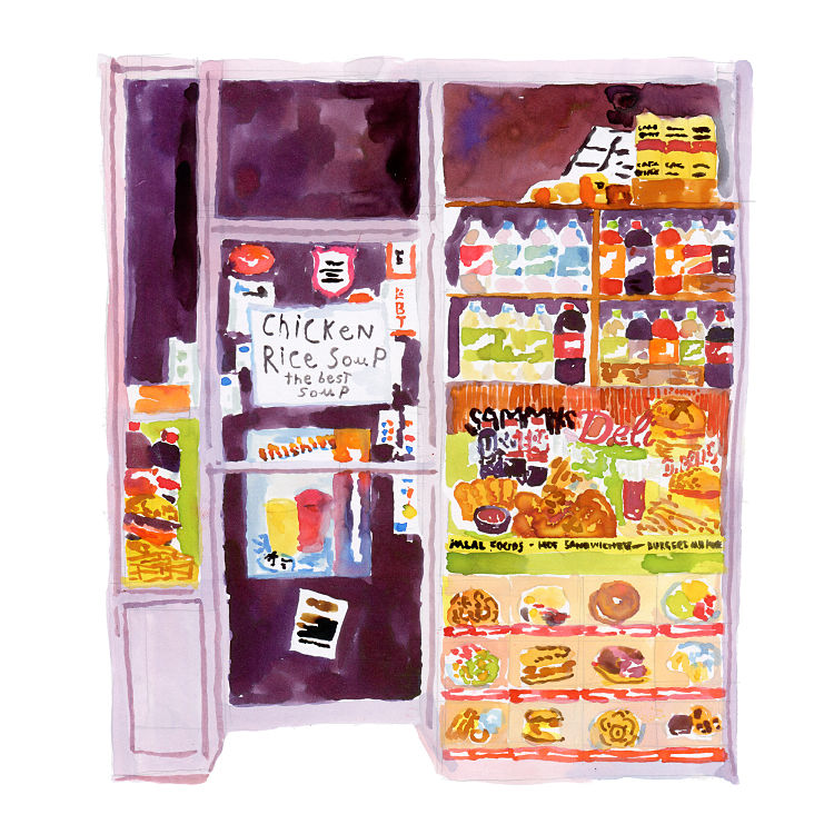
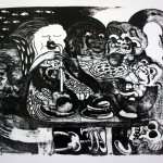
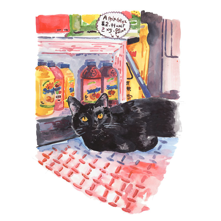 Lamontagne describes her illustration work as focusing on craft and “vernacular” aesthetics, looking to give a sense of playfulness in her images. This idea of the vernacular plays out beautifully in her series of Bodega images, for which she photographed “hundreds” of the New York City stories in order to paint them. “Bodegas are a fundamental part of our lifestyle in New York City. From hand-painted awnings, handwritten signs or food collages, the aesthetic of those corner stores is endemic to the city, and unique to the immigration ambition but they are often sadly overlooked,” she says. “I hope to capture their beauty and peculiarity of those storefronts. A great deal of the bodegas I’ve documented have since closed or switched owners and appearance since.
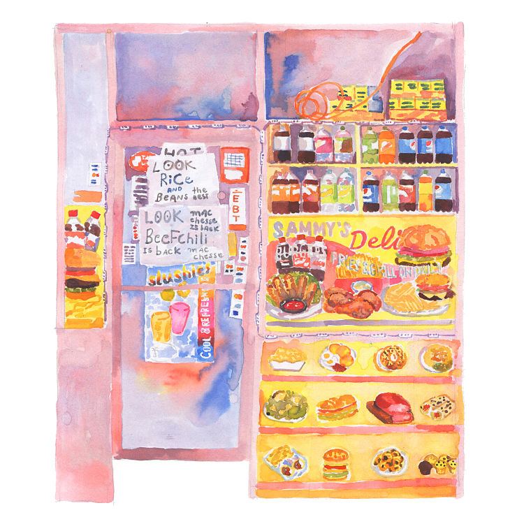
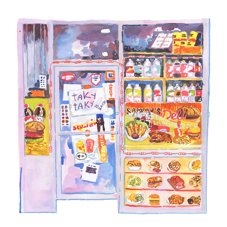 “As most of these bodegas don’t have websites and the Google street view photos taken at their location might have either not captured them or be updated with an image of the new business, my watercolours may be amongst the few documents of a business that represented the dreams and extraordinary determination of the family that owned them.”
You might like...
 Filippos Fragkogiannis | Vercetti Regular Free Sans-Serif Font
- C100
- Alma Kamal: STET
- Morgan Blair
- Marta Veludo
- Top Calendars 2024
- Parallel Universe Collective
- Department Store Vendor | Struan Teague
- Ward Heirwegh
- Plastic
- Herr & Frau Rio
- Brainchild Festival
- Chris Harley
- Music: A P A R T
- Live Printing :: Victoria Dalston
- Chrissy Emmerson


- Autobahn - November 26, 2021
- Alphabetical - November 12, 2021
- SOFA Universe - November 8, 2021