
Predominantly specialising in identity, print, editorial and web design, the multidisciplinary studio hailing from Bolzano reveals their playfully powerful yet serious aesthetic through an impressive array of sophisticated design, beautifully decorated through their iconic joyous colour palettes. From exquisite publication layouts to intriguing graphic design experiments, Studio Mut have developed an instantly recognisable aesthetic, constantly evoking the perfect balance of both strict and whimsical design. We caught up with the founders of Studio Mut to talk inspirations, aesthetics and the details of their latest projects.
Firstly, could you introduce yourselves and tell us a little background information about the studio.
Studio Mut is a graphic design studio of international repute, based in South Tyrol, Italy. It was founded by Thomas Kronbichler and Martin Kerschbaumer and creates powerful and clever branding, websites, and publications. ‘The studio balances Austria’s assiduous work ethic with Italy’s ideals of relaxation and enjoyment’, writes Communication Arts magazine, and AIGA Magazine recently dubbed us ‘Italy’s friendliest design studio’.


Who or where do you draw your inspirations from? What influences your designs?
Thomas: There’s always another unknown name that pops up when talking with other designers, and if you like your conversation partner, you should probably look that fantastic designer up. Since we have a design studio, you can buy books on the studio account, which is nice. That’s how we get our influences: though designers who know better, and through fantastic books. It’s a shame that on the web, blogs often are only scratching the surface of projects: we like the shiny images, but we’d like to hear more about the process.


How would you ultimately describe your aesthetic?
Thomas: I like the definition my girlfriend gave me: ‘I like your work, but it always feels like you should tidy-up’. I think we make Swiss design with a twist. Or two. And throw in a lot of colour.

Are there any key themes you aim to explore within your work?
Thomas: We are trying to explore simplicity and clarity, without losing our sense of humour. I like when something is clever, but fun at the same time. That balance is hard to achieve. Everything in life is about balance anyway, but that’s another story.


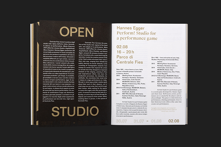
It’s clear from studying your portfolio that the diversity of your talent is immense. Your projects such as Centrale Fies Motherlode communicates a completely contrasting aesthetic from designs invested inTrieste Estate, can you explain your process regarding the Centrale Fies Motherlode project?
Martin: We designed the identity of the performance art festival Motherlode, taking place in an abandoned electricity station in northern Italy. Referencing the huge stones that are in that valley, we developed an identity that featured stones that hid something great inside them… a gem? An explosion? A power field… It was fun developing something emotional out of… well, stone.


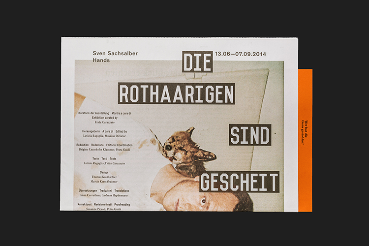
From intriguing explorations of typography to statement graphics, what seems to differ with Museion Project Room Catalogue is the distinct choice of medium, how did this project come to be?
Thomas: The museum of contemporary art, Museion, came to us with a very concrete brief: they wanted to make a more engaging catalogue format for their Project Room project, which features up-and-coming young artists. We came up with a catalogue that was printed with a rotary printing press, like real newspapers – a first for us. The previous catalogues were very small and printed in black and white, we instead designed a large scale newspaper with of images. And we threw in an exciting type experiment: we took the most interesting words from the description of the artworks and made them big. Also, we re-interpreted the works with some typographical experiment. All in all, it was a good exercise in making art more accessible… which is not always easy. Other designers go the other way: I see lots of art catalogues that seem to be super brainy, and then they often lack substance.


And finally, please could you talk us through your latest project, Trieste Estate 2015/2016?
Martin: We were contacted by the Trieste councillor of culture Paolo Tassinari, who is a fantastic graphic designer himself. He said he would love us to develop an identity for the official summer festival of this maritime Italian city. We visited Trieste and instantly fell in love with the seaside, the food, the culture there. Summing this feeling up wasn’t easy, but we came up with the first poster which shows a watermelon quite quickly. We wanted to design a series of three posters, and coming up with the other two was a painful process. Long story short: it’s great that these posters show nothing of the hard work that went into their creation: they look as they were drawn during a sunny afternoon, and that’s perfect!


