Over the past 15 years or so, London-based studio Zak Group has quietly made a name for itself as an outfit that produces work that’s both exceptionally beautiful, and very, very cool.
While some of this work is slick, minimal (perhaps a nod to founder Zak Kyes’ background as the art director of the Architectural Association School of Architecture, where he co-founded the renowned publisher Bedford Press with Wayne Daly); much of it takes a bold, experimental approach that’s frequently centered around striking typography.
Working predominantly in arts, fashion and editorial across identity and creative direction, Zak Group defines its client lise as “people, institutions and brands guiding the trajectory of contemporary culture.”
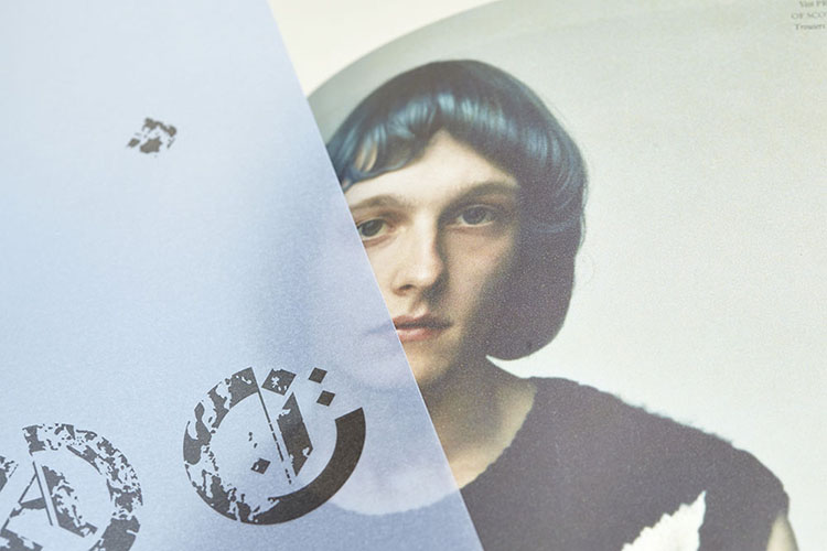
Indeed, it was Zak Group that designed the much-hyped Boys Don’t Cry magazine for Frank Ocean’s magazine, which bore a hand-distorted masthead, created with a large-format scanner and inspired by “artists such as Bob Cobbing or experiments made in the late ’60s with the then-new photocopy technology,” the studio has said. Recent commissions include identities for Berlin Atonal and Nike, and art direction for Fact and Anne Imhof.
We spoke to Kyes about what they’ve learned over the past decade or so, the studio’s scholarship scheme, a magazine that’s also an exhibition and more.
We last spoke when you’d just celebrated Zak Group’s tenth birthday in 2017. How has the studio changed in this time?
After a 15 year investment into culture with a capital ‘C’ we realised that we excluded a vast and equally relevant field of culture with a lowercase ‘c.’ That realisation made us expand our field of vision. Now I would say that we work with people that guide the trajectory of contemporary culture. That could be an artist, or an organisation or a brand.
This was a paradigm shift for us and it led us to build a more cross-disciplinary team. We have a core-team and roster of frequent collaborators that we regularly join forces with. Our mission is to foreground the potential of design to masterplan, whether that’s product design, spaces or creative direction.
 You recently announced the launch of a graphic design scholarship. What was the impetus for starting it? What did you look for when deciding who to award it to?
We set up the FUTURE FWD scholarship because we believe that our industry needs to expand opportunities for underrepresented communities. Our primary focus is to increase access to design occupations. The first step is to level the playing field within design education.
Fashion companies support fashion students, so why don’t design companies support design students? As the director of a design company, I consider it my responsibility to address this imbalance by supporting the next generation of graphic design talent.
With the support of my team and our clients we established FUTURE FWD, a £30,000 scholarship that provides full maintenance and support for the three years of their degree. We’re excited to award this year’s recipient Aaron Reid. His passion and the determination to pursue a future in graphic design immediately stood out.
We hope this will inspire more companies to do the same. If you run a studio, and you support our agenda, please contact us!
 What more do you think the design industry could do in terms of diversity and so on?
The lack of diversity in the creative sector starts before arts and design university courses. Who is encouraged and supported to embark on a creative career? Especially in light of the UK government’s announcement to cut funding to arts courses in higher education, the next generation of design talent is facing further barriers. We received an overwhelmingly positive response about the scholarship and are in conversation with other design offices that want to support the cause and expand the programme.
In the end, actions count more than words. Everyone can open the door in one way or another. A lot of people are already doing the work, like offering access to summer schools, hiring using the Kickstarter Scheme, or join an initiative like Diversity in Design.
What do you look for when you’re hiring grad-level roles?
We run an internship scheme which gives recent graduates the opportunity to work alongside our team on the full range of studio projects. At that level, we’re looking for someone who is switched on, can pick up new skills quickly and genuinely wants to help the team. Cover letters should not be underestimated. David Zilber’s application to Noma should be required reading. It’s well organised, considered, direct, down-to-earth but still humble. In 16 years of running a studio we’ve been lucky to receive four or five letters of that calibre. They almost make the portfolio irrelevant.


 Tell me more about the Fact magazine redesign commission… it feels very “clubbing”, if that makes sense?
Sean Bidder, the editor, came to us with the perfect concept and opportunity: a magazine composed entirely of features. Fact focuses on the intersection of audio and visual art forms – two mediums that are hard to convey on the page. Our approach to this challenge is to create an exhibition in print.
Our favorite response [to the redesign] was from AnOther’s Jefferson Hack who said he “just wanted to press play”. That gets at the contradiction of a magazine as exhibition. And contradictions create possibilities. The second issue sharpens the videographic image treatment. We doubled down on oversaturated, image-heavy layouts combined with straightforward and occasionally brutal typography.
The Fact logo features extended letterforms and highly contrasting counterspaces fused into a single graphic element. It connects the futurist origins of pioneering audio technology from the 1960s and 70s with contemporary digital culture.
I like to think about what makes magazines exciting in the first place. At a certain point magazines became books and the throw-away ephemerality that made them exciting and experimental in the first place was lost. We wanted to return to the tension between the lightness of a magazine and the permanency of a beautifully printed object.
 The catalogue design you did for the Is This Tomorrow? Whitechapel Gallery show in 2019 must have been something of a dream project for such an arts-focused studio. What was it like working on it? Was there any trepidation creating the identity for something with such a strong/famous precedent in This is Tomorrow [the seminal 1956 show it was restaging]?
Twelve pairs of contemporary artists and architects were once again invited to collaboratively envision the future of our society, including Amalia Pica & 6a architects and Simon Fujiwara & David Kohn Architects amongst others.
Is This Tomorrow? was a bold curatorial experiment and very much in the spirit of the original. The curator Lydia Yee was not afraid to approach such an icon and dare the impossible of recreating it in a contemporary light.
We approached the catalogue as the reinterpretation of its historic predecessor designed by Edward Wright, from the ring-binding to cut-outs on the section dividers. The title pages for This Is Tomorrow were reintroduced, but shuffled to spell out Yee’s updated title. Collaboration played a crucial part in both the exhibition and the catalogue, with the pairs pitching in to their respective chapters. Our bespoke stencil typeface was applied across the gallery walls as well as the printed floor plan, translating Wright’s visual language into the present.

- Autobahn - November 26, 2021
- Alphabetical - November 12, 2021
- SOFA Universe - November 8, 2021