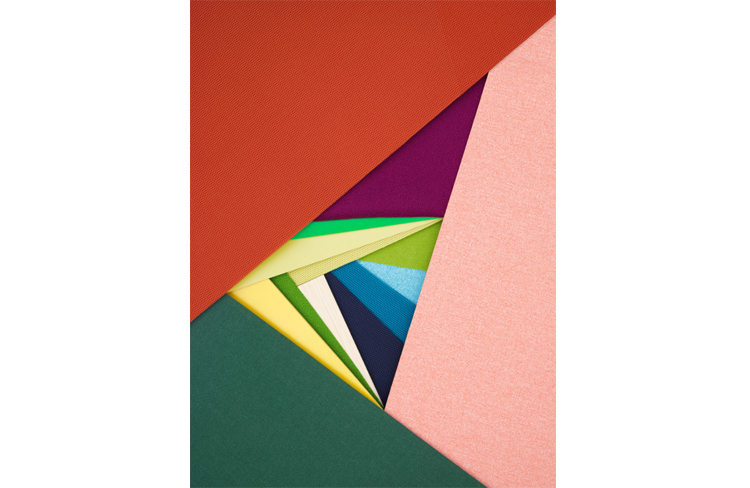
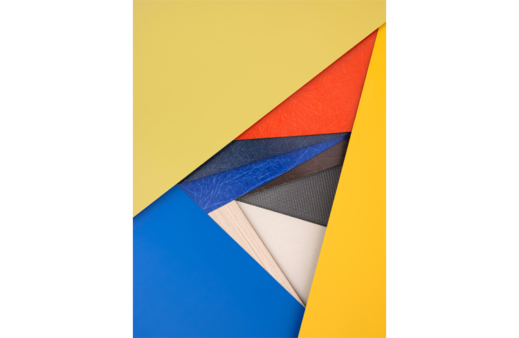
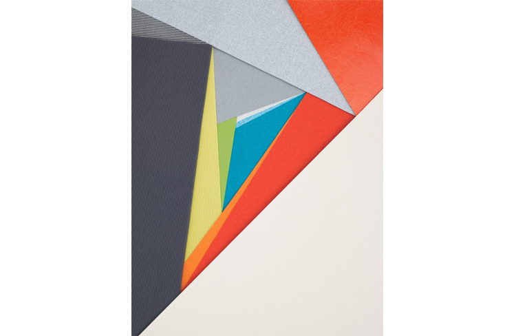
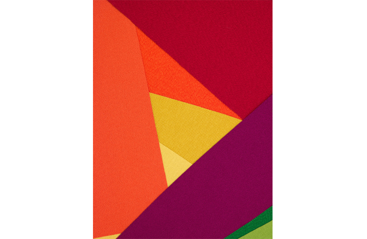
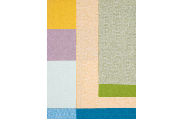
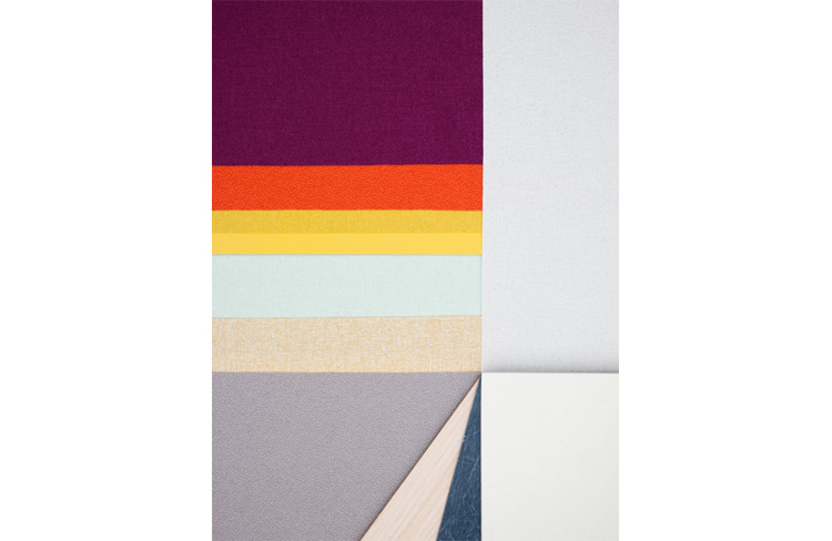
Photographer and stylist Carl Kleiner has created these stylish compositions with Herman Miller’s materials palette, capturing a sense of play in colour and showing how important colour is in product design. According to Institute of Colour Research, between 62 and 90 percent of subconscious opinions about a product are mostly based on colour. This is the reason why Laura Guido-Clark, creative director of Materials for Herman Miller has developed an untraditional method called ‘climatology’ to learn about human values and emotions.
‘Climatology’ is a process of determining colour palettes by taking ‘temperature readings’ of the current environments in order to analyse human moods and expressions. These graphic compositions show different refreshed materials consisting of Fibreglass, Crepe, Resonance, Groundcloth textiles, etc. They are intended to be not only a reference but also something for clients and designers to enjoy and explore.

http://www.hermanmiller.com/
http://www.carlkleiner.com/


anna@peopleofprint.com
- Icinori - February 9, 2021
- Sergio Membrillas - December 18, 2020
- La Perruque: Type Magazine - December 8, 2020