This month we’re proud to present a selection of linocut projects created by Official People of Print Members. From intricately carved illustrations of fish, to the life-cyle of a moth, and book cover commissions, our community show bundles of talent and innovation when using the medium of lino.
RLH Prints: Metamorphosis
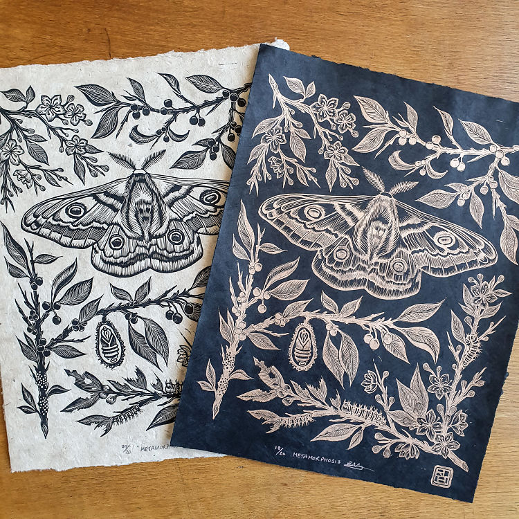
 Metamorphosis is a linocut design by block print artist Rachael Hibbs that she has hand carved and printed using a traditional etching press. The print took approximately 20 hours to design and carve from start to finish, and has been printed onto natural nepalese lokta paper. and hand sealed with a Japanese inspired stamp designed by Rachael to include her initials. The botanical inspired design depicts the life cycle of an emperor moth. From egg, to caterpillar, to cocoon and finally to an adult moth. The elements are hidden amongst spring blackthorn blossom, developing into autumnal sloe berries, showing the seasonal changes of the cycle. Metamorphosis is intended as a metaphorical representation of our current situation in lockdown: “We are currently motionless, cocooned in a dormant state, however we continue to grow and thrive, ready to emerge and flourish on the other side”.
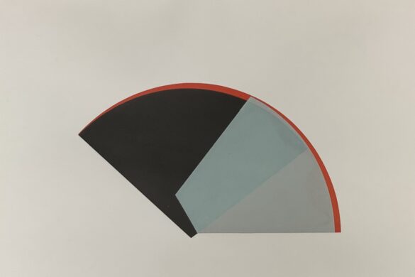
Masha Tiplady: Geometry I

 Geometry I is a 5 colour, 3 layer reductive linocut Masha created over 3 weeks in February to March of 2020. Reduction linocut is a method of printing that allows the printer to be able to print multiple colours from the same block of linoleum. This block can be carved multiple times and inked and printed after each carving, so that the colours are layered on top of each other. With the reductive technique the block of lino gets destroyed in the process so the edition can never be reprinted. Geometry I is a small edition of 15 prints, all pulled by hand. “This linocut was such a great fun to carve, I just loved the geometrical shapes of the stylised petals and will be making more linocut to add to my ‘Geometry’ series” desribes Masha. She used lino cutters from Pfeil and FlexCut, hessian-backed linoleum, oil-based ink by Cranfield, and Zerkall printmaking paper in order to create the piece.
Dave Lefner: The Galaxy Motel Key


“It always makes me a little sad when I think of things lost to history, even if it’s common, everyday objects. The old motel room key fobs are just such an object… classic Americana” explains Dave on the inspiration behind this reduction lino print. Dave has created several images of these keys, blown up ten times the size, in order to take in every detail. The Galaxy Motel was particularly fun and challenging for Dave due to its translucent nature and silver and gold sparkles. It was printed from one single block in 11 colour stages in a limited edition of 6. He used oil-based Cranfield Traditional Relief ink, printed on Rives BFK paper size is 30in x 20in.
Gaëlle Garrocq: Linocut Prints

 Gaëlle discovered linocut printing 4 years ago, and she immediately became very passionate about the printmaking process. “I particularly love the meditative rhythm of carving process and the creative moment of sketching upstream” describes the printmaker. She also enjoys using the elegant, tapered, and perhaps “dangerous” tools needed to produce a lino print, as well as the very tactile process of it. “I realise that I have a very sensory approach to my working process. The printing process is a kind of magic moment revealing sometimes hours of concentration and work” she concludes.
Jennifer Zee: Koi Galaxy 

 Koi Galaxy is printed from over 20 carved blocks within a circle stencil. Dark blue areas are comprised of either equilateral triangle or diamond shaped blocks, and fit together in a quilted fashion. Jennifer started this composition by first establishing the river of koi. In light pencil, she then drafted out where masses of lily pads would congregate, in a balanced yet organic and asymmetrical design. Using light pencil guidelines and careful alignment, Jennifer selected blocks to print as she progressed. Upon filling of the circle, the lily pads were printed in green, and the koi in a multitude of colours. All blocks were carved from Speedball Speedycarve, and printed with Versafine Clair ink. This modular style of printing is Jennifer’s signature technique which she has been honing over years; “I enjoy the flexibility and unpredictability that comes from recombining my blocks in different configurations” states Jennifer.
Inky Dog Studio: Upcrate Co-Captain

 Jane Constable of Inky Dog Studio was recently commissioned by Upcrate, a German-based art materials subscription club, to be their featured artist for the next “crate”, which was to be on the theme of linocut printing. Jane was tasked with designing and creating an A5 linocut print, using only the materials sent to her in the crate, with the print to be made by hand-burnishing with the back of a dessert spoon. Jane decided on a bird theme for her print, based on a pen drawing she had previously made in her sketchbook. In addition to making the print, Jane was also asked to make a full process video for the Upcrate website, as well as to design her own version of the Upcrate logo which would be featured on a postcard and sticker to be included in the crates of art materials sent out to subscribers.
Cally Conway: Cover illustration for Hamnet by Maggie O’Farrell

 Cally Conway was asked by Tinder Press to create a linocut illustration for the cover of Maggie O’Farrell’s new book, Hamnet. She was briefed to create something that reflected the importance of nature in the book, as well its importance to the central character, Agnes. Cally’s illustration would also have to act as a metaphor for grief, reinterpreting the embalming process of wrapping a body with herbs. After reading the book, Cally worked on some initial sketches, and a strong ‘H’ was decided upon. It was to be adorned and wrapped with healing herbs, and the wildlife associated with the forest of Arden. Final adjustments were made to the design, before it was carved and printed as a one colour lino print. Only three prints were editioned; one for the author, one for the editor, and one to be given away in a competition for an avid fan of Maggie O’ Farrell. The lead designer at the publishing company created a beautiful final book jacket with a sumptuous colour scheme, including gold foiling and end papers.
Ingrid Schindall: Surfaces


The search for the ocean within Ingrid Schindall’s artistic practice started with See the Sea; a linocut made from Marley Tile, a type of vinyl flooring with a marbled pattern. Ingrid carved away one colour of the marbled pattern, and the surface of the ocean appeared. When printed the original material and pattern are unrecognisable in the piece, reflecting the ocean’s enduring presence. She continued her attempt to understand the surface of the ocean through Surface II (Getting to Know the Wind), in which Ingrid used a photographic reference in order to learn how the wind affects the water’s surface. In Surface III (Incomplete Memory), she attempts to represent the ocean using repetitive strokes of the gouge crashing against the block like waves.
Spiegelsaal: Meet the Linocut Unit

 While Torsten takes care of the screen printing department, Jochen, the other half of Spiegelsaal, experiments with relief printing, linocut, woodcut and monoprints. These featured linocut prints were used as motifs for silkscreen gig posters, that the duo are notorious for. “Solid colours, surfaces and elegant lines is what it is all about stylistically” state the duo. They are usually printed run is a run of 20 editions and range from postcard size to A2.
www.spiegelsaal.net
Habitats: Does it have to be the same old shit?


An exercise in routine and repetition, this print mimics the back and to of daily working life in the north, passing the same rows of terraced houses on the seemingly never ending journey Greg Meade of Habitats studio takes through Salford to work. “The piece feels like a symbolic end to my obsession with the subject matter, coupled with the feelings on how difficult it is to escape the routine of a day job and somehow split time with an artistic career” describes Greg. Each house on the print is individual in nature, but as a collective, somehow looks the same. The basic form was transferred to the lino, but all detailing was added on an improvised basis.
Kerry Pagdin: Perch Fish Prints

 Kerry Pagdin is fortunate to have several biology skeletons in her office at work; “While some people may not find this something to be excited about, to me skeletal structures are fascinating and beautiful“. Life and death is a common theme throughout her work and this series of images originated from a sketch of a perch skeleton that sits on her office windowsill. After carving the image into lino and creating a test print, Kerry decided it would be interesting to carve a companion piece; so she created a sketch, and then a carving, of a live perch. “I have thoroughly enjoyed experimenting with these blocks; printing them in free-form compositions, embossing them by running them through the press without ink, and most recently, printing them on linen” explains the printmaker on the project.
Follysome Prints: Birth Flower Bouquets

 Mindy Schumacher of FollysomePrints, based in Rockford, IL, carves out custom botanical prints in linoleum. Mindy takes commissions for botanical bouquets representing the birth flowers of couples and families. Shown here are lily of the valley, larkspur, marigolds, narcissus, roses and chrysanthemums. Each is an opportunity for Mindy to express delicate foliage with graphic, illustrative linework. As an extension to these custom works, she is currently working on individual birth flower carvings and plans to release them throughout the year as lino prints and illustrated sticker packs and textile works.
Mary Bruno: Blue Jay

 Mary Bruno recently created Blue Jay after she was inspired by a photo a friend of hers took whilst bird watching in a local park. The image was transferred to a lino block, and she then began carving. Mary’s reduction prints are made on a Vandercook #4 proof press, in order to have great registration. “I have been making linoblock reduction prints for over 15 years, and this print is by far my best work as I have acquired some new tools and magnifying goggles that have been a real game changer” states the printmaker. The feathers were hand inked with two different runs of a split fountain brayer of light to dark blue. She then ended with black, and created an edition of 35.
Browse all of our members’ profiles at www.members.peopleofprint.com. You can apply to become a Verified POP Member and benefit from a heap of perks here.
Want to know more about our membership? Give us an email at members@peopleofprint.com.
- Tactile Chaos: Christina Galbiati’s Fragments and Feelings - June 8, 2026
- Keep a Pencil on You: M.C. Pressure’s Thinking Cap - June 8, 2026
- A Battleground of Memory: Ahmed Elnafad’s 30°N - June 2, 2026