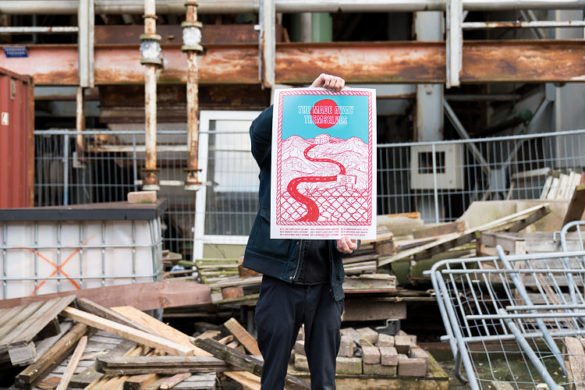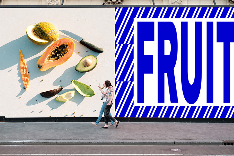
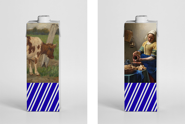
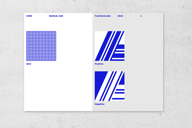
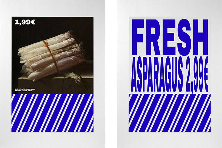
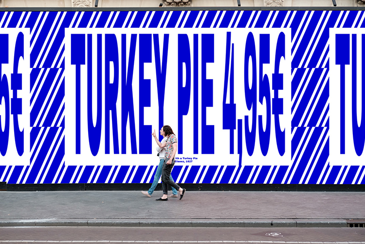
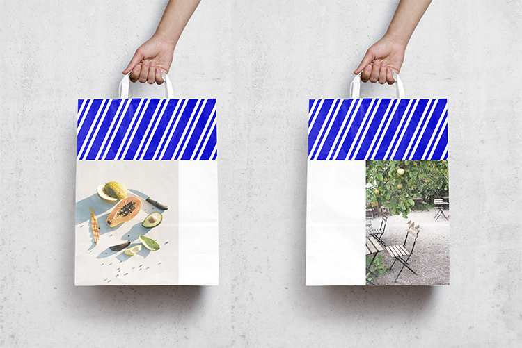
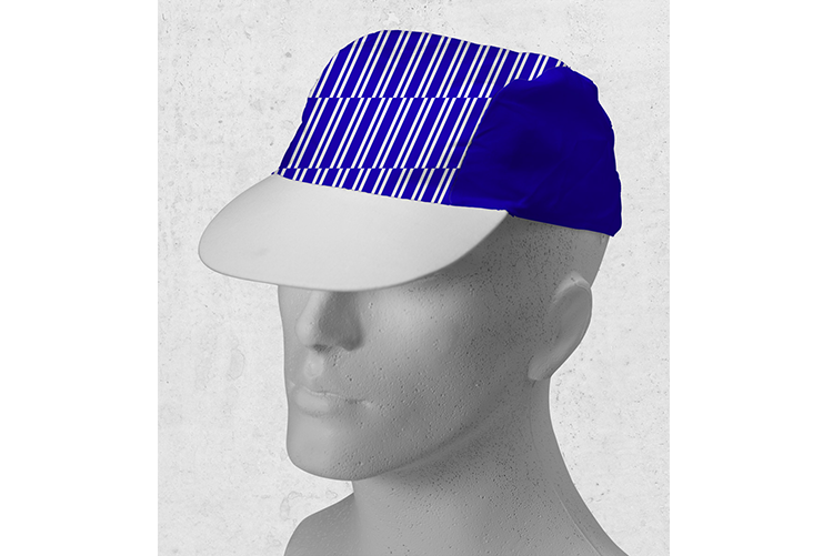
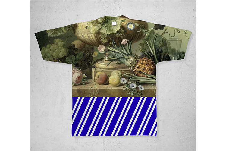
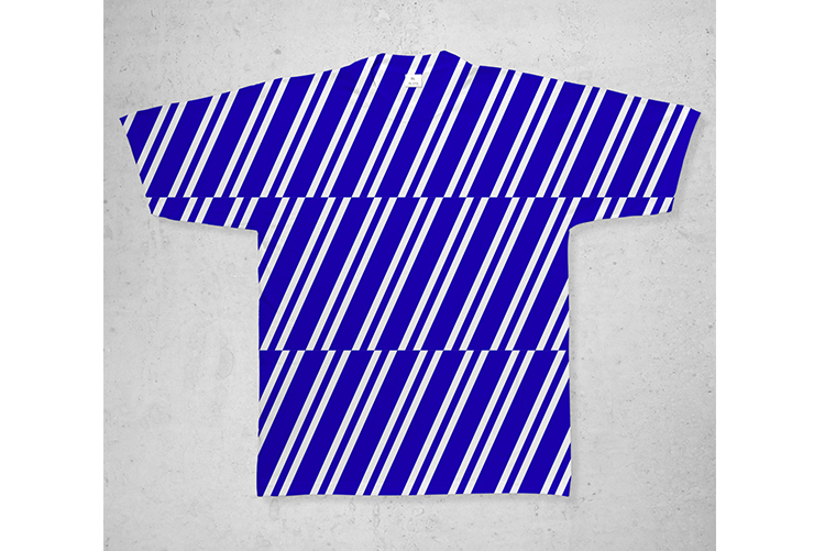
Two Points are back again and have reimagined the branding for the supermarket brand – Aldi. This is a fictional branding questioning the bigger picture behind design and it’s function. This project was commissioned by Icon Magazine.
When you ask yourself about the function of communication design – one of the first thing that pops into your mind it that the function of it is to improve communication. Communication design is of making more legible and accessible for all to understand. However… good design isn’t everything. Reaching out to target audiences and achieving higher use and consumerism isn’t part of the bigger picture. From book covers, to advertising, packaging labels and so on are constantly surrounded by it.
Through design, we have the chance to challenge their visual literacy. A risk that designers are not take and that are afraid of creating friction. Do we really want to see, read, hear or taste only what we already like? I don’t think so. This is why Two Points have successfully, through this rebranding of Aldi, made us thinking of the importance of learning and our capacity to experiment and look beyond. Aldi was the perfect brand to do so as it has more than 10,000 supermarkets across 18 countries it reaches a broad spectrum of customers.
You might like...


- Anna Zaccaria - May 15, 2018
- Taylor Turdd - April 16, 2018
- Circa 78 Designs - April 16, 2018