Following his first publication about screen printing two years earlier, designer, art director and author, Caspar Williamson has just launched his second title, Low-Tech Print : Contemporary Handmade Printing, a freshly published hardback book by Laurence King. The book was released internationally in October and we were very lucky to have a chance to sit down and have an exclusive morning coffee chat with him about the ideas and concept behind his latest volume.
A graduate from Camberwell with a degree in illustration, Caspar Williamson took his first job as a graphic designer. He has been working on various types of projects including print, packaging design and design consultancy, but illustration has always played a major role. Caspar mentioned that he used to work for an agency, work from home, spend some time doing freelance jobs and also travelled around the world – phases that all artists and designers must have gone through. And of course, there must always be some conflict involved in finding a balance in the career, how to enjoy working for yourself but also earning money from a full time job. “Without the nature of being a freelance”, he added, “it’s almost impossible to write a book.”
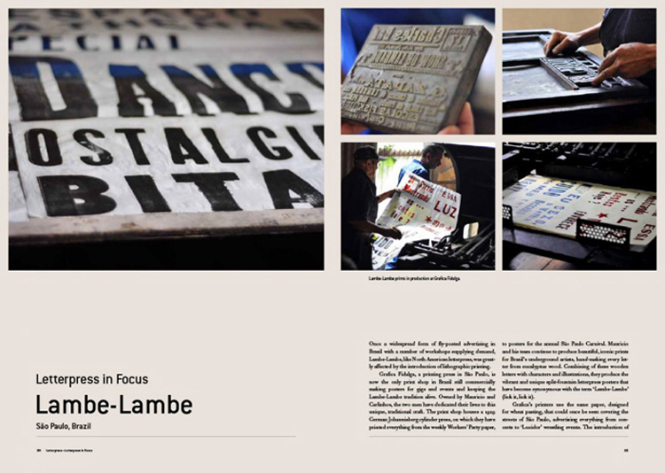
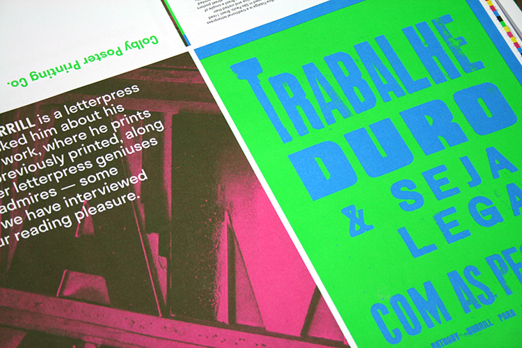
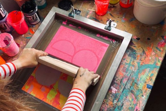
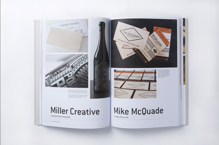
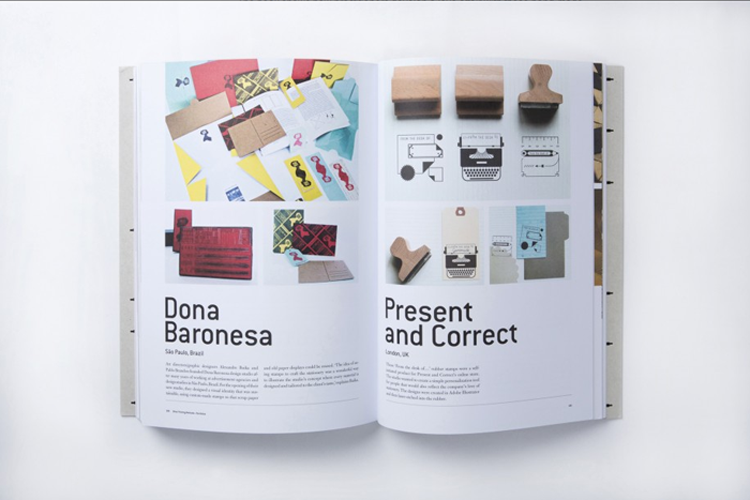
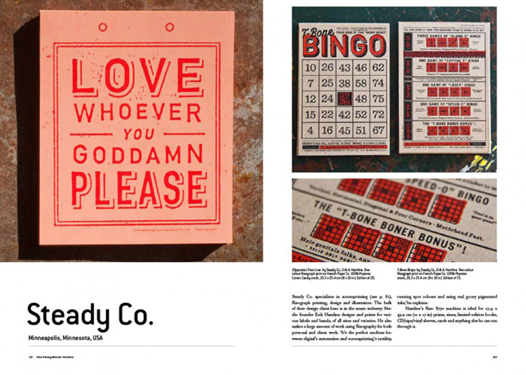
He had spent two years planning and collecting information for this book. The initial concept was to make a letterpress book, with typographic elements taking the main part and showcased work from contemporary design studios. However, after speaking with the publisher, they both agreed to push the idea further; so he started off by doing interviews. With sheets of different questions, he started exchanging ideas and having conversation with various print experts across the globe. “I managed to hit all the continents on the list,” added Caspar, this also includes small press in Russia, a stationery studio run by a couple in Bangkok, a handmade letterpress studio in South Africa and some other studios that use special techniques such as relief printing which Caspar found “folksy and old-school but intriguing.” Since the idea is to represent the culture of printmaking and to build a connection between print enthusiasts rather than just being a visual reference, it is vital for him to get to the insight of these virtuosos and feature this exclusive piece of information in his fantastic 224 page volume.
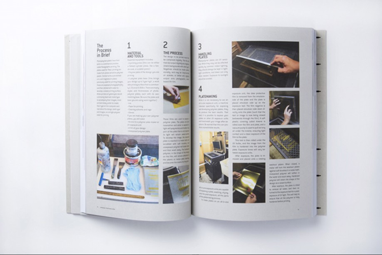
Hence, the texts are also an essential part of this book. This is the reason why the book is divided into four distinctive sections, each focuses on different print methods plus process guidelines at the end of each section, “because without a review of printmaking processes, it is difficult to get to the insight… and this is something special about this book that you cannot find somewhere else,” asserted Caspar. Certainly there are some interesting practical sides that non-printmakers might not be aware of, “it is for a basic understanding of how printmaking works, to explain to people, showing them equipment.” This is why this book is different from other printmaking books in the market because it unveils the stories in the background, revealing marvelling tales behind each print piece.
Both the publisher and Caspar himself wanted to make the book comprehensive and simple in terms of design, “to show a clearer understanding of printmaking.” Caspar did not want to ditch any contents and wanted to keep as many texts as possible. This is the reason why the book was carefully curated and needed to be well designed. There were also many details to be considered, for example, in order to help readers to follow the contents more easily, he distinguished the process parts by adding colour to these pages. He also admitted facing some slight problems, which is usual to any project like this. “At the beginning, the heading in the book was double in size.” He also came across some difficulties selecting the tone of voice in the which book should be written. A highlight of the process was a stage where he was put in the glassy room full of book shelves, exposed to all the books that had formerly been published by Laurence King, being asked what kind of covers he preferred. Ultimately the pleasant cover was nicely laid out by world-class design agency, Pentagram.
“No one’s getting paid,” added Caspar. “It’s a self-promotion for the [artist / studio] and in their interest to represent themselves to the world.” The book is genuinely made for anyone who has passions for physical prints. The contents are of full overview of all print fanatics, with various products that were carefully picked, offering readers the sense of tangibility and tactility. The book is also being translated into six different languages and is going to be sold worldwide, “I can’t wait until they all come out,” concluded Caspar, “I am going to get hold of them all.”
Words by: Anna
http://www.weareflyingmachines.com
https://twitter.com/flyingmachines_
You might like...
 Vans x Liberty Art Fabrics :: Holiday Collection
- Reed Anderson
- Wild Press: Riso Craft Kits
- Sarah Ransome | Moroccan Prints
- Chris Harley
- Will Sweeney :: Microlife
- SintLucas
- Alessio Perez
- mcbess x TFL
- What If x Pomme Chan
- Team Thursday
- Kid Acne – “Colour me Bad 2”
- Broken Fingaz Crew
- Mixed Special: Camberwell BA Illustration show
- CLOT X VANQUISH X fragment design
- Iain Mckell


marcroy@peopleofprint.com