Reduction printing is a form of image making that involves working repeatedly into the same block in order to layer up colour. The block is gradually carved away, as each colour is added one by one, usually working from light to dark. Below, we check out some incredible reduction print projects from members of our community who have flourished using this specialist technique.
Emily Jackson: Worm Cats (Swamp Tig & Ruby Mew)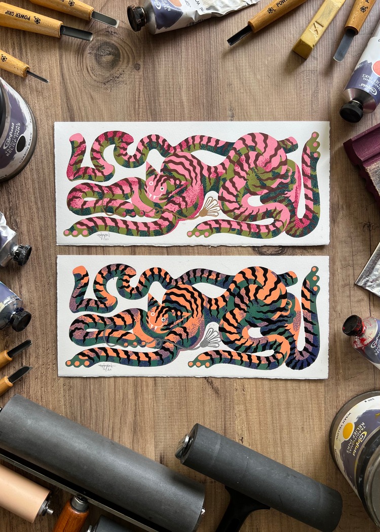
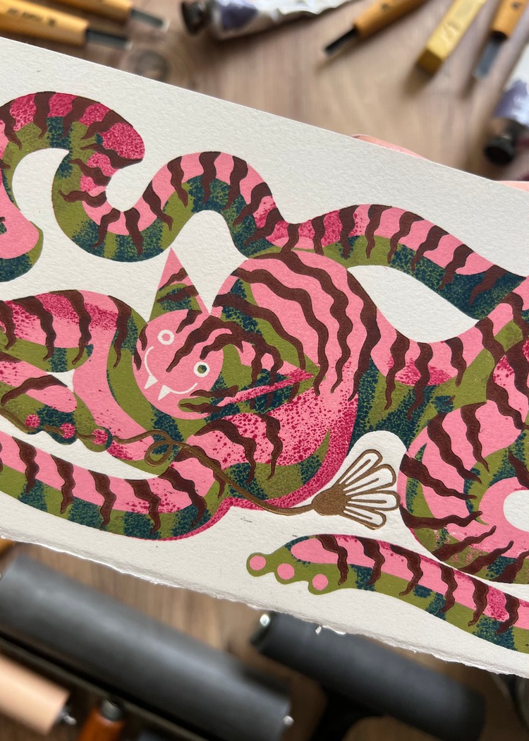
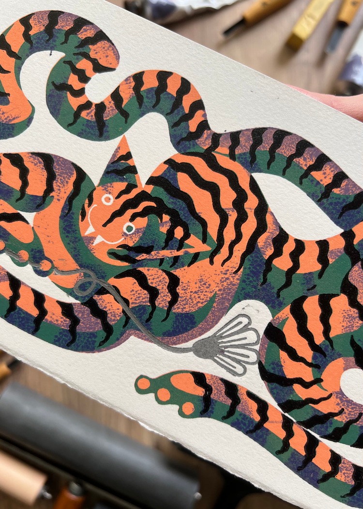 Whilst working on a project which was becoming a little tedious, artist and printmaker Emily Jackson decided to take a step back and get a bit silly. Thus, her two reduction printed Worm Cats, Swamp Tig and Ruby Mew were born. She comments; “They’re an all time favourite of mine, and a reminder to not take things too seriously.”
Casey Williams: Ocellus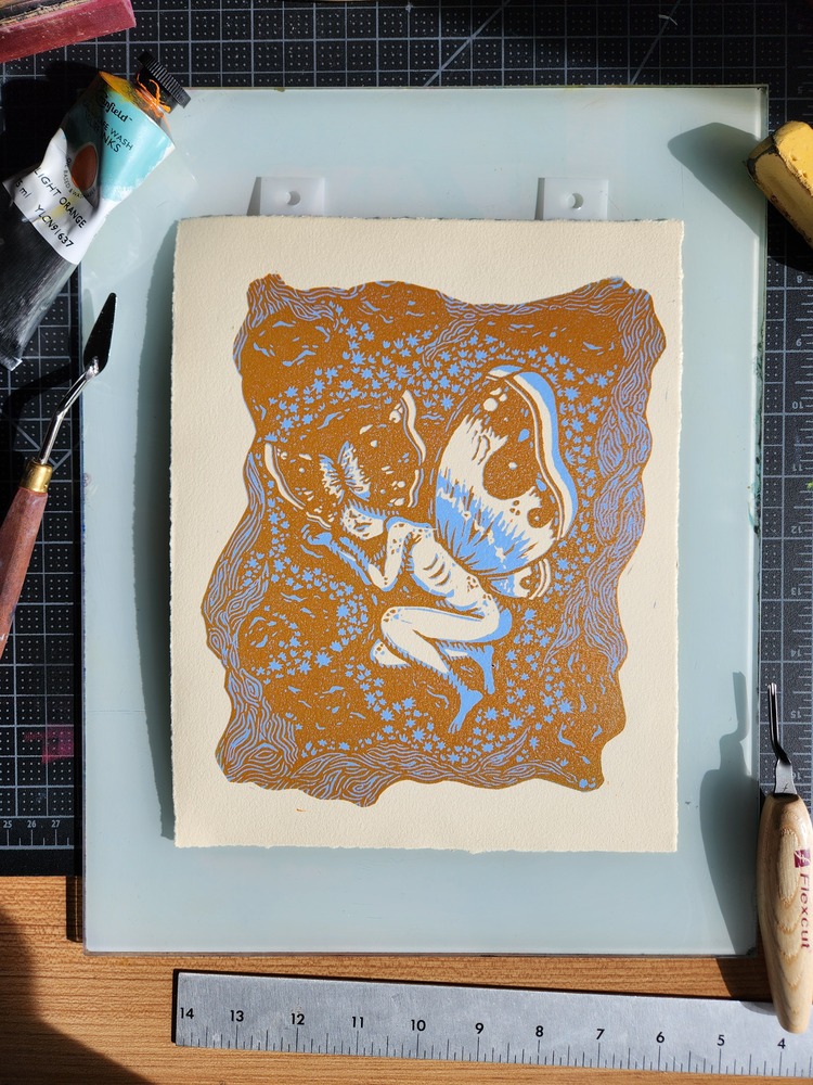
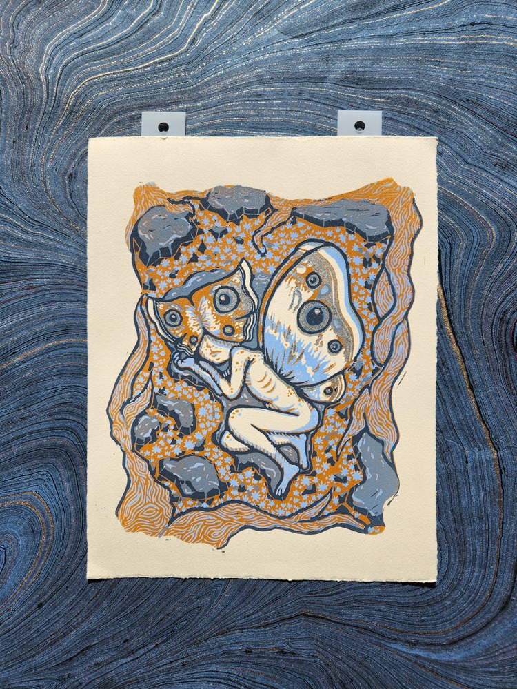
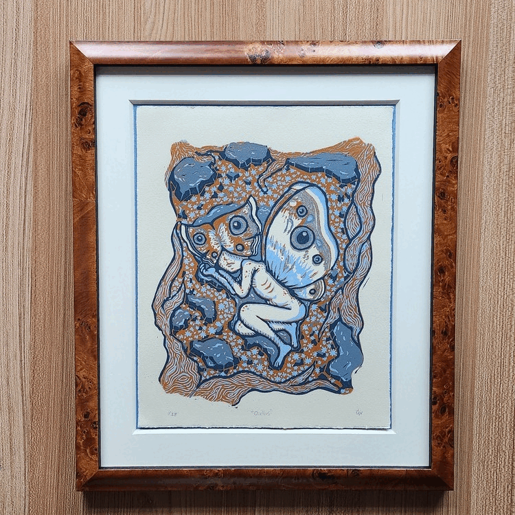
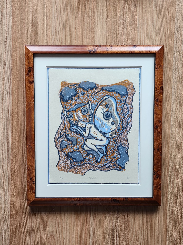 Casey Williams’ Ocellus is a 5-layer reduction block print (beginning with light ultramarine blue, light orange, and ending in various shades of blue grey) in a limited edition of 38. Casey digitally illustrated the layers before she carved and printed the linoleum block. The piece was born out of a desire to illustrate the anxiety the artist feels due to the male gaze, while working within a fantasy and ecological framework. Ocellus is currently exhibited at the Mosesian Center for the Arts in Watertown, MA.
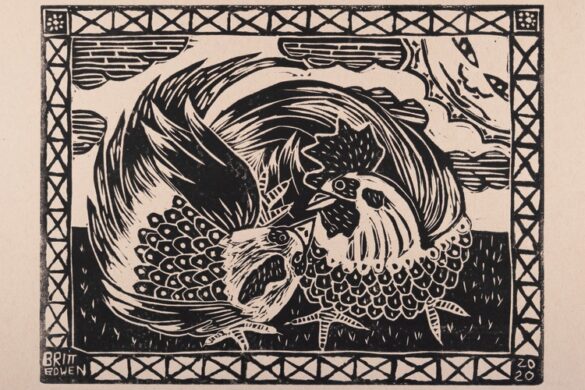
Pernille Sand: True Friends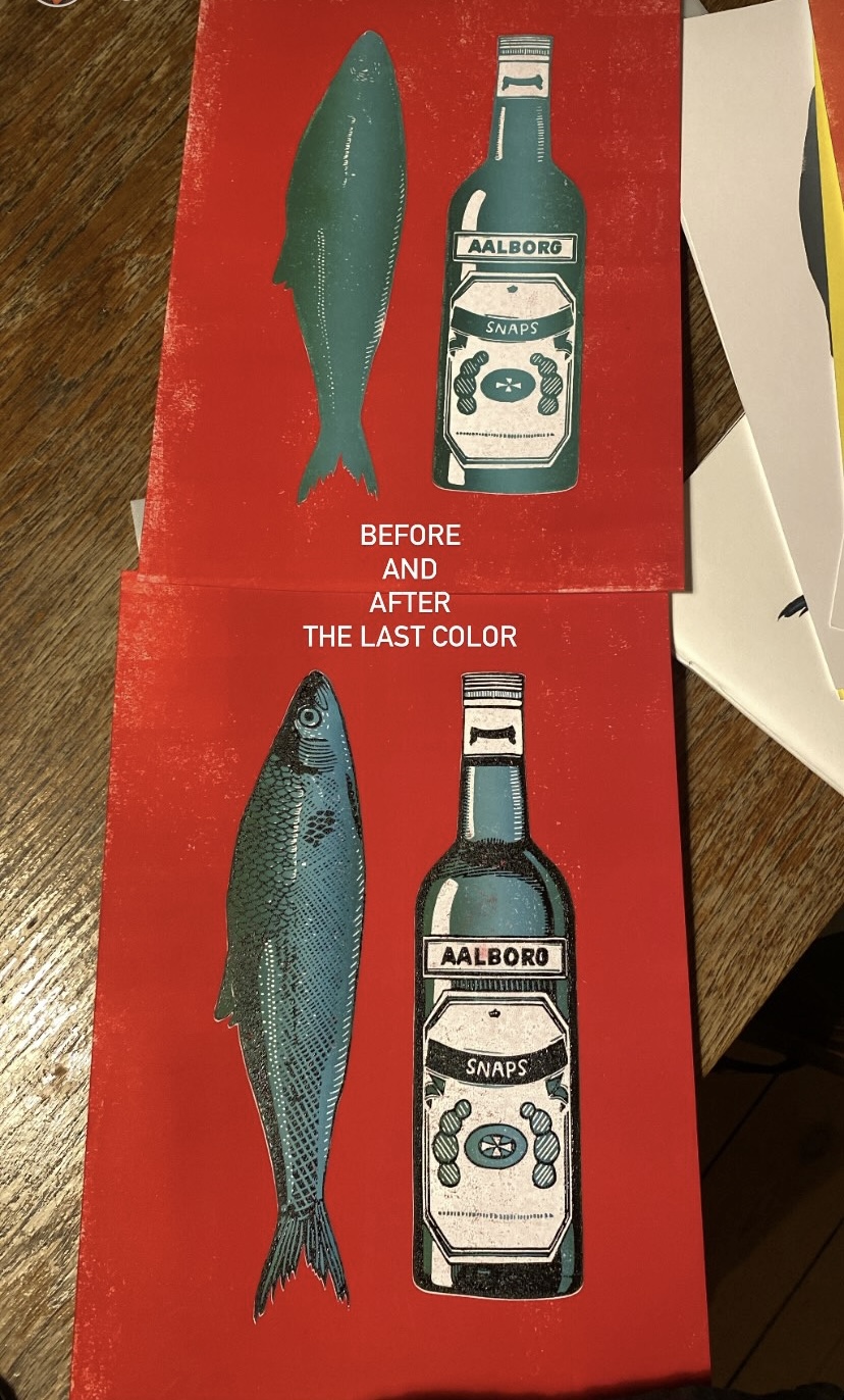
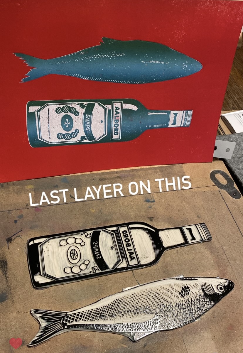
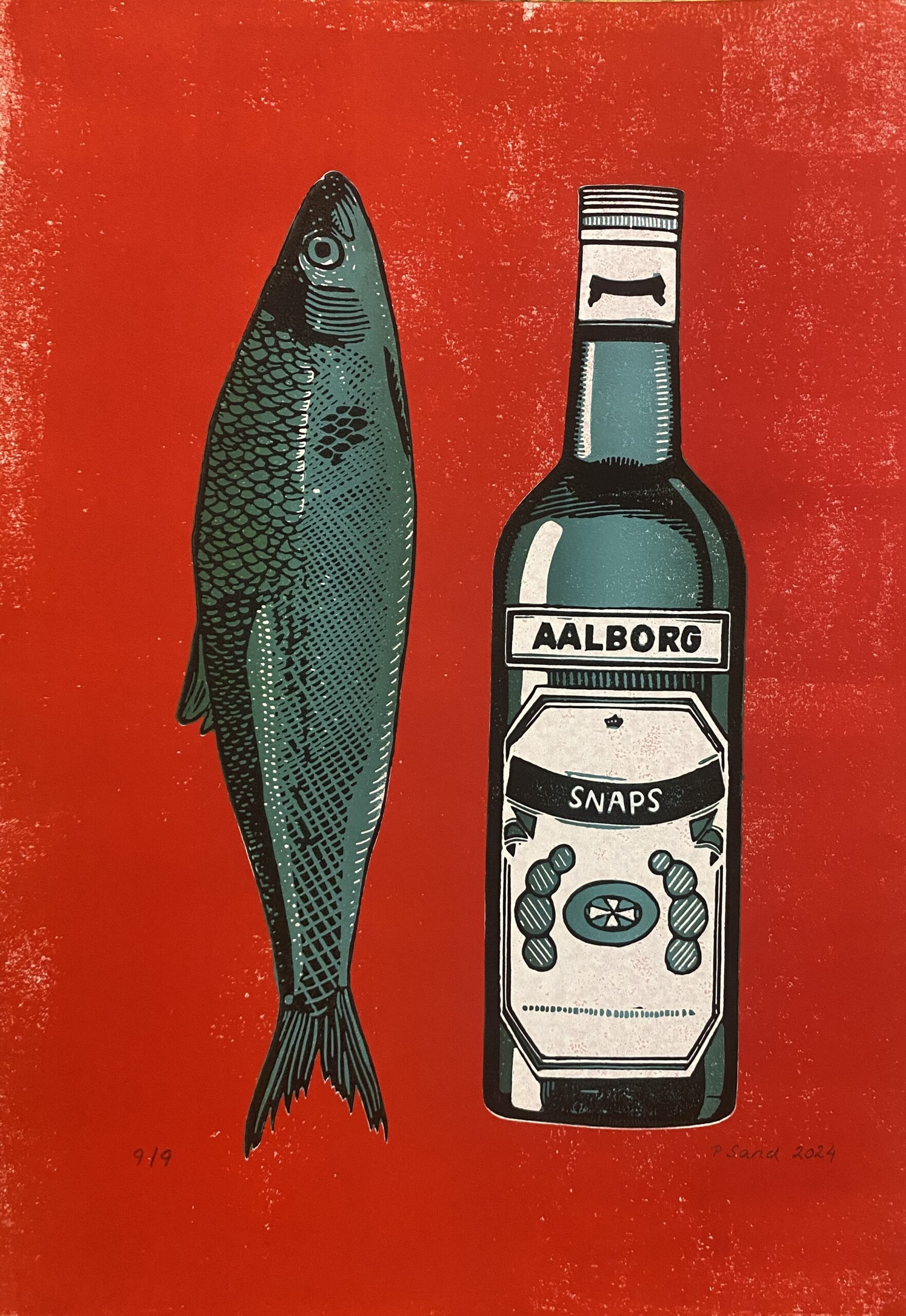 “I’m Danish and it’s a tradition in Denmark to enjoy herring and schnapps. They are best buddies! Personally I don’t really like this combo, but SO many of Danish people do, so I thought I would make a little portrait of these BFFs,” says printmaker Pernille Sand. She used the reductive technique on linoleum to make the print, and created various versions to work with different colours. She tells us; “I love making reduction prints as it challenges my brain and things happen along the way that surprise me in a positive way – eg. some colours just look better together than anticipated or the lines are giving a great effect. I never really know how it will turn out until I lift the paper – it’s thrilling!”
Matt Spierings: Pouring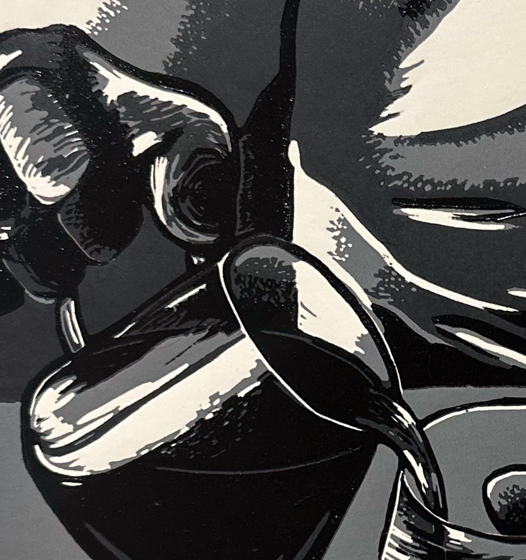
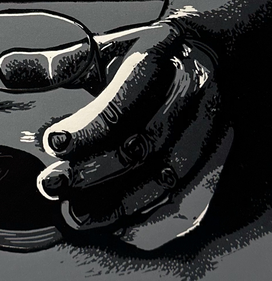
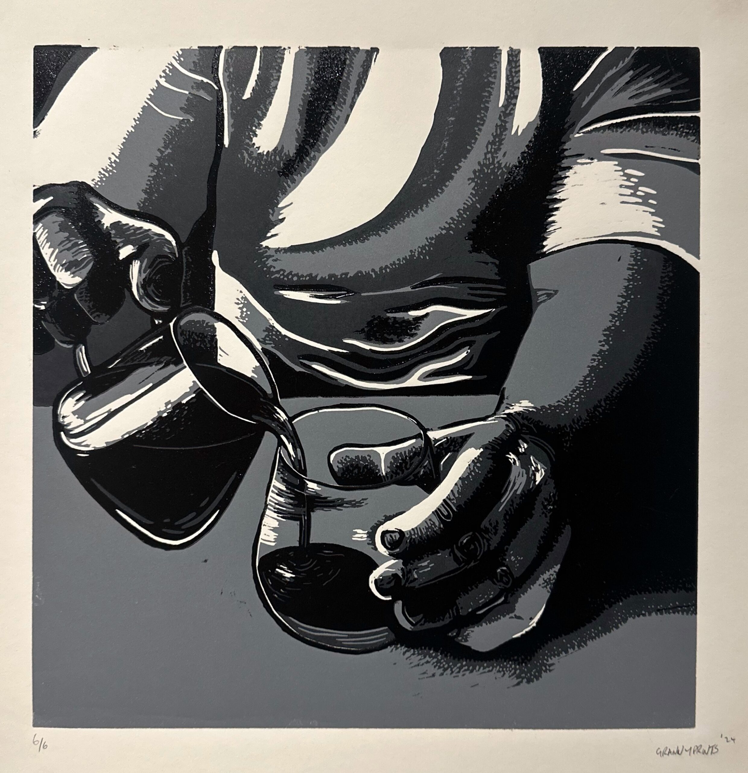 Pouring is a 3 layer reduction print on heavyweight Stonehenge paper using Cranfield Colours inks by relief printmaker Granny Prints, aka Matt Spierings. The print is inspired by a photo of the artist sitting at a local cafe, pouring a coffee from a carafe into a glass.
Rosanna Reade: Ten Past Ten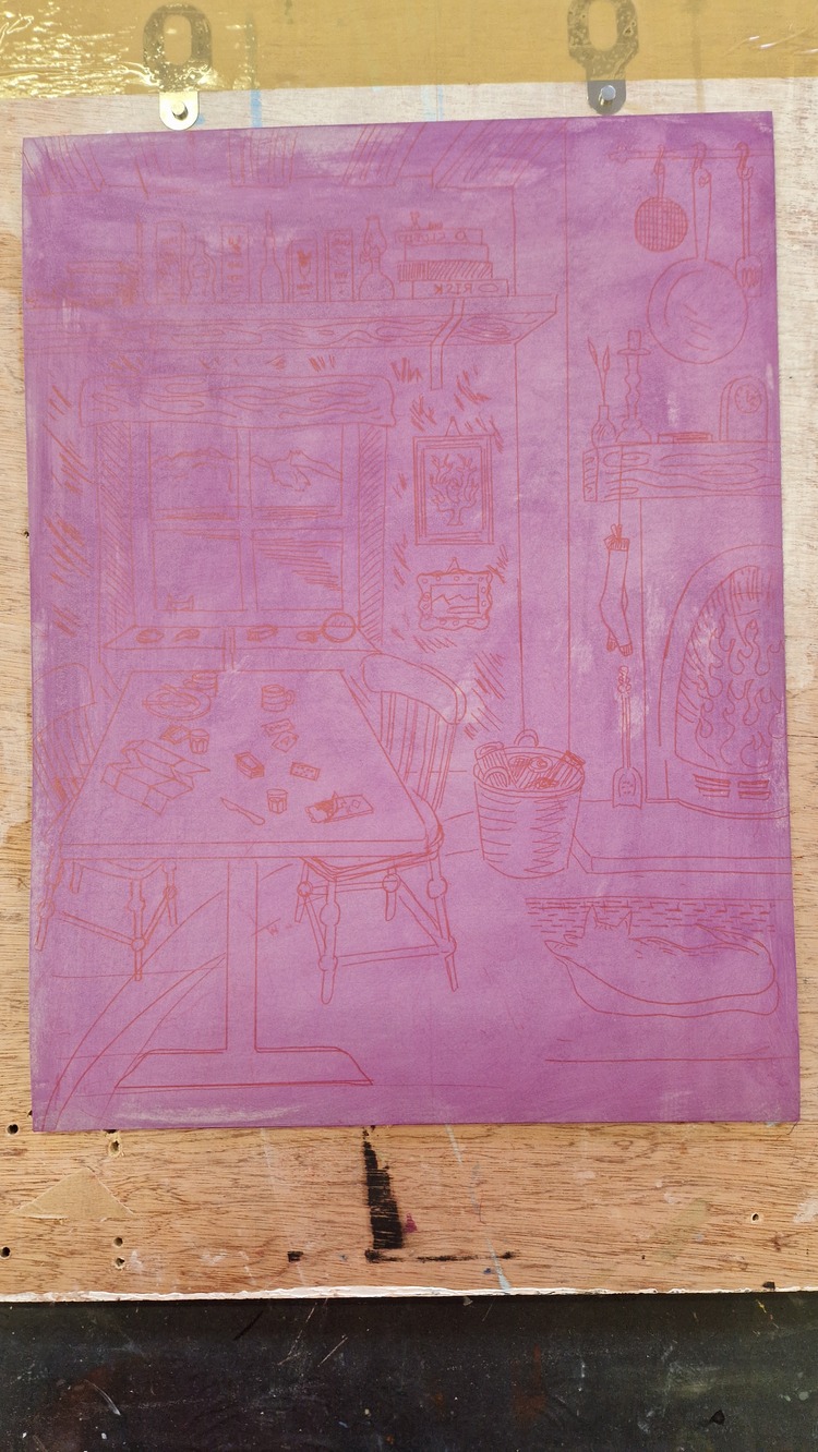
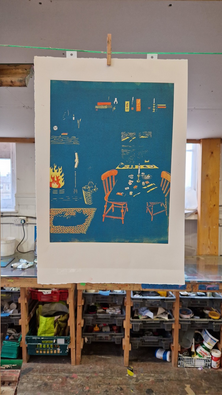
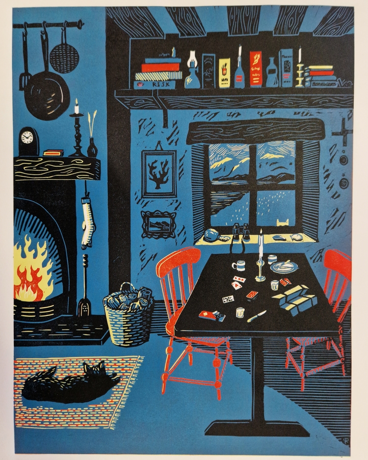 Rosanna Reade recently completed her largest reduction linocut print to date, featuring a cottage (or bothy) scene. It was printed using 4 colours; yellow, red, blue, and black, with the initial layers using a fair amount of extender. The colours were decided very early on, and played a big part in the development of the image. The featured scene is an imagined one, built from memories. “I don’t use references in my work, and I like to draw from memory, using perspective guides,” says Rosanna. The main image of the work was carefully planned before she started any carving, but the details were adapted as she carved. Rosanna has included lots of small personal symbolic items within the print. These include; chess pieces on the shelf along with boxes of whiskey and board games, logs for the fire in the basket, chocolate and playing cards on the table, and a glass bouy and shells on the windowsill.
David Rees: Stargazer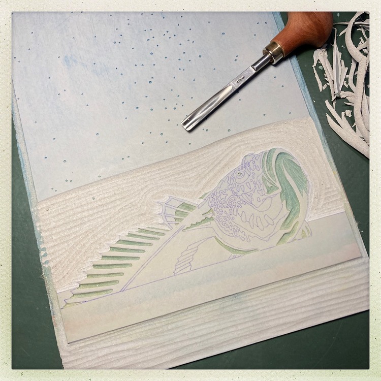
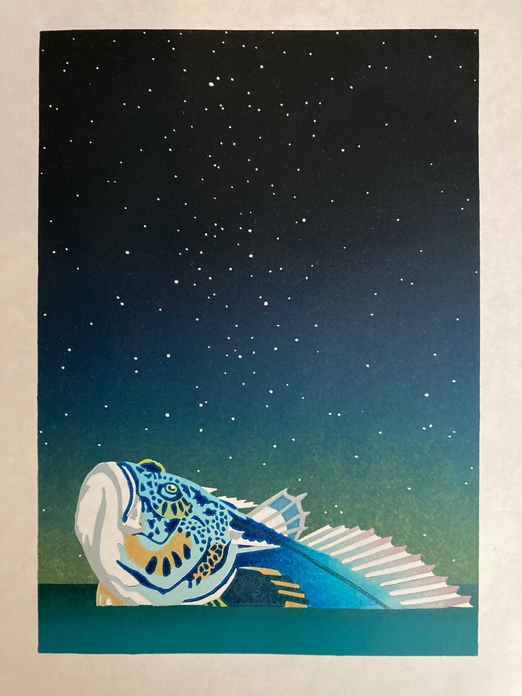
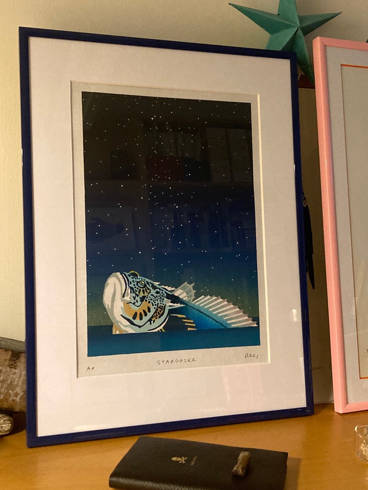 Working in marine biology, David Rees has a love for unusual organisms names, which often generate an instant visual. For this piece has was inspired by the Stargazer fish; a venomous fish that buries itself in sand and ambushes prey. However, David’s take on the name was quite different. Normally working with multi-block colour prints, this was David’s first attempt at a reduction print. The print includes an incredible12 layers! He states; “It was a good learning experience for me and a print that connects my science and my art, which is always a nice direction to go.”
Caroline Erolin: All that Glitters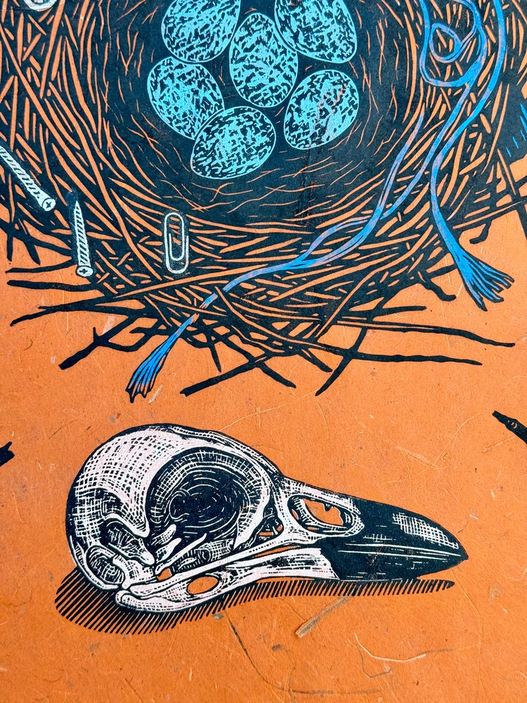
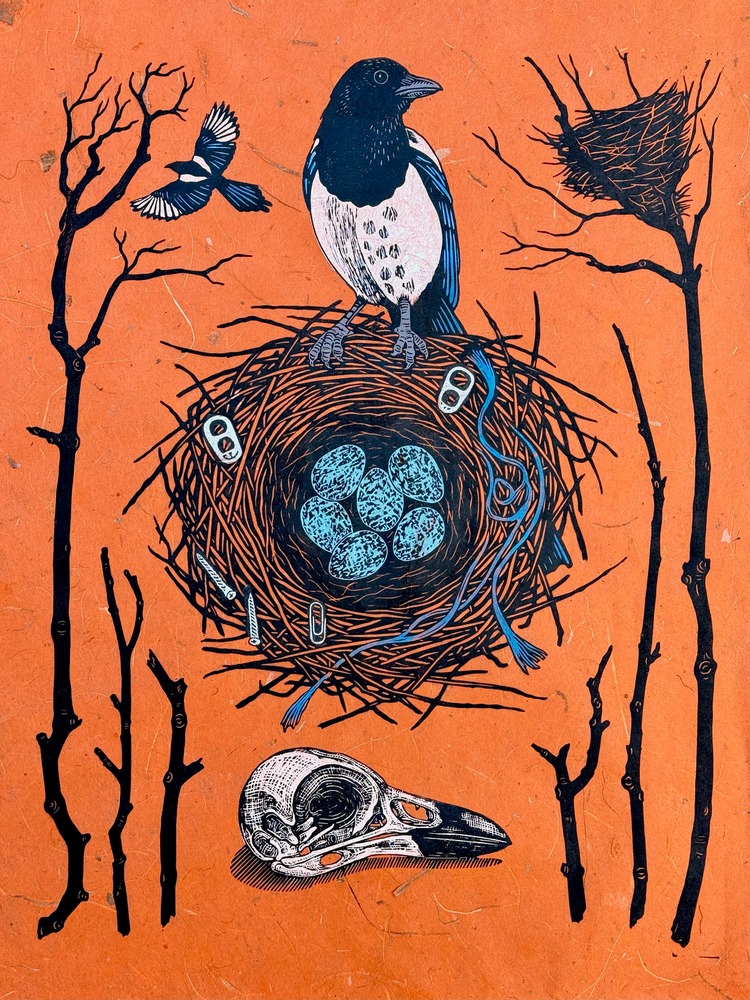
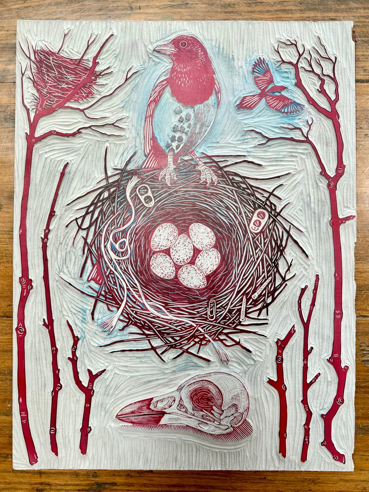 All that Glitters is a three layer reduction linocut printed on 40gsm acid free Thai Mulberry paper with Cranfield Caligo safe wash oil-based ink. It explores themes around life cycles: life, death, and the potential in the eggs. Magpies are well known for stealing shiny things, but in this case the magpie has gathered up litter, rather than treasure. The dangers of litter and pollution to the natural world are further signified by the skull at the bottom of the print.
Gerry Coles: Mr Majestic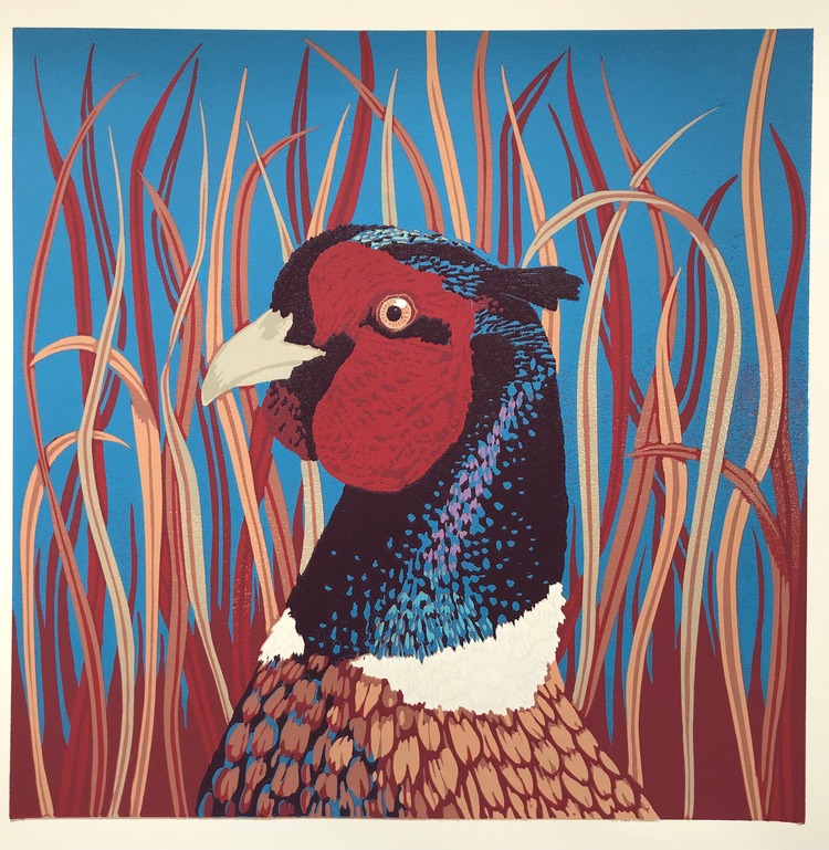
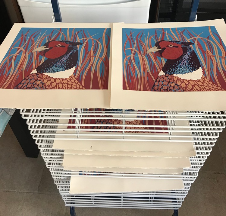
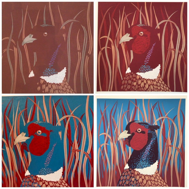 Gerry Coles’ Mr Majestic is a reduction Linocut inspired by the many pheasants that they have roaming in their Oxfordshire garden. “I do think the pheasant is our most beautiful bird, overlooked perhaps because it is so common,” comments the printmaker. The Linocut was made from 8 layers, with sometimes more than one colour per layer. Gerry used Schmincke water-based inks and Somerset satin paper. She describes; “I love its vibrant colours that are echoed by the waving grasses that camouflage the bird.”
Haychley Webb: Playtime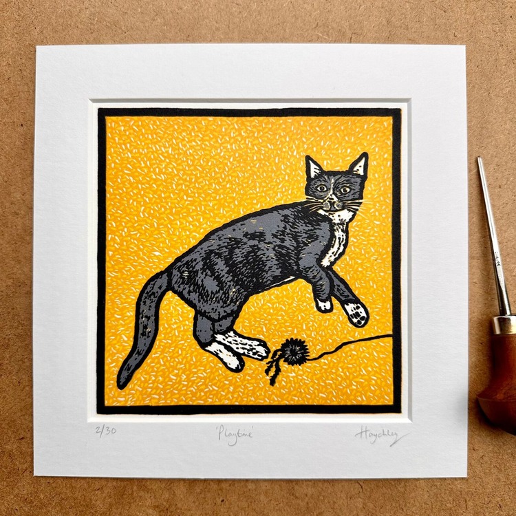
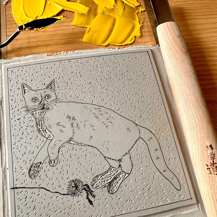
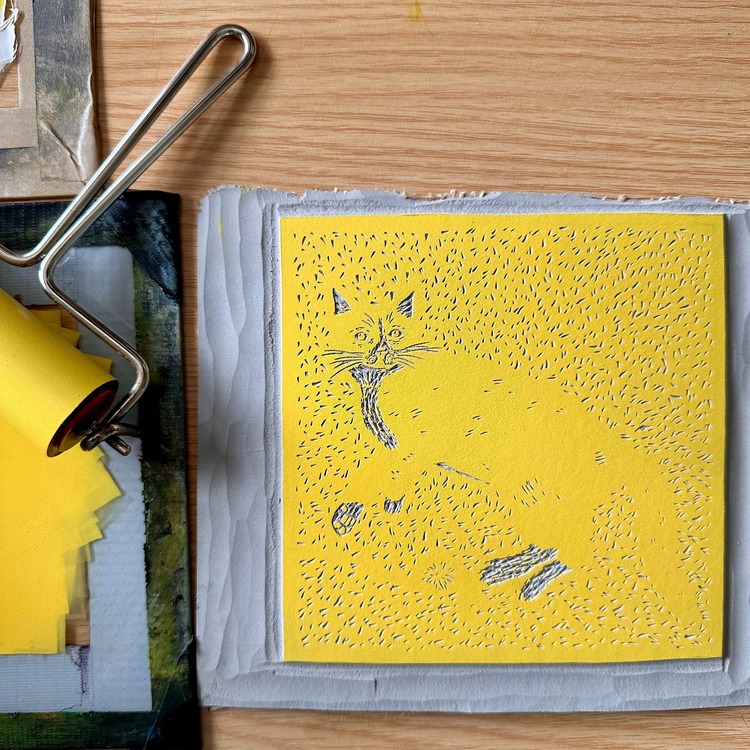 While visiting a local cat cafe in Norwich, Haychley Webb snapped a photograph of a kitten lying on a fluffy yellow rug – and knew she had to turn it into a linocut print. Haychley usually works in linocut using the multi-block method, however the depth of colour needed for the rug background gave her a good excuse to play with reduction printmaking again. Working light to dark, she began colour mixing the various shades of yellow she’d need to give the rug texture. Including the white of the paper, the print became five colours; two shades of yellow, a light grey for Stanley the kitten, and a black key block to bring the print together. Haychley finds it good practice to print more copies than she’d like in the edition to allow for any slips and trips, thus Playtime became a limited edition reduction linocut of 30 prints.
Malgorzata Servanska: The Beauty of Life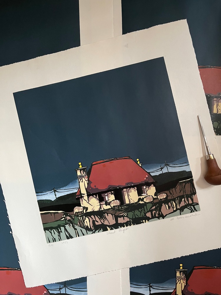
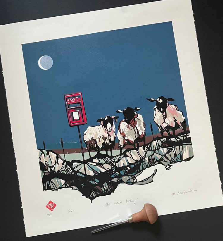
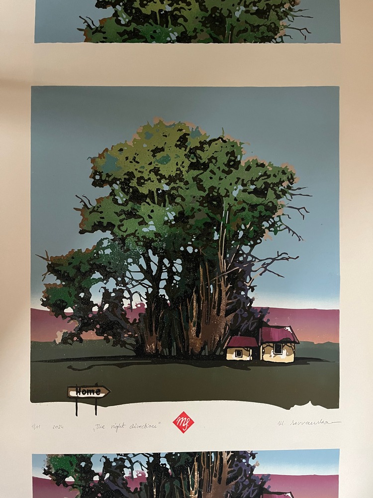 Striving to reflect the fusion of various cultures and symbols, Malgorzata Servanska invites the audience on a journey that crosses cultural borders and celebrates the beauty of life. Making her prints by hand; without a printing press, her edition sizes are often small, but more exclusive and intimate. “I enjoy the combination of bold linework with rich, vivid and substantial layers of colour,” states the printmaker. When making work, Malgorzata steers away from conventional pictorial formats, creating compositions using a subdued and considered colour palette in an attempt to create thoughtful and engaging work.
Stewart Taylor: Unbounded – The Little Punks & The Ash Dieback Project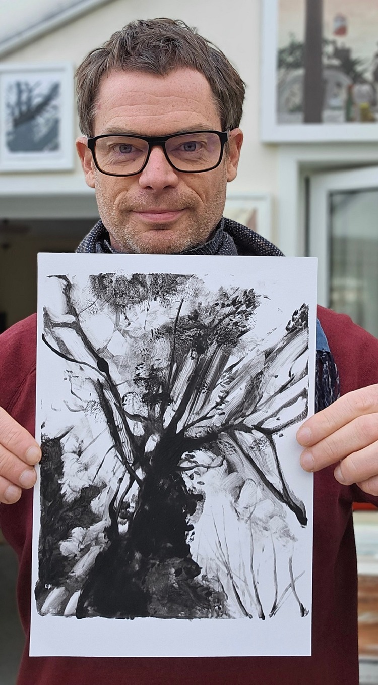
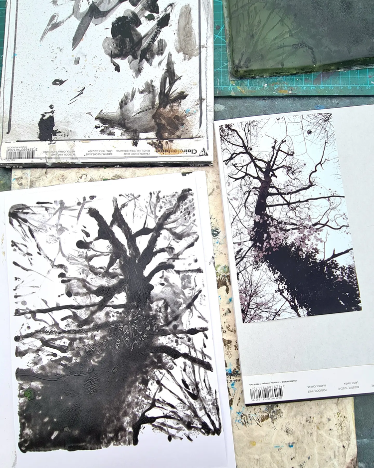
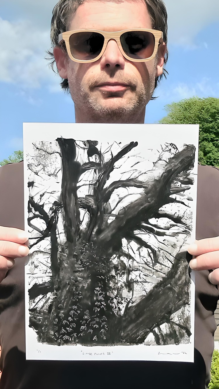 The Florence Contemporary Gallery is currently home to 4 Tree Portraits by Stewart Taylor as part of their Unbounded online exhibition. These pieces are gelli plate reduction monoprints, titled Little Punks I, II and III, and Ash Dieback – Dusk. Stewarts 2023 Little Punks series was inspired as part of a collaboration and discussion around urban and rural spaces, and how they can be managed for the benefit of both people and the regeneration of ecosystems. More recently, he has been documenting the ravages of Ash Dieback near his home in Devon, which will ultimately cost the UK in the region of £15 billion.
Check out more work by our community and apply to join our thriving community at www.members.peopleofprint.com.
You might like...
 Janne Kokkonen
- Redbellyboy | Album Design for Pissabed Prophet
- Anymade Studio
- Sebastian König
- Graphic Design before Graphic Designers
- 2016 Calendars :: Risotto
- PANTA
- Artwork by Blondie: Black and White Collection
- Department Store Vendor Interview | Nounua
- All Cats Are Grey
- Carolina Salinas
- Stephanie Buer
- Things Organized Neatly
- Vitoria Bas | Untitled Signed & Editioned
- Dominic Kesterton
- Stussy :: Biannual Vol1


Want to know more about our membership? Give us an email at members@peopleofprint.com.
- Super Seconds Festival May 2024 - April 29, 2024
- Francis Chouquet - April 29, 2024
- Tim Belonax |All Of My Mistakes Have Led Me To You - April 26, 2024