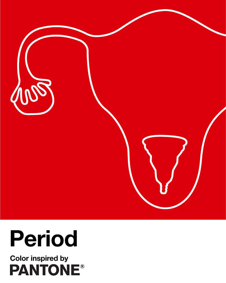
The Pantone Colour Institute have collaborated with INTIMINA, a Swedish intimate well-being brand, to release a custom Pantone red colour to represent menstruation and normalise this most normal of bodily functions. This original shade of red is emblematic of a steady flow during menstruation and makes periods visible, thus encouraging positive conversations about menstruation throughout society.
The colour Period is an energising and dynamic red shade that encourages period positivity and serves as the banner for INTIMINA’s Seen+Heard campaign. The global campaign is designed to empower everyone, regardless of gender, to feel comfortable to talk freely and proudly about periods, to start conversations and encourage a more sympathetic and accurate depiction of menstruation in culture.
Laurie Pressman, Vice President at Pantone Color Institute states; “Pantone and Intimina worked alongside a gynaecologist and consulted research published in Medical News Today to develop the shade, but by no means is this supposed to be an accurate depiction. Instead, we created a visual identifier of a red shade that would help Intimina leverage the power of colour to share their story”.
As part of the Seen+Heard campaign, INTIMINA has donated £2,000 to ActionAid, an international charity that works with women and girls living in poverty. This donation will support the full range of ActionAid’s work, which includes the fight against period poverty and reducing the stigma around menstruation.
Learn more about the project at www.intimina.com.
You might like...
 Hello Marie
- PANTA
- Minx Creative: Sustainable Packaging, Products, Direction and Design
- Erin O’Keefe
- Jonathan Leder | Imperial Publishing Ltd (NSFW)
- Jason Sturgill
- Miss Take
- Benjamin Murphy
- Dasha Starostin
- Interview with b r u ï
- Laura Solteys
- Magpie Studio | Straits Kitchen Design
- Lo Siento
- Stone Island AW13
- Matt Manson
- Yo-NEWYORK!


robyn@peopleofprint.com
- Benny Andallo X Foundation F.M Posterzine - April 26, 2024
- leafie Issue 01 Currently Crowdfunding - March 27, 2024
- Reimagining The Nature of Work - March 5, 2024