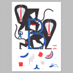
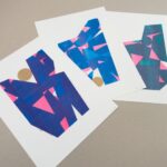
Paris-based graphic designer and typographer Clément Le Tulle-Neyret describes his work as “content driven”, detail-oriented and “characterised by an exceptionally high typographic culture.” While there’s clearly a small element of lost in translation in the final phrase, if you’ve seen his work, you’ll see what he’s getting at. Le Tulle-Neyret is clearly both a perfectionist and a total type-nerd.
Since setting up shop in 2011, he’s worked mainly with “cultural, industrial, and institutional” clients, as he terms them. These include architecture firms; art schools; photography and music festivals; photographers; the Saint-Étienne Museum of Modern Art, among other museums; galleries and more.
I first saw Le Tulle-Neyret’s work back in 2015, when he’s created the catalogue for Grenoble’s Avatars de Rousseau exhibition, bringing together imagery and essays in a layout that deliberately recalled 19th Century pamphlet design. Around the same time, the designer had also worked on the book Strange Designs, a compilation of essays by designers including Elio Caccavale, Didier Faustino and Pieke Bergmans. He chose to focus the design around the colour green, describing it as “the colour of Satan…strange beings, sorcerers…genies in bottles,” among other odd entities.
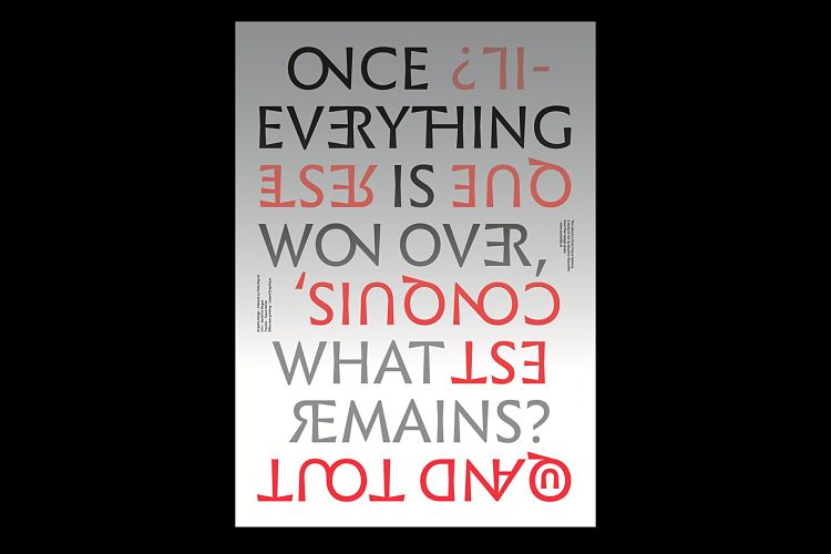
 Alongside his publication design work, Le Tulle-Neyret has always demonstrated an intense fascination with typography, both in terms of aesthetics and more conceptual, historical and sociological contexts. Back in 2017, he created poster and publication designs for Notions of the Future, an essay publication by Gauthier Roussilhe of French design agency Flair.
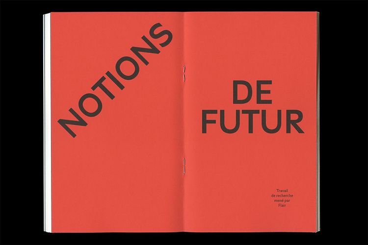
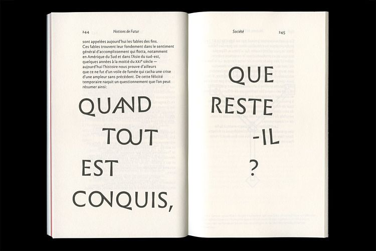
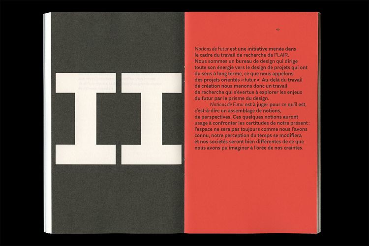 The designs deliberately offered a counterpoint to the usual visual associations we might have with the “futuristic” (those cliches around Geocities era web design, or sci-fi-esque silvery palettes, for instance). Leaning more towards Soviet era Futurism, Le Tulle-Neyret opted for reddish orange and black tones and a range of eye-catching, unusual typefaces including Infini, Merkury and Traulha. According to Le Tulle-Neyret, the book’s format was designed to create “a dialogue between classicism and anticipation” through the use of a grid that divides the page into nine sections both vertically and horizontally. In a strange twist, the book “begins” on page 201, meaning that the “cover” is found on the inside.
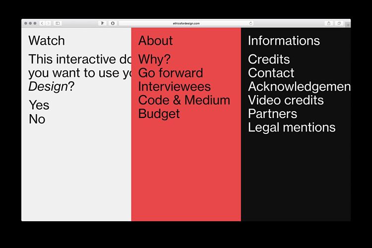
While most of Le Tulle-Neyret’s work is within the culture sector, the being a designer working for a design client—i.e. someone who does pretty much the same thing as you do on a day to day basis—must be pretty daunting. In 2018, Le Tulle-Neyret did just the when he departed from his usual print-based work to create the visual identity and digital designs for the documentary Ethics for Design, created and produced by Gauthier Roussilhe.
 Le Tulle-Neyret often to use a bold, typographically driven approach for the project. It’s very much a design system designed for designers: based on grids, it prioritises simplicity and clarity.
One of Le Tulle-Neyret’s most recent projects is the launch of his first retail typeface, the Immortel type family. Published by French type foundry 205TF, Immortel has been in development since 2016, and began life as part of a research project developed at l’Atelier National de Recherche Typographique (ANRT) in Nancy, France. He says he started working on the type family for a few reasons: one of the key ones was that he was unable to land on just the right typeface when he’d found himself searching for a French Renaissance style font in previous projects. “One of the reasons behind the design of Immortel Infra came from a longstanding interest for the Galliard, Plantin and Lyon typefaces,” he explains.
 “Having worked with these typefaces on different projects, I realised that none of the three truly incarnated what I was looking for when using typefaces descended from those of the French Renaissance, forms that were present enough to be visible but sufficiently discreet to go unnoticed. The need for this type design arose from the desire to develop a personal version of Robert Granjon’s Gros Cicéro, engraved in 1569, which influenced the three typefaces previously mentioned.”
In the early days, the development of Immortel was based around a number of questions the designer was asking as part of his research: “ starting from the principle that a text is seen before it is read, how can the form of the letters serve the words? How can one visually re-transcribe a content, not only in terms of page layout? How can a typeface embody a text?”
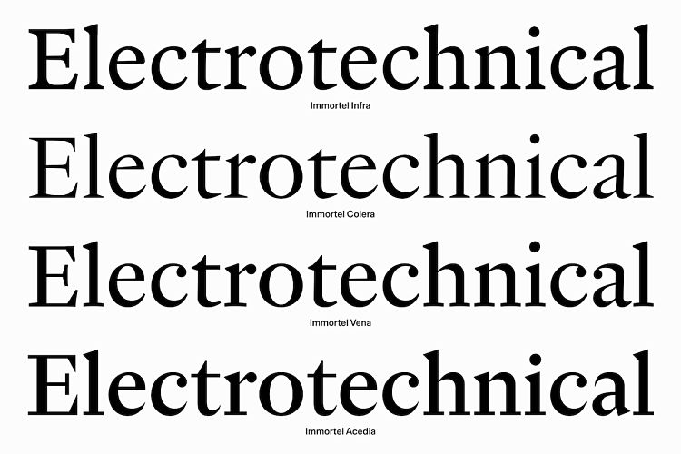
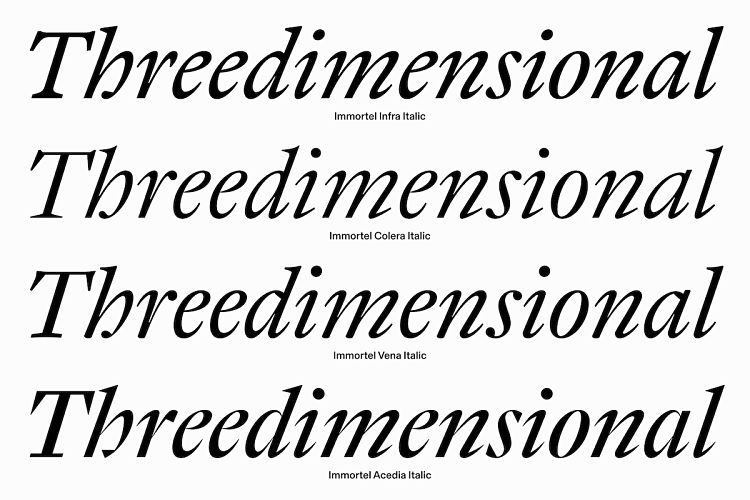
 When the font was launched fully last month, it was revealed that the four variants that make up the Immortel family have characteristics that are each inspired by a different “humour”. Here, humour refers to the physiological “humours” as laid out in the Hippocratic theory. In simple terms, these are bodily fluids that were once believed to cause certain character traits: as Le Tulle-Neyret explains it, “phlegm represents a lymphatic, sluggish, slow character (Immortel Infra); yellow bile, an angry and prideful character (Immortel Colera); blood, a jovial and warm character (Immortel Vena); and black bile provokes hopelessness and melancholy (Immortel Acedia).”
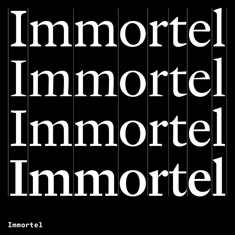 They’re also each inspired by a different engraver or type designer from throughout history. Immortel Infra is “associated with a phlegmatic temperament” and draws on the work of 16th century typeface engraver Robert Granjon; Immortel Colera has “a choleric temperament” and is inspired by the work of Jean Jannon, an engraver from the 17th century; Immortel Vena has “a sanguine temperament” and draws influence from 18th century engraver Jacques-François Rosart. Finally, Immortel Acedia is associated with “melancholy”and is inspired by the aforementioned Melencolia I by Albrecht Dürer, while also attempting to synthesise the look and feel created by 16th century tools and modern, narrow point type design instruments, giving it a more modern aesthetic.
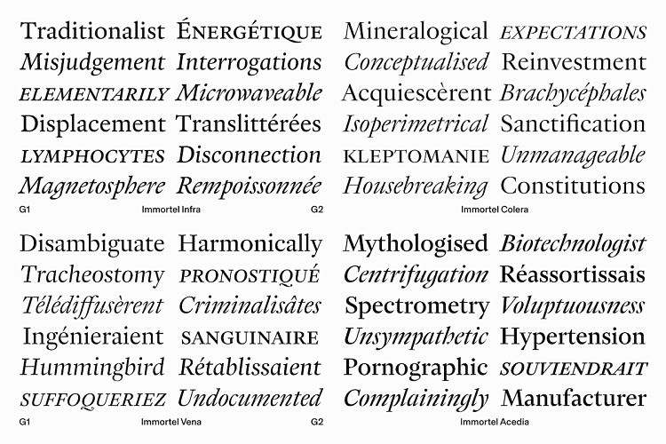
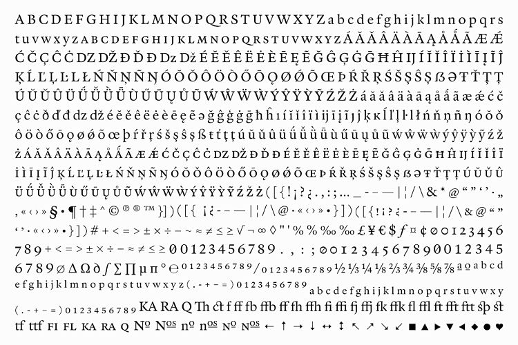 One of the key ideas behind Immortel is that the whole family can be used for a single magazine layout, since the variants provide options for everything from body copy to abstracts, titles, mastheads and more. “This family is designed for serious typesetting,” as Le Tulle-Neyret puts it.


- Autobahn - November 26, 2021
- Alphabetical - November 12, 2021
- SOFA Universe - November 8, 2021