Dutch creative studio Autobahn was never meant to be a design outfit at all: it was meant to be a band. It seemed music would be the destiny of four graphic design classmates, who between them, could play guitar, piano and bass; mix beats; and “sort of” sing. But it wasn’t meant to be, thanks to, we’re told a combination of “lacking harmony, musicality and musicians of any calibre.”
One night, that same quartet was watching The Big Lebowski. “As a side story within this movie, three German nihilists claim to be a band, but they never played any music,” Autobahn cofounder Rob Stolte explains. “At one point, the lead character Lebowski pulls out an album from a crate that read ‘Autobahn Nagelbett’. Intrigued by the typography and design, someone from the never-to-be-band shouted, ‘Autobahn, that’s us!’ The band never took off, but the name Autobahn stuck.
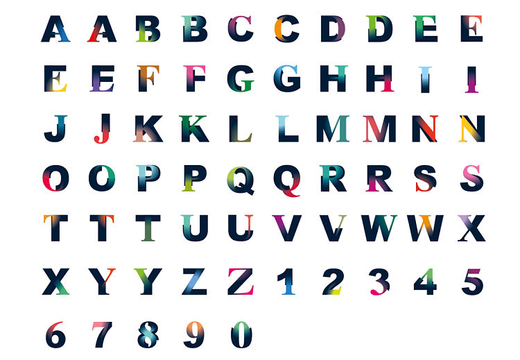
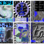
 Early on in the life of the studio, it was invited to perform at a Pecha Kucha night in Amsterdam (NL). However, the team wasn’t convinced that their typographic designs were interesting enough to talk about in front of an audience so instead they started to created their own digital typefaces in a project dubbed FreshFonts.
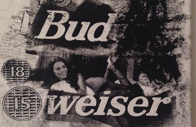
This saw them print a large alphabet in Helvetica, then trace the letterforms in ketchup, hair gel and toothpaste. These were then photographed and digitized to create three typefaces: Tomatica (ketchup), Gelvetica (hair gel) and Heldentica (toothpaste).
“The creation process was great fun but the font was a far cry from high quality design,” says Stolte. “The boys weren’t sure it would appeal to their audience. However, the ‘making of’ seemed to be a good story and focal point for their talk.”
The team offered the three typefaces as free downloads; and the talk got a lot of attention – including a piece in a national newspaper and Autobahn’s site traffic hitting 60,000 unique visitors per month.
Since then, experimentation has been an intrinsic part of studio life for Autobahn, which incorporates experiments throughout their assignments for clients. We spoke to Stolte to find out more.
 Why is experimentation important to you as a studio?
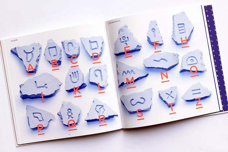
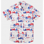
It forces clients to commercialize and get a grip on time, money and assets. This led to some great projects, including a stone carved typeface for Sony Playstation; a duct tape inspired typeface for Nike Bootcamp and recently the design of a modern-day scriptorium for Graphic Matters, used throughout a cycle route in the Netherlands.
These projects were shown in international exhibitions, numerous book and magazine publications and won prestigious design awards. It became apparent that letters are not just ‘carriers’ that are there to form text. The letter type is far more symbolic with a bigger role, communicating further meaning to its reader. Autobahn recognised that the semiotic relationship between form, content, meaning and letters as images gave way to a whole new layering system. Communication was no longer black and white and the design possibilities endless.
 You’ve run Autobahn alongside cofounder and co-creative director Maarten Dullemeijer since 2005. What makes for a successful partnership between two people in running a studio?
We complement each other well because we are opposites in many aspects. Where Maarten is analytical, precise and real a designer, I do things by feel, guide design processes and am a concept thinker. Because of this contrast, we always explore the entire spectrum of an assignment. All perspectives are reviewed.
But the personal differences sometimes also cause disagreement and misunderstanding. When that happens, we make sure that one person takes the lead in a project and makes decisions. This is often the person who maintains contact with the customer. Sometimes we use these differences to play good cop bad cop. In this way we can clarify things, create understanding and sometimes force things.
What sort of projects and clients do you find most satisfying?
The projects that appeal most to us are projects where we can create interesting communication by using words, materials and a challenging context in which all this is displayed. We love to challenge ourselves to experiment. We do not create a design twice, and don’t depend on a certain style or method. This keeps it interesting for ourselves and our clients. Although this is a lot of work, it gives us the most satisfaction.
Autobahn uses the philosophy that projects come and go, but good contacts remain. That’s why Autobahn works with people who share our outlook on life, rather than focusing on big brand names. Autobahn feels most comfortable when they work with people who have the same outlook on life as they do. We need clients’ confidence to be able to experiment and achieve unexpected results. This is where the fun aspect is in an assignment because though this approach each design process is different.
The second aspect is honesty. It ensures open communication, so that business aspects of an assignment, such as budget, time and planning, can be easily discussed.
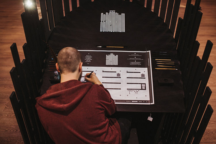
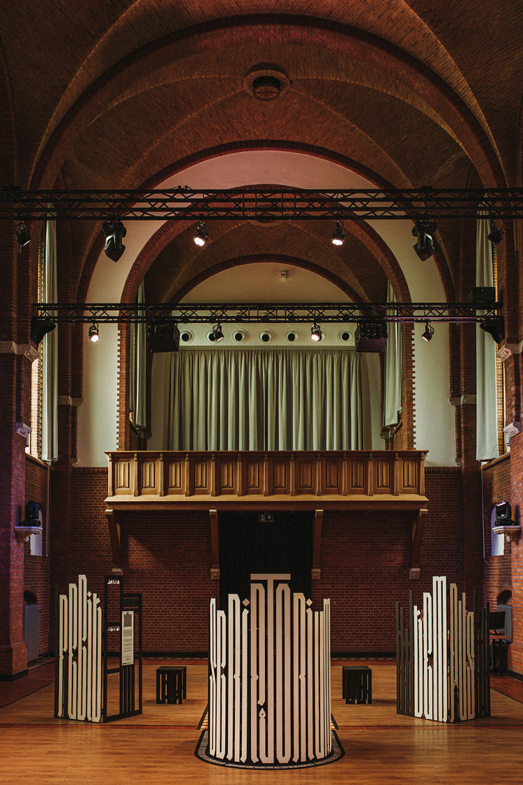 Can you tell me a bit more about the Scriptorium project?
Scriptorium is a project about the relevance of typographic design, from the monks to modern scripts. The way that visitors interact with the Scriptorium is very satisfying. The amount of participants is way higher than expected. The reactions are very positive. Visitors take the time to reflect on their handwriting, something that doesn’t happen much in this digital age. It gives them satisfaction to work contemplatively with letterforms. It brings the visitor close to the designer at such a moment because they share an experience. That is what we would like to achieve with our designs.
 What advice would you give young designers on getting into type design?
Try to not only focus on the way the letters look, but also the way they function and where they are used. Involve the use of materials when designing. Not all letters need to be designed behind a computer. Aesthetics can be found in flaws or irregularities as well as super tight curves.
and on setting up your own studio?
Just do it! One of the reasons Autobahn operates as a small studio is because we want to work with people who can hold their own. Designers that chase their own dreams. Don’t be afraid of not having enough paid work. Just take on a side job and gradually grow into your designer role. Develop your design attitude by visualizing and telling stories that you find important. There will always be like-minds that understand you and love to collaborate.
And don’t be afraid to reach out to other people. When we admire someone, we just ask them if we can buy them a cup of coffee and have a chat about their work and experience. If you approach someone based on their interests and personality, they will be more likely to meet you than if you ask them for time, work, or an internship. An entrepreneurial attitude goes a long way.
How do you go about ensuring the studio has enough time to work on self initiated projects alongside client work? Why are those projects important to you?
We work four days a week: the fifth day is for personal time and projects. We always try to involve others into our personal projects. This makes it more fun because you work with new people, but also it makes sure you work on the project because the others depend on you. This makes sure that projects are actually created and finished.
You might like...
 Kevin Trageser
- Fruitlands Zine
- Pressing Matters — Issue 6
- Drop Dead X Sonic
- Hirundoaves
- Badlands Unlimited
- Aurélien Heilbronn
- Poster Roast
- Josh Freydkis
- QHUIT X DSL / Ed Banger :: Capsule collection
- Balla Dóra
- Peter Judson :: Recent work
- Mark Frendo | Danger UXARD
- AOI Illustration Awards 2014 | Somerset House Exhibition
- Bence Bakonyi
- Adam Daily


- Autobahn - November 26, 2021
- Alphabetical - November 12, 2021
- SOFA Universe - November 8, 2021