Daan Rietbergen is an Utrecht based independent graphic designer and artist working on visual identity, poster design, typographic systems, record sleeve design, book design and murals. He studied Graphic Design at Gerrit Rietveld Academy in Amsterdam and St. Joost School of Art & Design. After graduating, Daan worked as a visual designer at Studio Dumbar from 2014 to 2019. “Working at Studio Dumbar completely shaped me as the designer I am today” says Daan. At Dumbar, he started to develop his love for grids and systems as a base for designing visual identities, and later his typographic systems. Before working there, Daan painted a lot of graffiti in a free and expressive style. After leaving the studio, he started to paint in public spaces again, but now with his new typographic systems.
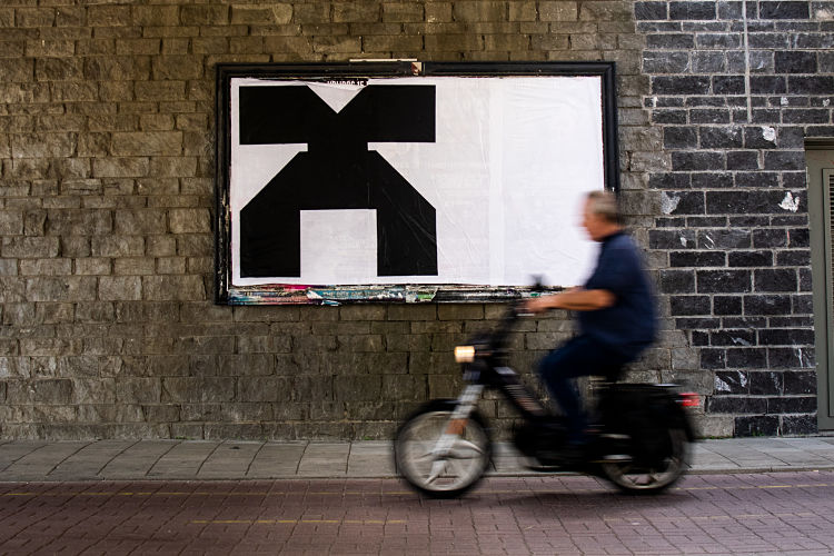
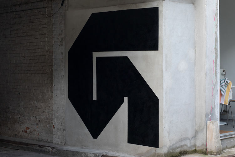
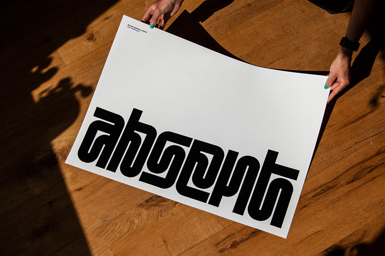
“On a screen, the letter often doesn’t do it for me, but when it’s printed or painted on paper, it comes to life much more. And painted in public space, when it’s even bigger, it comes to life even more and can look aggressive, powerful and alienated in the streets. Most of the time I paint only one typographic character instead of a word. When it’s one letter it becomes much more abstract and get’s less meaning in a way. With words you communicate something and I want to focus more on the shape and the character itself.”
 When designing a visual identity for a client, Daan always begins the process with visual research; looking at competitors and visualising concepts he has in mind in order to begin sketching from. He states; “With these projects there are always deadlines and I need to force myself to produce. With my personal typographic systems, it’s different. I never sit down and think now I’m going to make a new typeface. Most of the typographic systems I designed started as little ideas when I was sketching on a project for a client. Those little ideas or shapes can be interesting but not for that particular client, so I will use them later on, without any deadline”. Daan constantly switches between client work and personal work, with each reinforcing the other; “letting the project rest for a while provides new insights”.
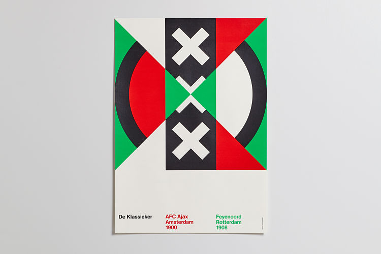
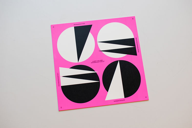
 His work is greatly influenced by Dutch Modernist graphic designers such as Wim Crouwel, Ben Bos and Jurriaan Schrofer; “The way they designed is the way I try to design; only show the things that are really necessary by using very powerful graphic shapes based on well thought out grid systems that get rid of all the visual noise”.
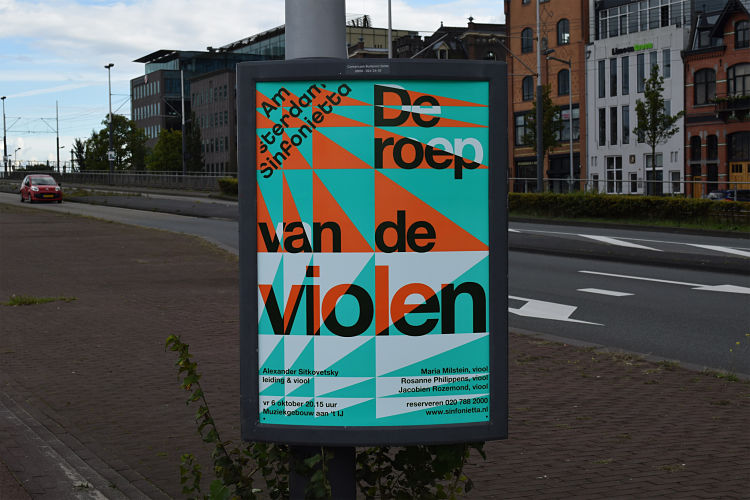
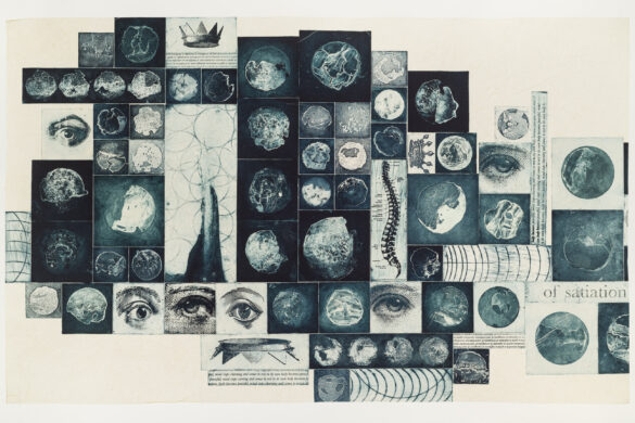
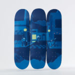
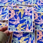
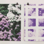
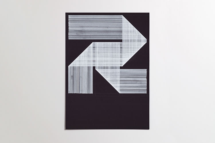 Daan works across a variety of materials and techniques, including silkscreen printing, fineliner drawings on paper that are made with rulers and pencils to create a grid, acrylic paint on paper and tape for masking, wheat paste, spray paint, and Offset printing in CMYK or Pantone colors.
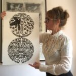
 Going forward, Daan hopes to create a series of publications; “I want to design books that are the summary of my typographic systems”. The book about his first typeface, Nespor, will be published at the end of this year. The publication will be like a type specimen, but also with all the drawings and murals he created, resulting in a complete overview of 200 pages, offset printed.
 www.daanrietbergen.com
@daan_rietbergen
You might like...
 Joseph Vass
- Vans | These Projects Are Ads for Creativity
- Reed Anderson
- James Barker
- Liam Ashley Clark
- Moby Digg
- Kipepeo Cards :: The Artists Collection
- ‘New Flavours’ Colourful Calendar :: Nearly Normal
- McQ :: SS14
- Modern Design Review x GTF
- Inky Kat Studio
- Jade Bridgwood
- Beth S. Robertson
- RIP :: Dieter Roth
- Lucy K
- Print Club Boston


Want to know more about our membership? Give us an email at members@peopleofprint.com.
- KesselsKramer | Het woekert in Tolhuistuin - May 7, 2024
- Satinder Parhar | Start the Press! Artist in Residency at IKON Gallery - May 3, 2024
- Heather J. A. Thomson - May 2, 2024