Uruguayan graphic designer Gabriel Amijai Benderski Perez recently got in touch about a fascinating project he’s put together: an archive of graphic design from his home country. Benderski Perez was born in Montevideo, Uruguay, and completed his formal BA training in graphic design at ORT University before spending five years working for various studios. Now working as a freelancer at his eponymous studio, among his portfolio projects are his work helping develop the 1891 brand as well as the interior way-finding system and visual identity of Peñarol’s ‘Campeón del Siglo’ Stadium.
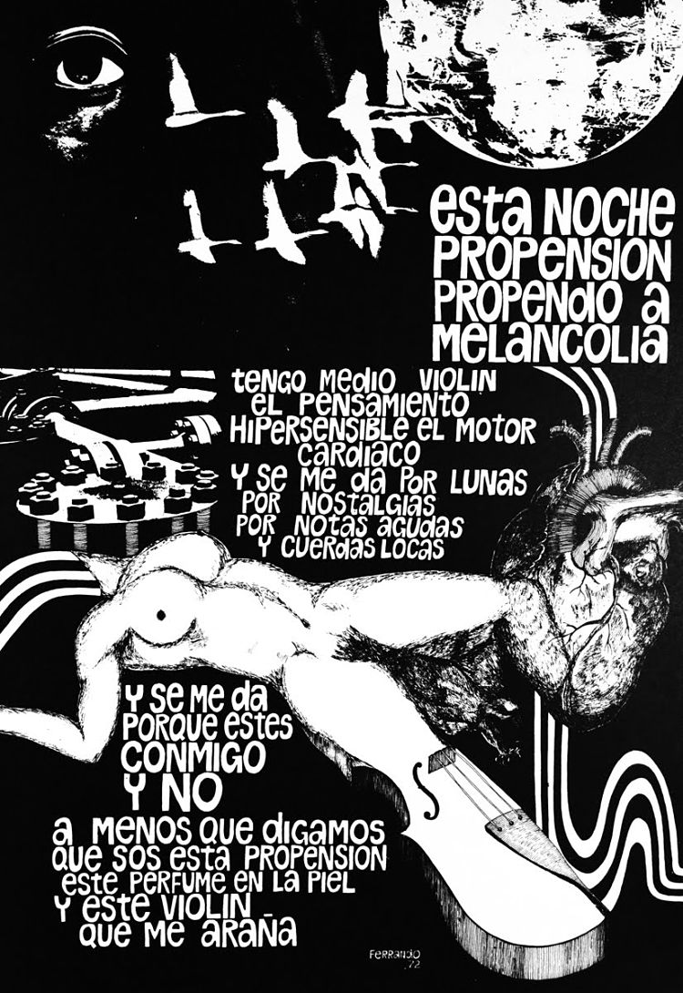
 Recently, his focus has turned to “the human aspect of graphic design,” as he puts it, and created the Social Poster Exhibition as part of The Uruguayan Plan for Human Rights Education. The collection of posters aims to encourage viewers to reflect on various subjects in the human rights agenda through image and typography as applied to the poster format. Talks, workshops and exhibitions were held in New York, Warsaw, Ottawa, Toronto and in four cities around Uruguay “where graphic design was used as a tool that promotes tolerance,” says Benderski Perez.
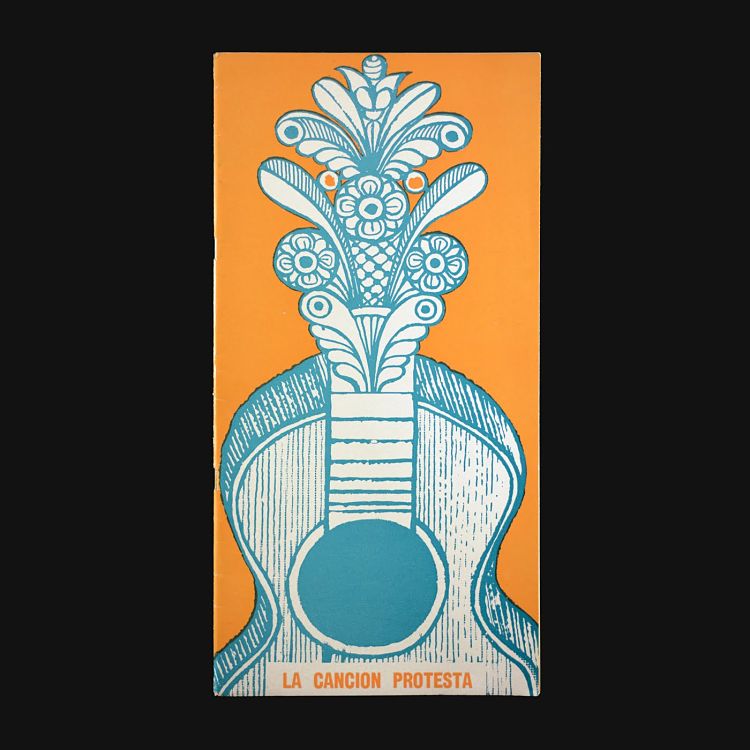
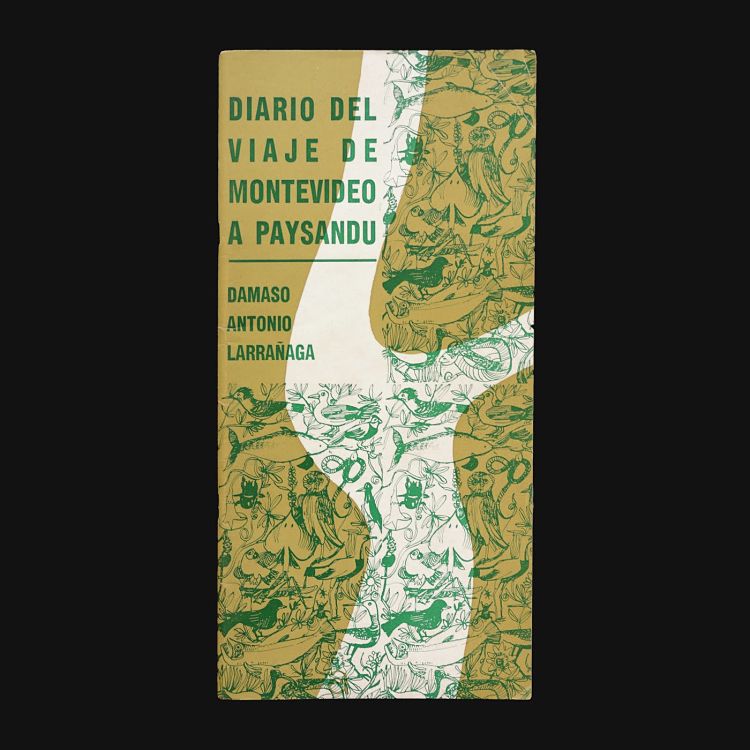
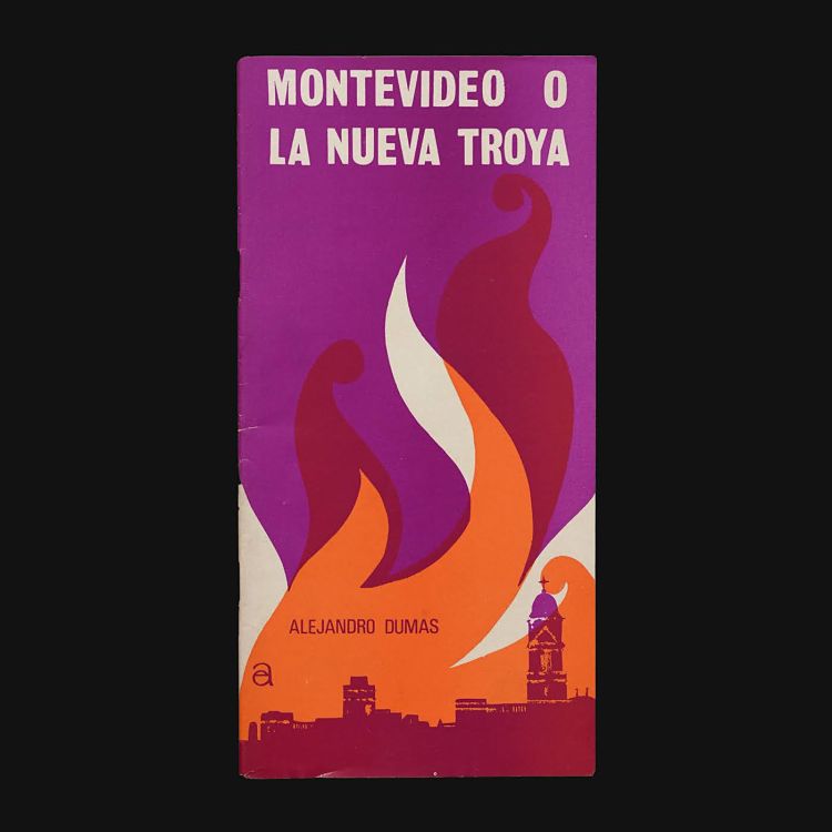
 Since around 2018, he’s also been working on a huge undertaking: creating an online archive of Uruguayan graphic design. The idea was to learn more about “how Uruguayan printers communicated different social events,” he says.
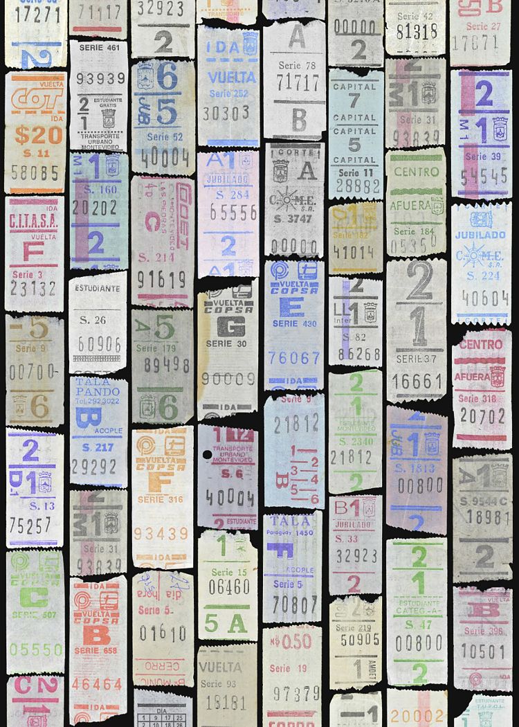
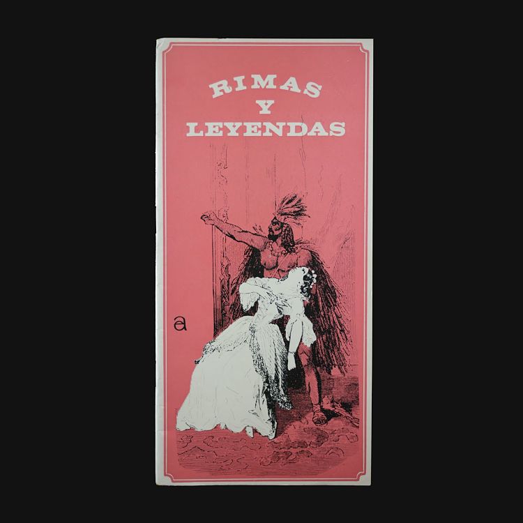
He started out by visiting Uruguay’s National Library to discover and photograph flyers from the late 19th and early 20th centuries, which he then shared on a devoted Instagram account flyers from the late 19th and early 20th centuries. The first image was posted on August 23, 2018. His main interest lay in studying the layout of flyers; how the “printer diagrammed what was a copy into persuasive communication.”
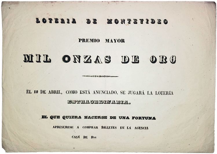 One of the first pieces of printed matter that caught his eye was a lottery flyer with unique typesetting: “To compose “MIL ONZAS DE ORO”, a 13 letter headline was missing 3 letters which the printer had to figure out how to accomplish the job. The most curious case being the last O of oro (gold) which is a 6,” the designer explains.
 An underlying goal with the archive is to do away with any perceptions that Uruguayan design is subordinate its peers from countries such as the UK, Germany and Japan. It seems to be working: at the start of 2020, Uruguayan journalist Leonardo Haberkorn, invited Benderski Perez to appear on a television program to talk about the initiative. “For almost 20 minutes I had the marvellous pleasure of talking about graphic design to an audience that is used to politics and economics,” says Benderski Perez. He adds that appearing on national TV made him realise that there was “much more to explore and work on” when it came to making “the Uruguayans and the world know about the value of local design as a communication channel and its connection with the environment.” It was only at the end of 2020 that the designer decided on the name for the project—Graphic Design Archive of Uruguay—“as this name could be interpreted as a state agency.”
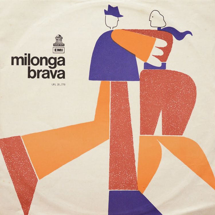
 So far, a unifying aesthetic style hasn’t emerged when it comes to graphic design in Uruguay; but the projects do have a certain way of working in common. “Uruguayans, not only in design, work with what there is,” says Benderski Perez. “In other places, [designers have] an abundance of resources, in Uruguay that isn’t the case. It’s not that we are underprivileged, it’s that the limitations are noticeable.” For instance, while a magazine cover created elsewhere might use the services of a photographer, a lighting designer, a couple of designers and an art director; in Uruguay, one person would be responsible for the lot. “I don’t see it as a disadvantage, but, on the contrary, as a great virtue that allows us to have control over all parts,” says Benderski Perez.
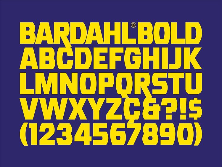
 As for what he’s gained in terms of his own design from creating the archive, the designer says he’s now got a whole load more references to draw from. This was shown in a project he worked on with an architect, a writer and sociologist, a type designer, an experience designer and a graphic designer. The team ended up creating a new typeface based on the lettering found in the laboratory of a Uruguayan state electricity company. “A solid conceptual foundation was able to introduce me to produce my first font,” says Benderski Perez.
 “On the introspective side, I learned to be more receptive of my colleagues’ approach to design. It happens that in design, as in politics, everyone has their own way of doing that differs from what one is and does. What is relevant from this lesson is to spread Uruguayan design and not just design that I like. What would be the sense of spreading Uruguayan graphic design that I find to my liking? The making of the archive helps me to work on my ego and to position myself in a better place where personal interests are left in order to focus on the collective.”
You might like...
 50 Letterpress Printers, Studios, and Artists You Should All Know About
- Fiona Quill
- Nick Satinover
- Heretic :: Forbidden Onion Zoop
- Zineswap
- José Ja Ja Ja
- PANTA
- The Black Heart
- Fermin Guerrero
- Magnum x Dolce & Gabbanna
- Polina Joffe
- Zines of the Zone
- POP Member Showcase: 14 Collage Artists
- I Love Ligatures
- Nike X Liberty AW14
- Make Away


- Autobahn - November 26, 2021
- Alphabetical - November 12, 2021
- SOFA Universe - November 8, 2021