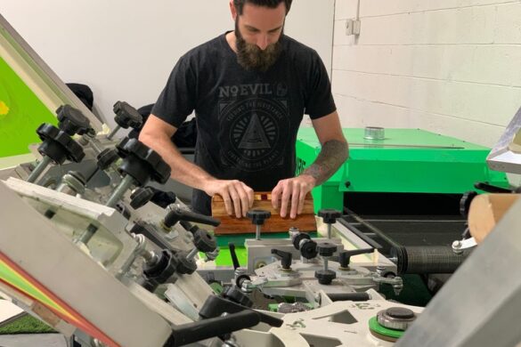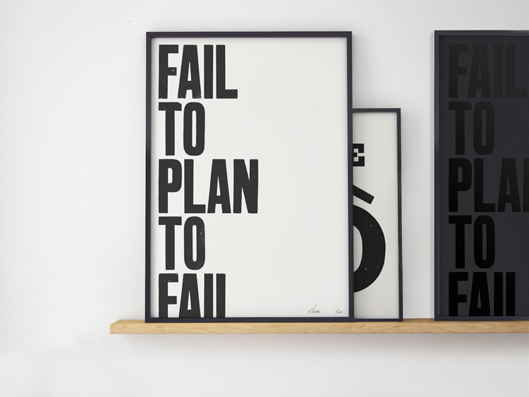
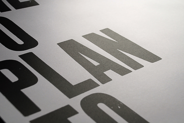
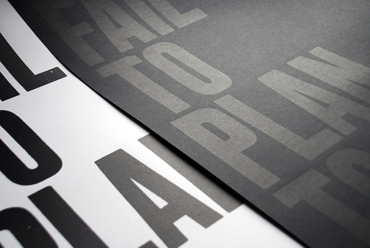
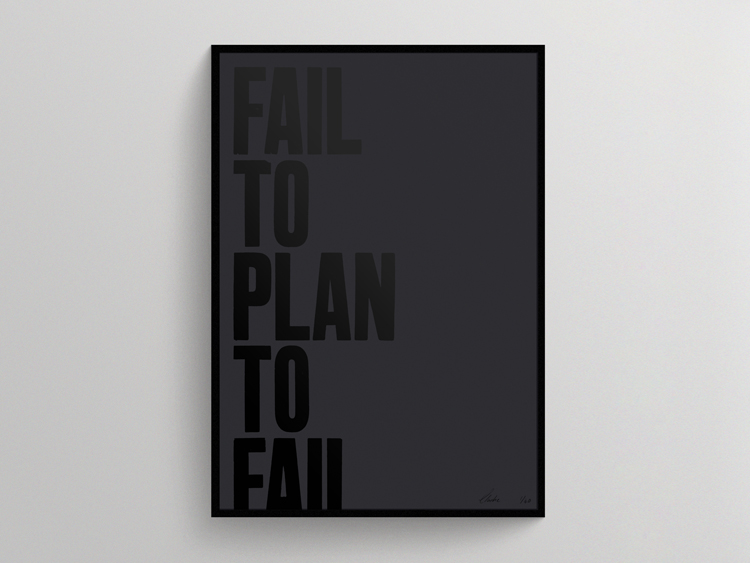
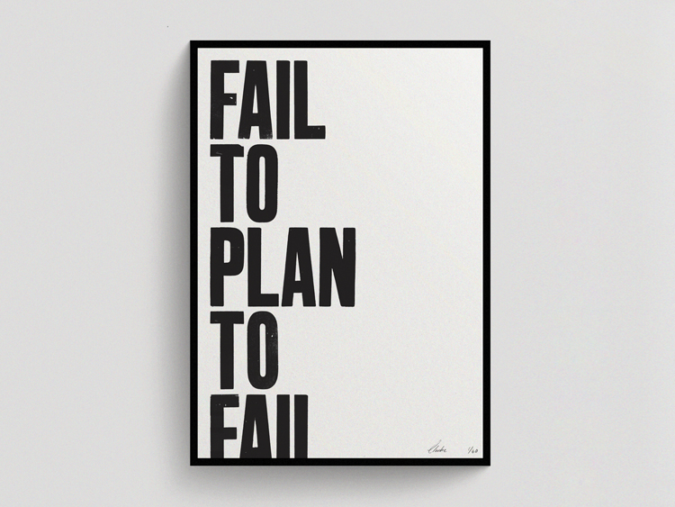
Using an unmarked typeface and a few glyphs, Fail to Plan, Plan to Fail prints are typographic exercises in word play. ‘The ideas start very organically, usually as hastily scribbled musings in a notebook and often responses to current affairs. The words, phrases and statements that resonate will then manifest onto the wood type, hand rolled and carefully placed and impressed.’ describes the designer Chris Clarke. ‘The experience to design is really liberating — the limitations imposed by having just the one character set means the posters intelligence and playfulness must come through the word play and typographic placement.’
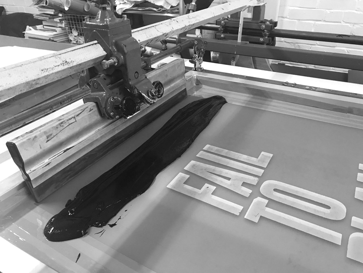
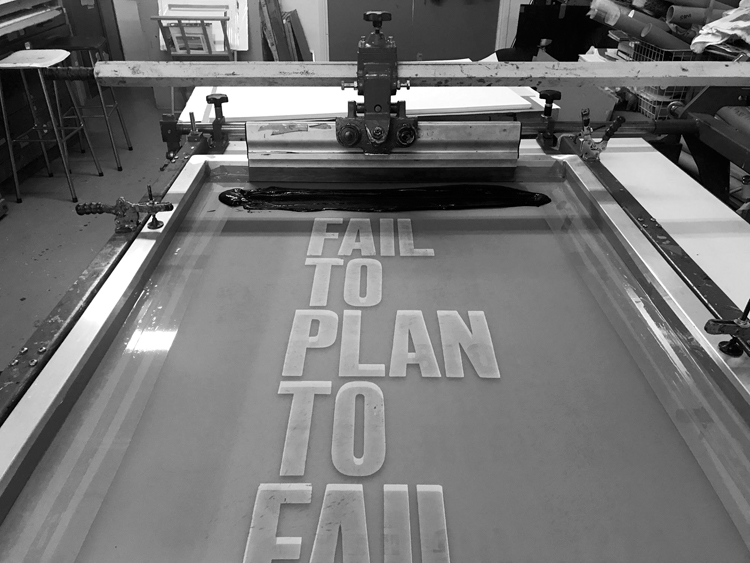
Fail to Plan, Plan to Fail is a limited edition of 50 screen prints, priced at £45 with free UK delivery printed by Marcroy Smith, the director at People of Print of 350gsm GF Smith Colourplan and Zen White paper using a distinct black ink mixture which contains mix of 3 inks, a pigment and Lascaux medium to achieve the density of black.
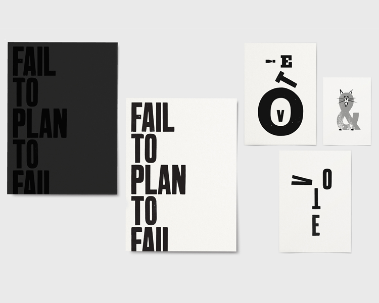
Chris Clarke is an award winning multidisciplinary design director based in London. Currently global deputy creative director of The Guardian Chris has been noted on numerous accounts by the Society for News Design, Society of Publication Designers, It’s Nice That, YCN, Creative Review, Design Week, and D&AD.
You might like...
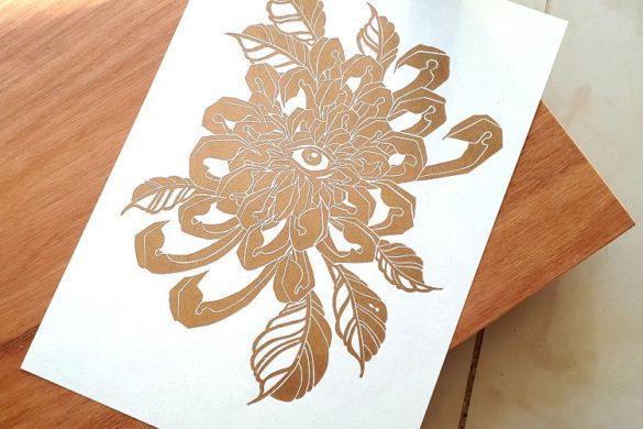
 Mathilde Roussillat Sicsic
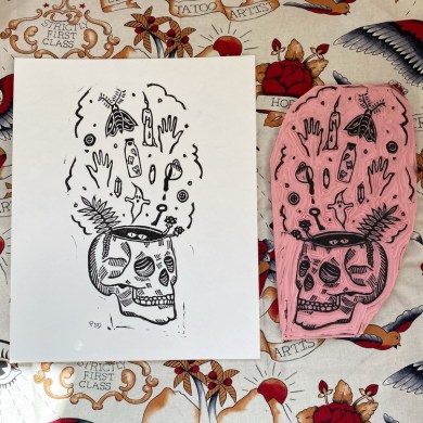
- Joseph Vass
- Magnum x Dolce & Gabbanna
- PRINT ISN’T DEAD Magazine | Element #002
- Noway Apparel
- Studio Everett
- POP Member Showcase: 10 Publications
- Haley Rich
- Studio 37 Prints
- Murray Fredericks | Vanity Series
- Cathrine Alice Liberg: Imaginary Photographs of my Great-Grandmother
- Future You No. 2 by Nada Alic & Andrea Nakhla
- George Greaves
- Joo Hee Yoon
- Liam Cobb
- Xanthe Bonsall


- Brighton Print Fair - September 19, 2017
- Bad Korean - September 8, 2017
- Qingyu Wu (Q) - September 5, 2017