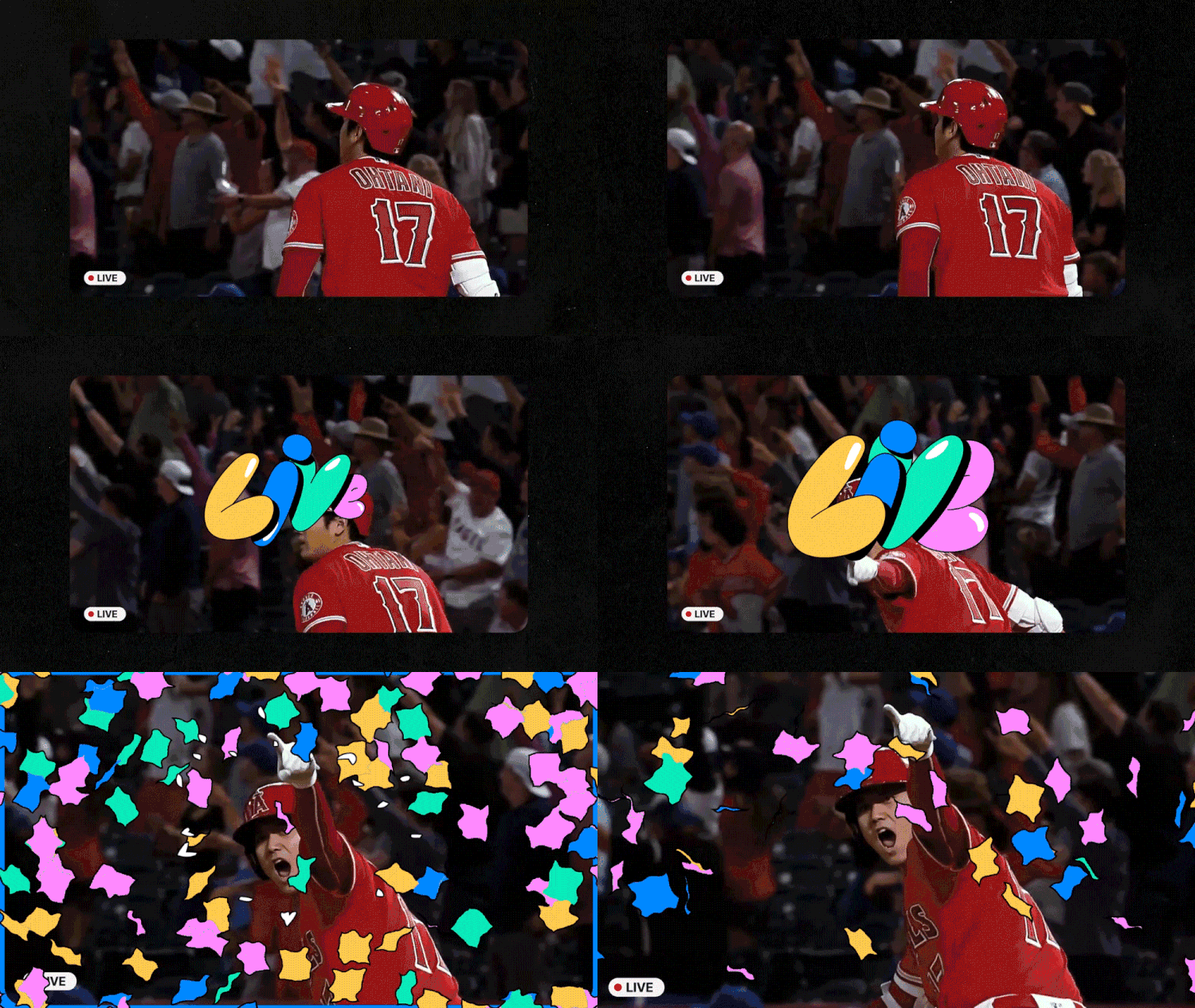
Mat Voyce, the UK-based type-designer and 2D type animator recently worked with ESPN on a collection of 2D typography for promo in the US.
The project was initiated when Mat was approached directly by an agency who had seen his work online and wanted to get him involved. The talented team behind the full project are from 1st Ave Machine (Buenos Aires Studio) and had undertaken this very same brief for the last few years in a row, but wanted to step up their 2D type game for the 2023 edition, so Mat was the perfect fit!
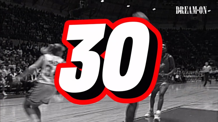
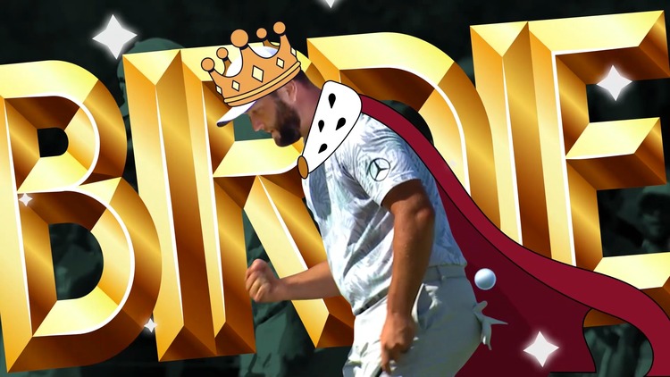 Funnily enough, Mat had actually seen the previous edition of this campaign and had always been a huge fan. He tells us; “However, regardless of the client I would’ve jumped to work with 1st Ave Machine as they have one hell of a past portfolio of global work!” The main attraction for Mat was the complete mix of styles and footage effects, with such a rough, choppy, but polished feel, the project really appealed to Mat’s way of working.
“I’ve always found it addictive combining type styles and bringing new elements into my work, so this project was truly a dream one to undertake as I got to do so with a great team, great client and to have my work seen on a global scale.”
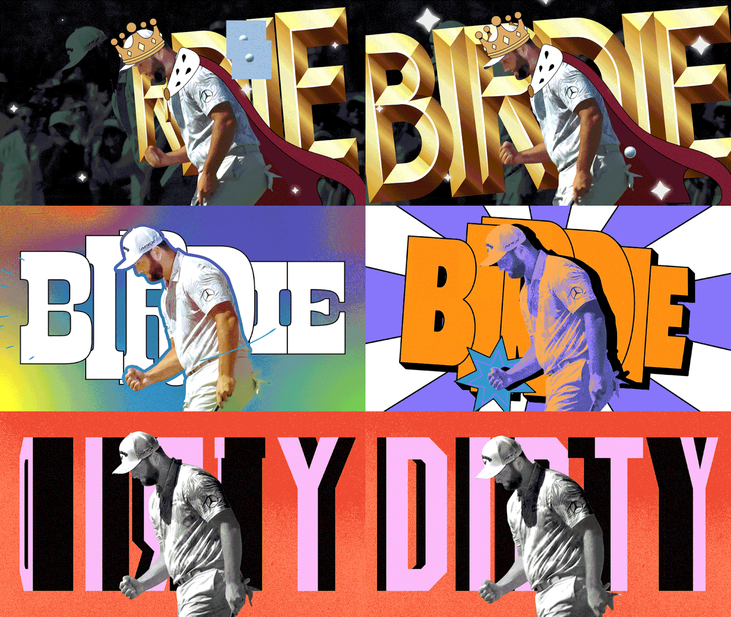
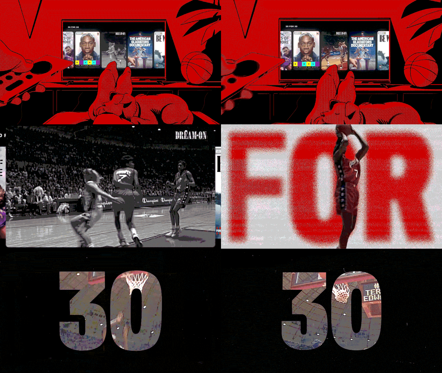 With this project, Mat’s inspiration differed from scene to scene. The style of each piece of type and animation was all unique and worked specifically to the footage or sport shown on screen at that time. Many of the type styles featured in the project come from vintage sport designs, for example, lettering from baseball cards, large LED numbers and ligatures from stadium scoreboards, even the smallest of elements drew inspiration from Sportsworld, but all come together to feel like part of the same visual language.
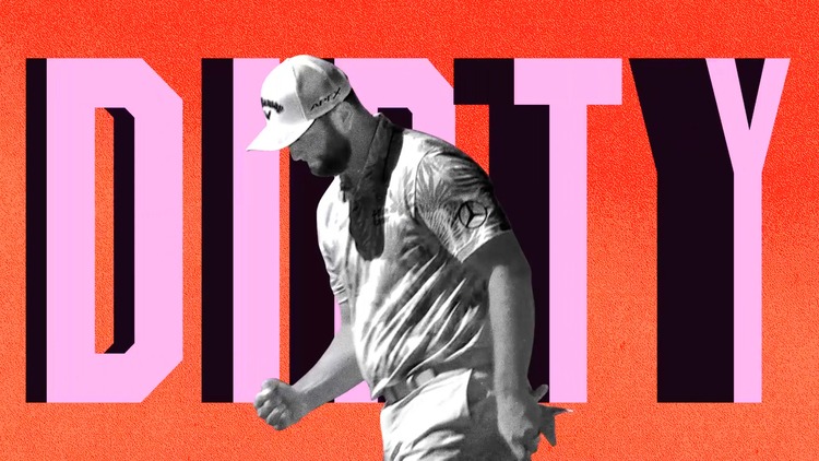
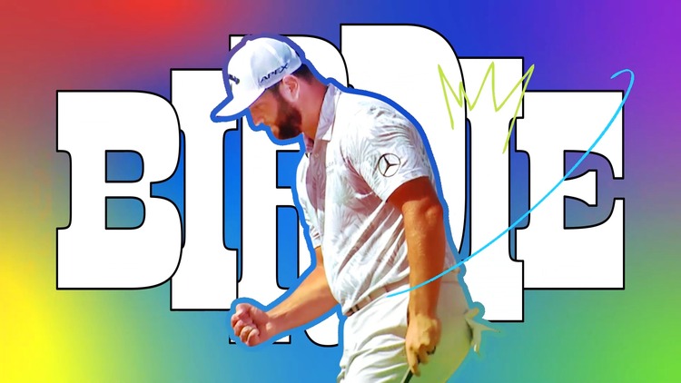
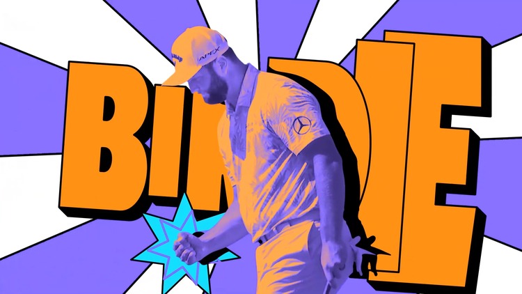 For each scene, Mat and his collaborators planned and roughly story-boarded multiple design styles to see what would work within the scene, testing different illustrations and type layouts. Then, when they had something that looked right, it was straight into the motion process, combining illustration and texture to create something unique and special to that moment in the film. Mat comments; “Some scenes proved a little more tricky than others, needing multiple rounds and explorations tests. However, thanks to a smooth process and a great collaborative spirit, we got the very best out of each piece of type, truly crafting something fun and memorable.”
 Mat hopes to work with the team again on the same project next year. He concludes; “We created a really nice working condition which was purely remote but very flexible. Not only that but the outcome of the project itself has been a big enough reward. Seeing all that hard work pay off on screen feels very rewarding and almost a bit of an honour to have been involved with such a talented bunch of designers, animators and producers. Of course seeing this work featured on any motion design sites or attracting any positive press would always be a good thing, but anything like that is just an added bonus at this point.”
You might like...
- Tim Belonax |All Of My Mistakes Have Led Me To You - April 26, 2024
- The Humber Printmaker - April 25, 2024
- Horizons by Angus Vasili - April 24, 2024
