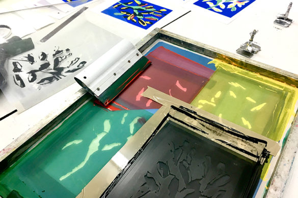
Post Typography is not, as you might expect, a type foundry; nor is it “post” lettering (it uses a lot of it, in fact, in work across print, digital and conceptual design)—it’s a creative studio that we’ve long admired. There’s a hell of a lot of thought behind what the studio does: rather than just a pretty portfolio—though theirs is a pretty portfolio, too—the team has taken it upon themselves to list the things that the studio is “post”. Among them are “punk,” “hardcore”, “office”, “modernist” and “capitalist.”
While, sadly, the realities of being a working, bill-paying design studio and totally rejecting capitalism seem idealistic at best, Post Typography and its partner studio since 2019, Topos Graphics, pride themselves on working with “cultural and change-making clients” across branding, messaging, design strategy, signage and environmental graphics, publication design, illustration, moving image and more.
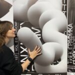
Now based across Baltimore, NYC and Atlanta, Post Typography’s founding in 2007 by Nolen Strals and Bruce Willen, that hefty client list now includes the likes of Baltimore Museum of Art, Maryland Film Festival (MdFF), Sony Music Entertainment, Thrill Jockey Records, Sonos, Johns Hopkins University, The New School, the U.S. Forest Service, Union Craft Brewing, The New York Times, Penguin / Random House, Time Magazine and so, so many more. Founding Partners Nolen Strals and Bruce Willen spoke to us about their work, and also reveal the post-punk band they formed together that sparked the genesis of Post Typography.
 How would you describe Post Typography’s style?
Bruce Willen: The studio intentionally cultivated an omnivorous style, which allows the work to respond to the context and also reflects our broad aesthetic interests. We love everything from “high-brow” conceptual art to minimalist music to comics and “low brow” commercial art and packaging from all over the world. The context and concept inform the stylistic approach.
That said, there are definitely common threads that run through our work, both collaboratively with the Post Typography studio and with our new practices, Public Mechanics (my new design and public art studio) and Nolen’s solo work.
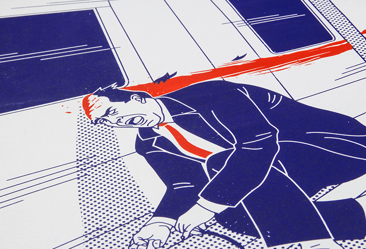
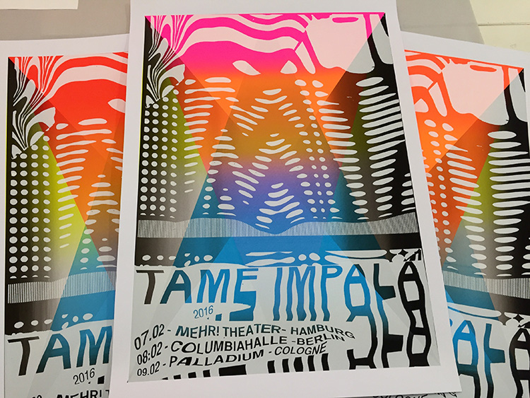
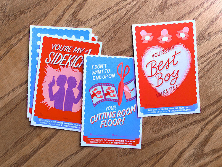
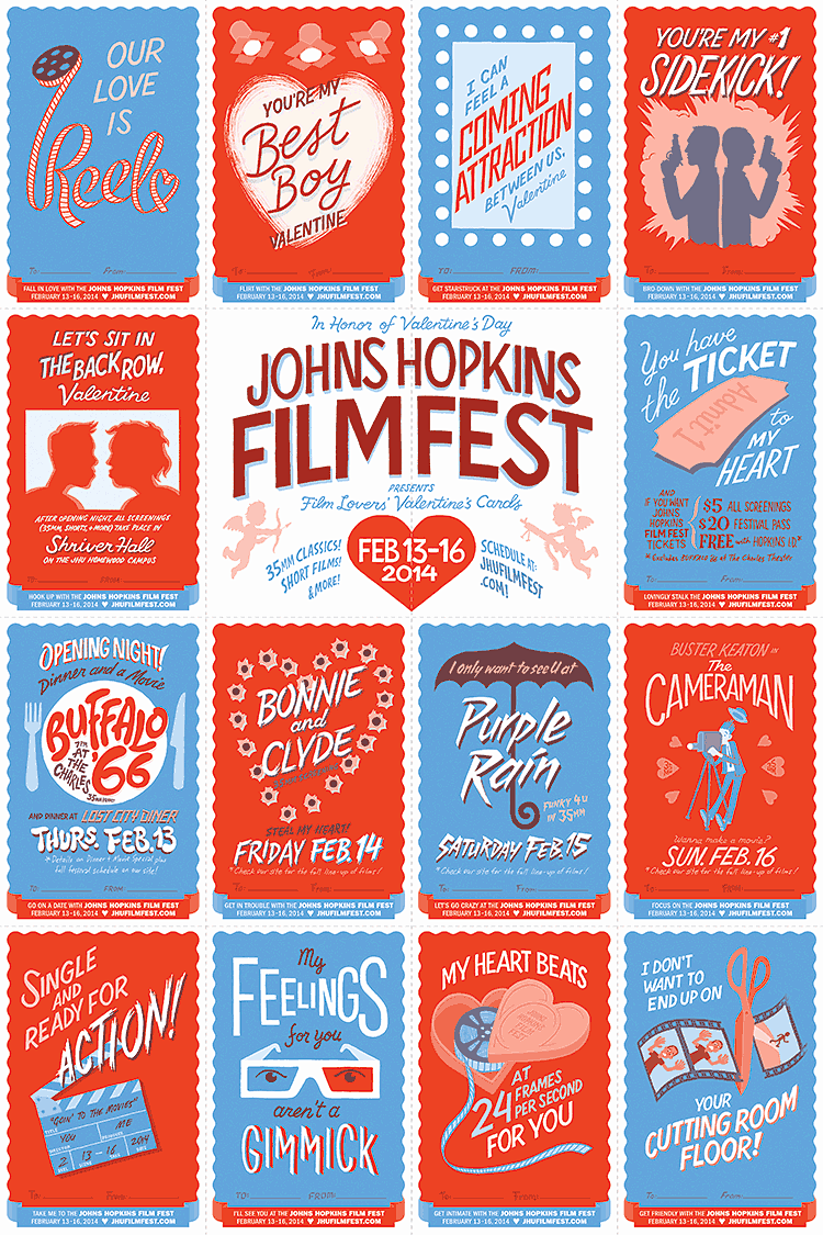
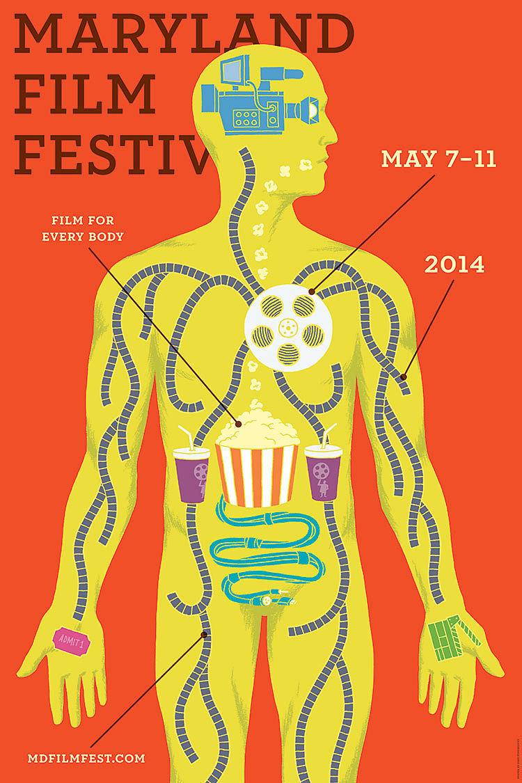
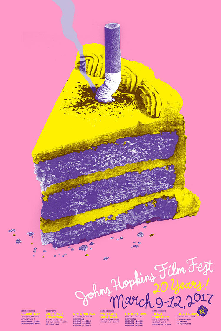
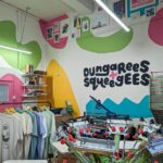
Nolen Strals: We’re known for injecting playfulness and wit into many of our projects as well, from visual gags or easter eggs to clever turns of phrase in the text. These touches can help a project connect more deeply with a viewer because making someone smile or feel like they’re “in on it” immediately adds positive associations to the item, campaign or project. You see this quite a bit in some of our old posters for the Johns Hopkins Film Festival, our motion work for MICA and The New School, and our site design for Type Supply.
 Of all the “post” suffixes listed on your about page, which do you identify with most as a studio?
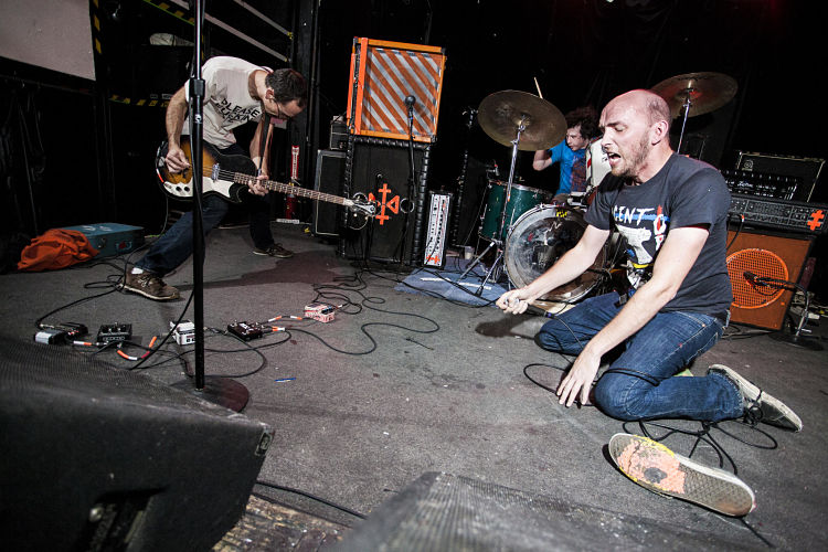
Willen: I would probably say “post punk” since the studio really emerged from our collaborations together with our band Double Dagger. DD was a very loud post punk group that we formed together after college at MICA (Maryland Institute College of Art). I played bass and Nolen was the vocalist/frontman, with our friend Denny Bowen on drums. We didn’t have a guitarist, so I used extra loud, unorthodox bass playing to fill the melodic space that a guitar would typically occupy.
Punk rock really influenced how we approach design, and I think the post-punk ethos really came to define the studio. Punk rock is all about doing more with a limited set of resources, as well as having a strong point of view.
 What are the biggest things you’ve learned so far as a studio?
Strals: Confidence is key. Having enough confidence in your work to charge enough money to make a living. Having the confidence to properly defend the work when the person on the other side of the table (who’s holding the checkbook) pushes back on your work. The flipside of that is having the confidence in your client to accept that sometimes their edits will make your work better.
We also learned at some point that doing work that one loves and working with the types of clients that make one happy won’t always garner big paychecks. The balance of ethics, morals, personal preferences, and capitalism is a tricky one, and it’s something to always keep in mind. There’s no right or wrong approach to it, only what makes the most sense for each individual, and that can change over time. What’s the key to a successful working relationship?
Strals: Respect for your collaborators’ ideas and input. Ego drives a lot of creative work, and that’s fine—ego gives one the confidence to create, but a working relationship won’t succeed if you can’t put your ego to the side often enough.
On the creative side, it’s the respectful push and pull between ideas, personalities, skills, perspectives, all of that stuff. Because the magic happens in the spaces between people, where our contributions meet to create something new. Collaboration is something we both have always been drawn to and always made core to Post Typography’s work.
Collaboration is key to the business side of things, too. Knowing who’s best at what, and making sure the load is properly divided is crucial.
 What sort of projects do you most enjoy working on and why?
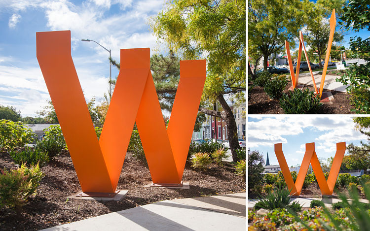
Willen: I started Public Mechanics in 2020 as a way to focus specifically on public and cultural spaces. Right now I’m especially excited about hybrid projects that span art, design, and public space and especially ones that include community-building elements. We of course explored some of this built-environment, community-focused work at Post Typography with the SNF Parkway Theatre, Baltimore Museum of Art, Beyond Video, Waverly Main Street, and many others. But Public Mechanics really sharpens my focus on these areas.
I’m also making self-initiated public art and public space projects a cornerstone of the new studio. While I love collaborating with clients to support their projects and communities, I’m excited to explore new works that grow from my own research and artistic practice.
Strals: My favorite type of clients make the things that are part of our everyday lives: the stuff in our homes, in our fridge, the clothes we wear, the things we go out to experience in our free time. My schedule in 2021 has included branding for two beer brands, a pizza restaurant, a cocktail pop-up, a hot sauce, a film festival, band merchandise, and a documentary on British stuntmen. If I had a similar client list all the time I’d be thrilled, whether working on my own or with others.
I’m just starting to dip my toe into restaurants and food retail spaces. I’m branding a new pizza venture opening this spring and possibly some ice cream shops. I’d love to continue with more work in that realm where these product-centric brands come to life in physical spaces.
 What is it that you enjoy about working with cultural clients and non profits?
Steals: Cultural clients are an indelible part of the fabric and energy of life where we live. They play host to or create moments to help us see the world in new ways or to escape regular life for a bit. Working with them allows me to be a part of that, drawing people to and shaping those experiences. It’s a way to impact the local texture of a place, to make it somewhere I and other people want to live.
Willen: This community-building aspect is the key attraction for working with both cultural and non-profit clients. So much of the design/communications industry supports profit-oriented, exploitative, and transactional projects—clients and work that offers little meaningful human value or is basically just a tool to make a small group of people wealthy. It’s much easier to get invested in your work, to create good design, when you know that you’re supporting something that builds community, empowers people, or creates something beautiful in the world.
 Any recent projects you’re keen to show off to us?
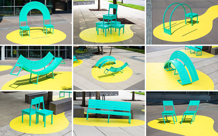
Willen: One of the first projects I completed as Public Mechanics is The Chairs, a public art installation in Washington, DC. The Chairs consists of eight sculptural chairs and benches that each create different opportunities for social interaction and play. The project is a permanent installation that’s part of Playable Art DC, an initiative that commissions interactive works of art that double as alternative play spaces. To bring the Chairs to life, I worked closely with the Neighborhood Design Center, an amazing community design organization, and Tim Scofield, a great metal fabricator (both also based in Baltimore). I love getting to collaborate with talented folks from different fields and backgrounds, especially when they are up for weird or ambitious ideas.
I feel like this project continues the playful conceptual approach you’ll find in a lot of Post Typography’s designs and illustrations, bringing it into the physical and interactive realm.
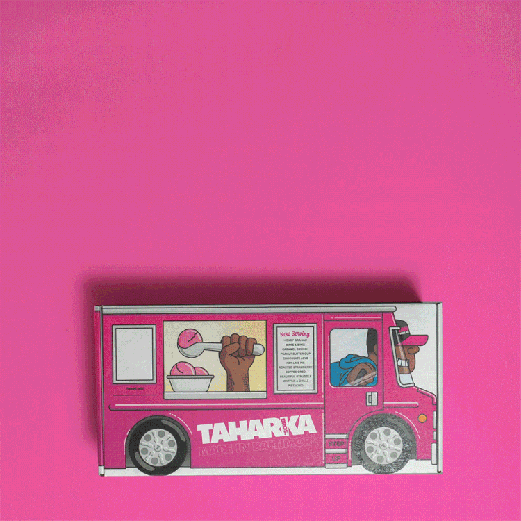
Strals: Last year, social distancing led Taharka Bros. Ice Cream to pivot from retail to home delivery. I worked with them to help make this a better customer experience with a delivery box that expresses who they are on every single panel. The concept, copywriting, and illustrations were crafted to express their brand, their people, and their mission in a really fun and engaging way. It was such a hit that the style and voice I established there is starting to make its way into other brand touchpoints this year.
I recently did a refresh of some core brand elements for 2SP Brewing, updating work that Post Typography did about seven years ago. Exactly what that is can’t be revealed, but you’ll start seeing it on shelves in late spring.
You might like...
 Beniffer Editions
- Grip Thumb | Grip Art
- Alex Trochut
- Emily Woolford: Postcard Print Swap
- Maharishi X Undefeated
- Peckham Springs Booklet :: Finn O’Brien
- Rus Khasanov | Sweet Dreams
- Katya Slobodskaia | Rave Culture
- Book :: Le Cabinet de Curiosités de Mlle Clouette
- Jonathan Koshi
- Inga Eicaite
- RareKind Print Show
- Puck Studio: Good Measures
- Shrewsbury’s First Open Access Screen Print Studio Is Crowdfunding!
- Studio Cabrio
- Adam and Cuth – The Letters EP Promo


- Autobahn - November 26, 2021
- Alphabetical - November 12, 2021
- SOFA Universe - November 8, 2021