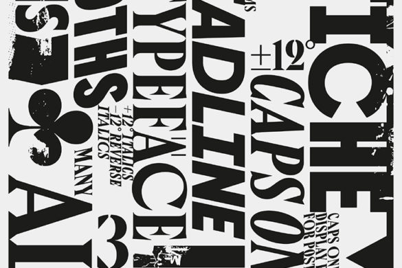
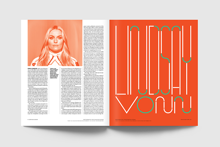
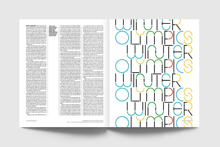
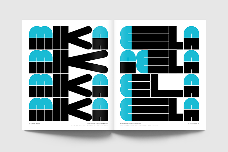
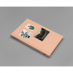
You should remember TwoPoints Studio from our issue 15 of Posterzine™ and their project Urbanism for Kids. Their work is a range of illustrations, editorial work, typography as well as interior design.
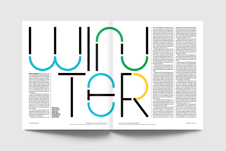
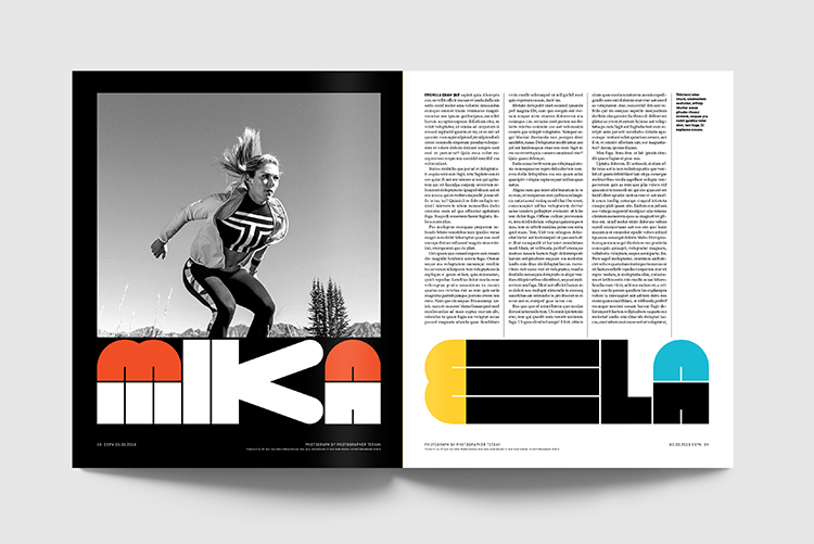
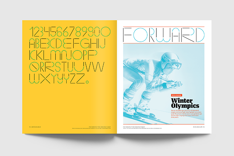
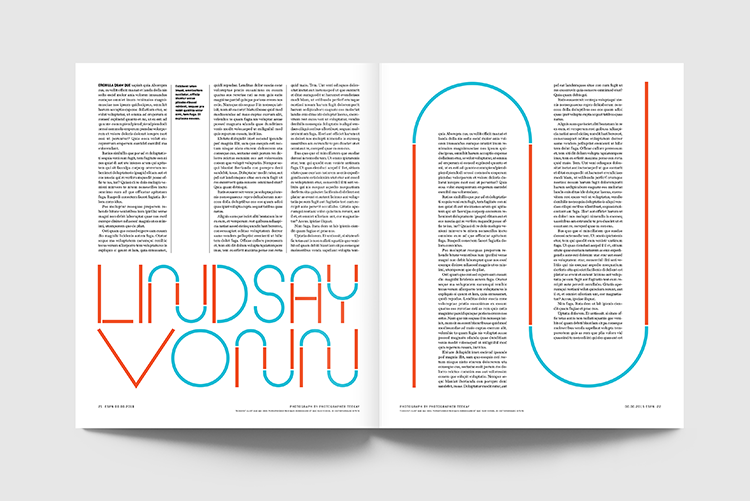
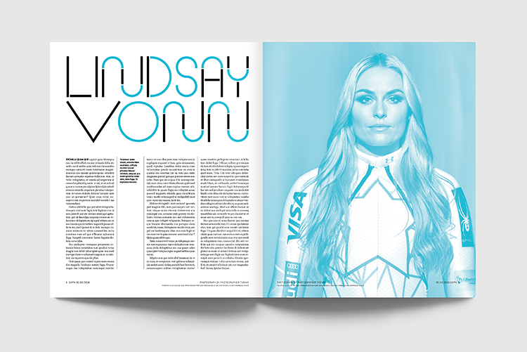
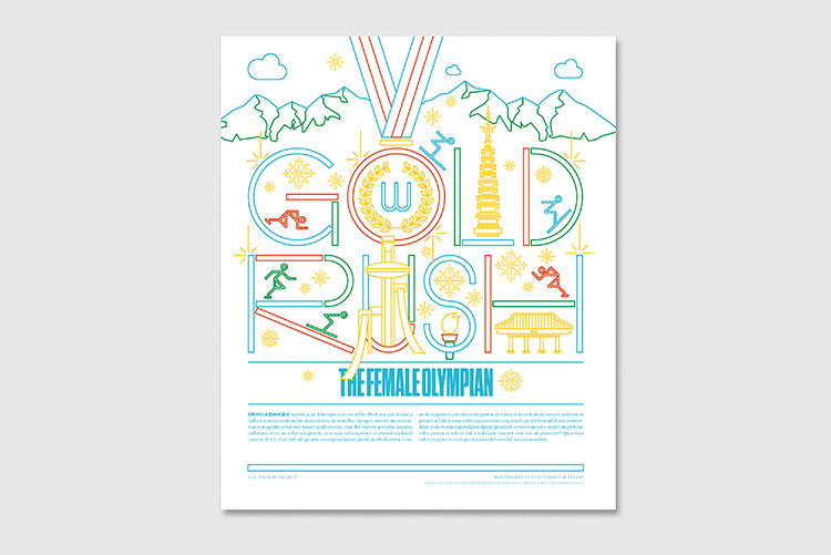
For this project, they have been ask to join forces with ESPN magazine and publish an issue that focuses on the female athletes participating in the Winter Olympics in Pyong Chang. The design studio took this project to the next level and worked on the typeface as well as pictograms, illustrations and layouts.
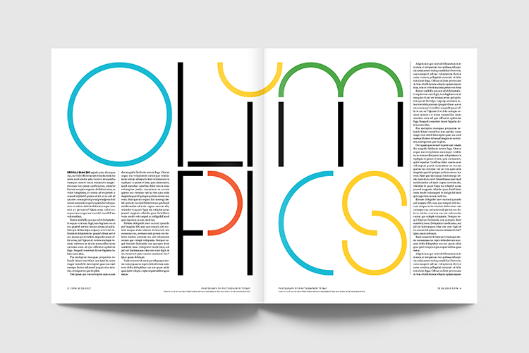
The typeface they designed is colourful, bouncy and in movement. Two points have used round and geometrical shapes to design the visual identity and have successfully communicated the dynamics and rhythm of the Women’s Winter Olympics. The shapes and use of colour remind you of the ski slopes, the races and all the movement generated by the sports.
Grab their issue of Posterzine here!
You might like...
 Arts & Architecture :: David F Travers / Taschen
- Horfee’s Imaginarium
- Strange plants Publication :: Zioxla
- Studio Everett
- 51 Riso Studios You Should All Know About
- Viviane Sassen
- Vitoria Bas | Untitled Signed & Editioned
- Gradspotters Prospects | Abby Crawford
- Kid Acne – “Colour me Bad 2”
- StreamWalkStudio
- Ryan Thayer Davis
- Department Store | 10 Screen Prints £50 and Under
- Diego Mena: Ministry of Sound Print
- Darren Cullen
- Interview with Peckham Print Studio
- Kvadrat x Raf Simons 2016


- Anna Zaccaria - May 15, 2018
- Taylor Turdd - April 16, 2018
- Circa 78 Designs - April 16, 2018