From gig advertisements, to decorative statement prints, the poster medium has a variety of applications. Below, we check out some the awesome poster projects from our print community, and discover why the printed poster format is still very much relevant today in a digital society.
Yuliya Ratnikova: Tea at the Circus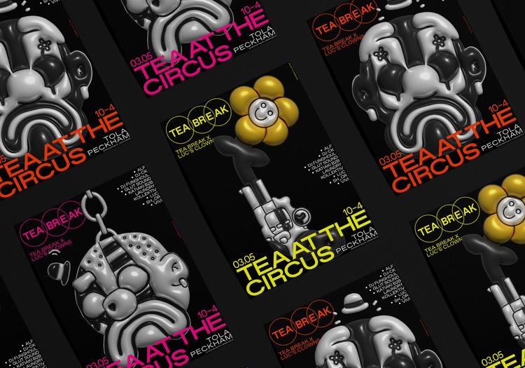
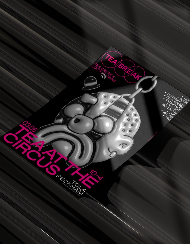
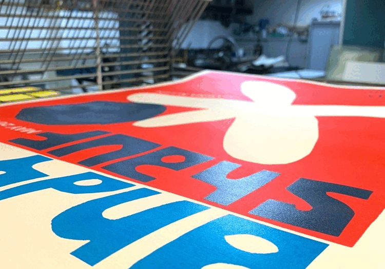
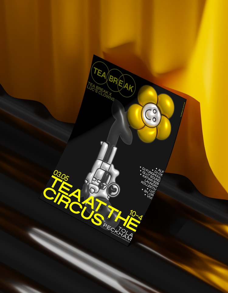 This poster series was created by Yuliya Ratnikova for Tea Break Collective party in Peckham, London, which is a series of parties featuring local DJ’s that emphasises local artists. Each party has a different theme and the theme of this party was “Tea at the Circus”. The poster collection was created in collaboration with artist Luc’s Clowns. To add depth, Yuliya gave his clown illustrations a 3D balloon effect, reflecting the association between balloons and clowns. Yuliya also used yellow, red, and pink colours that are synonymous with the circus.
Mario Carpe: You Are My Type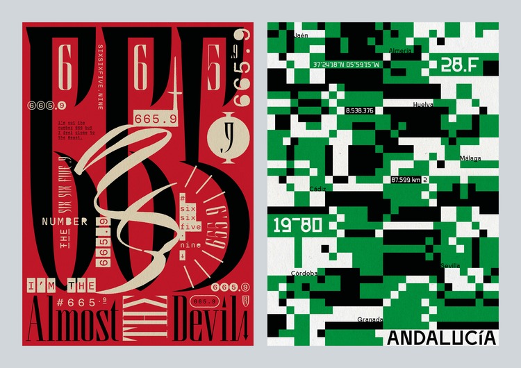
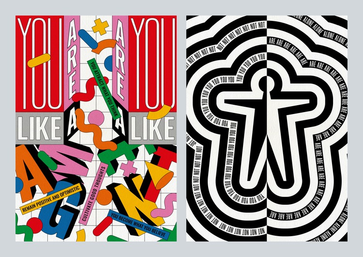 Thus far, Mario Carpe has created three volumes of his You Are My Type (YAMT) typographic poster series, and is currently working on the fourth. YAMT is a series of prints exploring a wide range of themes, from introspection to daily life, and social commentary through typography. Mario’s main goal with these projects is to use typography not just as a medium for communication, but as a tool for expressing complex ideas and emotions, manipulating words and letters (and sometimes adding graphics) to create visual narratives.
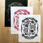
Steven Soltysik: Hermanos Gutierrez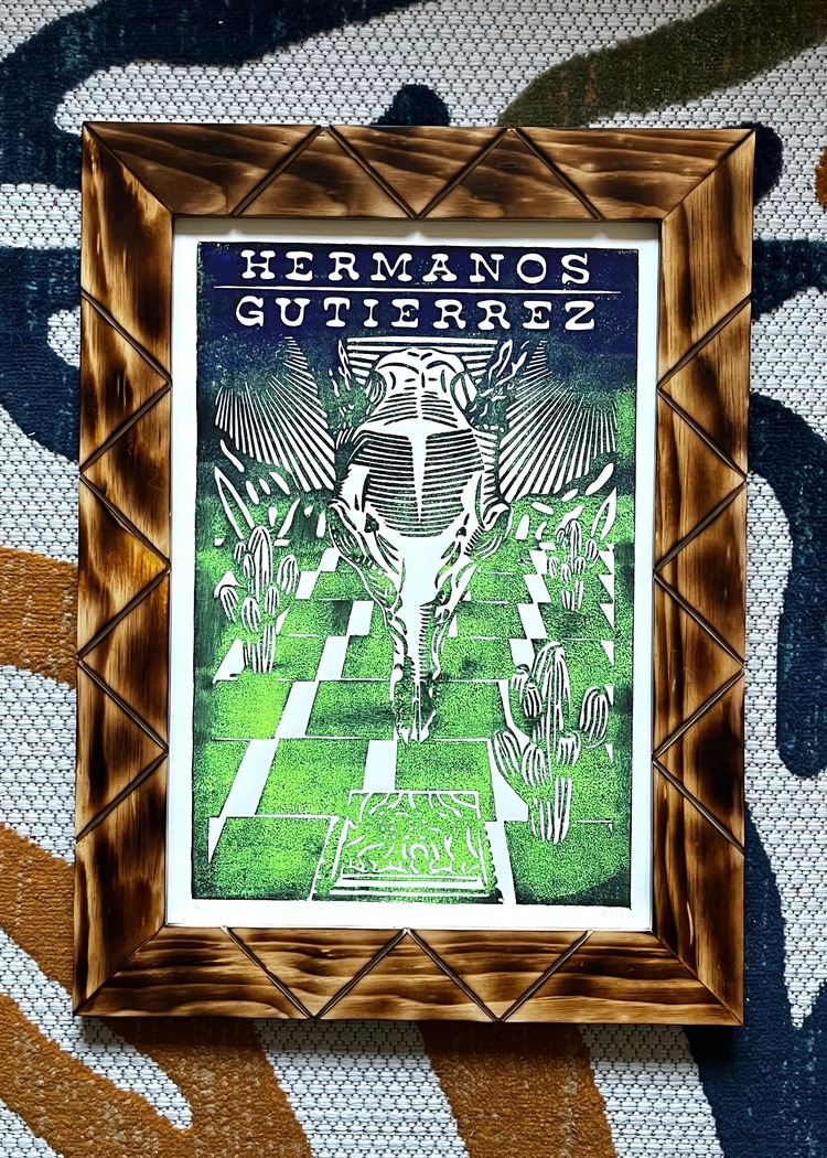
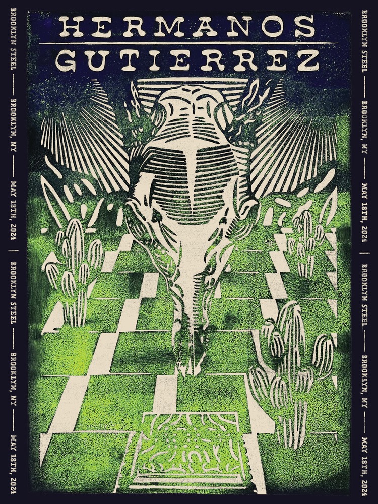
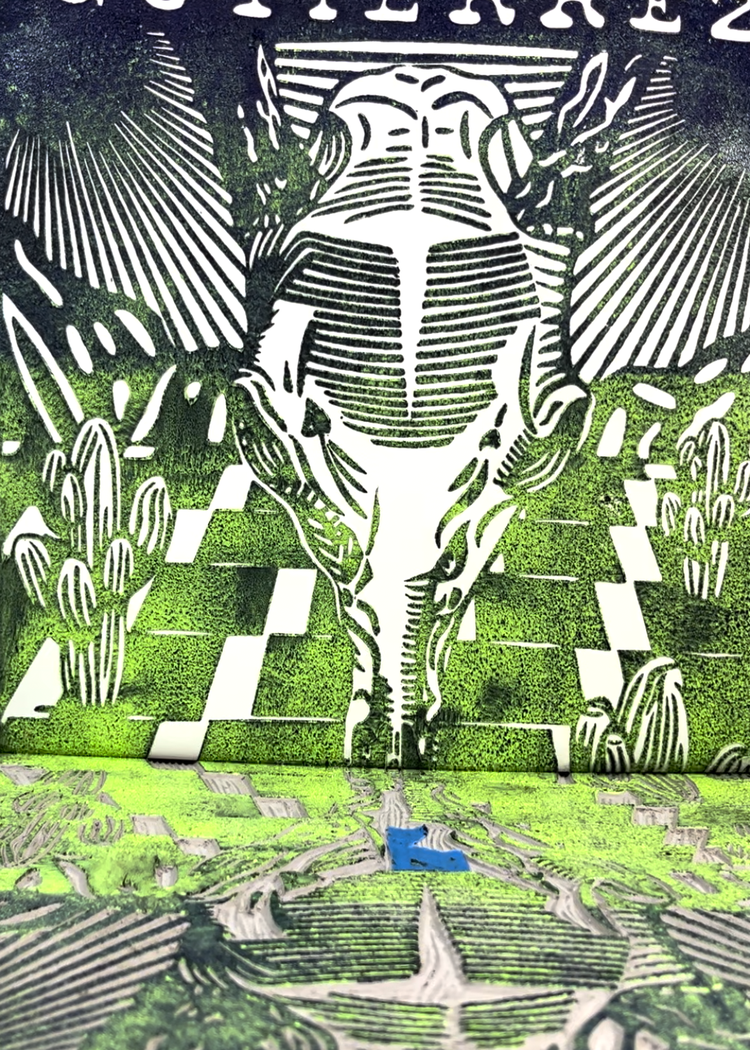 This linocut print was a passion project that Steven Soltysik completed in February 2024. Hermanos Gutierrez is a two-piece band consisting of brothers, Alejandro and Estevan Gutierrez. Steven tells us; “Their music is always playing in the background while I create my compositions. I find it to be the perfect boost for my creativity. After purchasing tickets to see them In Brooklyn this coming May, I decided to produce this print.” To complete this design, Steven scanned the original print and brought it into Photoshop. This is where he added the background colour and text along the edges.
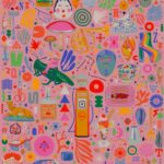
Redbellyboy: Voting Schmoting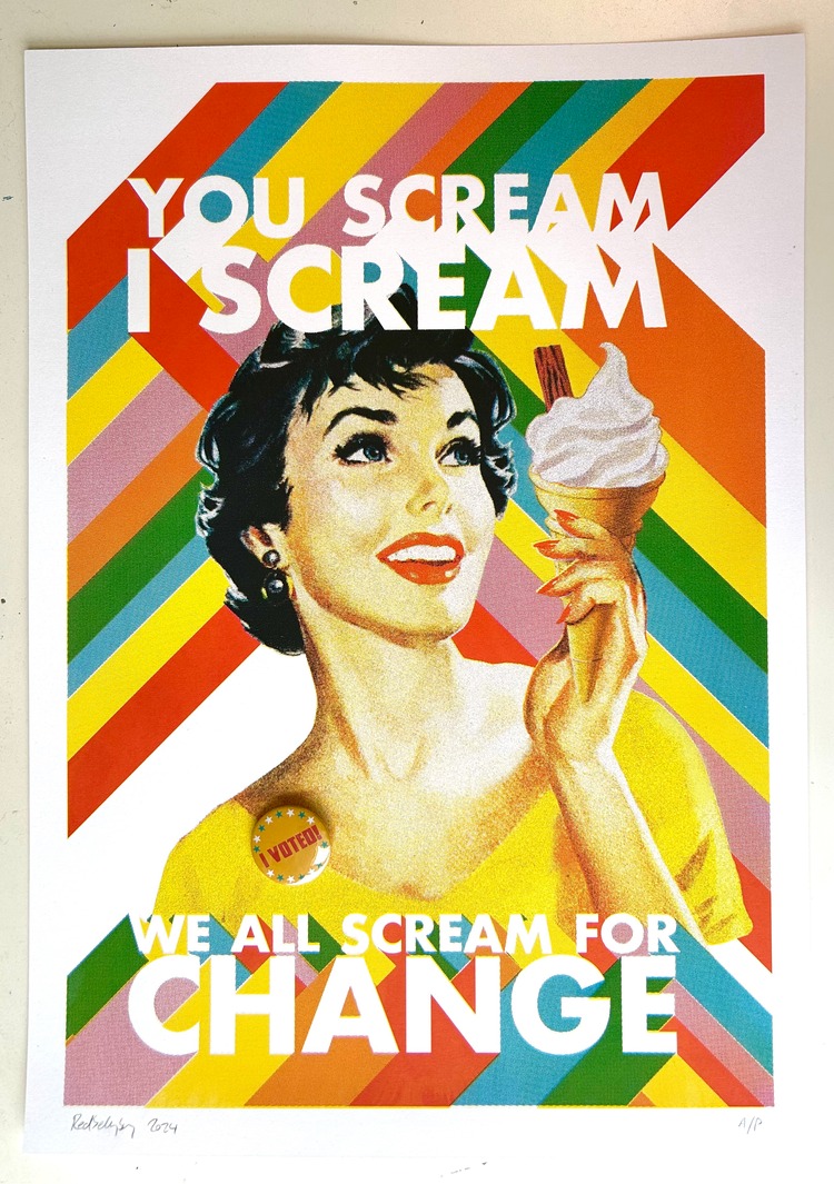
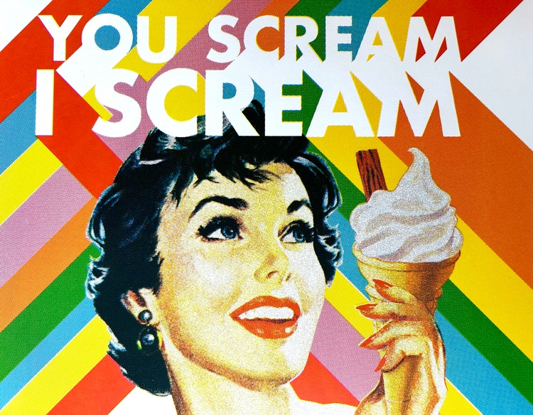
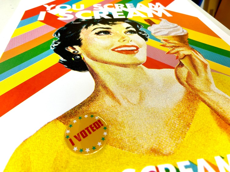 At the last London Mayoral Election only 42% of Londoners voted. “That’s pretty pathetic, considering that in 1913, Emily Davison fought for votes for women with the suffragettes and was killed when she threw herself under a horse at the Epsom Derby,” says artist Redbellyboy. Voting Schmoting is a show designed to raise awareness about the power of your vote and the impact your voice can have. All profits from sales will go towards UAL Art School Bursaries. The show was an open call to artists, so features a huge selection of styles and mediums. Redbellyboy’s piece Ice Cream is a colourful take on retro 1950’s advertising posters.
Mikhail Lychkovskiy: Typographic Posters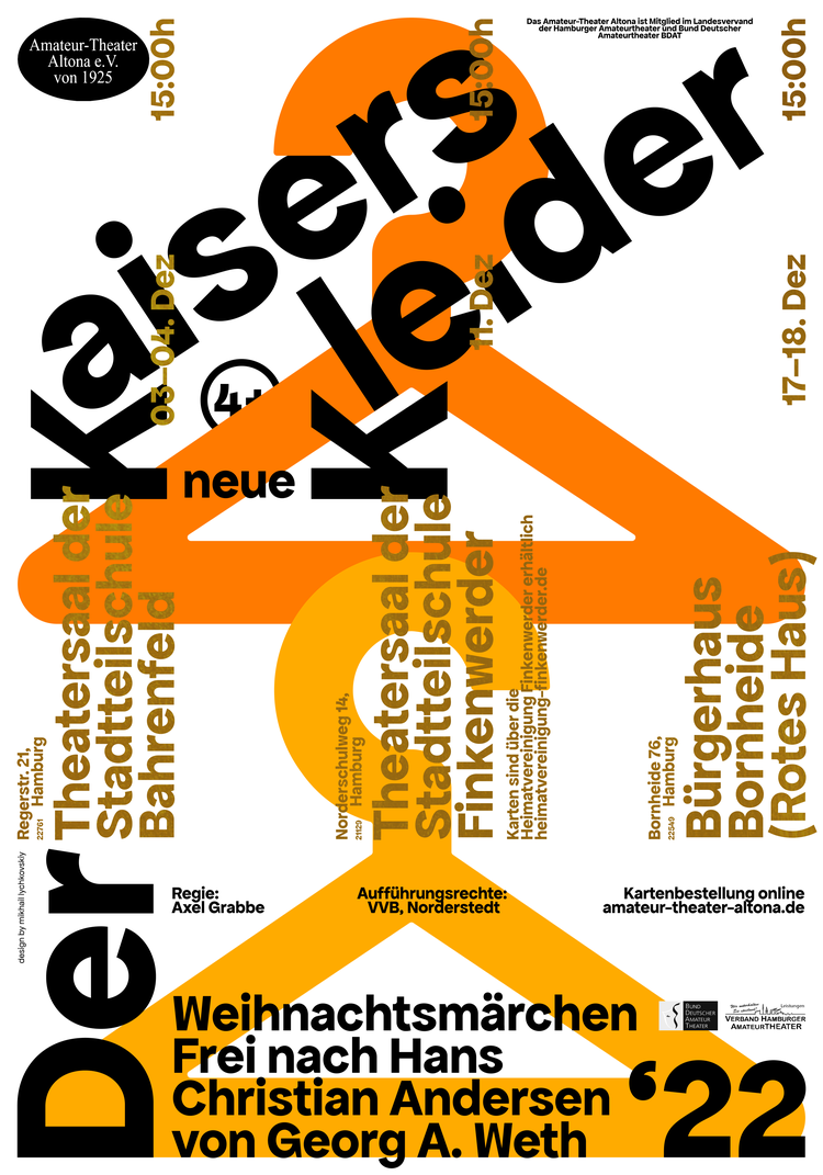
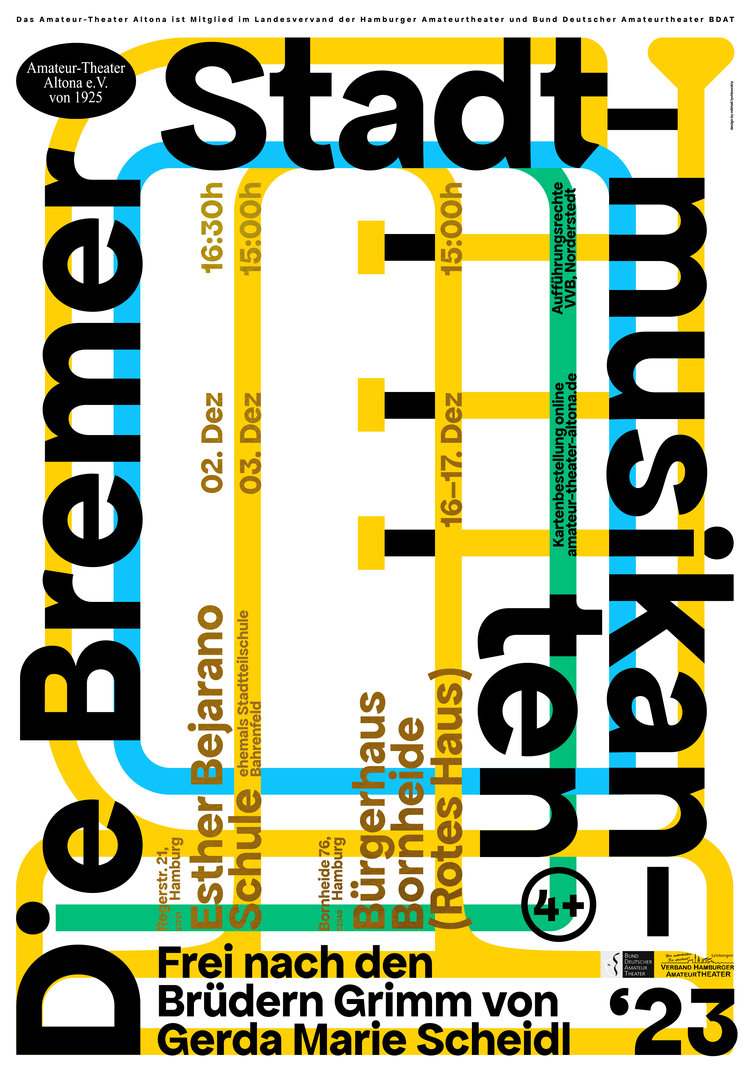
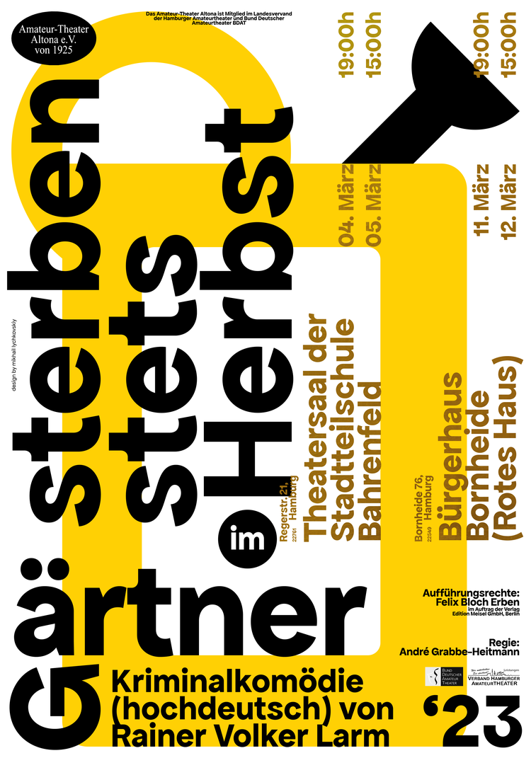 Mikhail Lychokovskiy’s conceptual typographic series of posters for the Amateur Theater Altona in Hamburg is based on the study of the possibilities of constructing a font composition based on the geometry, position, and other parameters of letters. The height and thickness of the stroke of large letters sets the size of the image lines and the size of small texts. The lines of the letters are also the basis for the grid, which allows each word to reasonably hold onto each other.
Sarah Sumeray: Official Smashing Pumpkins West Palm Beach Gig Poster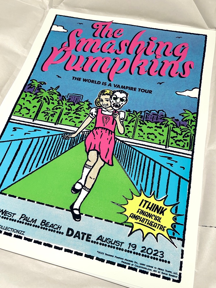
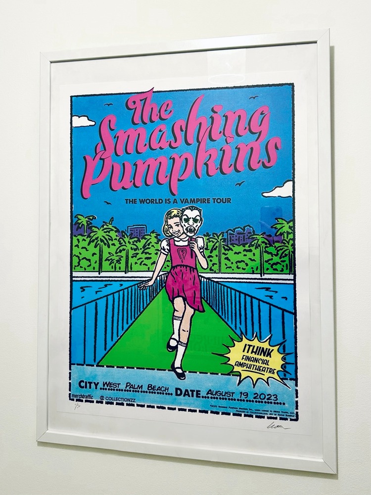
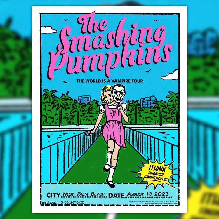 Sarah Sumeray was asked to produce a poster for the Smashing Pumpkins’ West Palm Beach gig on August 19th 2023 with a distinct aesthetic that wouldn’t look like a generic gig poster. Utilising the name of the tour, The World is a Vampire, and incorporating her love of vintage comics, Sarah settled on a design depicting a young girl skipping down a pier on West Palm Beach, holding a retro-style vampire mask. The information box at the bottom was made to look like the cut out form from a mail-order ad, and she coloured it in halftones to give it the ultimate old comic touch. The poster was on sale at their gig and website, alongside the option to purchase the design as a collectible trading card.
Wen Ching Yiu Krystine: (Un)learning Matters — Socially Engaged Art in Hong Kong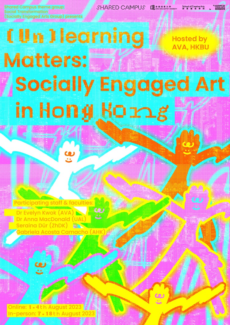
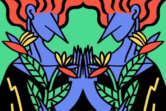
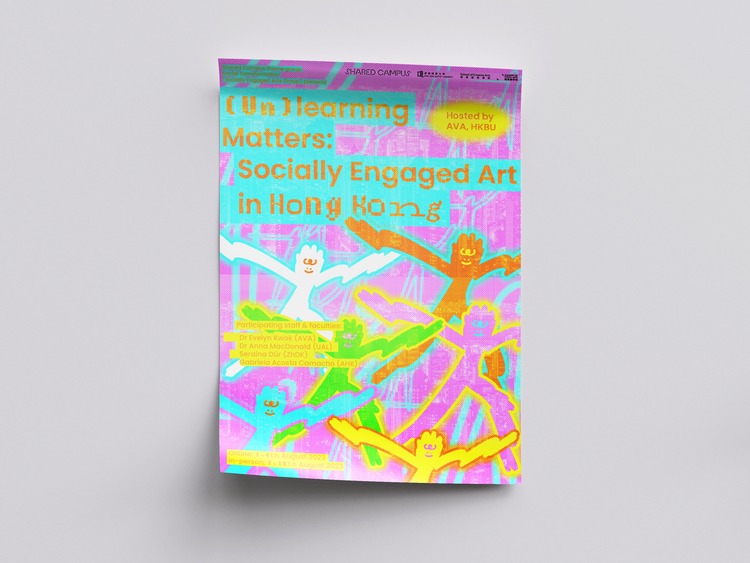 (Un)learning Matters — Socially Engaged Art in Hong Kong is a 2-week intensive summer course where participants can expand their knowledge and experiences through the framework of socially engaged arts and unlearning. The location of focus is Sham Shui Po and surrounds, where there is a rich history of industrial works, material culture, traditional and contemporary arts, design and crafts—an abundant site for socially engaged art projects. In this poster design, Krystine has used vivid and energetic colours to present the busy but also diverse lives in Hong Kong. She also created the interactions of people through overlapping humans graphic, to unlearn the busy lives, as well as showing the human touch of Hong Kong and Sham Shui Po citizens.
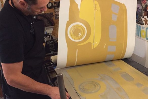
Michal van Kekem: Screen Printed Poster Design for Andy Shauf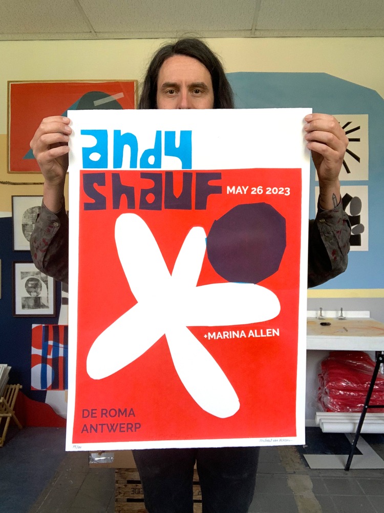
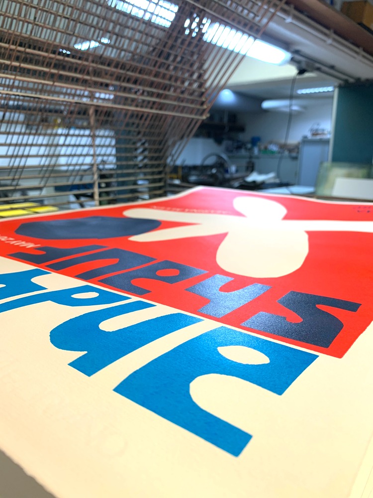
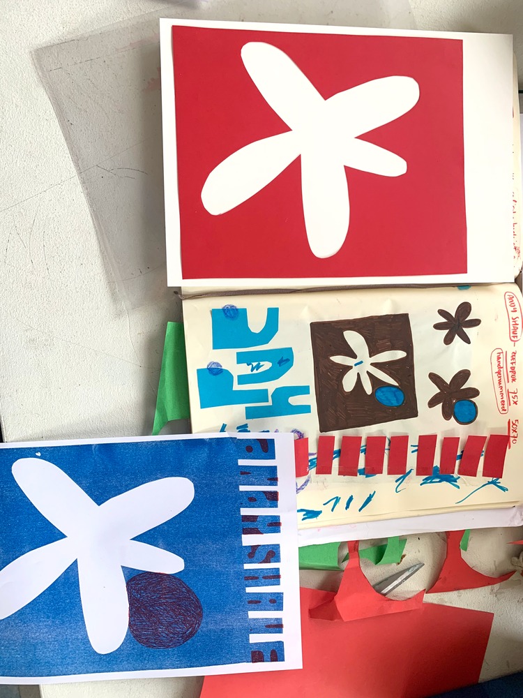 For the Antwerp show of Canadian indie singer/songwriter Andy Shauf Michal van Kekem created this hand pulled screen printed poster on 300 grams Fabriano paper in two colours. The edition of 100 was sold during the show at the merchandise stand. The print started during a fun cutting shape session in the studio, which was then printed put into a Riso machine for an A4 version. It was then scanned, enlarged to 70x100cm, and exposed onto a screen.
Ink Lounge: Winter Tour Gig Poster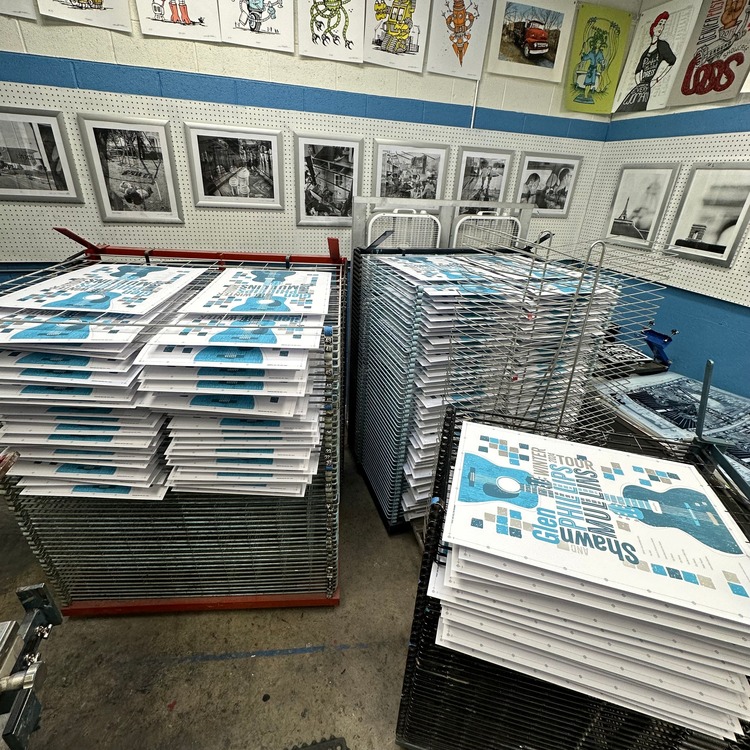
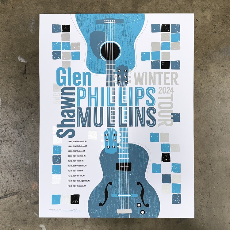
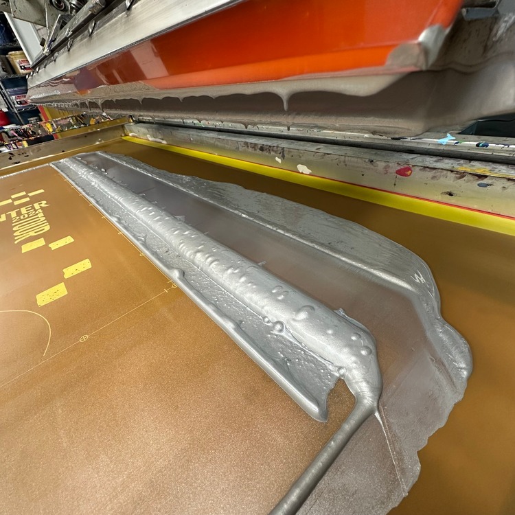 Stuart Alden of Ink Lounge Denver designed and screen printed a poster for Glen Phillips / Shawn Mullins‘ winter tour. He implemented a select choice of colours and shapes to evoke a chilly feeling, integrating the typography with the design. The design is also a nod to Stuart’s own personal love of mid century design. The poster was produced in a run of 150 and printed in 4 colours, including a metallic silver.
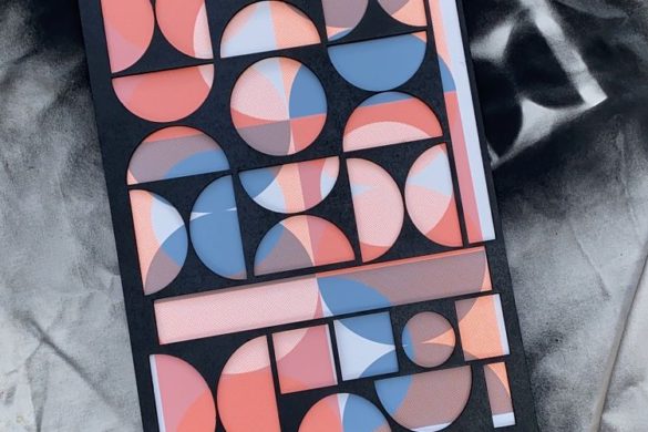
Christa Stoop: Onboards Biennale Antwerp Poster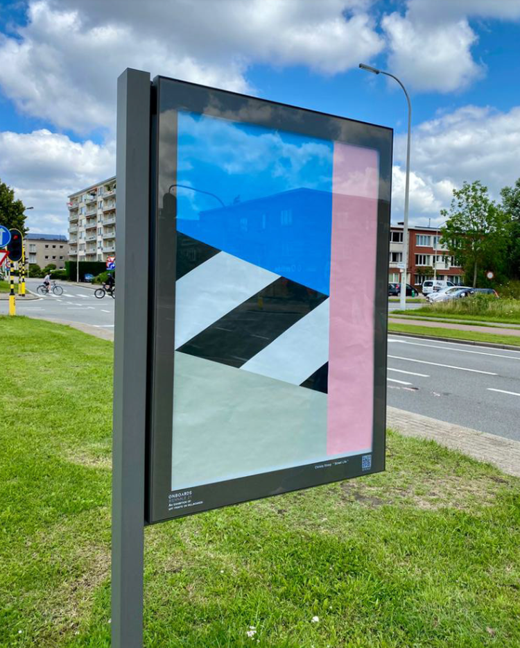
 With her brand, VAN CHRISTA, Christa Stoop creates colourful geometric designs. For the Onboards Biennale Antwerp she made this poster titled Street Life. The Antwerp Biennale is an exhibition of art displayed on street billboards throughout the streets of Antwerp, accompanied by audio descriptions of artworks. Christa’s artworks all have an abstract style and tell a story about the daily (built) environment and landscape. This poster tells the story of life in the city, such as a pedestrian crossing, and fits the streets of Antwerp perfectly. The poster is available for sale in 50×70 cm as well as a fine art print.
Browse our membership directory in full and learn more about joining our community at www.members.peopleofprint.com.
You might like...
 Jeong Hwa Min
- Interview :: Bongout
- Interview :: Rice Creative
- Rosy One
- Black Scale AW14
- Faulty Christmas
- Nick Greenbank
- Albatro Design: Natural History Cards
- (de)Conceptualise
- PANTA – Issue 12
- Rachel Hiemer
- Anna Higgie | Constellation Series
- Bert Danckaert
- Las Coleccionistas | Pista
- Fergus Purcell (NSFW)
- Issey Miyake | Ikko Tanaka


Want to know more about our membership? Give us an email at members@peopleofprint.com.
- Tim Belonax |All Of My Mistakes Have Led Me To You - April 26, 2024
- The Humber Printmaker - April 25, 2024
- Horizons by Angus Vasili - April 24, 2024