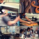
This month we’re stoked to present a selection of letterpress projects by some of the talented members of our community. From collaborative typographic workshops, to greetings cards and artist books, our members have used letterpress printing to bring a range of unique ideas to life!
Tom Boulton: Your Voice 2 Artist Residencies at Art Space Portsmouth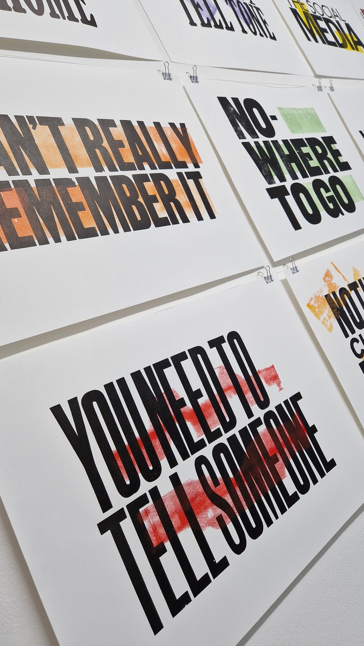
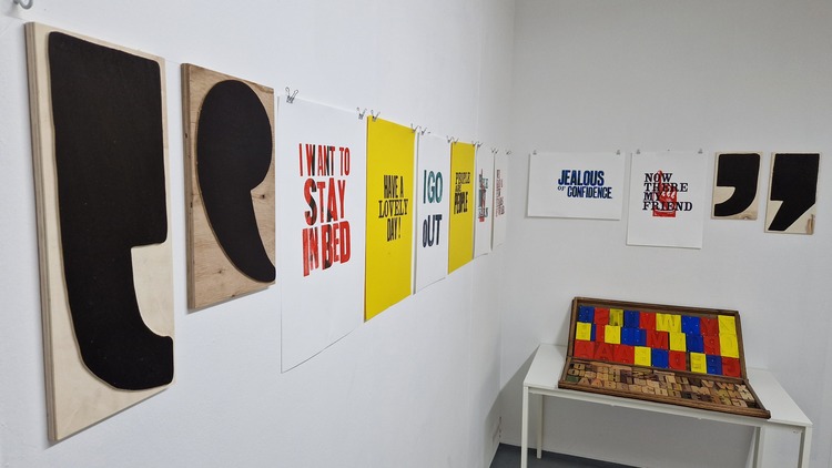
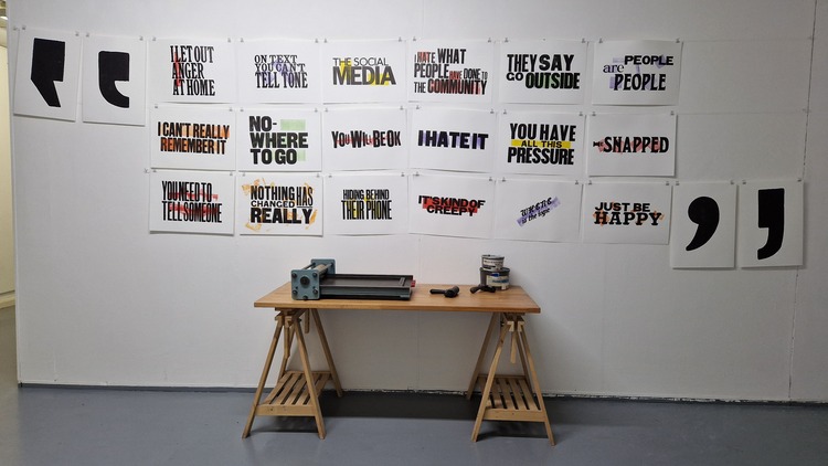 Tom Boulton recently took part in Your Voice 2 (YV2), artist residencies at Art Space Portsmouth, running a series of creative Letterpress workshops with groups of young people from Motiv8. He then created artwork based on these experiences and audio of conversations / interviews of local people from Portsmouth. For this project Tom looked at how easy it is to misinterpret someone and not understand them. For example; “I hate what people have done to the community” – the conversation was about an online gaming ‘community’ not our wider community. “I found it really interesting that by taking a very short phrase or statement you can give a picture of a conversation, though by not being involved in the conversation you really do not understand what is going on,” describes Tom. The final piece was a collection of 18 phrase prints with some huge printed quotation marks, made in-house by rescaling old vintage type. The project ended with a pop-up exhibition of both his prints and the prints created by the young people from Motiv8.
The Garage Press: Orphaned Type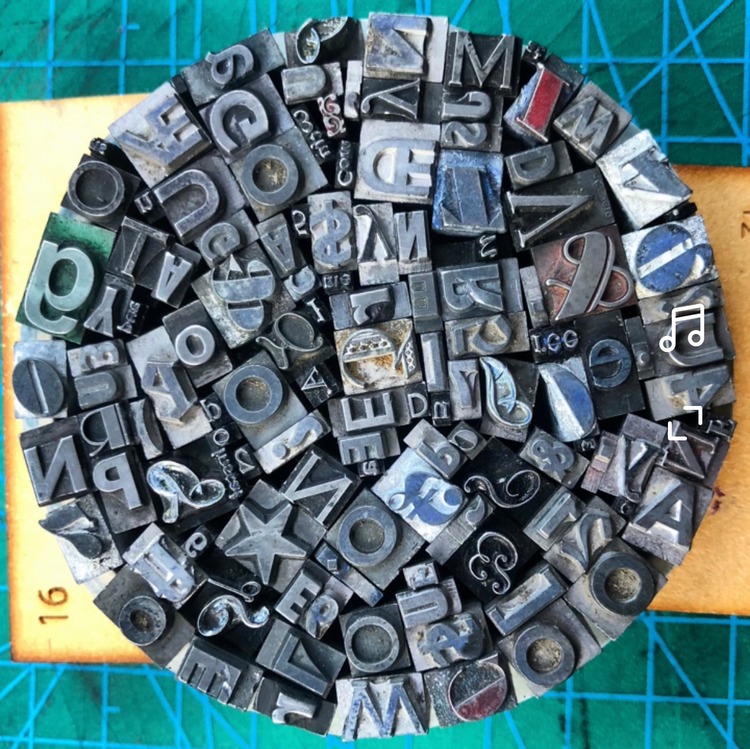
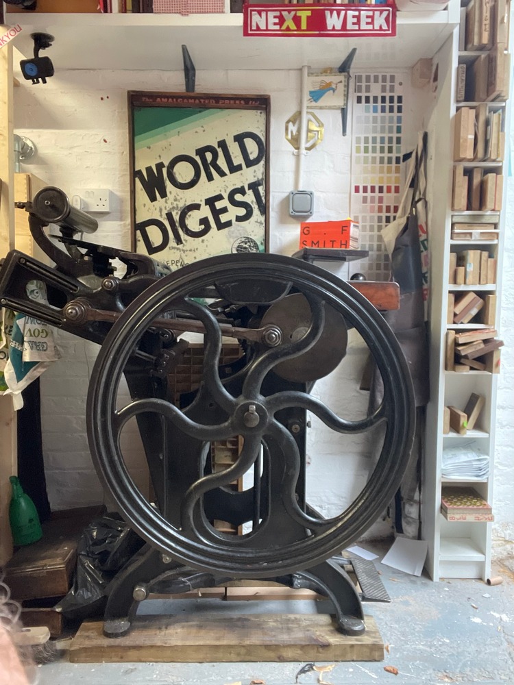
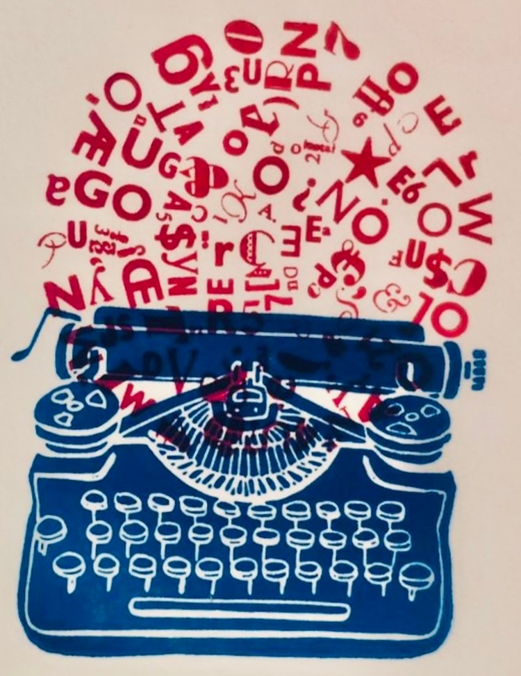 Simon Trewin who runs The Garage Press recently moved his letterpress studio to the astonishing 18th Century building Bell House which was built for Lord Mayor of London Sir Thomas Wright. Part of the moving process involved him sorting huge amounts of metal and wooden type, and inevitably he was left with a lot of what he called “orphaned” type. Instead of discarding it, Simon decided to group it all together with the aid of copious amounts of hidden double-sided tape and create a ball of exploding creativity. Once this was all set he had a photopolymer plate made by @lymebaypress of a vintage typewriter. He then printed each layer in a different colour on his 19th Century Cropper press ‘Gloria’. Simon ended up with a healthy edition of 50 on G F Smith paper. “I love the fusion of the formal lines of the typewriter with the crazy explosive random pattern of the text,” says the printmaker.
Rizzo Studio: Letterpress Type Specimen Notebooks
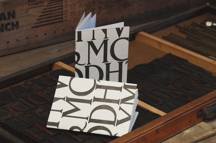
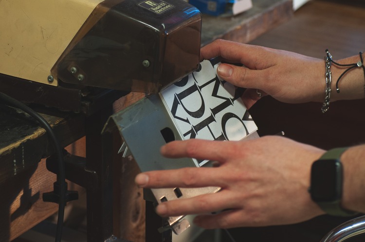 Printed using vintage 12 line (144 point) wooden type of unknown origin (usually wooden and metal type can be traced back to a maker using the pinmark – a small identifying mark on the side of the block), the letterpress printed covers of these A6 notebooks use a beautiful Serif typeface (just look at that ampersand!) and are inspired by the type specimens that foundries would supply to typesetters and designers as examples of their wares. The covers are printed in rich black ink on Rizzo Studio’s 1962 Heidelberg Windmill press onto part-recycled, fine Italian cotton paper supplied by Fenner Paper, with the inner 40 pages being plain 120gsm 100% recycled stock with a beautiful tooth – ideal for favourite pens or their favourite – a 2B pencil.
These are available to buy from Rizzo Studio’s Store
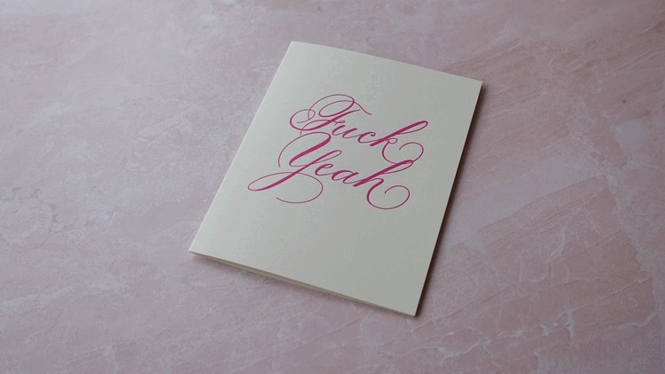
Type A Design & Letterpress Studio: Fuck Yeah Card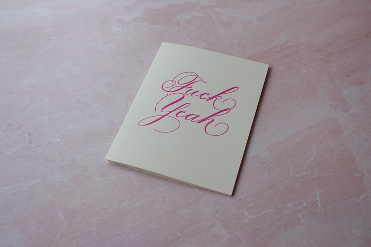
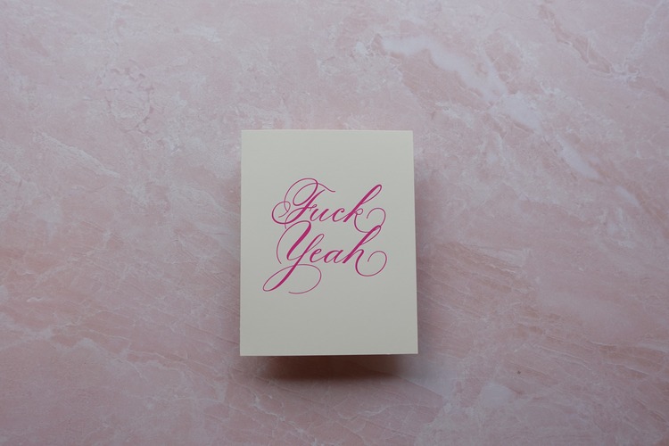
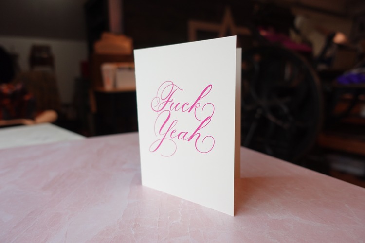 The idea for this project bloomed as a request from Type A’s founder Ashleigh’s husband and was designed and pressed by one of their professional in-house artists and letterpress specialists, Tina. The colour of this press run was chosen by Type A’s executive organiser and writer, Skylar. It was then hand pressed in their Kingsville, Maryland studio on their Pearl Golding press from the late 1800’s, onto FSE Certified Recycled 100lb paper. The journey to the final Fuck Yeah card shows the power of human connection that is at the heart of their team at Type A Studio. This card highlights the ubiquitous and all-purpose nature of the word “Fuck” with an added optimistic exclamation. Excellent for celebrating a menagerie of moments – marriage, pet adoption, birthday, graduation, quitting-your-soul-eating-corporate-job, new car, Valentine’s Day, etc…
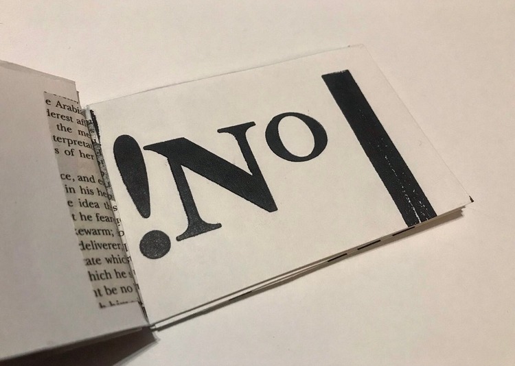
Wood Words Letterpress Art: Read My Mind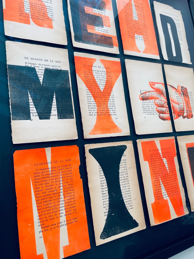
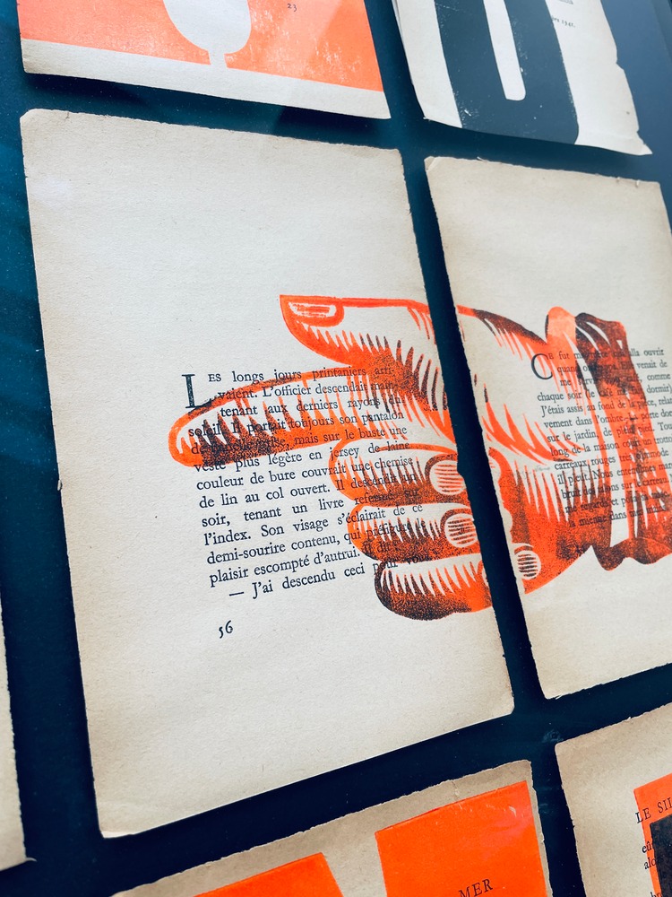
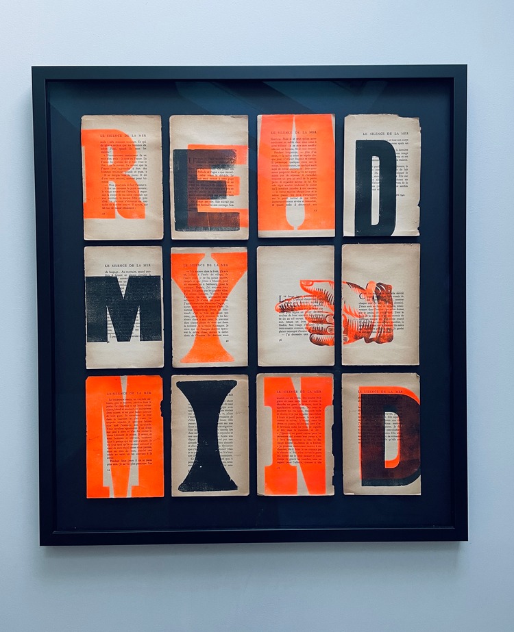 Using vintage book pages not only enables Julia Humfress of Wood Words Letterpress Art to re-use and recycle, but also gives her the opportunity to celebrate the letterpress printers of the past, to admire their mastery, and highlight their skills. These aging, fragile text pages and the contemporary overprint using fluorescent inks and vintage wood type illustrate the contrast between the old and the new. They demonstrate the differences between the boldness of wood type and the delicate refinement of metal type. The concept is a reference to the beauty of books, they are not just to be read and discarded but each page can be loved and enjoyed for their physical structure and visual aesthetic.
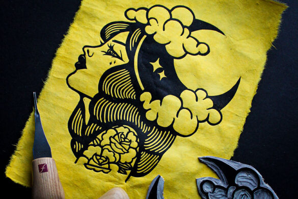
Patrick Barber: Parenthesis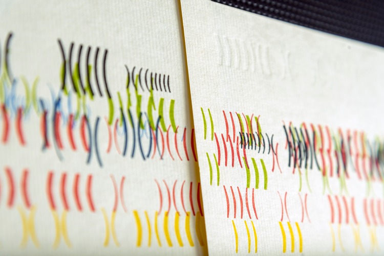
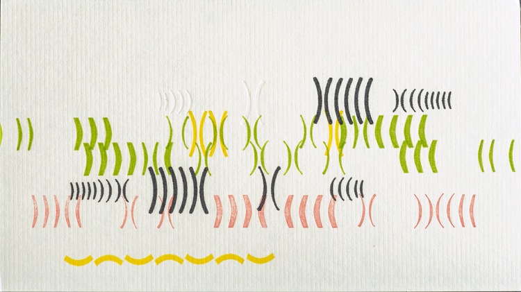
Parenthesis is a series of letterpress prints attempting to create a kind of visual, typographical ambience. The prints are each unique, by varying position or orientation on press, and each features several lines of typographical parentheses, some open-ended, some enclosing nothing. The work began as an exploration of a concept for a record cover project. In attempting to create a piece that was a reflection and response to the music, rather than a description of it, Patrick came upon the idea of repeated forms. A few tests showed him that parentheses were what he wanted, and the rest has been pure play and intuition. The pieces shown here are about 7×4 inches on laid cardstock, and there are about 45 pieces all told in this group.
Emily Pallett: Letterpress Artist Books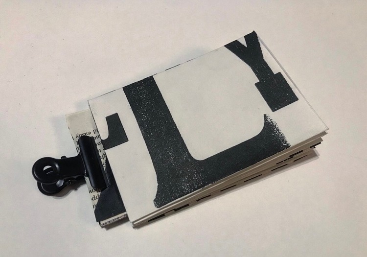
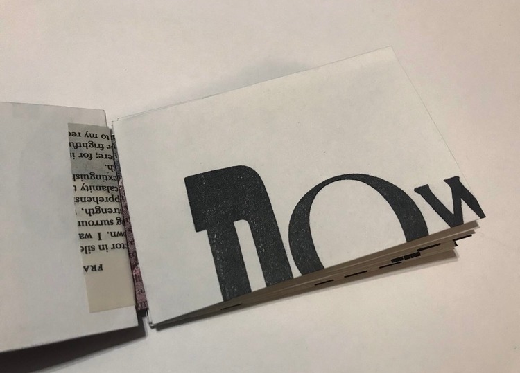
 Emily Pallett is a printmaker who uses artist books to explore how art can be interactive by encouraging an audience to touch the work. She feels that this makes art more accessible as it invites everyone to experience the work, but it also makes art more human, an idea which stems from her interest in the analogue. The act of making the work is just as important to Emily as how it is perceived once made, and in this latest book, Emily used letterpress prints for the book pages to celebrate these processes.
Browse more work by our community and apply to join at www.members.peopleofprint.com.
You might like...
 The Radical Skate Apparel Collection :: Kyle Platts x Wasted Paris
- Our submission for Panasonic ‘Cut out the darkness’ Campaign
- Street Heroines
- Drip For Drip — Octobercup
- Moby Digg
- Chris Haughton
- Craig Oldham | In Loving Memory of Work
- Stendig Calendar
- Edie Woolf
- London Print Studio
- Gradspotters Prospects | Lee Nutland
- Lee Richards | Chine Colle Tree Ring Prints
- Henri Matisse
- Caskshare X Phoebe Phillips
- Mario Carpe | Zodiac
- Interview:: Heretic Studio


Want to know more about our membership? Give us an email at members@peopleofprint.com.
- Caroline Tomlinson | To Dream of Adventures & Way Out on a Sea of Dreams - December 11, 2024
- POP Member Showcase | Etching - December 9, 2024
- Inga Eicaite | Suminagashi Notebooks - December 6, 2024