Once again, we’re proud to present a selection of projects from the talented members of our community. This month, we check out some awesome typographic prints, created using techniques from Risograph to letterpress, and conveying a range of empowering and inspiring messages.
Filippos Fragkogiannis: Labor Day Poster
 Graphic designer Filippos Fragkogiannnis tells us; “I believe human labor must follow certain standards, starting from a fair reward and ultimately honoring the worker. It should be individually accessed and tailored to a person’s needs and abilities. It is not profit that makes labor “sacred” but individuality.” To inspire action Filippos created this typographic Labor Day poster. He continues; “What we need is action, to repel the concealment of the truth, to battle silence and inertia. To overturn, any passive state that requires surrendering our rights without question, doubt or reserve… It is our duty to remember, all freedoms must be claimed, even in the face of adversity, even by breaking imposed regimes and overturning oppressors”.
Oh For Print’s Sake: Dancin at the Palais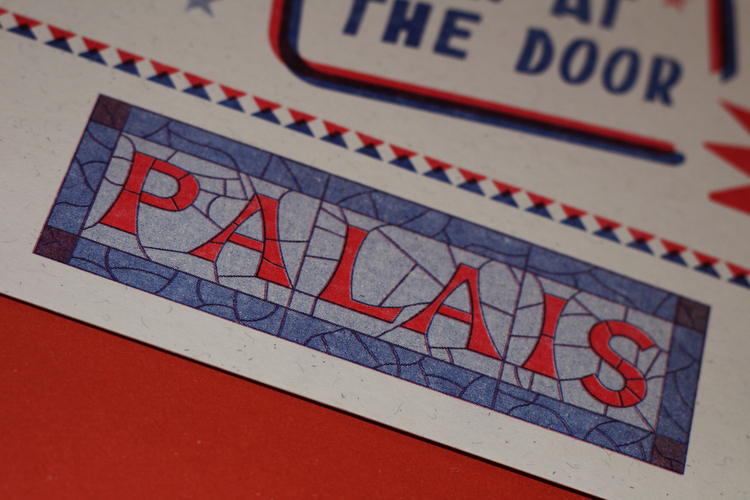
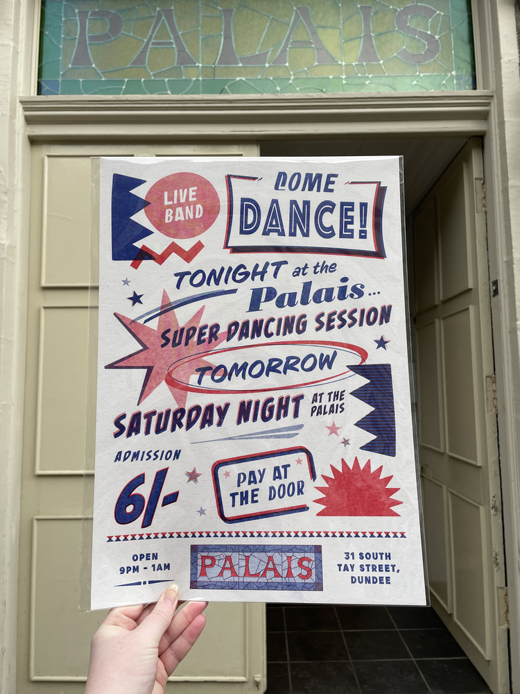
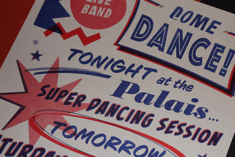 Dancin at the Palais is a tribute to one of Dundee’s most cherished venues from bygone years; the Palais. It’s a playful typographic celebration of the old dance hall and music venue. Taking inspiration from old ads and music posters, this is a re-imagination of those nostalgic and dazzling typographic designs. After walking past its old stained glass signage, Oh For Print’s Sake was inspired to create a piece that would remind Dundonians of the Palais in its glory days. The piece is a two colour Risograph, printed in beautiful medium blue and bright red inks on quality Oatmeal 300gsm paper by fellow POP member Yalla Riso,
Benjamin Wurster: Woodcut Words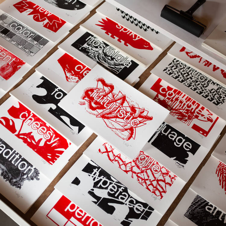
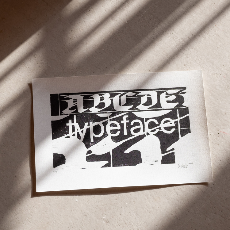
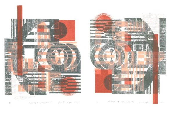
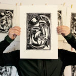
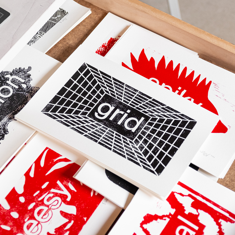 Woodcut Words is a project from 2021, where Benjamin Wurster published a woodcut every week by visualising a specific word from the creative jargon. Currently, he is working on compiling these 52 motifs into a deck of cards that he will publish. The Woodcut Words are intended to serve as a source of inspiration for other creatives.
Emily Pallett: Shelves of Concealment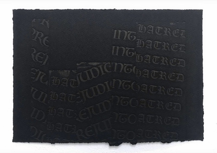
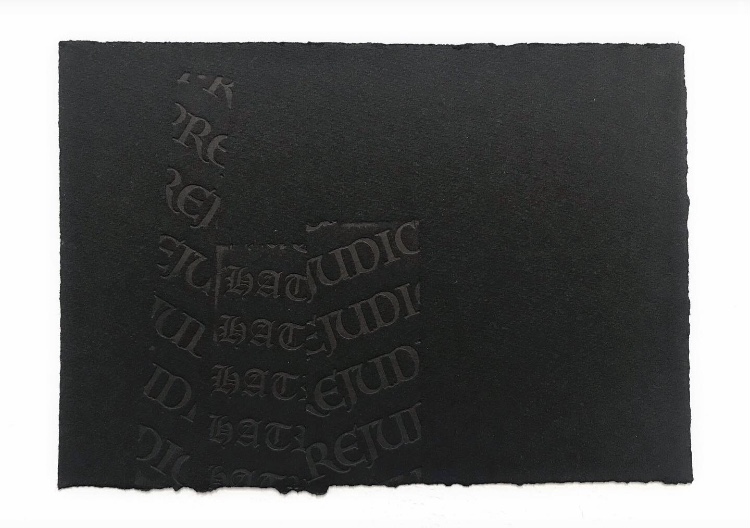
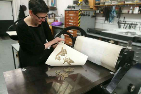
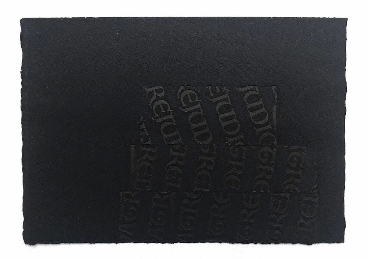 Ever since she found print and fell in love with letterpress, Emily Pallett’s work has included language as a common feature. However, for her most recent project Emily has worked with photopolymer etching in order to find new ways of creating. Focusing on identity, bullying, and judgemental criticism, she has been printing Old English and Medieval typography on black paper to explore how language can be concealed, all whilst considering the term ‘don’t judge a book by its cover’. Two prints from this series can be seen at the Derby Print Open from the 1st June at Green Door Printmaking Studio, Derby.
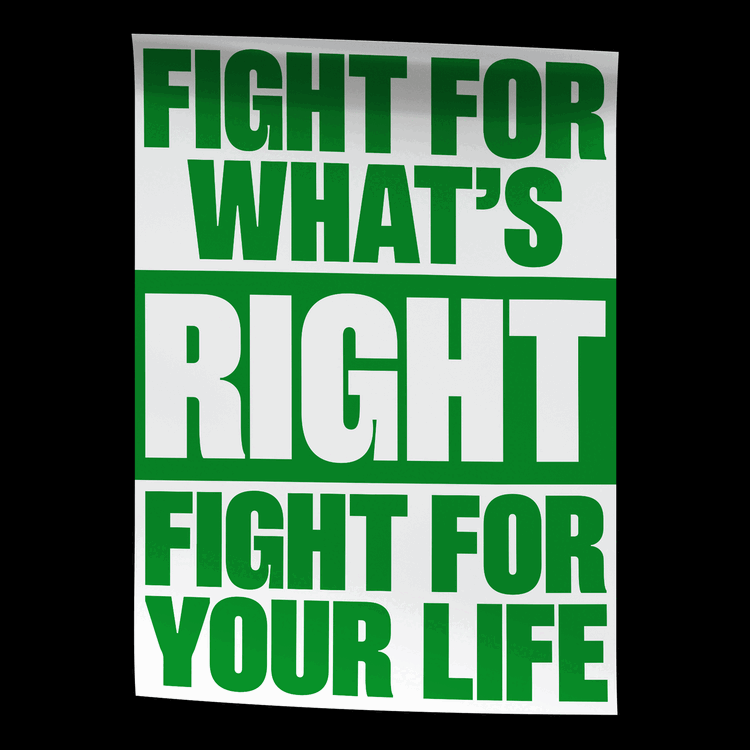
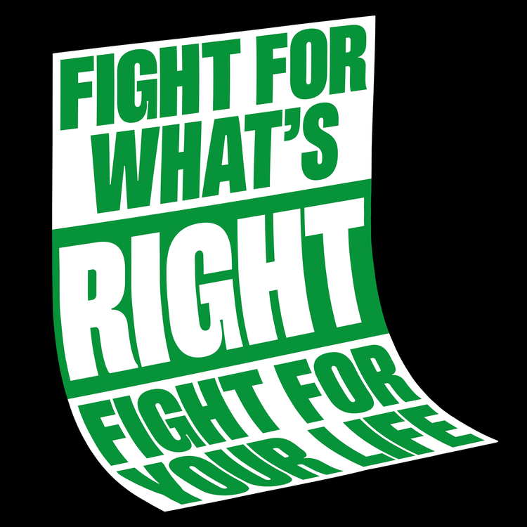
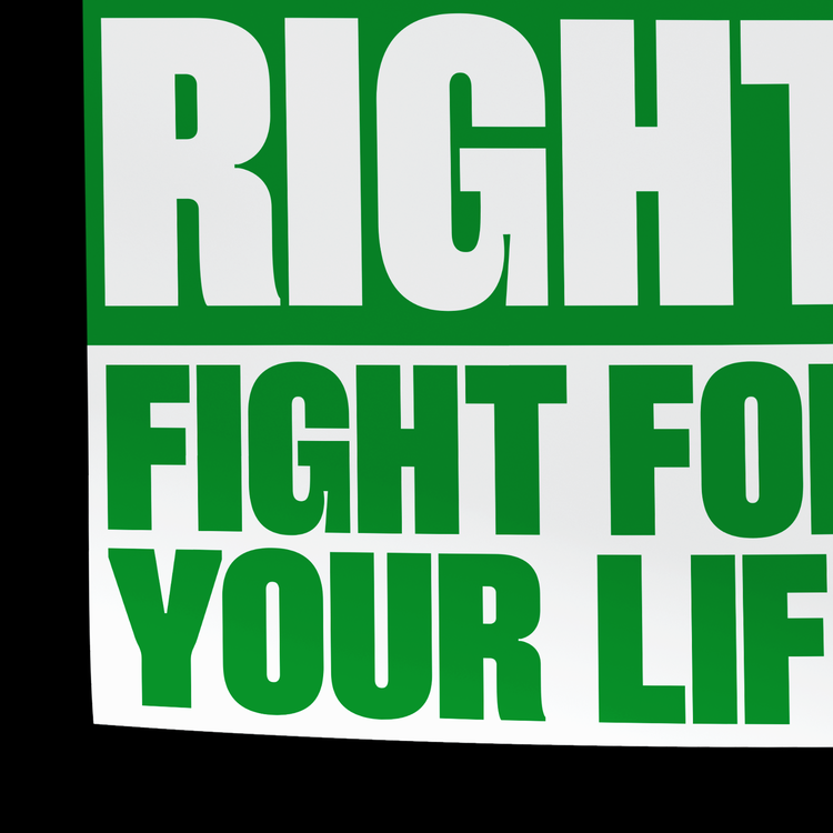
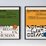
Luke Matthews/OKNO: Don’t Trip Over What Is Behind You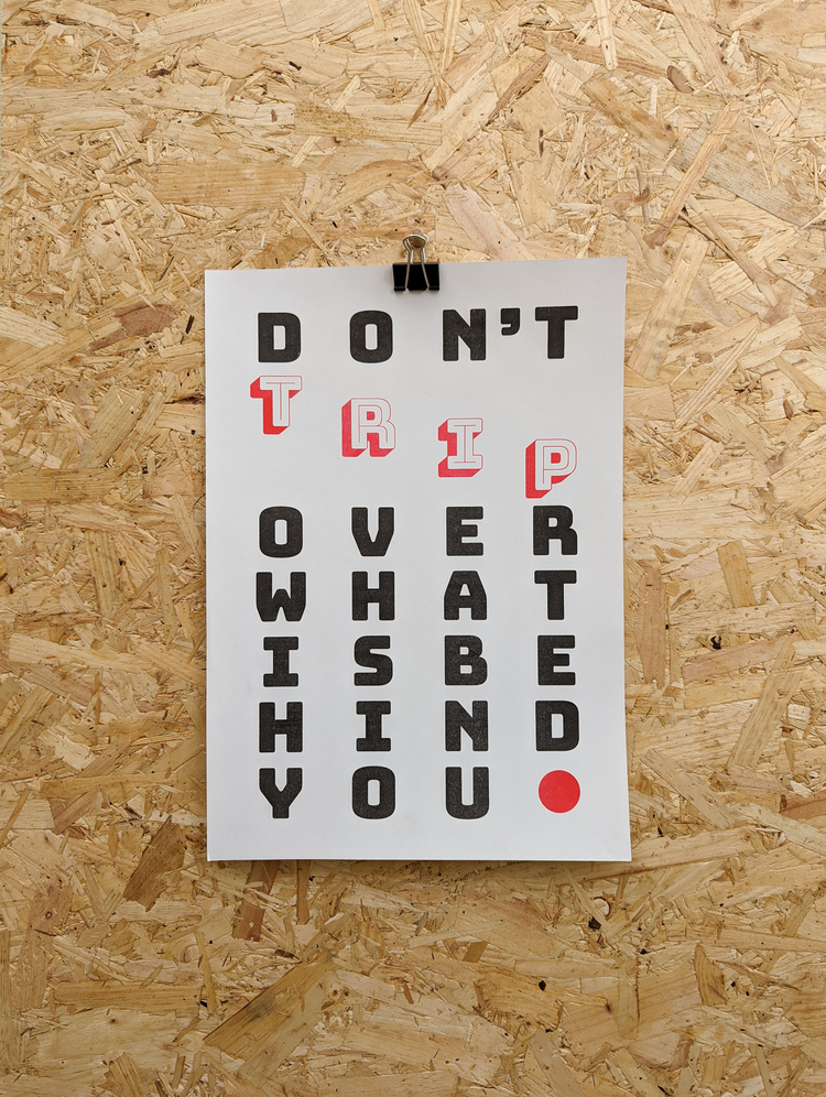
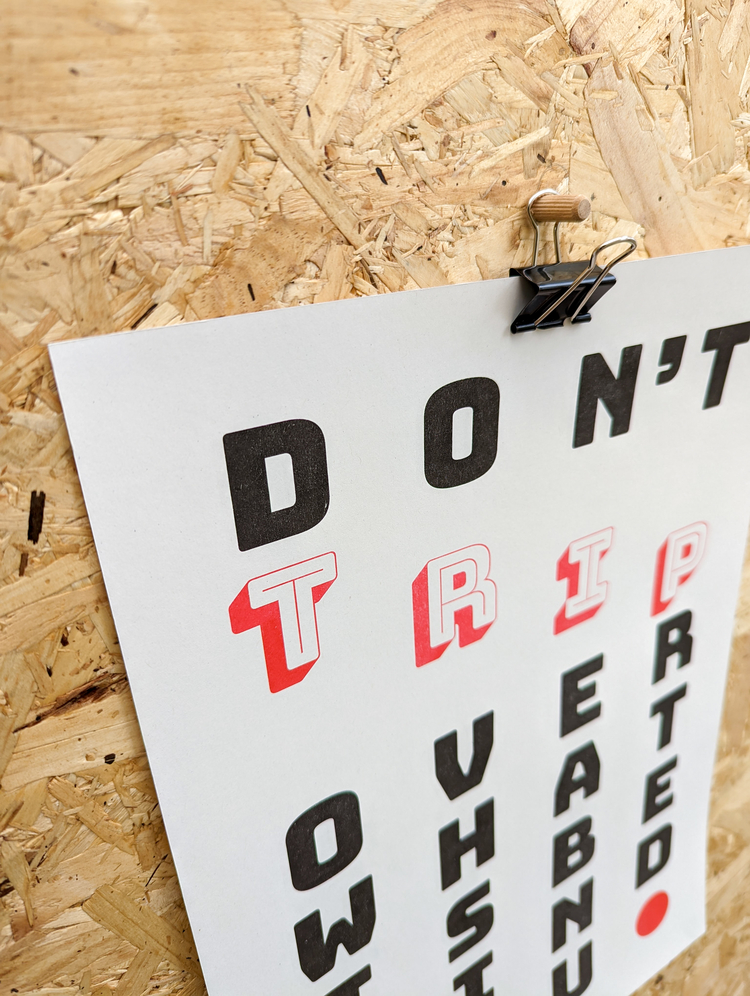
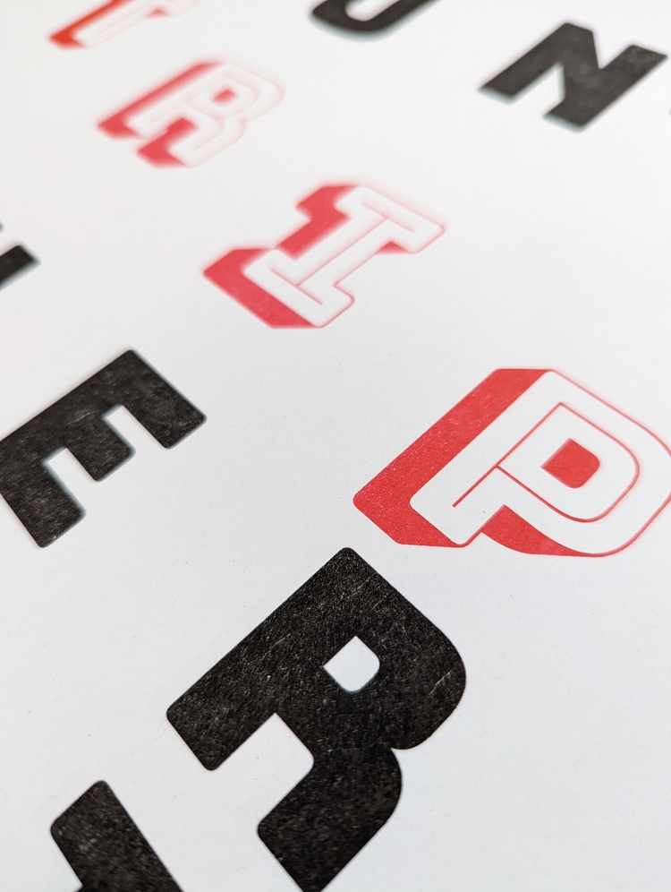 The visual inspiration for this design came from some of the incredible letterpress artists that Luke Matthews knows or follows on Instagram; “Having individual, physical letters that you can handle and move into place makes you much more aware of spacing and composition. This can be lost when you design digitally, so I wanted to try and bring a bit of that back into my work. The message is simple, the layout is straightforward and the colours work hard without being overpowering. I’m really happy with this one.” Luke always tries to put a little bit of himself into his prints, and as we’re (hopefully) coming out of a weird and difficult time for the world, for Luke it felt right to do a print about focusing on what’s ahead. “Learn from it and leave it in the past. Keep looking forward,” says Luke.
Colour Black/Dan Lacey: Typographic Prints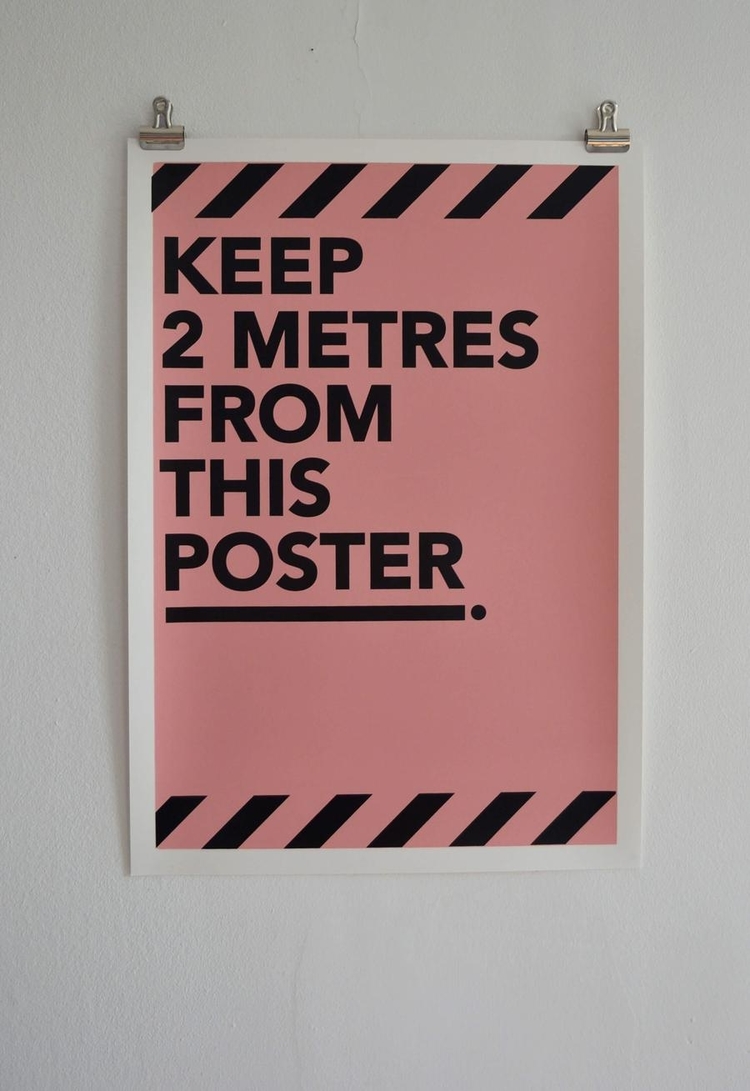
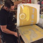
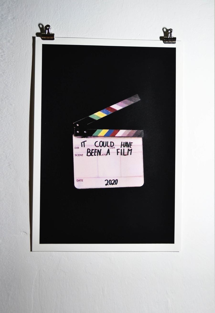 Dan Lacey, who works under the pseudonym Colour Black, has created a selection of typographic and hand drawn prints over the years. Each of the pieces was hand screen printed at PrintClub in East London. It Could Have Been a Film reflects the worlds situation during Covid, Fruit Message is a fun way of sharing a message with a loved one, and 2 Metres was printed during Covid as a tongue-in-cheek take on the two metre rule.
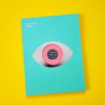
Julia Schimautz: I Love Books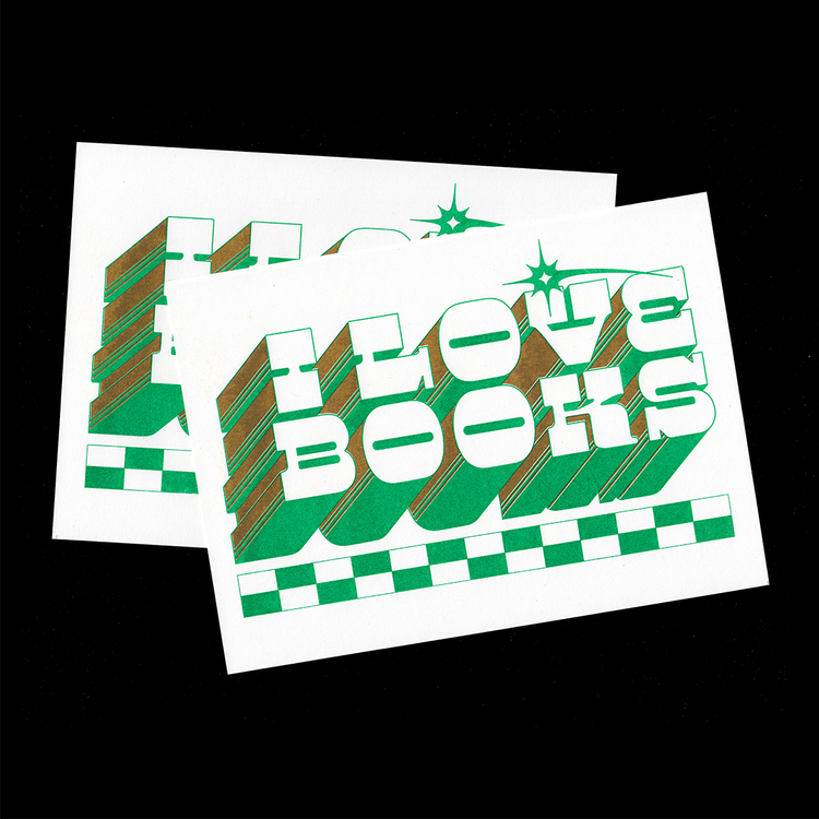
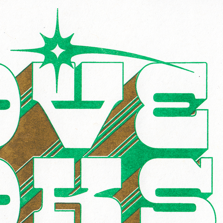
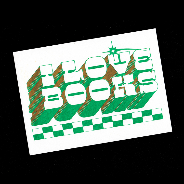 This typographic postcard, I Love Books, was designed by Julia Schimautz for South Africa-based publishing and Riso studio Dream Press. Printed using green and flat gold, the cards were used as a little extra gift with every order.
Check out more work by our community, browse services offered, and apply to become a POP Member at www.members.peopleofprint.com.
You might like...
 Charlotte Tyne
- Studio Emmi
- Heavy Pencil :: Pick Me Up 2013
- Mario Carpe | Toys
- MC1R :: The Magazine for Redheads
- New Sellers | Department Store
- Alicia Breakspear
- Andi Rosenthal
- Eye On Design — Pilot Magazine
- Benjamin Thomas Rawson
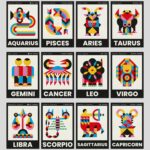
- Mario Carpe | Zodiac
- John L. Wilkinson
- Dave Lefner: 1946 Ford Woodie Linocut Print
- Victoria Ng
- Benjamin C. Carr
- Nanamica / Woolrich


Want to know more about our membership? Give us an email at members@peopleofprint.com.
- Tim Belonax |All Of My Mistakes Have Led Me To You - April 26, 2024
- The Humber Printmaker - April 25, 2024
- Horizons by Angus Vasili - April 24, 2024