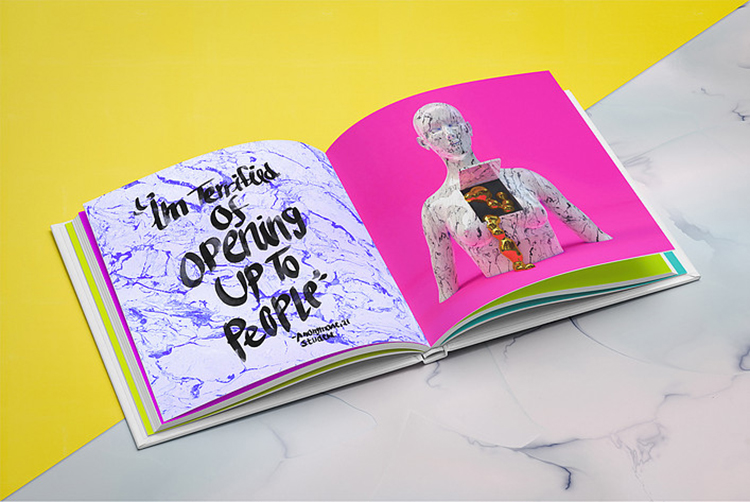
For the first time in its history, this year’s D&AD Annual has gone digital—and perhaps even more significantly than that, it’s available to everyone—not just a select (relatively small) few who can either afford it, produce work that’s gone into it, or write about it. The 2020 D&AD president Kate Stanners describes the annual this year as celebrating creativity “in all its glory, its passion, its ingenuity, its stories, its beauty and its magic. It captures a unique moment in history with work from a pre-Covid world sitting in stark contrast to work that reflects and responds to the unfolding pandemic.”
The 58th D&AD Annual was designed by Studio Dumbar, which was brought in to work on the project before it was decided that this year’s annual should be digital, and was briefed to create a digital platform that “captures the evocative, timeless quality of the physical Annual and translates it into an agile and easily accessible online resource.”
As ever, the “book” showcases D&AD award-winning and nominated work from across the design and advertising industry; and in the interests of keeping things print-focused, we’ve taken a deep dive into the Design section’s subcategory, Magazine and Newspaper Design, to pick out the trends or general noteworthy bits and bobs that stand out to us.
 1. Shit got “edgy”
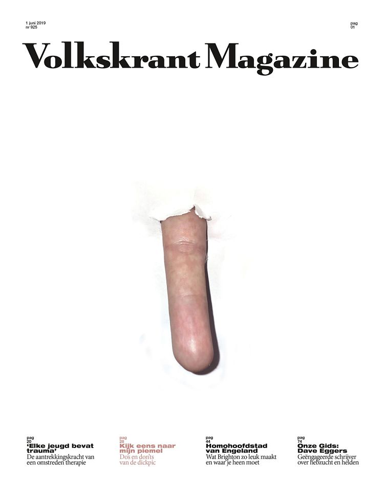
Is it a… sausage? Is it a…finger? Is it…? Never mind. It SURELY can’t just be us who, having narrowed the annual down to its mag ’n’ paper section, didn’t feel like they’d been metaphorically dick-slapped round the face. That’s thanks to Volkskrant Magazine, which scooped an award for its front cover that sold readers a piece about, yup, dick pics. According to D&AD, the mag “commissioned suggestive imagery that recreated the surprise moment of actually receiving one” (a dick pic, that is).
But that wasn’t the only winner/nominee that screamed “EDGY”. Completing another of the two-thirds of the sex/drugs/rock and roll trilogy, another standout image was that of a forensically shot clear baggy, packed to the zip-lock with weed. The image, shot in isolation against a stark black backdrop, is credited to aaa & niiiiice agency for magazine 500 gr. The publication is described by D&AD as “the first magazine that utilises graphic design and illustration to enhance the smoking weed experience” (though we’d argue the likes of Broccoli, a triannual cannabis magazine for women, and Gossamer have been at it for a while); and this design is certainly striking. What have we learned here? That cover designs that would shock your teen-selves’ parents can never go wrong.
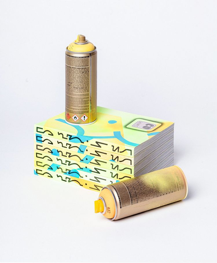
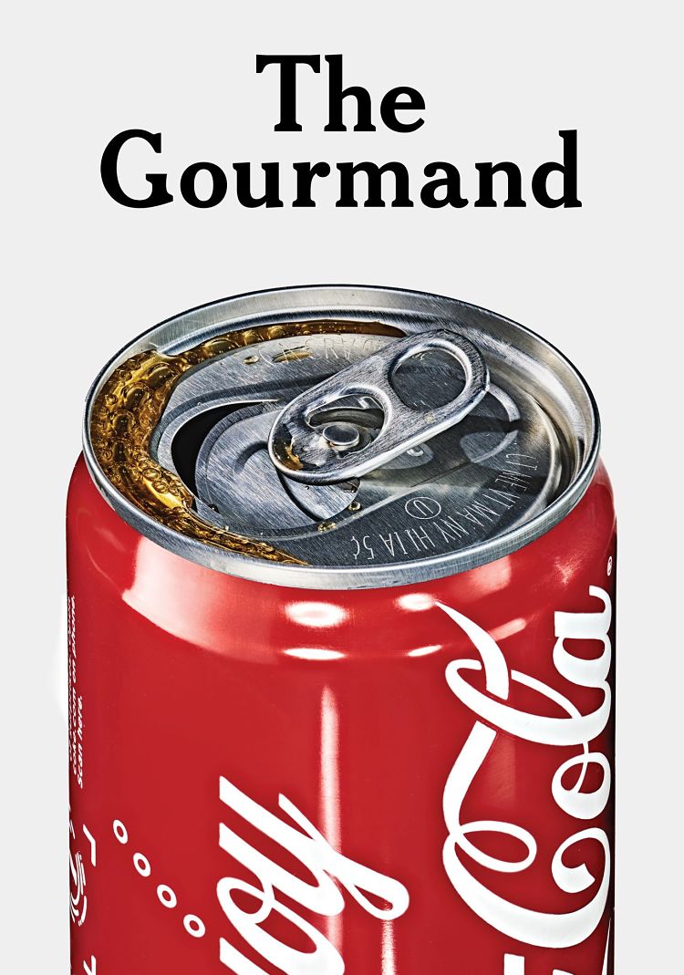
Honorable edginess shoutouts also go to Swim magazine (there’s a mid-secretion spray can in the mag shot, which is both sort-of-suggestive and indicative of naughty, naughty graffing); as well as The Gourmand for placing the MOR millennial’s biggest taboos—sugar and Big Brands—at the fore, with a highly detailed coke can gracing the cover.

 2. Taking online offline
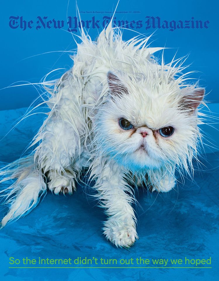
Everybody knows that the two things that keep the World Wide Web turning are cats and emojis. Little surprise, then, that both these things grace applauded publication designs in this year’s D&AD Annual. And internet or no, it’s surely only the most awful, awful of people that can’t resist the soggy, angry cat that’s the star of one of the covers celebrated from the ever-brilliant in-house team at The New York Times Magazine.
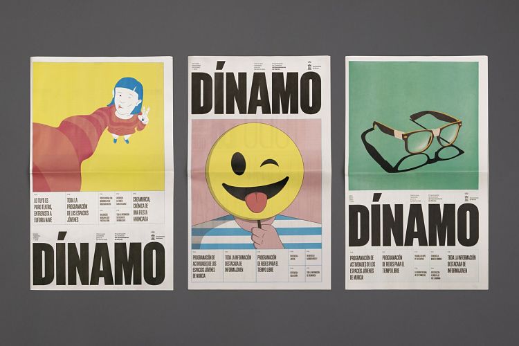
Over at Dínamo, described as “a magazine that collects information of interest for young people in the city of Murcia” (that’s in Spain) the design reconfigures the familiar smiley icon into a smart, subtle but arresting cover illustration.
 3. Looking to the past to design for the present
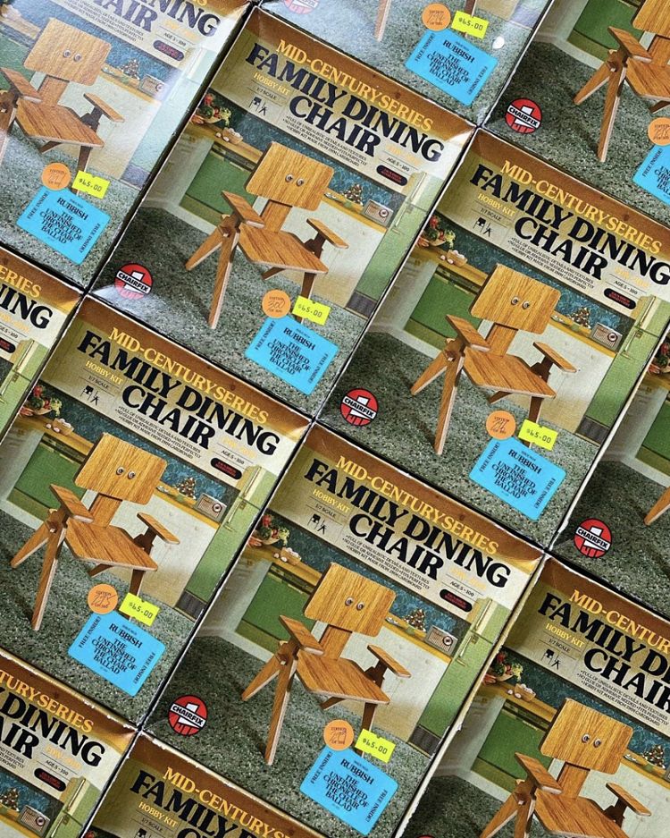
A couple of notable designs in the mag and newspaper selection make very deliberate, beautifully accurate parodic nods to the past to keep things feeling highly contemporary. First off, Rubbish Famzine’s no.9 issue continues the publication’s lineage of impeccable ideas and design work with its ninth issue, The Unfinished Chronicle of the Chair Ballad. The type, imagery and print quality are unabashed pastiches of that mid-century Americana-catalogue thing, and look excellent for it.
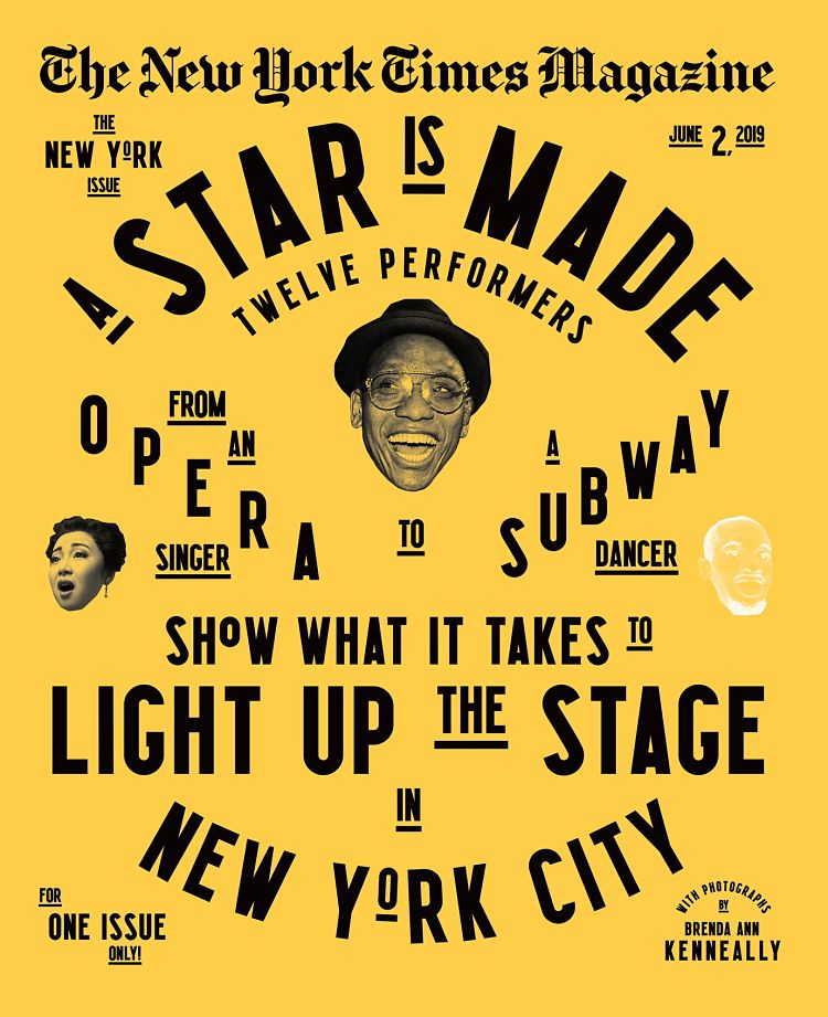
Meanwhile, another well-deserved mention for The New York Times here in the shape of its annual New York Issue. The 2019 issue was (hubristically, in hindsight) was devoted to live performance and focused on 12 people including a Metropolitan Opera singer, a subway performer and a sword swallower shot by photojournalist Brenda Ann Kenneally performing their daily routines, captured backstage, onstage, rehearsing, commuting, eating, and relaxing. The cover design harks back to the early 20th century music hall designs, with its unapologetic billboard sans serif type with its gorgeous condensed forms and kerning that feels off-ish to the modern eye. Photographic cutouts and a striking black and yellow limited palette set off the idiosyncrasies of mixed lettering sizes beautifully.
You might like...


- Autobahn - November 26, 2021
- Alphabetical - November 12, 2021
- SOFA Universe - November 8, 2021