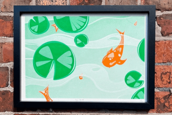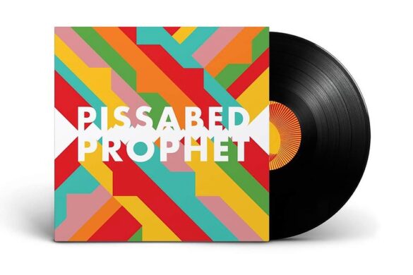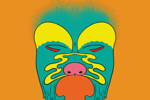
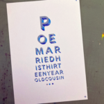
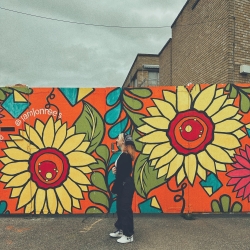
Michelle Wagenaar is a freelance illustrator based in the Netherlands, and uses her creativity to craft vibrant posters that acknowledge life’s melancholic aspects. Initially conceived as a side project, aimed at exploring the inevitable sombre sentiments of life in a whimsical light, it has evolved into a cheerful assortment that fuels her creative endeavours.
We asked Michelle where she finds the inspiration for her posters. “Mostly from my own life.” she states.
“I reflect a lot on life and the meaning of it, so I often stumble upon a thought or feeling that speaks to me and where I feel the need to capture it into my work. I also find a lot of inspiration in music. This happens more subconsciously as I don’t actively search for inspiration when I’m listening to music. It just happens that when I listen to music – albums I’ve been listening to for a long time or music that I just discovered – that suddenly a particular line in the lyrics or a concept stands out to me. When this happens, it often connects to a train of thought I already had or one I’ve been captured by recently. Whatever the case is, it then suddenly forms a concrete idea that I feel I need to capture just like the thoughts from my own life.”
Wagenaar adopts a more hopeful perspective, stating it is universally understood that life encompasses both joy and sadness, and it should not be shied away from.
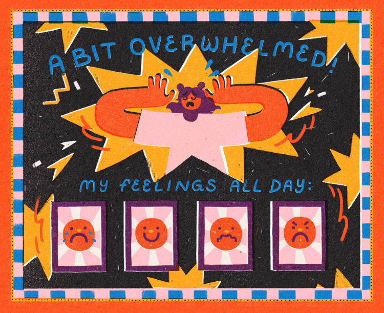
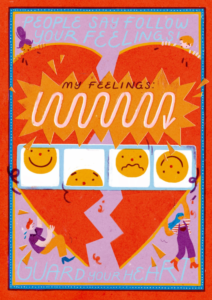
When asked ‘what made you approach the art with bold colours and playful typography?’ Michelle went on to say “I always felt the need to depict sad emotions in my work, but just emphasising these feelings didn’t work out for me. The art became a pity party and I didn’t like it at all. I started experimenting with colour and I realised this worked much better for me, but it also gave an interesting touch to my work.”
She continued, “I could depict the sad subjects, but it also became approachable. That’s when I came to the idea to depict a serious message in a playful and joyful manner. The fun typography contributed to this playfulness, but also gave the serious message.”
Rather than dwelling solely on negativity, they present a lighthearted and sincere response to the challenges that everyone encounters in the digital realm.
So, Michelle, which is your favourite and why?
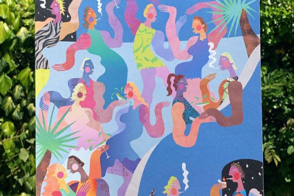
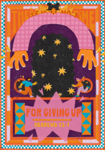
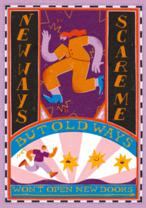
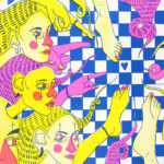
“The one with the 2 people ‘escaping’ their emotions. Till this day it is one of my favourite artworks. I think because I really discovered what I wanted with my work in that piece, but also because there’s a lot happening there, but it isn’t too busy. The purple pattern as background, the stars flying all around the 2 figures, the typography in the middle on the black diamond shape – there are even bunnies! I think it’s a really fun piece 🙂 ”
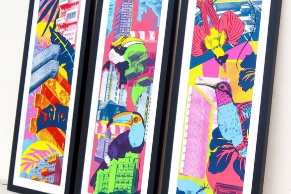
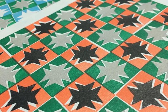
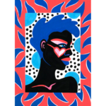
Wagenaar said the series evolved into an ongoing one about both the sad and fun side about life. “The original series only focussed on the sad side, but I now also incorporate the fun side. It still contains the same ingredients as the original one – bold colours, typography, decorative borders, etc – but as it’s an ongoing series, the posters aren’t as united as the first series. It’s still clearly my work, but you can see how my style develops 🙂 ”
Regarding future projects, Michelle told us she has been working a lot on her blog where she goes deeper into the thoughts that inspire her art.
“Like I said before, I reflect a lot on life so I have enough subjects to write about haha. In this blog I also combine my illustrations, so the text and illustrations compliment each other. When I’m not illustrating, I work on that. Unfortunately it’s only in Dutch for now!”
It has been a pleasure to hear from Michelle and we cannot wait to see what work she produces in the future!

You might like...
 Keep Calm Gallery
- Kate Gibb
- Wisdom Apparel
- Better or WORSE?! lunkeymarna on Seeing the Abuse
- Rosa Kusabbi
- Knock Out!
- Lynnie Zulu
- VERITIES
- Want to be our next contributor?
- The Fandangoe Kid: Painting Togetherness
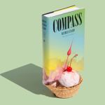
- Ice Cream Books
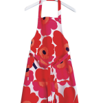
- Marimekko | ‘Unikko’ 50th Anniversary
- Pick Me Up 2013 :: Call For Entries
- Eric Yahnker | Paradise Row
- Matt Lyon
- Dana McClure


- Reintroducing the Keaykolour Collection by Antalis - April 18, 2024
- Embracing The Contrasts Of Life Through Michelle Wagenaar’s Vibrant Posters - March 23, 2024
- New Book Celebrates Iconic Band Logos That Rocked the World - March 12, 2024