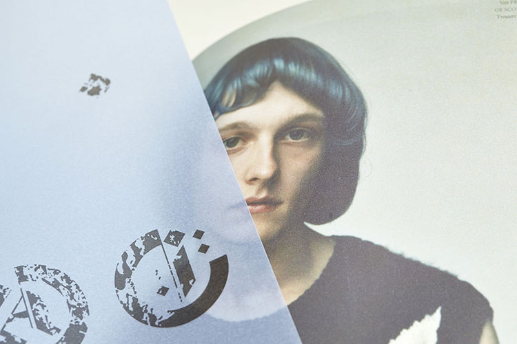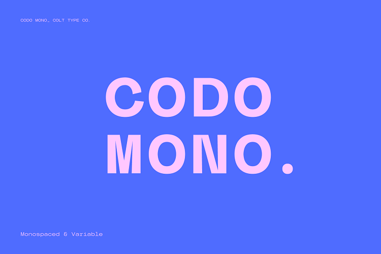
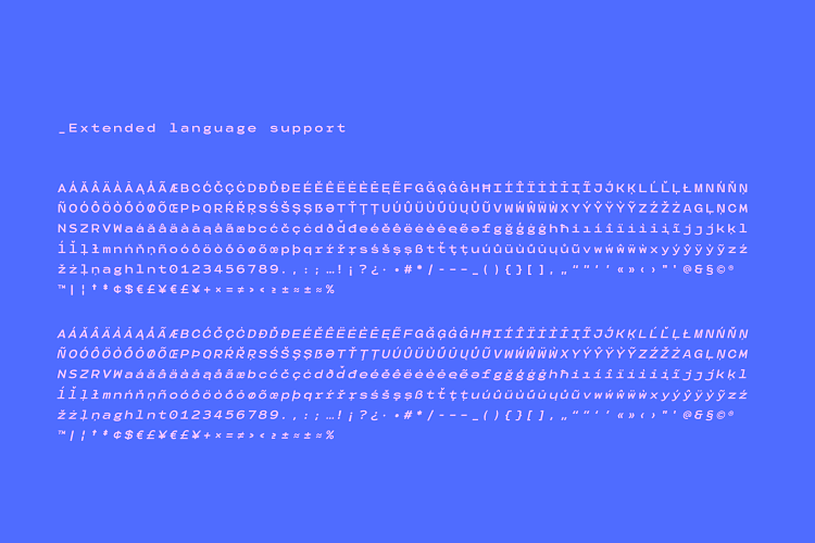
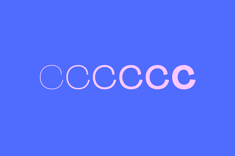
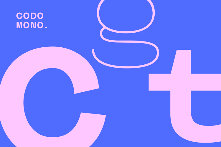
Codo Mono is a new carefully crafted monospaced typeface that features a range of stylistic alternatives, designed by Adam Grealsey of Colt Type Co. The font family is full of character, the most notable being the uppercase ‘C’ with its pronounced underbite. Although this is a monospace font, a style normally used for coding, the design features lend themselves to logo design and brand identity.
 Adam has been a designer since 2004. With no formal education in design (he studied theatre), he ended up bagging a job with a company that supplied IT services to schools. Since then, Adam has worked across a variety of design roles including magazine layout, fashion branding, and lead designer for a gin brand. Today, he works for himself under Oakfold, focusing mostly on brand identity and packaging for drinks brands.
About 10 years ago Adam dipped his toes into the type design world; “I found myself in that passive income scene after securing a spot on MyFonts. Now I’m self-employed I can spend a bit more time on font design which is gradually becoming a larger part of my design work”
When developing a brand identity as part of his everyday work, if it suits the brand, Adam likes to also design a custom logotype. This means that he may have a few unused type ideas which he then uses as inspiration or a starting point for a new font.
“I like to use font design as a bit of a creative outlet, it’s something I can spend time tinkering with or quickly get a fun display font into the world. There’s is no client involved, just a thing I made and hopefully people like it enough to use it in a design or two.”
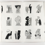
 Adam’s latest type release, Codo Mono, is his first monospace font; “I fancied tackling the challenge of designing using fixed-width glyphs with no option of kerning. I hoped having these restrictions would force me to try different ways to make a good looking, balanced font.” Some nice letter shapes came from these restrictions, with letters such as uppercase ‘M’ and ‘N’ adding a modern and dynamic feel.
The underbite of the uppercase C came from an unused logo, and adds a further element of fun to the type. Adam comments; “A monospace font should be legible and I was cautious not to overuse the quirky styling. As a designer, I like to have style options in a font so Codo Mono features stylistic alternatives for some letters like the C, a, Z and M, among others.”
 When creating Codo Mono Adam aimed to keep the process clean; “working methodically, it can be easy to get tied up in knots when you have lots of characters”. He started the design process by creating letters that have reusable elements; E, d, O, P, etc. “This really helps speed up the process and reusing shapes helps to keep uniformity throughout,” says the typographer.
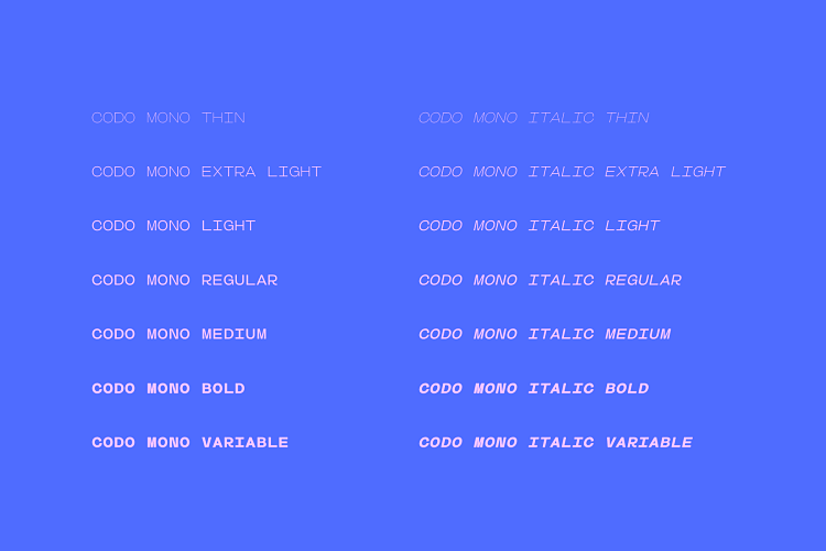
With this font, Adam had to create some letter shapes to fit inside the fixed-width space. The ‘M’ and ‘m’ are usually the wider letters, and ‘i’ would be the thinner, yet in Codo Mono Adam fits them all into the same width so the ‘m’ becomes quite narrow and the ‘i’ has some slab serifs to add width.
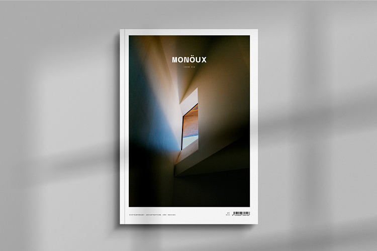
 “As with any font it’s always nice to see them in use on other people projects. Hopefully Codo Mono inspires a few people and maybe forms the basis for some great logo’s.”
Codo Mono is available in standard or italic and both with variable weight versions here.
You might like...
 Ritty Tacsum
- Matías Eiras | MEDG
- FourFiveX Editions 001
- Craig Black | Avondale Type Co
- Magazine: Spring Releases
- Discordia | Moises Saman
- John Livingston
- SPOUK
- Megalomaniacs | A Game About Despicable and Incredible People
- Ice Screen Printing
- The Wooden Spoon Press | Ghosts of Christmas Past
- Richard Peacock
- Heuberger
- Jeremie Fischer
- Freshmattic
- L’Empressee | Osmos


robyn@peopleofprint.com
- Benny Andallo X Foundation F.M Posterzine - April 26, 2024
- leafie Issue 01 Currently Crowdfunding - March 27, 2024
- Reimagining The Nature of Work - March 5, 2024