Generally speaking, we’d guess PoP readers to be design-nerd-types, into zines, counterculture, music etc etc—and so we’d wager that there aren’t many who haven’t heard of David Carson, the man as infamous for his use of Dingbats as for his pioneering of “grunge” graphics and typography.
You know someone’s a big deal when they’ve inspired an homage in the form of a meme-like badge reading: “Dont give up, David Carson Wasn’t Built in a Day.” Creative Review has called him “the art director of the era.” In 2014, he was awarded the AIGA Gold Medal.
It’s not hyperbolic to say that David Carson is a man who has transformed the field of graphic design through his distinct self-taught, resolutely grid-free design approach, which paved the way for other designers to break the rules when it came to editorial layouts around image placement, consistent typography, or doggedly flowing copy issue after issue.
 Best known for his work with Ray Gun magazine in the 90s and various surf/snowboarding publications including Transworld Skateboarding, over the years he’s also worked on branding projects and campaigns for the likes of Nike, Levi, Pepsi and Ray Ban; surfboard designs; packaging design for potato chips, and most recently, another beautiful tranche of work for longstanding client The Macallan.
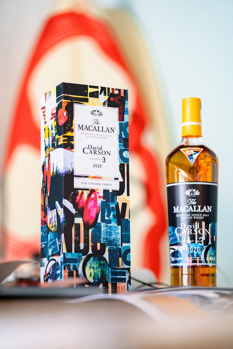
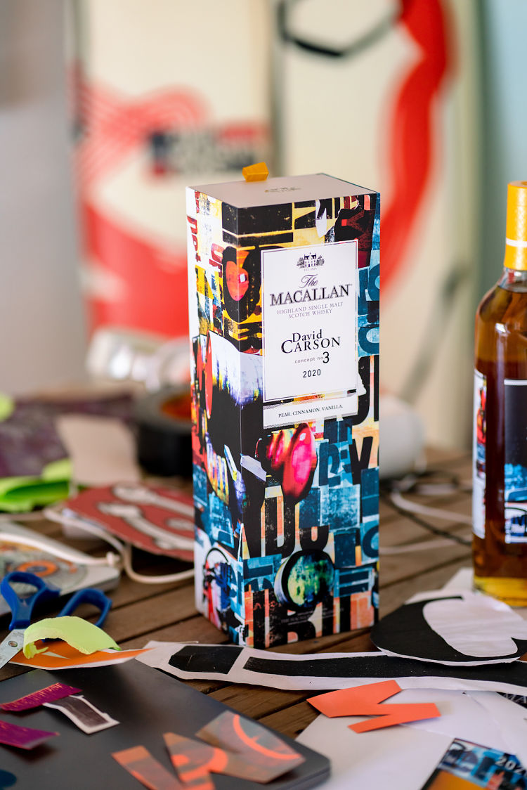
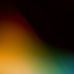
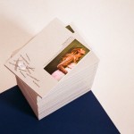
This latest work saw Carson collaborate with whisky brand The Macallan on Concept No.3 (“an unusually fresh single malt with a sunny hue,” apparently). This is the third and final release in the Concept Series, a limited collection of annual release whiskies which aim to “fuse the artistry and expertise behind The Macallan’s whisky-making with creativity and culture,” according to the brand.
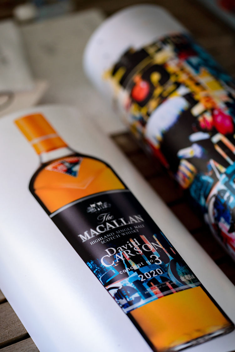
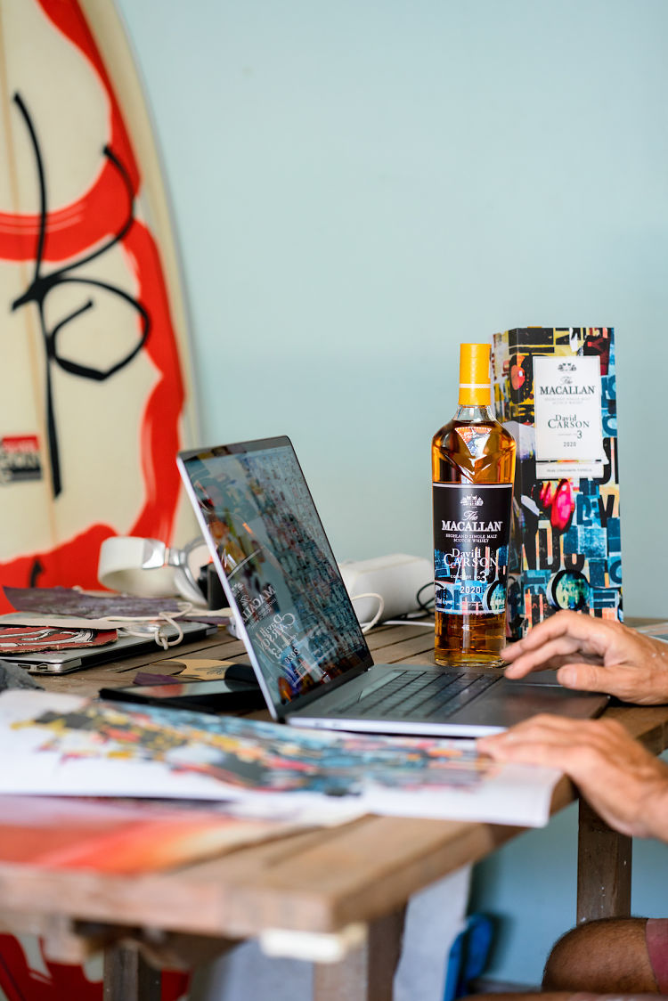
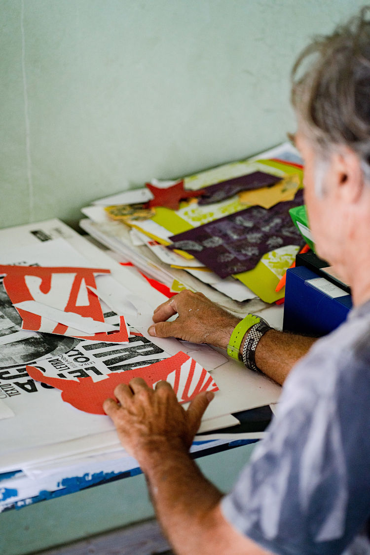
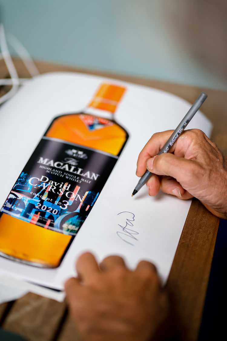
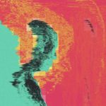
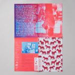
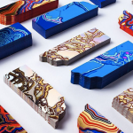
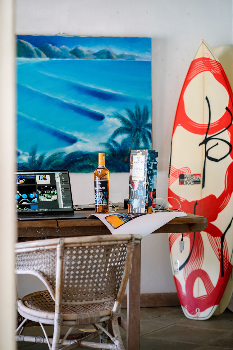 The designs showcase two of the things Carson is best known for today, perhaps: his typography and his beautifully vibrant, dynamic, and deliciously off-kilter collage. Carson created the presentation box and bottle labels for the whisky, and the bottles also feature a bold chevron symbol bearing his signature.
Concept No. 3 is the latest project in a wider collaboration between The Macallan and Carson, who’s previously worked on other projects for them including a 2020 festive campaign.
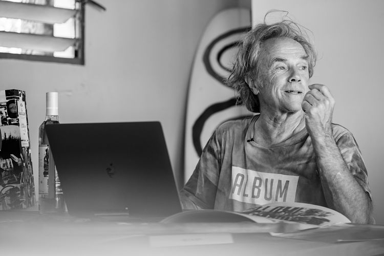
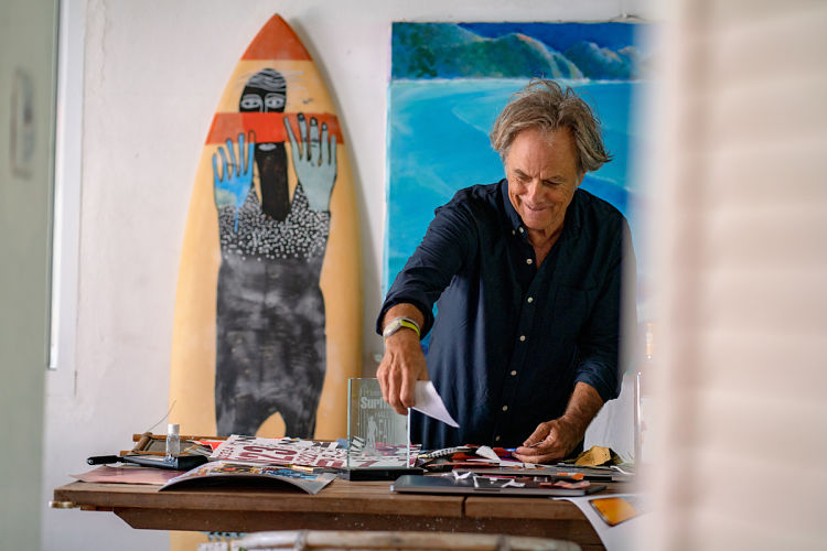
The project saw Casron initially visit The Macallan’s beautiful 485-acre Estate in Scotland’s Speyside, where he spent time with The Macallan Whisky Maker Polly Logan.
“They discovered that a remarkable number of similarities define their approach to their respective crafts,” says the brand. “Both are driven to revisit and evolve their work, creating greater depth by ensuring every element in their creations has a distinct purpose.”
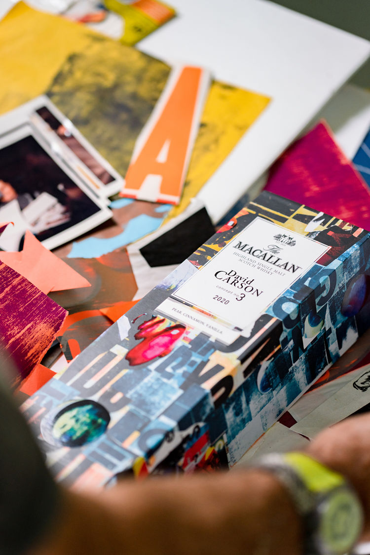
 Carson’s designs were all handcrafted, and feature certain nuances that nod to this shared outlook and methodology, such as the inclusion of the letter P for Polly. Many of the colours used are also those found at The Macallan Estate on Scotland’s Speyside, with blue representing the River Spey and red drawn from the colour of The Macallan’s sherry-seasoned oak casks.
“Polly, in turn, has drawn influence from David’s character and career when crafting Concept No. 3, to create an unusually fresh whisky, with a distinctive warm, golden hue that pays tribute to the graphic designer’s years on the USA’s West Coast,” The Macallan adds. The ABV was developed specifically to be 40.8%, after the pair realised that eight is their favourite number.
 “In some of The Macallan work, I very noticeably got into what I call ‘my zone’, where I was just clicking. It was all coming together so I’m not aware of time, or even where I am,” says Carson.
“The Macallan people I’ve dealt with have been so open to exploring new ideas and to different types of creativity. Their obvious love for nature and where they work, the hand-doneness and the wooden casks – you have so much of that with The Macallan collaboration and I am very proud of it.”
Logan adds that she was “deeply inspired by [Carson’s] vibrancy, and drew on this to create a bright, fresh whisky.” She adds, “Its pale yellow colour, which we’ve named Californian Gold, reflects David’s sun-soaked days as a surfer and it also reveals the citrus notes which shine through.
You might like...
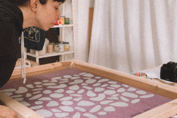
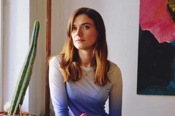
 Karen Takahashi
- Marie Err
- Wainwright Bookbinding | Hand-Marbled Notebooks & Diaries
- Tamasyn Gambell
- Design LSC
- Barney Cools :: SS15
- Oliver Jennings: This Is What My Brain Looks Like
- Posterzine Issue 03 | Hello!Lucky
- Saiman Chow
- ‘Storm In A Teacup’ Deck by James Callahan for Lovenskate
- MegaLilyDesign
- The Bakery: Arjowiggins X Fiac Bookmark
- Alakazam
- The Cameron Twins
- No Substance Magazine
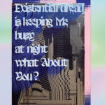
- Amélie du Petit Thouars: Existential Dread is Keeping Me Busy


- Autobahn - November 26, 2021
- Alphabetical - November 12, 2021
- SOFA Universe - November 8, 2021