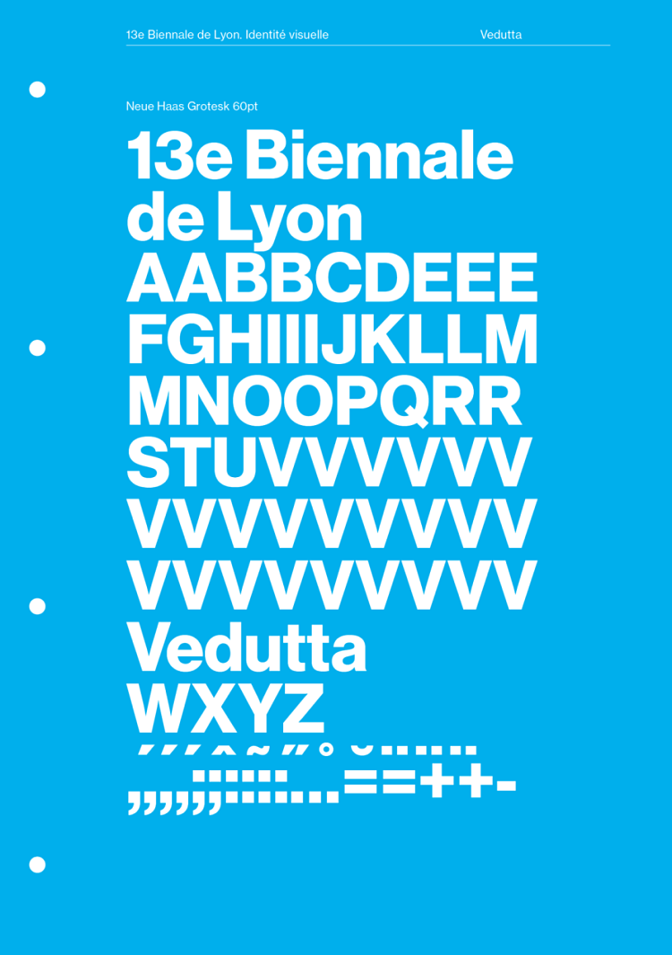
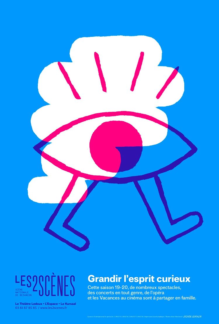
Across his poster design visual identity work, publication design, exhibition graphics and a raft of custom type faces; Thomas Huot-Marchand’s work is characterised by a sense of timeless class. His work always looks contemporary, but the craft and nuance—his marriage of rigour and impact—make the world feel both fresh, and as though it’s always been a part of the cultural landscape.
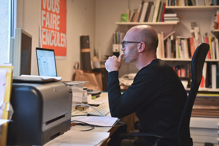 The designer lives and works in Besançon, France, where he studied graphic design at the School of Fine Arts. “This is where I discovered typography and type design, even if there was no type design class at the time,” he says. “I learned it on my own, making many mistakes of course.”He went on to join the Atelier national de recherche typographique (ANRT), where he studied type design. It was at ANRT that Huot-Marchand designed Minuscule, “a typeface for very small bodies,” as he puts it, which went on to be named one of the “Ten typefaces of the decade” by 20210, as well as receiving several international awards including Type Directors Club of New York recognition in 2005.
 Alongside his studio practice (he’s always been freelance, having never worked for or interned at an agency), Huot-Marchand has also been teaching graphic design and typography for nearly two decades: he spent ten years teaching at the Institut Supérieur des Beaux-Arts in Besançon and at the School of Art and Design in Amiens. Then in 2012, he sort of went full circle, returning to ANRT, but this time as director. The role is part of a postgraduate research course investigating new paths in type design.
One of its projects, The Missing Scripts concerns the writing systems that are not yet encoded in the unicode standard, and therefore are inaccessible on computers or smartphones. “Almost half of the scripts of mankind are still missing, and it is for sure a subject that industry and designers must tackle,” sys Huot Marchand.
When I ask the Smash Hits style question, what’s your favourite font?, Huot-Marchand replies that it’s like asking someone’s favorite song: “it all depends on the moment and the mood.” However, he namechecks the second typeface (115R) cut by Konrad Sweynheim and Arnold Pannartz in Rome in 1467: “It was only 12 years after Gutenberg’s B42, these guys founded the first press in Italy. They were used to Gothic letters and they had to adapt to a completely different culture, to cut a roman typeface instead. The result is amazing. It’s a bit weird, half-way between gothic and roman, handwriting and typography.”
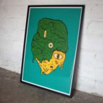
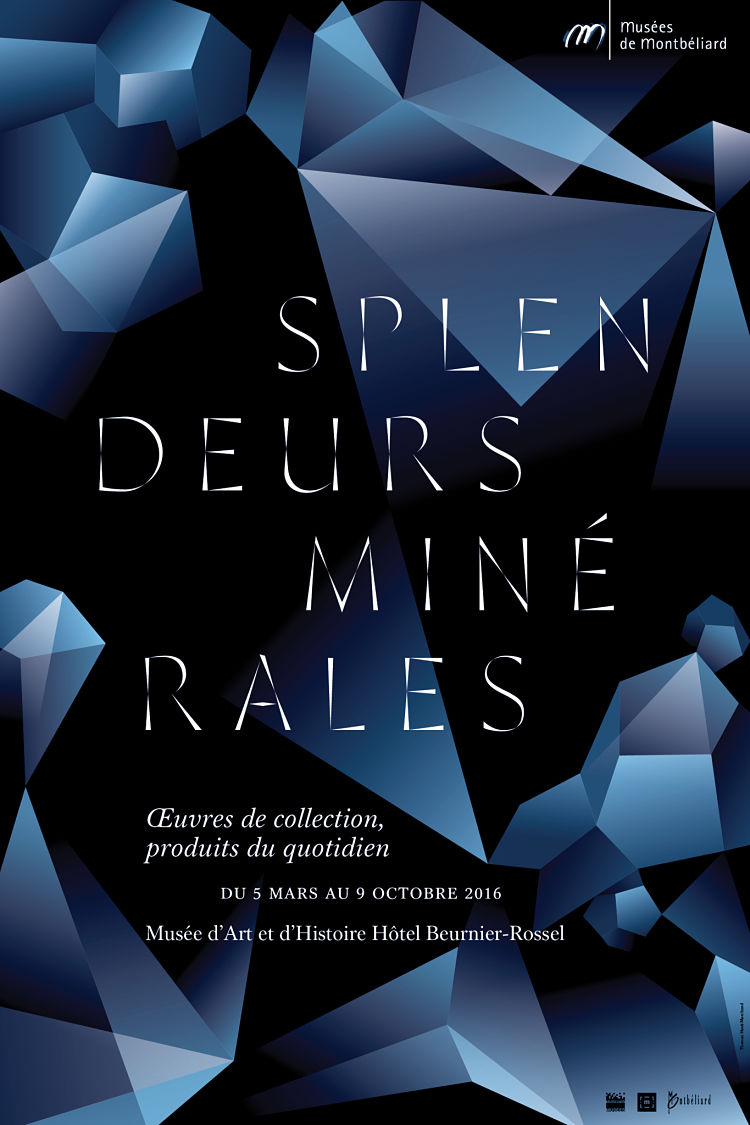 I first came across Huot-Marchand’s work through the fonts he publishes with French foundry 205TF. Some standout typefaces have emerged from that little dream team in recent years: 2018’s Minérale is a striking chiseled geometric font that bears “angular yet fluid forms in honor of the variety of crystalline shapes on display,” as writer Angela Riechers put it. The font went on to scoop awards from organisations including TDC and Typographica.
 Garaje, a font published in February 2020, but in the works for the past 20 years, merges influences from the Bauhaus and signs on Spanish garages. The designs of Garaje’s letterforms aim to highlight the fact that geometrically perfect shapes actually look imperfect to the human eye; in fact, the vast majority of type designs use numerous corrections to make them seem optically accurate. “Garaje plays precisely with this paradox: its construction is strictly geometric, without any optical correction,” said 205FT. “It is a perfectly objective system, but also a typographical aberration, both right and wrong.”
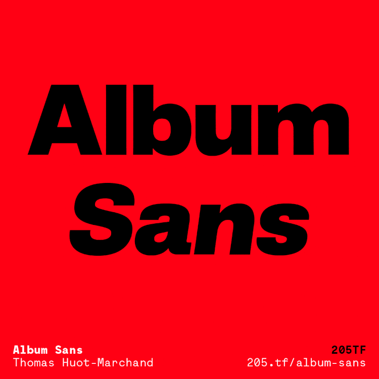
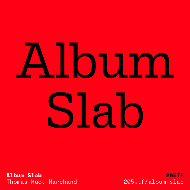 His latest font releases, also with 205FT, are Album Sans and Album Slab. they’re inspired by the work of Justus Erich Walbaum, (1768-1837), a confectioner by trade who carved his own cake moulds and also decided to learn punchcutting. “Considered to be one of the foremost creators of his time, he engraved gothic letters and Antiqua type. But his Romans had a different flavor, and for some, they contain the origins of the Grotesques that followed,” says Huot-Marchand. In 2010 he and graphic designer Philippe Millot were asked to develop the typographic identity for the Musée d’Orsay. The original identity had always been based on Walbaum’s lettering; and the museum team proposed that the designer add distant “cousins” in later typographic styles: a bold grotesque and a thin slab serif.
These typefaces would ultimately remain unused until Huot-Marchand decided to work on them last year while developing an extended family. “Album is a subtraction of Walbaum: with no serifs for Album Sans and with no contrast for Album Slab,” says Huot-Marchand. “Its silhouette retains some memory of the particular proportions and slightly flattened curves of Walbaum.” Album Sans, meanwhile proposes a new reading of grotesques with an extended range of weights.
 “Each time I’m trying another system, another way of drawing: each typeface has its own logic, it’s own story, and is always strongly connected to my practice as a graphic designer and researcher,” he says. “The typefaces I published so far had pretty extreme formal choices: Minuscule Deux is very strange, Garaje is so huge that it becomes absurd, and Minérale has an uncommon structure.”
Rather diplomatically, Huot-Marchand says that “every project could be a dream project. It depends on how much you invest yourself in it.” Designing a typeface design is usually a long term project and “a bit obsessional,” he adds.
 “Type design is a singular field of graphic design. A digital font is at the same time a means to communicate, a tool, a formal system, a tiny piece of software… It is also a very discreet kind of design, sometimes unnoticeable (which may not be a bad thing, when it comes to reading).”
His advice to those looking to get into the type design industry? “Play, have fun, tell stories. Typography doesn’t have to be serious, it’s a way to share ideas, to communicate.”
You might like...


- Autobahn - November 26, 2021
- Alphabetical - November 12, 2021
- SOFA Universe - November 8, 2021