Beavertown Brewery, a long-standing pal of People of Print, has proven itself to be a bastion of brilliant offbeat design, intricate illustration and popping colours (as well as very very tasty beer) since its launch around eight years ago. In a world where craft beer copycats are two a penny, it’s a testament to its design work that it still feels fresh and brave after almost a decade.
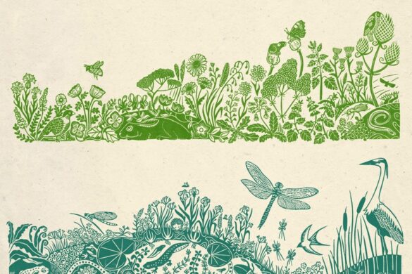
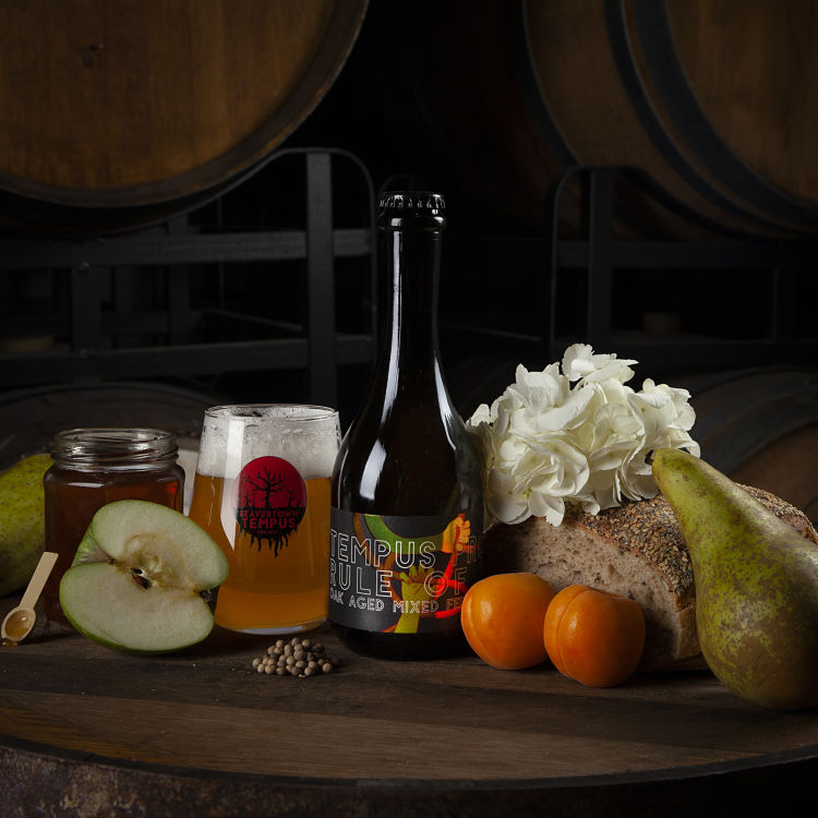
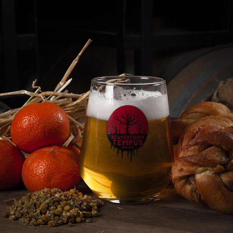
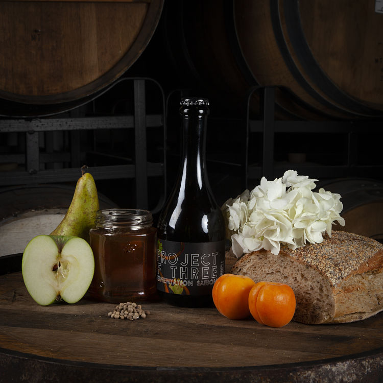
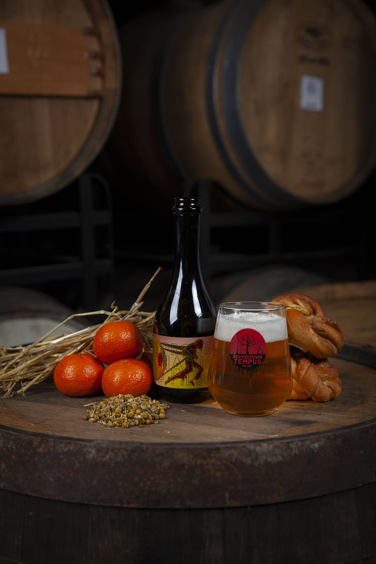
In December 2020, the brand launched two new beers—The Chariot and The Rule Of Three—in its newly relaunched Tempus Barrel project—a darker, broodier bottled counterpart to its comics-like neon-leaning can designs. Inspired by the seasons and the ancient Pagan Wheel of the Year, and created with locally sourced ingredients, they new designs are a striking counterpoint to the core range can artwork.
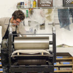
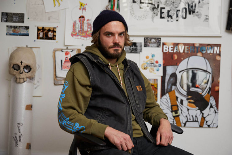 Remarkably, just one man is behind all the design work for Beavertown—that’s everything from the illustration to type choices, across all touchpoints from packaging designs to van livery designs and merch, such as some new tea towels. That man is Nick Dwyer, who’s worked with the brand pretty much from the start.
“We started Tempus to showcase what we could do with wild fermentation and barrel ageing and processes like that,” says the designer. “There’s been lots of messing about with microbes, and seeing if we can brew using old bread; so it was an opportunity to mess around with the brand, too. There’s a level of details and intricacy in the design.”
The Tempus designs were inspired by vintage wine labels, he says: “We wanted the labels to be colourful, but also clearly defined as their own range of beers, which is why we went for influences from things like druid calendars. As they use local and seasonal ingredients, our spring and summer beers are lighter offerings in general with maybe more flowers and florals, so the artworks intended to reflect that.”
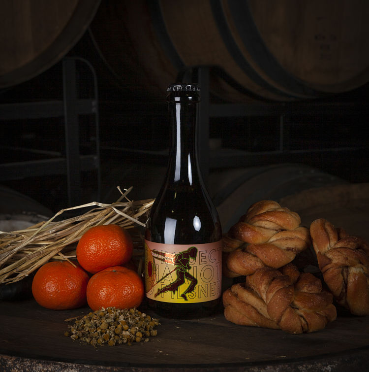 For the font, Beavertown licensed and modified sans serif Vulpes from Da Font. It merges Bauhaus-ish vibes with a modern Art Deco feel sans serif, “with a nice mix of acute angles and straight lines,” says Dwyer. “It’s also blocky enough so you can outline and see through it into the bottles.”
When he first started working with Beavertown, Dwyer was more an illustrator than a designer, having specialised in illustration during his graphic design course at St Martins. He pretty much learned the art of packaging design on the job. “We sort of stumbled into the way we do our brand with the colours and designs,” he says. “At first there was a lot of luck involved, and we built on the fact it was something new in every aspect—we filled every corner. When we released the Gamma Ray and the core range it was cool, there was so much to learn about the beer and also learn about the designs.”
 At first, Dwyer’s less design-led background meant that for the Beavertown typography, he settled on the laborious process of using a separate Illustrator file with each letter as an asset, and dragging them in one by one. Eventually, they asked someone to help me make a font from his letters. “I think the hand drawn lettering] is really important, as it means the branding doesn’t look like an illustration with the branding slapped on,” says Dwyer.
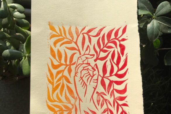
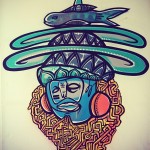
A unifying principle across all Beavertown’s beers is a sense of intrigue and ambiguity: the names and artwork alike encourage people to make their own mind up when it comes to meaning, rather than imposing ideas on drinkers.
 Since Beavertown started out, the craft beer sector has exploded, and there’s been no shortage of copycats when it comes to the brand’s design: graciously, Dwyer says this is “frustrating”, and that he feels bad that the designers on such projects didn’t have the opportunity to be as creative as they might have wanted to be. But why have his designs stood the test of time? “I find it really hard and a bit dangerous to study it too much,” he says.
One reason he suggests might be that from the get-go, he pushed the Beavertown founder Logan Plant (“the straight one”) to be really bold. Plant went with it, where other brand owners might be more likely to err on the side of caution, or go with more traditional tried-and-tested routes. “It’s never been designed by committee—it comes straight out of my head,” says Dwyer. “There was definitely some luck to it as well.”
He didn’t struggle to create the highly illustrative pack designs, as the self-described sort of person who’s always “filling up Moleskines with line drawings for the sake of line drawings. There are a lot of limitations in putting things onto aluminium.” Something he found that encouraged him to be really creative was, in fact, the limitations involved in creating can designs: obviously certain information has to appear on pack legally, but on a more technical level, there are certain considerations around things like line thickness “which informed the style of my drawings a lot,” he says.
 He sounds genuinely humbled at the success of his designs: “I benchmark everything against Gamma Ray: it was like, ‘holy shit people really like this!’ I didn’t think it would do that, but it turned into the impetus to keep doing what we do now.”
You might like...
 Home-Work
- Nate Harris + Spectrum Skateboards
- Decent Peoples
- James Dicks
- Dean Beattie
- Arseni Khamzin
- TextielMuseum & TextielLab Identity
- RIP :: Eduardo Paolozzi
- Colour Options & Lee Goater Collaboration
- Cachete Jack
- HelloMarine
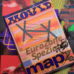
- Mould Map #4 :: Eurozone Spezial
- Ana Catarina Pinho
- Esther Rigg | The Eye Has To Travel
- Elyse DeLisle | Images from the Darién
- Jonathan Barcan


- Autobahn - November 26, 2021
- Alphabetical - November 12, 2021
- SOFA Universe - November 8, 2021