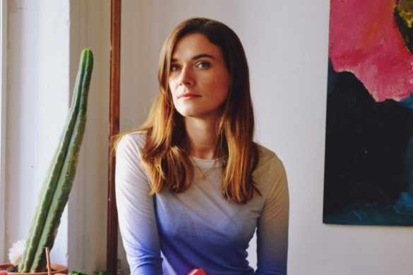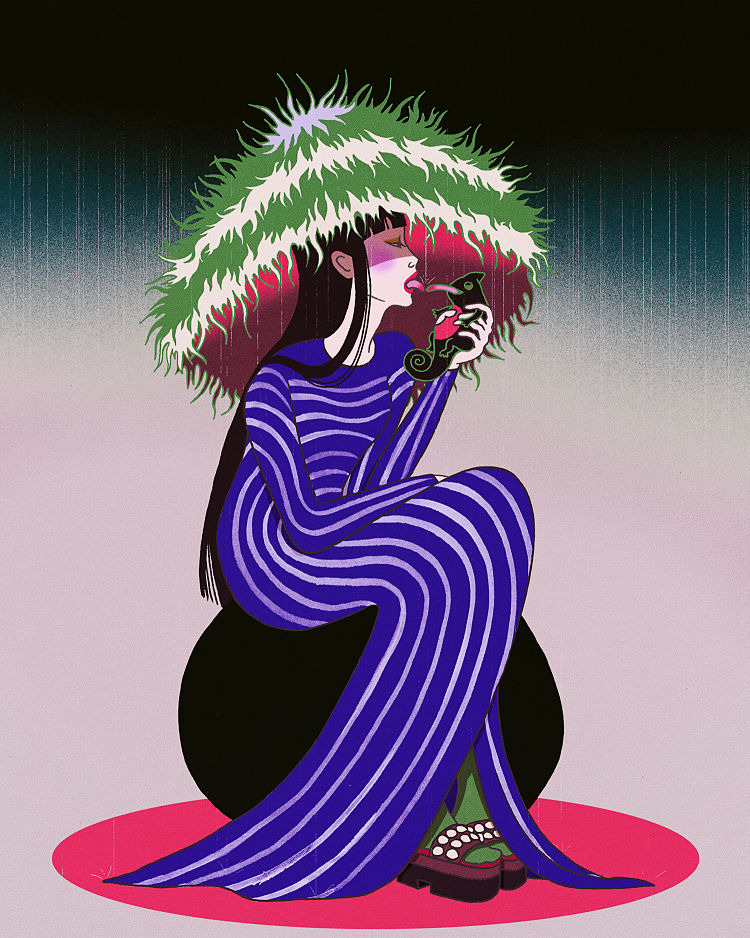
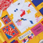
Chau Luong’s work merges contemporary impulses and traditional influences to create work that’s striking, beautiful and refreshingly original. Focusing on cross-discipline collaboration, the Berlin-based artist applies her superbly crafted illustration and design work across everything from fashion projects to branding, film posters, editorial commissions for the likes of Lenny Letter and The Atlantic.
Based in Berlin, Luong grew up in Germany and much of her work is informed by her German-Vietnamese background: in terms of colour, form and imagery she often juxtaposes “Chinglish” and Western stereotypes; while her vivid tones and maximal leanings draw on the kitschy interior design beloved of her mother. Much of her work is also influenced by her love of cinema—Japanese horror classic Hausu looms large, alongside the incredible tradition of Polish film poster design.
While she’s clearly a creative who approaches her craft with passion, dedication and occasionally ridiculously long hours; Luong, refreshingly, doesn’t take herself too seriously (her “about me” section avoids both earnestness and cliche by describing herself as someone who can be found “musing on food and soft drinks” outside working hours.
While there’s no doubt her work is aesthetically superb, for Luong, illustration needs to be conceptually rigorous rather than purely decorative. “I was always more interested in how I can tell a story than how I can make it look nice,” she’s said.
We spoke with her about how to say no, time management, cinema, finding inspiration in Twin Peaks’ Black Lodge and more…
 How’ve you found the last year or so with the pandemic, lockdowns and so on in relation to your work?
Right after the pandemic I noticed a drop in commissions but after a couple months the situation relaxed. I also noticed that budgets got cut down. I was feeling anxious at the start of Covid, however I was somewhat positive that things would fall into place when the initial shock would wear off.
When we met up before and chatted for Eye on Design you said you had a hard time saying no, and often took on too many projects. Did you find a way of dealing with that?
I’d say it got better, there’s still room for improvement, though! My way of dealing is to suppress my FOMO on opportunities and money. Perhaps experience helped me realise that not every project is vital for my career. In the long run, my career profits more from a healthy dose of sleep than stressing myself out over things that won’t matter in hindsight. In terms of money, getting better at negotiating was a huge change for me. It allowed me to be more selective about the commissions I take on. Setting clear expectations was helpful too—something I was scared to do when I started out. Not only does it improve your client relationship but it also takes off a lot of pressure.
I try to keep a stricter routine as I have the habit of working long hours. Right now, I split up my working time into days where I’m partly at the studio and other days I stay home. Often I do mornings at home as I prefer the calmness and afternoons in the studio. With the pandemic, I realised I need to be alone at times to be productive. Especially in the beginning of a new project I like to have a day I can spend thinking.
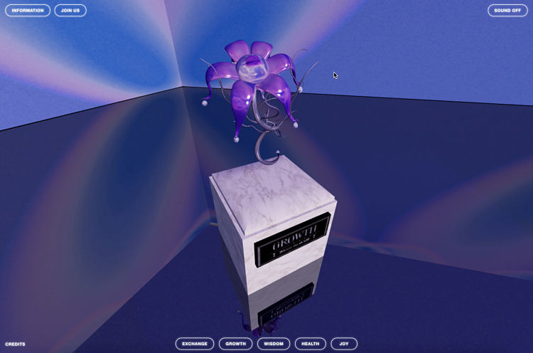
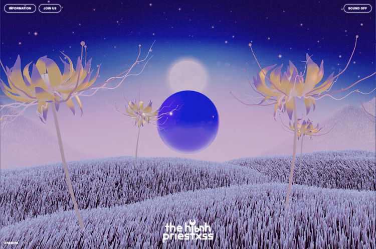
Can you tell us more about The High Priestxss project you’ve been working on?
One of my most recent projects is an interactive website for a spiritual platform called The High Priestxss. I was tasked with the creative direction of the branding. My briefing was to find a visual language that is futuristic, spiritual, mystical and in close touch to nature.
Around that time, lockdown prevented me from socialising, so I was stuck at home with too much free time on my hands and descended to video games hell. This sparked my idea to create an immersive website with a low-key video game experience. I was keen to apply my art direction and illustration skills on a new medium. The concept provided me enough space to create an eclectic world and turn to my strength as an image-maker. My inspirations for THP were pretty much all over the place – I looked at video games like Zelda, the art of occultist Austin Osman Spare and rewatched Sailor Moon besides movies like Angel’s Egg or Holy Mountain! My idea was to show an ecological area with a portal to an extra-dimensional world. Kind of Twin Peaks’ black lodge but not terrifying.
For me it was important to find a direction that’s contemporary, utopian and fun. Something that younger people could relate to even if they wouldn’t consider themselves as spiritual… When I met Yurika Davis and Portia Ferrari for the first time (the founders), I loved how approachable and positive they are.
My brilliant team consisted of Bejal Lewis for development, Sven Herkt for UI, Sarah Ann Banks for 3d modelling and Sebastian Lux for sound. Each of them did such a great job as none of us was familiar with 3D websites at that point. There were many firsts involved but that made the end result so much more rewarding!
What else have you been working on lately?
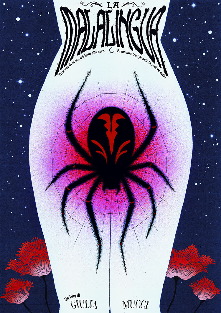
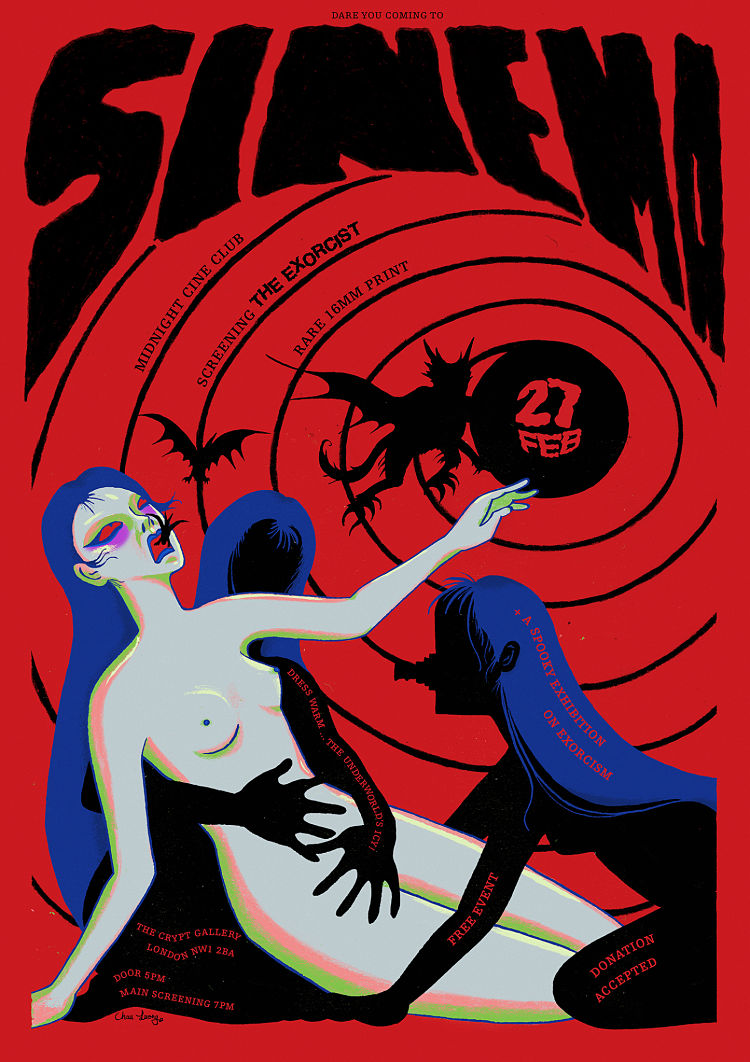
Another project was a movie poster for the upcoming feature debut of my dear friend Giulia Mucci. I can’t give away too much but La Malalingua is a coming of age horror about female sexual stigmatisation. I was brought on at an early stage of the production where I was given the synopsis and treatment. Coming up with an idea that distills a movie I haven’t seen yet into one image was exciting.
I’m a big fan of the artistic expression from Polish movie posters. For La Malalingua I attempted to do something similar. Stylistically, I wanted the poster to have a graphic as well as painterly quality since Giulia shoots with celluloid exclusively. As this is a pre-production poster, the image had to be illustrated, so another aspect I paid attention to was finding a visual idea that is stronger as an illustration than as a photograph. Conceptually, my goal was to hint at the movie’s themes only so far that it sparks the viewer’s curiosity and finding the right tension between beautiful and horrifying/disgusting.
I’d love if someone with arachnophobia looks horrified at the poster but can’t take their eyes off it!
 Anything you’d love to work on but haven’t yet?
I’m keen to do more photo and video production work! I’m experienced with both but I’d love to do projects on a much larger scale. My ultimate dream would be to work as a production designer on a movie or be an art director of a video game. What I like about both is that you can truly immerse yourself into it and lose track of time. I’d be very happy to create work that has a lasting impact on the viewer.
 What do you hope for 2021?
I hope the pandemic will gradually fade out as I want to dedicate more time on projects that are not Covid-friendly and involve in person work! I truly wish to see more projects from visual artists as well as designers with a BiPoc background too, especially in higher positions. The political events of 2020 were another proof that there’s an urgent need for a massive change in the industry and I’m hoping to see a continual improvement.
You might like...
 Crumb’s World
- Kumiko Watari
- Fabiolous: San Giorgio, A Tribute To Ljubljana
- Nicholas Burrows
- Brothers of the Stripe
- ICNY :: SS15
- Nadine Tropschuh
- Ken Carbone: Colour and Digital Devices
- Matt Taylor
- Jive Prints
- Graduate Print Awards 2015 :: Magda Kaggwa of Check Out My Print’s Advice for Grads
- PPQ
- Pixel | Los Villanos Series
- Future Dept. | Interview with Eileen Chan
- Sophy Hollington
- Prelo Prints: Aesop Fables


- Autobahn - November 26, 2021
- Alphabetical - November 12, 2021
- SOFA Universe - November 8, 2021