Recent Yale graduate Orysia Zabeida has had an interesting journey: currently based in New Haven, Connecticut, she grew up on the island of Montreal in Canada, and was born in a coal-mining town called Tchervonograd (which literally translates to “the-red-town”) in western Ukraine.
She’s managed to achieve a lot in a short time: prior to studying her MFA at Yale, she was the art director at the PHI Center and designer at the PHI Foundation for Contemporary Art in Montreal, where she worked with clients like Red Bull Music Academy, MIT Media Lab, three-Michelin-star Italian chef Massimo Bottura and Björk, as well as art directing exhibitions, events and conferences.
That side of her work continued in the US, with collaborations with the likes of avant-garde art center NXTHVN, Yale Art Gallery and more recently, Harvard Art Museums in Cambridge, Massachusetts where she worked on designs for an exhibition highlighting American landscape photography.
Her practice spans typography, animation, web, print, “virtual spaces”, participatory design and more; but whatever her medium, her work is always concept-driven, with ideas coming first and a sense of academic as well as aesthetic rigour. Here, we speak to her about the “magical” connection between mind and paper of drawing; why it’s tricky to print on shower curtains; playing the recorder and more.
 How did you get interested in design? Is your family creative?
Both my parents are artists! When I was a kid, I used to draw every day: I would find ways to represent things that did not explicitly exist, like smells and sounds. Drawing and illustration was definitely my first dip into the world of design. There’s something magical about the direct mind+paper connection of drawing. It has something metaphysical and universal that I’m still trying to pursue and actively translate into my broader multidisciplinary body of work and in all my collaborations.
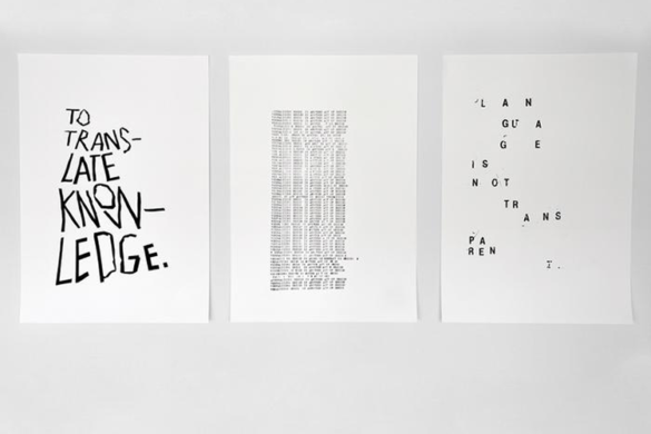
Can you talk a little about your Yale thesis book?
The goal is to stretch the definition of a book and mould your interests into an archival object that would preserve your ideas, discoveries and time at Yale. I was thinking of my book as a house that would host ideas. I’m interested in languages and translations–how abstraction can be defined and vice versa, how something very concrete can exist in a more poetic and abstract form.
I wanted to make a book that would extend beyond bound paper–a book that could act as something else and have its own unique language logic.
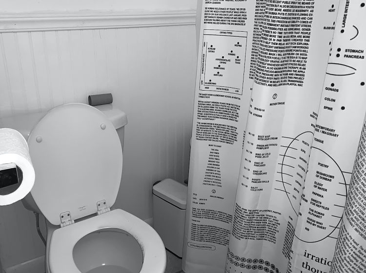 You used some pretty unusual printing methods…
The original idea was to print my book on a shower curtain. I wanted the reader to act as a performance object in daily life, so the shower-book concept successfully materialised that. It also addressed my interest in routines, mantras, fluidity, flexibility, the body and meditation. I believe every object has a soul. And I imagined that impermeable sheet of fabric as an alive being silently and cyclically witnessing my life through methodic soaking and drying sessions.
I also wanted the book to be accessible, so I was thinking about having it exist as an alternative ironic version. Something like a cheesy “Don’t Worry Be Happy” pillow or mug message à la “Keep Calm and Carry On.” Unfortunately, for budget reasons, that version of the book never happened.
How did you overcome those budget challenges?
I made a few prototypes and ended up going in a more traditional printing route. I used donated paper and printed the book at a low-cost printing facility down the street in New Haven. All in all, my publication’s final distilled form is more in line with the core message of my body of work–less is more.
My “book” had many iterations, but having financial limitations helped establish fruitful design parameters. Everything fell into place after embracing cost efficiency and making the most easily reproduced and low carbon imprint object possible.
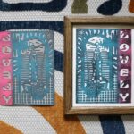
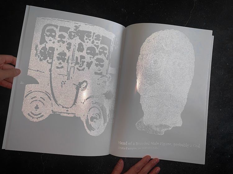 Could you talk more about your design decisions around things like the typographic choices, grid, and imagery?
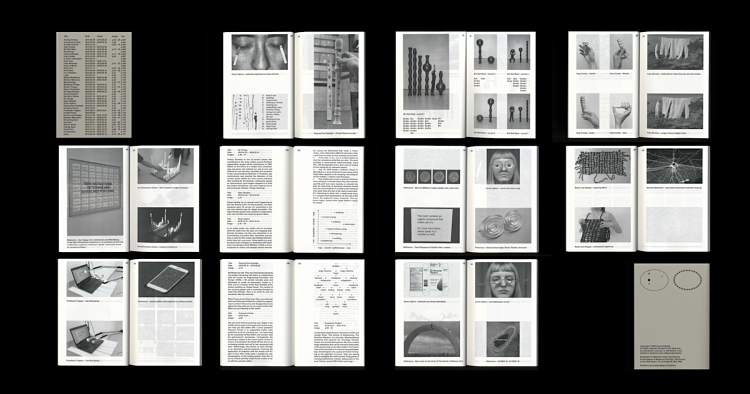
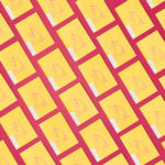
The thesis book starts with an alphabetically organised documentation of roughly 50 ideas, observations, references, prototypes, and thoughts collected in approximately 607 days.
The cover serves as an index and plays the role of a navigation system sorting project titles, images, texts by their respective birth and death. Mapping my work in such a way helped me see how one idea would influence another and how their shared lifespan and evolution helped push and influence other interests.
For type, I used Arial in 12 points throughout the whole document. Again, thinking about accessibility and ways to unite the eclectic contents of my multidisciplinary explorations. I didn’t want the design aspect of my book to overshadow its role of presenting the content in the most transparent way.
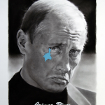
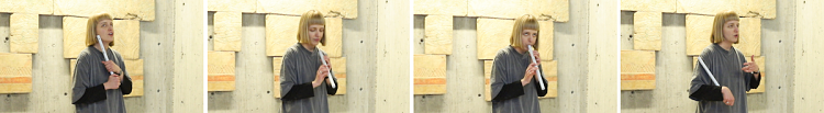 I see a recorder in one of the spreads from the book. How did you come to be photographing a recorder?
The project was part of an experimental workshop by British artist and designer Paul Elliman. His work addresses the instrumentalisation of the human voice as a kind of typography.
I was inspired by Cathedrals of Culture: If Buildings Could Talk, a film about the soul of spaces where buildings narrate their lives as if they were people. I vividly remember one of the directors Wim Wenders was convincing the viewers that buildings speak. So my project involving a recorder is exploring that idea.
In an attempt to talk to Paul Rudolph Hall, I 3D printed a recorder mimicking the building’s concrete sculpture at the corner of Chapel and York Streets. The Rudolph Hall brutalist exterior surface mainly consists of ribbed, brush-hammered, “corduroy” concrete. During the performance, I used the interior’s texture as a guide for timing and starting my musical conversation.
Playing the recorder was my way to speak to the building.
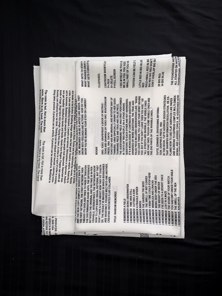
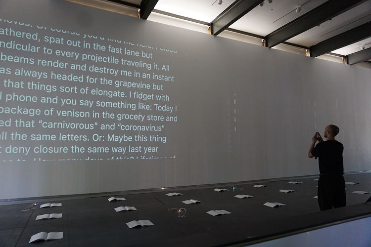
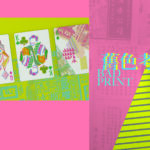
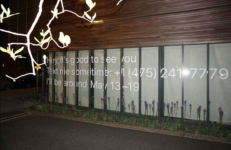 Why did you decide to use invisible ink for the book you made for the On My Way/OMW project?
The exhibition at the Yale Edgewood Gallery, OMW, was a massive collaborative project involving other multidisciplinary designers. We designed the Yale School of Art Graphic Design MFA thesis show that ran for a week in May, On my way!, and a publication narrated and documented by 17 dispersed graduates.
The books were displayed in the gallery between rows of phone chargers. Visitors were invited to photograph them to uncover hidden messages, as the images and texts of the physical books can only be seen through a mobile device. We printed with a reflective ink that activates and reveals the content with a flash. The images and texts of the physical books can only be seen through a mobile device.
The idea came from the paint used on roads. We were thinking about a poetic way to translate our experience working together remotely during the pandemic. The book translates how we are all headed our separate ways and how we all became somehow invisible–only present via the interfaces of our computers and smartphones. The photo reflective ink we used bridges print processes and digital technology.
 What makes a great collaboration and great collaborators?
Trusting the process and the people you work with. Everyone has different perspectives and the larger the team the more compromises will have to be made and that’s OK. Ultimately, when everyone’s goal is to do the best work, things go smoothly. It always comes together.
Any dream projects or clients?
I’d love to do more video and set design work. So I think a dream client would be a musician. I’d love to art direct a clip for Solange or Blood Orange. I enjoy working on exhibition design. It involves an understanding of space and print, but I miss the human interactions in the process. I realise now that I’m most comfortable in collaborative work, and the results have much more impact!
You might like...
 Top 20 Christmas Cards
- 12 Designers & GOSH Fundraise through Everpress
- James Hines
- Leave Me Hanging
- Hand Carved Magpie
- Kodak Super 8 Camera
- NUG ‘I am just trying to be nice’
- African Apparel | Basic Channeling
- Corner Bodega Publishing
- Posterzine™ Issue 42 | Aga Giecko
- Eric Yahnker | Paradise Row
- Graphic Playground
- Blending Past and Present: Rou Jiao’s Innovative Journey in Playing Card Design
- Solty Design
- Johnny Abrahams
- Damien Correll


- Autobahn - November 26, 2021
- Alphabetical - November 12, 2021
- SOFA Universe - November 8, 2021