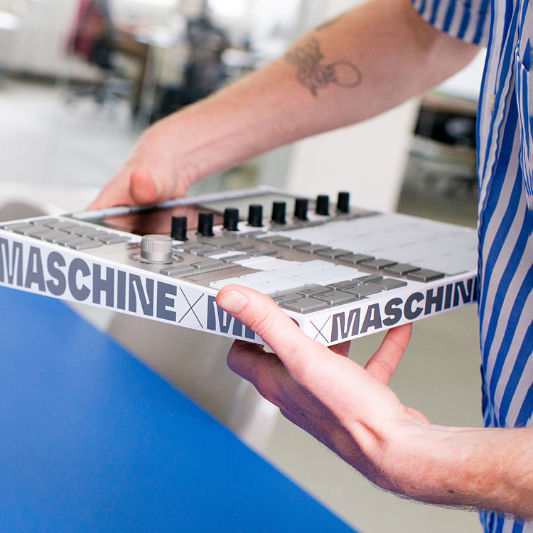
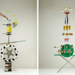
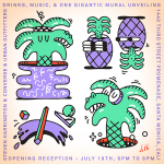
Two companies that we’ve got a hell of a lot of time for—type foundry Dinamo and Native Instruments, which makes audio production software and hardware—have come together, at last, creating the limited-edition Maschine Dinamo.
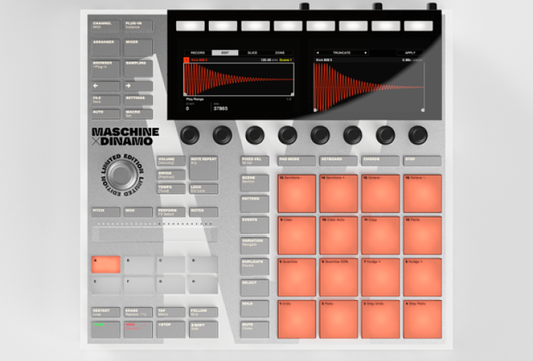
The piece is a limited-edition version of NI’s Maschine, a swish bit of kit that works as a beatmaker, drum machine, sequencer, sampler, synth, audio interface and more.
Dinamo was brought in to create bespoke typography for the Maschine, which serves as both functional usage tools and striking decoration.
 The collaboration came about in part thanks to the product’s hardware designer Johannes Schroth’s suggestion around emphasising the typography on the Maschine, since there’s a fair bit of it around the labelling of various functions and buttons.
Schroth had met Johannes Breyer, Swiss co-founder of Berlin/Basel type foundry Dinamo at a dinner party. Since the foundry already had a product arm Dinamo Hardware (which usually sells things like t-shirts and key chains), and the fact that Dinamo’s Fonte have been used by clients including Discord and Warp Records, it felt like a match made in heaven.
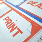
Breyer and Schroth landed on the Dinamo typeface Whyte for the project thanks to its mister of modernity and anachronistic idiosyncrasies. These nuances are born of the fact that the typeface plays with the notion of ink traps, which are usually associated with the bleed from rudimentary printing techniques, but places them delibertaltyey in letterforms printed digitally.
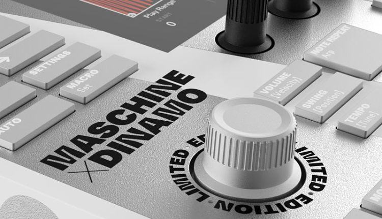 “Today, with high-res screens and modern printing, you don’t need ink traps – everything is super sharp. So we wanted to look again at ink traps through the lens of modern technology,” Breyer told Native Instruments.
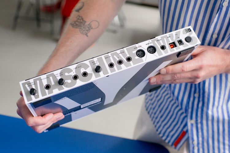
Dinamo’s focus on variable fonts and the idea of the adaptability of letterforms also cam into play in the project, “from the huge, squared-off M shape that sandwiches the the hardware, to the ‘ticker tape’ running around its edge and the tiny labels on each button and pad,” as NI puts it.
Taking advantage of Whyte’s vast character set, the Maschine Dinamo also bears some special glyphs, like the Korean brackets on the Swing and Tempo buttons, and Maschine’s standard left and right arrows have been replaced with distinctively ink-trapped equivalents.
 Schroth has said that the typeface reminds him of “graffiti bubbles. Those characters often have intense cuts in them – especially with the white, silver, and black. That’s also a little bit of a reference to classic hip hop–inspired products, like the JVC Boomblasters and Casio G-Shocks.”
Photos: Kasia Zacharko
You might like...
 Angel Design Studio
- Will Sweeney
- ShyBrainsGetNowt
- Printed Matter :: Art Book Fair 2014 | Los Angeles
- Good Press :: Print Resource
- Best of May 2013
- Noritaka Minami
- Jade Milne
- Interview :: Caspar Williamson
- Anna Lomax
- Josh Freydkis
- Steven Harrington
- Print Isn’t Dead | Digital Proofs
- Design Museum Shop
- Lorena G
- Andy Smith Exhibition @ Soma, Bristol


- Autobahn - November 26, 2021
- Alphabetical - November 12, 2021
- SOFA Universe - November 8, 2021